The decision to use Google Maps or Waze often boils down to personal preferences. Waze excels at real-time traffic navigation, providing users with the fastest routes and avoiding congestion. Its focus on traffic information makes it ideal for those who prioritize speed and efficiency.
On the other hand, Google Maps offers a cleaner interface and a broader range of features, including detailed maps, public transit information, and even walking directions. While its traffic updates are not as granular as Waze’s, its functionality appeals to many users.

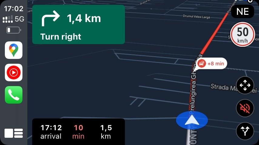
Waze, on the other hand, uses a more obvious marker to indicate the end of a traffic jam, allowing drivers to gradually slow down as they approach. This can help prevent sudden braking and improve road safety. In areas with heavy traffic and busy intersections, like the roundabout near my home, this feature becomes even more essential.
The authorities here seem unconcerned about the frequent traffic jams that can stretch for miles, and drivers often approach the end of the tail at high speeds. While Google Maps does highlight traffic congestion, a more prominent marker would make it easier for drivers to anticipate and avoid potential hazards.
Additionally, Google Maps could improve its real-time traffic feature by providing more detailed information about the nature of traffic jams. For example, the app could indicate whether a jam is caused by an accident, construction, or other factors.
This would allow drivers to make more informed decisions about their routes and avoid areas with significant delays. Furthermore, Google Maps could consider integrating real-time traffic data from other sources, such as traffic cameras or connected vehicles, to provide a more comprehensive and accurate picture of road conditions.
While Google Maps is a valuable tool for navigation and real-time traffic information, its current approach to indicating traffic jams can be improved. By adopting a more obvious marker for the end of traffic jams and providing more detailed information about the nature of congestion, Google Maps can help drivers avoid potential hazards and make safer, more efficient travel decisions.
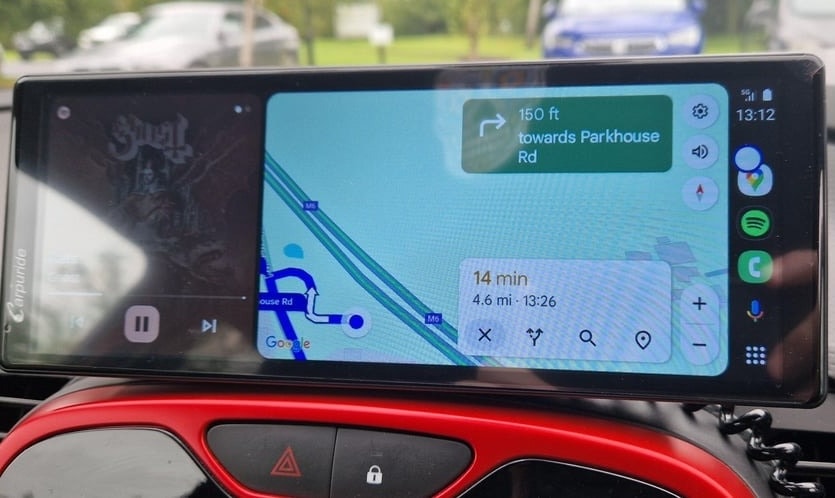
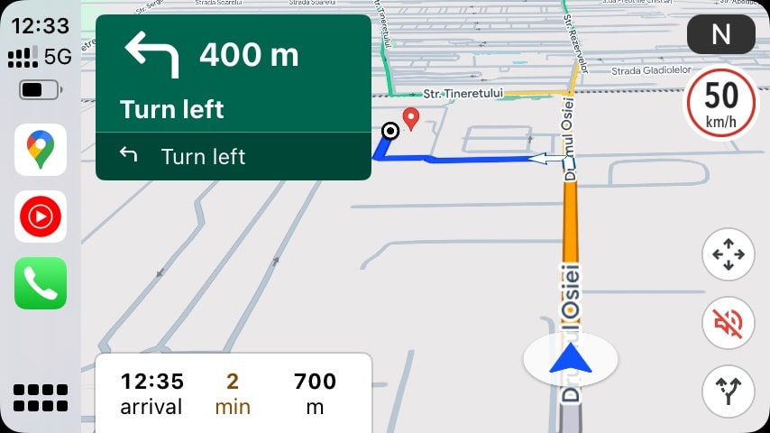
A recent Reddit discussion illuminated a critical usability flaw in Google Maps’ Android Auto implementation: oversized information boxes that eclipse the vital navigational elements. The core purpose of a navigation app is to provide an uncluttered view of the route and the driver’s position.

Instead, Google Maps frequently prioritizes large, static informational panels, relegating these critical elements to the screen’s edges. This design oversight is particularly glaring on Android Auto, a platform explicitly designed to enhance the smartphone experience within the car. While not a universal issue, its recurring presence on Android Auto underscores a broader problem: Google’s apparent indifference to optimizing the navigation experience.
The current interface clashes with the platform’s intended function, hindering safe and efficient navigation. A fundamental redesign is urgently needed to prioritize clarity, customization, and the driver’s paramount need for unobstructed route guidance.

