
A car’s dashboard is more than a collection of screens, buttons, and gauges; it forms the bridge between driver and machine. Imagine sitting behind the wheel, needing to adjust the temperature, change a song, or check navigation. If the controls are intuitive, the experience feels natural and even enjoyable.
If the layout confuses, every adjustment turns into a distraction. For daily drivers, long commutes, or weekend trips, a well-designed dash can dramatically improve satisfaction and safety. Carmakers invest heavily in design, but success varies. Some vehicles offer simple, logical interfaces that allow drivers to access key functions without glancing away from the road.
These dashboards reduce mental load, helping owners feel in control and confident. Others prioritize futuristic design or feature overload, resulting in cluttered screens and hidden controls that require time and patience to understand.
This page looks at ten cars, divided into two categories. The first five models stand out for their clean, user-friendly dashboards. They demonstrate clarity in design, consistent feedback, and intuitive control placement. The second set represents vehicles whose dashboards, despite impressive technology or styling, challenge usability and often frustrate owners.
By comparing these examples, drivers can understand how interface design affects the entire driving experience. From compact sedans to luxury SUVs, these ten vehicles illustrate extremes of dashboard design. Each model brings its own personality, strengths, and drawbacks.
Beyond aesthetics, the analysis considers accessibility, tactile feedback, information clarity, and ease of interaction. Whether choosing a first car, upgrading, or simply appreciating intelligent design, understanding dashboard usability ensures drivers spend more time enjoying the road rather than wrestling with controls.
5 Cars With Simple Dash Layouts

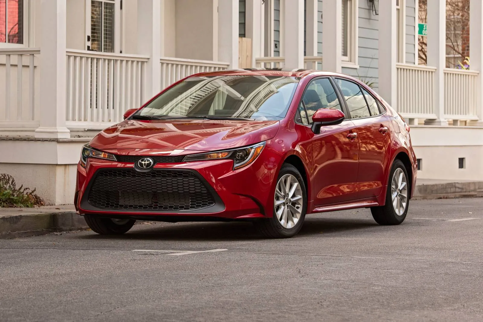
1. Toyota Corolla 2022
The Toyota Corolla 2022 presents a dashboard designed with precision and simplicity. Buttons are logically grouped by function, and the digital display complements analog gauges without clutter. Drivers can adjust climate, audio, and navigation with minimal distraction, supporting safer driving during urban commuting or long highway stretches.
Touchscreen placement enhances accessibility. The screen sits within the natural line of sight, angled slightly toward the driver. Menus remain concise, avoiding deep navigation trees that can frustrate users. Physical knobs for volume and temperature retain tactile feedback, ensuring adjustments can be made without looking away from the road.
This combination of touchscreen and physical interface maintains usability across varying driving conditions. Visual clarity in the instrument cluster reinforces quick comprehension. Information such as speed, fuel, and engine status is presented in bold, legible fonts.
Warning indicators are distinct, and the use of color coding ensures immediate recognition of alerts. Drivers familiar with standard layouts will quickly adapt, while new users encounter a gentle learning curve. Ergonomic placement of controls supports routine operations.
Turn signals, wiper controls, and cruise control buttons fall naturally under the hands. Seat and steering adjustments are intuitive, creating a sense of coherence between human and machine. For commuters who spend hours behind the wheel, such design choices reduce fatigue and increase comfort.
Audio and connectivity integration follows the same philosophy. Pairing a smartphone is straightforward, and audio controls respond quickly. Navigation, when used, keeps menus shallow and avoids overloading drivers with unnecessary information.
This Corolla dashboard demonstrates how thoughtful organization can produce a relaxed, confident driving environment. Every function feels deliberate and accessible, reducing stress during operation. For anyone prioritizing simplicity and efficiency, the 2022 Toyota Corolla delivers one of the clearest, most user-friendly interfaces available today.

2. Honda Accord 2022
Where minimalism meets technology, the Honda Accord 2022 sets a high standard for dashboard usability. Smooth lines and clearly separated zones allow drivers to access controls without hesitation. The digital instrument panel provides clear feedback, while secondary controls remain unobtrusive but within reach.
Touchscreen responsiveness contributes to an efficient experience. Menus load quickly, and functions such as audio, climate, and phone connectivity appear logically arranged. Honda’s design avoids layering too many options in a single screen, which keeps navigation intuitive.
Physical buttons for frequently used functions complement touchscreen operations, giving tactile certainty even when the vehicle is in motion. Lighting and color coding within the dashboard support rapid comprehension. Speed, fuel, and engine notifications use bold fonts and clear spacing. Lane assist, cruise, and driver assistance systems offer discreet indicators, allowing drivers to stay informed without feeling overwhelmed.
Ergonomics extends to steering wheel controls. Commonly accessed features, including phone, audio, and adaptive cruise functions, sit naturally under thumbs. Minor adjustments can be performed without removing hands from the wheel. Additionally, the HVAC system features simple rotary knobs and buttons positioned for immediate recognition.
Accord’s dash design considers passenger experience as well. Front passenger visibility of climate and audio information avoids forcing the driver to make adjustments for companion comfort. The integration of infotainment and smartphone support ensures seamless connectivity, reflecting careful attention to practical driver interaction.
By balancing touchscreen capabilities, physical control placement, and clear visual communication, the 2022 Honda Accord delivers a dashboard that enhances confidence and reduces cognitive load. This approach allows drivers to focus on road conditions and driving decisions, emphasizing usability without compromising modern features.
Also Read: 5 Vehicles That Feel Right for Daily Life vs 5 That Don’t

3. Mazda CX-5 2022
Precision and restraint define the dashboard of the Mazda CX-5 2022. Unlike some feature-heavy competitors, Mazda prioritizes clarity and simplicity. Minimalist controls allow drivers to operate climate, audio, and navigation functions with intuitive motions and limited distraction.
Central screen placement supports a natural line of sight. Physical knobs remain for volume and temperature, giving tactile confirmation during adjustments. The combination ensures that drivers can make essential changes without diverting attention from traffic conditions.
Instrumentation blends analog and digital elements effectively. Primary information, such as speed and fuel, is easy to read, while secondary features appear only when necessary. Warning lights are distinct and highlighted in color to attract immediate attention. This layout avoids overcrowding, promoting quick interpretation under different lighting conditions.
Steering wheel controls follow logical positioning. Functions frequently required during driving, including cruise control, audio, and phone operations, are accessible with minimal hand movement. Ergonomic consideration extends to the angle and reach of knobs and buttons, supporting comfort during long journeys.
Material choice complements functionality. Soft touch areas and clean trim lines guide the eye toward important displays, while minimizing visual distraction. Audio system controls respond immediately, and smartphone integration is straightforward, enhancing usability without requiring constant touchscreen interaction.
The CX-5 dashboard exemplifies how restraint and attention to detail can create a satisfying driving experience. It demonstrates that prioritizing function over flashy design can result in higher driver confidence and lower cognitive strain during daily operation.

4. Hyundai Elantra 2022
Hyundai’s 2022 Elantra provides a balance of modernity and simplicity. The dashboard features a central touchscreen integrated with intuitive physical buttons. Climate and volume controls remain rotary or push-type for tactile convenience, reducing the need for repeated visual checks while driving.
Instrument cluster clarity reinforces easy comprehension. Speedometer, fuel gauge, and trip information appear in clear fonts. Warning indicators use consistent color cues, ensuring that alerts capture attention immediately. Layout symmetry contributes to an orderly visual hierarchy that promotes quick interpretation.
Ergonomics supports natural movement. Frequently accessed controls for turn signals, lights, and wipers are positioned within reach. The center console ensures that infotainment and connectivity features can be adjusted without stretching or awkward gestures.
Connectivity functions are simple to initiate. Pairing a smartphone, adjusting media settings, and using navigation remain efficient tasks, reflecting a deliberate design philosophy. The interface avoids overcrowding, giving each feature a defined role.
Controls for climate and ventilation rely on conventional knobs and buttons, allowing immediate response even under varied driving conditions. Interior design emphasizes function without excessive decorative elements, contributing to a calm, uncluttered environment.
The Hyundai Elantra 2022 demonstrates that clarity, accessibility, and attention to tactile feedback can create a dashboard that supports confident driving. Simplicity, when paired with essential technology, reduces cognitive demand and enhances the entire user experience.

5. Subaru Outback 2022
Practicality drives the design of the Subaru Outback 2022 dashboard. Every function appears intentional, with clear labels and logical grouping. Controls for essential functions such as climate, audio, and navigation are within immediate reach of the driver, allowing swift adjustments.
Instrument displays provide information without clutter. Speed, fuel, and engine indicators are prominently positioned. Driver assistance systems display warnings and alerts in a nonintrusive way, allowing information absorption without distraction.
Touchscreen and physical controls coexist harmoniously. Rotary dials remain for volume and temperature, while the touchscreen handles less frequently accessed features. This hybrid approach enhances usability, giving drivers confidence that adjustments can be performed accurately at a glance.
Steering wheel integration further supports ease of operation. Frequently needed features, including phone and audio controls, sit naturally within thumb reach. Center console placement reinforces intuitive access to infotainment, navigation, and secondary functions.
Material selection complements the ergonomic philosophy. Soft touch surfaces and well-defined buttons guide attention to major functions. This thoughtful layout reduces mental load, ensuring that drivers can focus on the road while maintaining command over cabin settings.
Daily ownership benefits from predictability and ease. Whether commuting, taking long trips, or driving through variable conditions, the Subaru Outback 2022 provides clarity and confidence. Drivers can adjust controls quickly, interpret information instantly, and enjoy a distraction-minimized interface.
5 Cars With Confusing Dash Layouts

1. Tesla Model S 2022
The Tesla Model S 2022 demonstrates a commitment to technology that can feel overwhelming for new drivers. Its dashboard relies heavily on a large vertical touchscreen, which controls nearly every vehicle function. From climate settings to driving modes, traditional physical controls are minimal.
For drivers accustomed to tactile buttons, this requires a period of adaptation, and even experienced users sometimes find menus unintuitive. Touchscreen responsiveness is excellent, but its central role introduces challenges. Adjusting air conditioning, navigating media options, or changing vehicle settings requires precise interaction with the screen.
Multistep menus can delay tasks, and performing these actions while driving may reduce situational awareness. The lack of conventional knobs for quick adjustments intensifies this issue. Instrument displays, while sleek, can also confuse. Speed, range, and autopilot information are condensed into a digital cluster that changes depending on mode and menu selection.
Drivers must learn which alerts appear where, and misinterpretation can occur during unfamiliar driving conditions. Additionally, software updates periodically change the layout, which forces repeated adaptation. Ergonomics feels futuristic but sometimes unintuitive.
Steering wheel controls exist, but their functions are partially dependent on context and software settings. Physical feedback is limited, making repeated adjustments less precise compared to vehicles with dedicated buttons. This contributes to a sense of uncertainty in performing common tasks.
Integration of navigation, media, and vehicle systems demonstrates the potential of digital dashboards, yet complications increase cognitive load. Shortcuts exist but may require memorization. Drivers who value traditional interaction with dials, levers, and immediate tactile feedback may find the Model S challenging during daily use.
Learning to operate the Tesla Model S effectively requires patience and frequent reference to manuals or online guides. While enthusiasts often appreciate the minimalist, high-tech aesthetic, the interface prioritizes visual design over immediate usability. For drivers seeking clarity and quick accessibility of essential controls, this dashboard can introduce frustration and distraction during regular driving.

2. Mercedes-Benz S-Class 2021
Luxury in the Mercedes-Benz S-Class 2021 extends to its dashboard, yet this sophistication comes at a cost of usability. Multiple touchscreens, gesture recognition, and complicated menus create an environment that can confuse even experienced drivers. Controls that used to be simple buttons are now embedded in touch-sensitive panels or accessed through layered digital menus.
Gesture controls allow users to adjust volume or skip media tracks with hand motions. While visually impressive, these movements require precision, and misinterpretation can frustrate drivers. Occasional failure to register gestures leads to repeated attempts, which may divert attention from the road. Physical controls exist but are limited to basic functions, forcing reliance on digital interfaces.
Menus for climate, audio, and driver assistance are layered, with submenus that sometimes move after software updates. Locating a particular function often requires scrolling through multiple screens or remembering exact touch sequences. Even routine adjustments, such as heated seat activation, may feel cumbersome.
Instrument clusters are highly customizable, presenting speed, fuel, navigation, and infotainment data simultaneously. This flexibility enhances aesthetics but demands attention to learn where specific alerts appear. Color coding and graphical changes are consistent but not always intuitive, requiring time for the brain to process information quickly while driving.
Ergonomic intentions are clear, yet execution challenges drivers. Steering wheel buttons adapt depending on selected menus, which occasionally results in unexpected actions. Central touchpads demand precise control, and learning shortcuts is essential to avoid distraction.
For users unaccustomed to high-tech luxury interfaces, the S-Class dashboard may seem elaborate and unnecessarily complicated. Each system excels individually, yet integration creates cognitive load. Owners must invest time in learning the location of each function, calibrating gestures, and understanding software updates to maintain smooth operation.
The Mercedes-Benz S-Class 2021 delivers innovation and elegance, but can frustrate drivers seeking straightforward interaction. Its dashboard is an example of advanced features exceeding intuitive usability, creating a learning curve that requires patience and attention during routine driving.

3. Cadillac Escalade 2021
The 2021 Cadillac Escalade combines premium design with abundant digital technology, producing a dashboard that often overwhelms new owners. Two large screens dominate the center console, with one controlling infotainment and the other managing climate, vehicle settings, and secondary features. Traditional buttons are minimal, requiring drivers to rely on touchscreen interaction for most operations.
Menus are layered, with climate controls, seat adjustments, and media settings distributed across multiple submenus. This organization can make routine adjustments cumbersome, particularly for drivers used to straightforward physical controls. Each function requires visual confirmation, which increases cognitive demand while driving.
The instrument cluster displays present speed, fuel, navigation, and driver assistance information. However, the sheer amount of visual data can distract. Icons and indicators occasionally change location depending on configuration or software updates, demanding constant attention to interpret alerts accurately.
Physical controls for audio, volume, or temperature are limited and often secondary to touchscreen commands. While high-quality haptic feedback exists, learning which functions respond to touch versus physical interaction is necessary. Steering wheel buttons integrate some features, but their behavior changes depending on menu selection, which may confuse new drivers.
The Escalade prioritizes visual appeal and digital innovation over simplicity. Its central interface emphasizes aesthetics, animations, and futuristic design, which often compete with functional clarity. Shortcuts exist but are not immediately apparent, requiring memorization or repeated consultation of the manual.
Even experienced owners report a learning curve when adjusting daily settings. Simple tasks, such as changing fan speed or media volume, may require multiple interactions, contributing to a perception of inefficiency. Software updates occasionally move the interface layout, introducing further adaptation requirements.
The Cadillac Escalade 2021 demonstrates the tension between technological advancement and usability. While the dashboard offers impressive functionality, the complication can create a distraction and reduce operational confidence. Drivers seeking clarity and quick access may find it challenging, highlighting the importance of thoughtful interface design in luxury vehicles.

4. BMW X7 2022
The BMW X7 2022 delivers a highly digital dashboard that blends luxury with technology. A large touchscreen, secondary displays, and gesture control dominate the interface. While these features impress visually, they can overwhelm drivers seeking intuitive control. Menu depth and touchscreen dependence create cognitive load that can interfere with ease of use.
Climate, audio, and navigation controls are mostly touchscreen-based, with physical knobs limited to volume and temperature adjustments. Driving through menus requires attention and memorization of sequences. Minor changes, such as activating seat heating or toggling driving modes, may require multiple steps and visual confirmation.
Instrument clusters are fully digital and highly configurable. Drivers can select layouts and priorities, yet this flexibility demands familiarity. Alerts for safety, lane assist, or fuel warnings may move depending on the selected mode, which slows reaction times for new users.
Gesture recognition is included for specific tasks. While innovative, gestures sometimes fail to register consistently, causing repeated attempts and distraction. Steering wheel buttons adapt dynamically, which can create uncertainty during operation.
Ergonomic placement aims to minimize movement, but screen reliance requires drivers to glance longer than with conventional designs. Physical feedback is limited, and learning shortcuts is essential for efficient operation. Touchpad input adds versatility but introduces a secondary learning challenge.
Daily use of the BMW X7 2022 requires patience and practice. While the dashboard communicates wealth and advanced technology, usability is compromised by complication. Owners must invest time to internalize control locations, memorize menu hierarchies, and adapt to periodic software changes.
This model demonstrates that high-end technology without simplicity can reduce user confidence. Drivers who prioritize clear interaction may struggle initially, despite the vehicle’s premium performance and aesthetics.
Also Read: 5 Vehicles That Handle Potholes Well vs 5 That Don’t

5. Genesis GV80 2022
Genesis GV80 2022 merges contemporary luxury with extensive digital systems. A large touchscreen, secondary display for vehicle information, and limited physical buttons define the interior interface. This configuration challenges drivers who expect direct tactile control for routine tasks.
Touchscreen controls manage climate, media, and driving settings. The layout prioritizes visual elegance, creating submenus that require several steps for simple adjustments. Rotating knobs exist for select functions, but many operations depend entirely on touchscreen interaction, demanding focused attention.
Instrument clusters are digital and adaptive. Speed, fuel, navigation, and driver assistance features occupy a combined space, yet rearrangement based on software settings can confuse new users. Alerts for safety and mechanical systems appear in different areas depending on mode selection, requiring quick interpretation.
Steering wheel buttons supplement touchscreen commands but adjust based on menu context. Without familiarity, drivers may select incorrect functions, leading to repeated interaction or distraction. Gesture and voice control options exist but are inconsistent in recognition, adding another layer of learning.
Ergonomic placement of screens and controls emphasizes aesthetics, sometimes at the expense of immediate accessibility. Drivers must visually confirm selections and drive through multiple layers to perform common tasks. Climate adjustments, audio changes, or navigation inputs often require longer attention than conventional layouts.
The GV80 dashboard exemplifies advanced technology intersecting with usability challenges. While visually sophisticated, frequent adaptation and cognitive effort are required. Owners who value clarity may find initial use frustrating, and full comfort with the system develops only after extended familiarity.
Daily driving with the Genesis GV80 2022 demonstrates that luxury and technology do not guarantee intuitive operation. High-tech dashboards require users to learn menus, gestures, and adaptive controls, emphasizing the trade-off between style and straightforward usability.