
Some colors just hit different when they are rolling down a public road. You are sitting at a red light, minding your business, and then something pulls into the lane next to you wearing a paint scheme that belongs on a race track. Gulf blue and orange. Martini white with red and blue stripes.
Rothmans white and blue. Your brain registers it instantly, even if you cannot immediately name the race where you first saw it. That is the power of a truly iconic racing livery, and it does not lose a single bit of its impact when it moves from a circuit to a street.
Racing liveries are more than color combinations. They are compressed histories of some of the most celebrated moments in motorsport. Every stripe, every sponsor block, every color choice carries decades of association with speed, competition, engineering excellence, and sometimes outright drama on tracks across the world.
When those visual identities get applied to a road-going car, something genuinely interesting happens. A vehicle that might otherwise blend into traffic becomes a rolling reference to motorsport history that enthusiasts recognize and appreciate immediately.
What makes a racing livery translate well to a street car is not just visual appeal, though that certainly matters. It is also about how well the livery interacts with the lines and proportions of the specific vehicle it is applied to. Some liveries are so well constructed that they work on almost any body shape.
Others are so closely tied to a specific racing car that they only look fully right on road cars that share those proportions. This article covers eight liveries that manage both qualities: they are visually stunning, historically rich, and they look genuinely excellent on street cars when applied with care and accuracy.
Whether you are considering a vinyl wrap for your own vehicle, shopping for a Heritage Edition production car, or simply appreciating these combinations from a design perspective, what follows is a proper celebration of eight racing liveries that earned their legendary status.

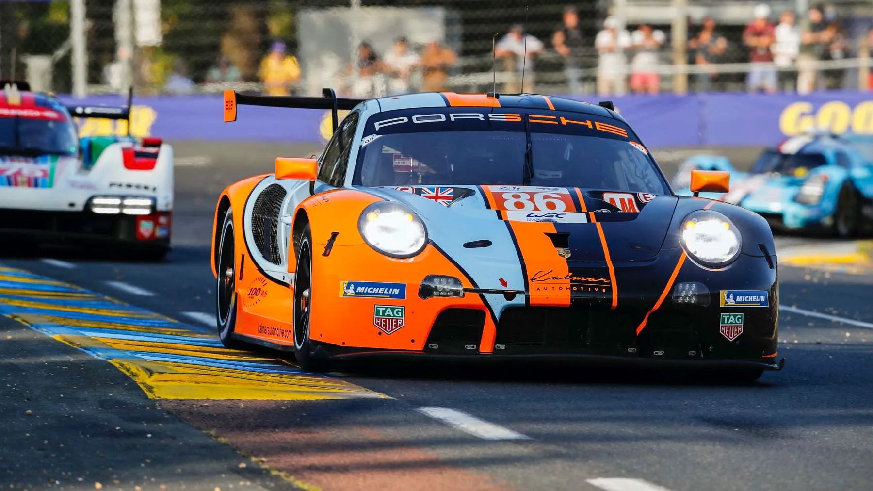
1. Gulf Oil Livery: Light Blue and Orange That Defined an Era of Endurance Racing
No racing livery has achieved the cultural permanence of the Gulf Oil color scheme. Light powder blue paired with a vivid orange stripe is one of the most recognized visual combinations in automotive history, and its association with some of the most celebrated endurance racing victories ever recorded gives it a depth of meaning that purely decorative color schemes cannot carry.
When this livery appears on a streetcar, it does not just look good. It arrives carrying the full weight of Le Mans victories, legendary drivers, and one of the most storied chapters in motorsport history.
Gulf’s livery became inseparable from Ford GT40 racing success during the late 1960s, adorning the Gulf-John Wyer cars that competed at Le Mans, Sebring, and Spa, and its visual identity was captured so extensively by photographers and filmmakers that it became embedded in popular automotive culture far beyond the motorsport audience.
Steve McQueen’s film “Le Mans” cemented the Gulf livery’s cultural status by featuring it so prominently that entire generations who never watched a single endurance race developed an emotional response to those specific colors. On street cars, the Gulf livery demands a vehicle with the right proportions and visual character to carry it properly.
Long hoods, low rooflines, and muscular rear haunches all provide ideal surfaces for the livery’s horizontal stripe work and color blocking. Ford recognized this when it offered the 2022 Ford GT Gulf Heritage Edition (second-generation GTE-based platform) as a production road car, applying the full Gulf livery treatment to a vehicle whose body shape derives directly from the GT40 racing cars that made those colors famous.
That production Heritage Edition commands serious collector interest precisely because the livery on that specific car body represents the most historically accurate and visually correct interpretation of the Gulf scheme available on any road-going vehicle.
For owners applying the Gulf livery as a wrap on their own vehicles, color accuracy is critical to achieving the right result. Gulf’s specific powder blue is a distinctive, relatively desaturated medium blue that reads differently from royal blue or sky blue.
Getting the exact tone wrong produces a result that enthusiasts immediately recognize as off. Paired with the correct warm orange, the livery achieves a visual harmony that looks effortless and historically grounded on almost any low, wide vehicle with clean body lines.
Replica Gulf liveries applied to vehicles like the Lotus Evora GT (Type 122 platform) or period Porsche 911 models demonstrate how well this color scheme transfers beyond its original host car. Street cars wearing Gulf colors draw attention and admiration from enthusiasts and casual observers alike, because those colors carry recognition that crosses automotive knowledge boundaries.
You do not need to know the racing history to feel the livery’s visual impact. But knowing the history makes it considerably more powerful.

2. Martini Racing Stripes: European Sophistication Drawn in Red, Blue, and White
Martini Racing’s livery is one of the few color schemes that manages to look simultaneously elegant and aggressive, a combination that is harder to achieve than it sounds. White base, with diagonal bands of red and blue that flow across the body in a sweeping, directional pattern, the Martini livery suggests motion even when the car is standing still.
It has appeared on some of the most celebrated racing cars in European motorsport history, and it translates to road cars with a refinement that few other racing liveries match. Porsche’s partnership with Martini Racing produced some of the most photographed and celebrated livery applications in motorsport history.
Porsche 917s, 935s, and 911 RSRs wearing the Martini scheme raced at Le Mans, in the World Sportscar Championship, and across European circuits during the 1970s and 1980s, building an association between those colors and Porsche’s racing identity that remains powerfully intact decades later. When Porsche applied the Martini livery to a production road car, the result was one of the most desirable limited editions in recent automotive history.
Porsche offered the 911 S/T (992.1 platform) with a Heritage Design Package that incorporated Martini-style stripe work in a factory production context, creating a road car that wore racing livery lineage as genuine factory specification rather than aftermarket modification.
Earlier, Porsche created the 911 Carrera T Martini Edition (991.2 platform) for select markets, demonstrating the brand’s consistent recognition that this livery’s appeal to its customer base is both deep and financially meaningful. What makes the Martini livery particularly successful on streetcars is its adaptability across different body shapes and sizes.
Where some liveries require specific proportions to read correctly, Martini’s flowing diagonal stripe structure can be scaled and adjusted to work on compact hatchbacks, sports coupes, and full GT cars without losing its visual identity. A Volkswagen Golf GTI wearing Martini-inspired stripe work looks sporty and historically referential. A Porsche 911 wearing the full factory treatment looks like a museum piece that someone decided to actually drive, which is exactly the right effect.
Applying the Martini livery as a vinyl wrap requires attention to the diagonal flow direction and the proportional balance of the stripe widths. When done correctly, the result is a street car that looks purposeful, European, and deeply connected to a racing heritage that spans decades of world-class competition across multiple racing disciplines.
Also Read: 12 Underrated Cars With True Racing DNA

3. Rothmans White and Blue: Rally Heritage That Commands Attention on Any Road
Rothmans Racing’s white and blue livery carries a different kind of motorsport heritage than endurance racing schemes. This is a livery born from rally racing, from stages through forests and mountain passes, from cars being driven at absolute limits by drivers with extraordinary skill and nerve.
When that livery appears on a streetcar, it brings that rally DNA with it in a visual package that is clean, bold, and unmistakably purposeful. On production road cars, Rothmans-inspired liveries look most effective on vehicles that share some visual DNA with rally cars.
Higher ride height, wide track, and boxy, purposeful proportions all make the livery feel contextually correct. A full Rothmans wrap applied to a Subaru WRX STI (VAB platform) works visually on multiple levels simultaneously. Subaru’s own rally heritage gives the car an authentic connection to the motorsport category that Rothmans most strongly represents, while the WRX STI’s proportions and stance provide ideal surfaces for the livery’s color blocking and stripe work.
Period Porsche 911 Carrera 4S models wearing Rothmans-inspired wraps have appeared at car shows and on the road with considerable visual success, demonstrating that the livery’s appeal extends beyond rally-specific vehicle shapes to any sports car with the right presence and stance.
Shops specializing in historically accurate racing livery reproductions cite Rothmans as one of the most requested designs precisely because its combination of white, blue, and gold creates a result that photographs beautifully and reads clearly from any distance.
Getting the blue tone correct is the most critical element of an accurate Rothmans reproduction. Rothmans’ specific navy-to-royal blue sits at a particular saturation level that distinguishes it from both the lighter Gulf blue and the darker shades used in other motorsport liveries.
Combined with the correct gold accent treatment and properly scaled lettering, an accurate Rothmans livery on a well-chosen streetcar is one of the most striking and historically resonant visual statements available in the enthusiast car community.

4. John Player Special Black and Gold: Possibly the Most Glamorous Racing Livery Ever Created
Black and gold should not work as well as it does. Black absorbs light. Gold reflects it. Putting them together on a racing car sounds like a design risk, and yet the John Player Special livery that adorned Lotus Formula 1 cars during the 1970s and early 1980s produced something so visually striking that it is consistently cited by designers, photographers, and automotive enthusiasts as one of the most beautiful liveries ever applied to a racing vehicle.
On streetcars, that beauty translates with remarkable completeness. Lotus entered its JPS sponsorship partnership in 1972, and the resulting all-black cars with gold pinstripe detailing and JPS logo work represented a complete departure from the brightly colored racing liveries that dominated the era.
At a time when most racing cars were wearing sponsor colors in red, white, and blue combinations, the Lotus 72, 76, 78, and 79 appeared in matte-adjacent black that made them look simultaneously more serious and more exotic than everything around them on the grid. Mario Andretti won the 1978 Formula 1 World Championship in a JPS Lotus 79, cementing the livery’s association with genuine racing achievement.
Lotus itself acknowledged the enduring power of the JPS livery when it created the Lotus Emira V6 First Edition (Emira platform) with an optional Black and Yellow colorway that clearly references the historic JPS aesthetic without reproducing the tobacco sponsorship branding. That production acknowledgment from the marque most closely associated with the livery confirms that the JPS color scheme retains strong commercial appeal with current buyers.
Street cars wearing JPS-inspired wraps consistently draw longer second looks than almost any other livery in this article, because the combination of black and gold reads as premium, purposeful, and historically informed in a way that immediately communicates the owner’s knowledge of and connection to motorsport history. For a vinyl wrap project or a heritage-inspired factory specification, the JPS livery remains one of the highest-impact choices available.

5. Marlboro Red and White: Formula 1’s Most Recognizable Color Combination
Decades of association with Formula 1’s most dominant team created a color combination that automotive enthusiasts recognize instantly, even without a single word of branding attached to it. Red base with a white chevron or geometric detail treatment, applied to sleek, low, aerodynamically shaped bodywork, reads as Ferrari and McLaren Formula 1 history simultaneously, connecting to championship victories, legendary drivers, and one of the longest-running title sponsorships in racing history.
Marlboro’s partnership with Ferrari from the early 1970s through 2010 created a visual identity for the Scuderia that extended far beyond the boundaries of the sponsorship itself. Even after tobacco advertising restrictions progressively removed the explicit branding from the cars, Ferrari continued to use color compositions and geometric design elements that referenced the Marlboro visual language in ways that enthusiasts understood without explicit identification.
McLaren’s earlier Marlboro partnership during the 1980s and 1990s similarly embedded those colors into some of the most celebrated championship cars ever raced. On street cars, Marlboro-inspired red and white liveries work best on vehicles with genuinely sporting proportions and a visual presence that justifies the reference.
A full red body with white geometric chevron treatment applied to a car like the 2023 Alfa Romeo Giulia Quadrifoglio (952 platform) creates a result that connects Italian performance heritage with Formula 1 color history in a combination that feels both authentic and visually striking. Alfa Romeo’s own deep connection to Italian motorsport history makes the livery’s cultural references layered and contextually rich.
White with red accent treatment, reversing the color relationship from the classic Marlboro scheme, has become a popular alternative application that references the livery without reproducing it directly. This reversed treatment often works better on vehicles with larger surface areas where bold red accents can create visual drama against a white base, similar to the approach taken with several McLaren road car special editions that have referenced the brand’s own Marlboro-era racing history in production paint specifications.
Accuracy in red tone selection is critical for a livery that references Ferrari and McLaren’s Marlboro-era cars. Rosso Corsa, Ferrari’s specific racing red, is a distinct shade that sits differently from generic bright red or fire engine red. Getting the red right produces a result that enthusiasts immediately place correctly. Getting it wrong produces a car that simply looks red, without the historical resonance that makes this livery worth replicating.

6. Castrol Green and Red: Rally Precision in a Color Scheme Built for Speed
Castrol’s green and red livery represents a different aesthetic tradition from the European endurance and Formula 1 color schemes that dominate most racing livery conversations. Green base with red and white accent treatment creates an immediately distinctive visual identity that draws from Castrol’s partnership with some of the most successful rally and touring car programs in British and international motorsport history.
On street cars, this livery reads as purposeful and technically serious in a way that complements sporting vehicle characters exceptionally well. Castrol’s livery became particularly closely associated with Toyota and Mitsubishi rally programs during the golden era of the World Rally Championship in the 1990s, when Castrol-branded cars competed at the absolute front of one of motorsport’s most demanding disciplines.
Toyota Celica GT-Four rally cars wearing Castrol colors won WRC championships that remain reference points in rally history, and Mitsubishi’s Castrol-liveried Lancer Evolution rally program similarly produced championship results that cemented the color scheme’s association with serious competitive achievement.
For street application, the Castrol livery has particular visual resonance on vehicles from the rally heritage lineage. A Toyota GR86 (ZN8 platform) wearing a Castrol-inspired green and red livery connects the current Toyota sports car to the brand’s WRC championship history in a way that feels historically informed rather than arbitrary.
Toyota’s own motorsport heritage program has referenced its rally-era color schemes in various track day and competition-specification cars, confirming the brand’s awareness of how strongly those visual associations resonate with its enthusiast audience.
Mitsubishi Lancer Evolution enthusiasts have long applied Castrol-inspired liveries to their road cars as direct references to the rally program that elevated the Evo’s reputation to its legendary status. Seeing a Lancer Evolution IX (CT9A platform) in full Castrol green and red at a cars and coffee event creates an immediate connection to WRC history that needs no explanation for anyone familiar with the rally program.

7. Brumos Racing Red and Blue Stripes: American Endurance Heritage at Its Most Elegant
Not every iconic racing livery comes from European motorsport. Brumos Racing’s distinctive red and blue stripe combination on a white base is one of the most recognized liveries from American endurance racing history, carrying decades of Porsche racing achievement at Daytona, Sebring, and across the IMSA championship in a visual package that is clean, bold, and unmistakably American in its confident simplicity.
Brumos Porsche, based in Jacksonville, Florida, raced Porsche 911s and later 935 and 962 models with a livery featuring a white base with red and blue racing stripes and the iconic number 59 that became synonymous with the team’s identity over decades of competition.
Drivers, including Peter Gregg and Hurley Haywood, drove Brumos cars to victories that defined IMSA endurance racing during its most celebrated era, and those results attached lasting emotional weight to the livery’s visual elements. Street application of the Brumos livery works extraordinarily well on Porsche 911 models across multiple generations, for obvious reasons of brand and proportional compatibility.
A 2022 Porsche 911 Carrera 4 GTS Coupe (992.1 platform) wearing Brumos-accurate stripe work carries the livery with the visual authority that the Porsche body shape provides, and the combination of current production quality with historic livery reference produces a result that works simultaneously as a celebration of the car’s heritage and as a genuinely striking contemporary aesthetic statement.
American sports car enthusiasts have a particularly strong emotional connection to Brumos livery because it represents a specifically domestic chapter of Porsche racing history, distinguishing it from the European circuit programs that most other Porsche liveries reference.
For Porsche owners who want a livery with authentic racing heritage but prefer a connection to American motorsport history rather than European, Brumos provides exactly that with a visual quality that holds up against any livery from either continent. Stripe width, placement, and the specific red and blue tones all matter for an accurate Brumos reproduction.
Period photographs of the original race cars provide the most reliable reference for getting these details correct, and several specialist wrap shops that focus on historically accurate racing livery reproductions maintain template libraries for the Brumos scheme that produce period-correct results on current Porsche body shapes.
Also Read: 8 Racing-Inspired Cars That Last Surprisingly Long

8. Warsteiner Yellow and Black: German Touring Car Glamour That Works Everywhere
Warsteiner’s yellow and black livery brought a bold, graphic confidence to German touring car racing during the DTM’s celebrated early era that set it apart from every other color scheme on the grid. Bright yellow base with black accent treatment and the Warsteiner wordmark created a visual package that was impossible to miss on a race track and equally impossible to ignore on a streetcar.
For enthusiasts who want a livery with German motorsport heritage and maximum visual impact, this combination delivers both with authority. Warsteiner’s sponsorship of the AMG Mercedes program during the DTM’s formative years in the late 1980s and early 1990s created the livery’s most celebrated association.
Mercedes-Benz 190E 2.3-16 and later C-Class DTM cars wearing Warsteiner yellow brought the color scheme to international attention at a time when DTM was establishing itself as one of Europe’s most technically impressive and commercially visible racing championships.
On street cars, the yellow and black combination from the Warsteiner livery works particularly well on German vehicles that carry direct brand connections to the DTM programs where the livery competed. A Mercedes-AMG C63 S Coupe (C205 platform) in Warsteiner-inspired yellow and black creates a visual link between current AMG performance and the brand’s DTM racing heritage that enthusiasts from that era recognize and appreciate immediately.
AMG’s own road car performance identity has strong roots in the DTM program, making the livery reference feel historically grounded rather than arbitrary decoration. BMW enthusiasts have also embraced yellow and black livery schemes that reference the broader German touring car tradition.
A BMW M3 Competition Coupe (G80 platform) wearing a yellow base with black detailing and appropriate racing-style graphic treatment connects current M division performance to the visual language of German touring car competition in a combination that looks both aggressive and sophisticated. Yellow’s psychological and visual impact on the road is considerable.
Bright yellow is one of the highest-visibility colors in normal driving conditions, making Warsteiner-inspired cars genuinely commanding presences in traffic and at events. Of all the liveries covered in this article, the Warsteiner yellow and black combination may be the one that produces the most consistently strong reactions from bystanders who have no specific motorsport knowledge, because the colors work on a purely visual level before any historical associations even enter the picture.