
Before safety regulations eliminated them from modern production vehicles and before aerodynamic efficiency replaced ornamentation as the primary design priority, hood ornaments were one of the most personal and most carefully considered design decisions that an automaker made about any given vehicle.
They sat at the very front of the car’s profile, visible to every approaching observer, rising from the hood’s leading edge as a miniature sculpture that announced the car’s identity, its maker’s aspirations, and the owner’s social position before a single door panel or interior detail was visible.
Great hood ornaments were not decorative afterthoughts. They were commissioned artworks, produced by craftsmen and sculptors whose work was evaluated against the same standards applied to fine decorative art in any other medium.
Chrome plating, die casting, and hand finishing techniques that produced the finest hood ornaments rivaled jewelry manufacturing in their precision and material quality, creating objects that caught light, threw shadows, and commanded attention with a visual authority that flat badge designs and grille treatments simply cannot replicate.
Some hood ornaments became so closely associated with their vehicles that they transcended the role of decoration and became symbols in their own right. A Spirit of Ecstasy does not merely identify a Rolls-Royce.
It represents a complete set of values about quality, craftsmanship, and aspiration that the brand has spent more than a century building. A Cadillac wreath and crest in chrome on a hood declares the driver’s position with the kind of understated confidence that requires no explanation to any observer in any social context.
This page celebrates eight of the most elegant hood ornaments ever created for classic sedans, each one discussed in the context of the specific vehicle it graced and the design achievement it represented. These are objects worth knowing, worth appreciating, and worth understanding as the small-scale masterworks of automotive design history that they genuinely are.

1. Rolls-Royce Spirit of Ecstasy on the 1965 Rolls-Royce Silver Cloud III Sedan
No hood ornament in automotive history carries the cultural weight, the design refinement, or the uninterrupted production legacy of Charles Sykes’s Spirit of Ecstasy, and its position on the 1965 Rolls-Royce Silver Cloud III Sedan represents one of the most harmonious pairings of ornament and vehicle in the entire history of automotive design.
Commissioned by Rolls-Royce in 1911 and based on a sculpture that Sykes had previously created privately for Lord Montagu of Beaulieu, the Spirit of Ecstasy was designed from the outset to be mounted on a Rolls-Royce bonnet, and every proportion of the figure was calculated to read correctly from the perspective of a pedestrian observing the car’s approach.
Sykes modeled the figure on Eleanor Velasco Thornton, Lord Montagu’s secretary and companion, capturing her in a forward-leaning pose with arms extended back and fabric flowing behind her in a manner that suggested both flight and speed without any of the aggressive dynamism that other manufacturers chose for their automotive mascots.
This graceful restraint was entirely deliberate. Rolls-Royce wanted an ornament that communicated elegance, femininity, and serene confidence rather than aggressive power, and Sykes delivered precisely this in a sculpture whose proportions and pose have required almost no revision in more than a century of continuous production.
Silver Cloud III production represented the final evolution of the separate-chassis Rolls-Royce design philosophy before the monocoque Silver Shadow replaced it for 1965, making Silver Cloud III sedans the last expression of a manufacturing tradition that stretched back to Rolls-Royce’s earliest years.
Pairing this historically terminal model with the Spirit of Ecstasy in its most mature and refined Silver Cloud-era scale created a visual combination whose coherence reflected decades of considered design development on both the ornament and the vehicle it crowned.
Chrome plating quality on the Spirit of Ecstasy during the Silver Cloud III production period reflected Rolls-Royce’s standards for every visible component, with plating thickness and polishing standards that produced a mirror-quality finish capable of maintaining its appearance across decades of exposure rather than months.
A properly maintained Silver Cloud III Spirit of Ecstasy in original chrome condition is a component that rewards close inspection with surface quality that consumer product manufacturing cannot approach. Collector and auction market responses to Silver Cloud III sedans consistently reflect the Spirit of Ecstasy’s contribution to the car’s desirability, with buyers who purchase these vehicles understanding that the ornament on the bonnet is not incidental to the car’s identity but is instead one of its most historically important and aesthetically vital components.

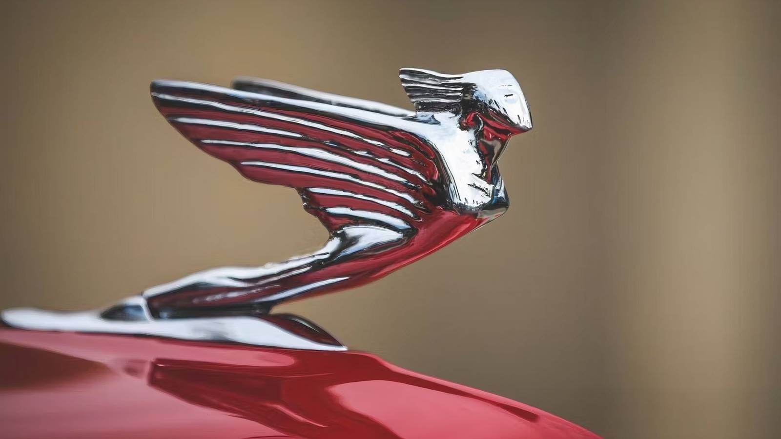
2. Packard Cormorant on the 1941 Packard One-Eighty Formal Sedan
American luxury car design reached its prewar apex in the late 1930s and early 1940s, when Packard, Cadillac, and Lincoln competed for the custom body market with vehicles whose design ambition matched European coachbuilding at its finest.
Packard’s hood ornament program during this period produced several interpretations of their diving cormorant mascot, but the version fitted to the 1941 Packard One-Eighty Formal Sedan represents the most refined execution of a design concept that had been progressively developed across multiple model years.
Packard’s choice of a cormorant, a seabird known for its speed and grace in both air and water, for their primary mascot reflected a design thinking that sought natural imagery capable of communicating dynamic elegance without resorting to the mechanical imagery that some competitors preferred.
A bird in a diving posture suggested speed and precision simultaneously, and Packard’s sculptors rendered the cormorant with sufficient anatomical accuracy to satisfy viewers familiar with the bird’s actual form while adding stylizations that read as sophisticated rather than merely illustrative.
Chrome finish on the One-Eighty Formal Sedan cormorant achieved the highly polished quality that distinguished Packard’s custom body department work from standard production, with surface preparation and plating that produced reflections clear enough to function as a distorted mirror of the surrounding environment.
This mirror quality was not incidental but was instead a deliberate design intention, as a brightly reflective mascot on a moving vehicle created constantly changing visual interactions with the surrounding environment that a matte or painted finish could never produce.
Packard One-Eighty production in 1941 was deliberately limited to create the exclusivity that its pricing and positioning required, with the Formal Sedan body style being among the least common configurations in an already-limited production run. Surviving examples with original cormorant mascots in unrestored chrome condition are genuinely rare, which reflects both the limited production numbers and the attrition that has affected original accessories across eight decades.
Design historians consistently place the Packard cormorant among the finest examples of American automotive ornament design, noting that it achieved a quality of sculptural refinement that distinguished it from the more generic mascot designs that populated the industry during the same period.
For any serious student of prewar American luxury automobile design, the Packard cormorant ornament is a required reference point.
Also Read: 8 Iconic Classic Cars That Are Surprisingly Good on Gas

3. Lincoln Greyhound Mascot on the 1938 Lincoln Zephyr V12 Town Sedan
Edsel Ford’s involvement in Lincoln design during the 1930s produced some of the most progressive and aesthetically refined American automobiles of the prewar decade, and the 1938 Lincoln Zephyr’s greyhound hood mascot represented a design decision that aligned the ornament’s character precisely with the car’s aerodynamic design philosophy in a way that very few automakers achieved during this period.
Where many manufacturers attached traditional or heraldic mascots to cars whose streamlined bodies made those traditional forms incongruous, Lincoln’s greyhound was chosen specifically because its natural form expressed the same aerodynamic values that the Zephyr’s body design pursued.
Greyhounds are among the most aerodynamically efficient of all domestic animals, with a body form that has been shaped by selection for speed over many centuries, and Lincoln’s sculptors translated this natural aerodynamic form into a mascot whose profile from any angle communicated forward motion with an effectiveness that no arbitrary decorative form could achieve.
Mounted at the front of the Zephyr’s long, flowing hood, the greyhound mascot created a visual vector pointing in the direction of travel that reinforced the car’s streamlined silhouette in a way that felt both natural and intentional. Execution quality on the greyhound mascot in 1938 reflected Lincoln’s manufacturing standards for a model that competed directly with Cadillac’s finest offerings.
Die casting and chrome plating produced a surface quality that maintained its appearance through normal use and weather exposure without the rapid deterioration that inferior materials and processes produced on less carefully manufactured contemporary ornaments.
Lincoln Zephyr V12 Town Sedan production in 1938 reached modest numbers that reflected the model’s positioning as a luxury purchase during a period when American economic conditions still affected all but the most affluent buyers.
Surviving Town Sedans with original greyhound mascots represent both the design achievement of the Zephyr program and the rarity that limited production naturally creates across eight decades of automotive history.
Period press responses to the Lincoln Zephyr consistently praised the coherence between the car’s body design and its ornamental details, specifically noting the mascot as an example of design thinking that extended beyond the car’s primary surfaces to create a consistent aesthetic statement across every visible element.
This critical recognition confirmed that the greyhound mascot was understood at the time of its introduction as a design achievement rather than merely a decorative accessory.

4. Cadillac V-Goddess Mascot on the 1959 Cadillac Series Sixty-Two Town Sedan
The year nineteen fifty-nine stands as a defining moment for American automobile styling, marked by scale, confidence, and theatrical presentation. At the centre of this visual expression stood the 1959 Cadillac Series Sixty-Two Town Sedan, a vehicle shaped to command attention from every angle.
While the towering rear fins drew immediate notice, the front required an element capable of asserting equal authority. That responsibility fell to the V-Goddess hood mascot, a sculpted figure positioned at the leading edge of the bonnet to establish balance and visual discipline.
The V-Goddess figure was developed under the direction of Cadillac design leadership, which understood that ornamentation needed purpose rather than decoration alone. The figure adopted a forward-leaning posture, arms extended in a gesture that suggested motion and controlled power.
This stance echoed aviation references common in postwar American design while also drawing from classical sculptural traditions that had long informed luxury symbolism. The result was a form that felt modern to its period while remaining grounded in recognised visual language.
Surface treatment played a central role in the mascot’s presence. Highly polished chrome covered smooth planes free from unnecessary detailing. Light interacted with these surfaces from varying angles, giving the ornament a dynamic appearance as the car moved through daylight or artificial illumination. This quality ensured that the mascot remained visually active rather than static, reinforcing the impression of forward motion even when the vehicle stood still.
Proportion was addressed with rigorous attention. The long bonnet of the Series Sixty-Two demanded an ornament that could hold its own without appearing exaggerated. Designers tested multiple scale studies before approving the production version.
The final size allowed the V-Goddess to read clearly from a distance while retaining refinement upon closer viewing. This careful calibration prevented the ornament from being lost against the body or dominating it excessively.
Production volume for the Series Sixty-Two Town Sedan exceeded that of many luxury peers, making surviving cars relatively accessible to collectors. Original V-Goddess mascots, however, are less common due to removal, damage, or replacement across decades of use. Examples retaining factory chrome finish and correct mounting details attract close attention during evaluation, as the ornament contributes materially to the authenticity of the vehicle.
The V-Goddess remains a defining symbol of Cadillac’s nineteen fifty nine design language. It expresses ambition, technical confidence, and visual authority through form alone. Positioned at the front of one of the most expressive American sedans ever produced, the mascot completes a design statement that remains instantly recognisable many decades after its introduction.

5. Bentley Flying B on the 1937 Bentley 4.25 Litre Park Ward Saloon
The Flying B hood mascot associated with Bentley represents a restrained approach to automotive symbolism, relying on precision rather than ornamented sculpture. Introduced during the interwar period, the winged letter B communicated motion and authority through simplified form. On the 1937 Bentley 4.25 Litre Park Ward Saloon, this mascot served as both brand identifier and visual anchor, expressing confidence without theatrical excess.
Bentley’s designers recognised that clarity mattered when a vehicle was viewed at speed or from a distance. The Flying B answered this requirement through its clean silhouette. A central letter B formed the core, flanked by wings that extended rearward in a controlled sweep.
This geometry suggested speed through implication rather than depiction, avoiding figurative imagery while still conveying movement. The mascot’s outline remained readable from multiple angles, a quality essential for a component placed at the foremost point of a moving vehicle.
Design development during Bentley’s early years benefited from contributions by skilled sculptors familiar with automotive requirements. The Flying B reflected an understanding that an ornament must function within airflow, vibration, and light exposure. Its modest height and smooth transitions reduced visual clutter while preserving presence. The form demonstrated that typography, when handled with discipline, could achieve the same authority as elaborate sculptural figures.
Coachwork by Park Ward on the 4.25 Litre chassis represented a high standard of British craftsmanship. Panel alignment, paint finish, and trim execution displayed care consistent with the luxury expectations of the period.
The Flying B complemented this workmanship through material quality and finish. Chrome-plated brass provided durability and depth of polish, ensuring that the mascot aged in harmony with the body rather than deteriorating prematurely.
Material selection distinguished prewar Bentley mascots from many later examples. Brass offered structural stability and resistance to surface degradation, qualities that allowed surviving originals to retain clarity decades after manufacture.
Many examples show chrome integrity that reflects both the initial specification and attentive stewardship by owners. This endurance contributes to the continued appreciation of authentic pieces within collector circles.
Brand continuity adds further weight to the Flying B’s importance. Bentley retained this mascot across changing ownership structures and production environments, affirming its role as a visual constant. A 1937 Park Ward Saloon displaying its original Flying B carries an emblem that speaks to heritage, restraint, and mechanical confidence.
Rather than relying on elaborate imagery, the Flying B achieved lasting recognition through disciplined design. Its simplicity allowed it to age gracefully, remaining relevant long after stylistic trends shifted. On a properly preserved Bentley of the period, the mascot stands as a quiet declaration of quality, crafted with intent and executed with lasting care.

6. Lincoln Continental Script and Star Mascot on the 1942 Lincoln Continental Cabriolet Sedan
Edsel Ford’s Lincoln Continental represented such a personal design achievement that its hood ornament was given correspondingly careful attention, and the chrome script nameplate with integrated star motif that appeared on the 1942 Continental Cabriolet Sedan created an ornamental approach that was entirely distinct from the figural and animal mascots that dominated contemporary luxury car design.
In choosing a beautifully rendered script nameplate rather than a sculptural mascot, Edsel Ford’s design team made a statement about the Continental’s design confidence: the car’s form was so complete that it required no external symbol to communicate its quality.
Script lettering on the 1942 Continental’s hood ornament was rendered in a hand-lettered calligraphic style that referenced the tradition of skilled penmanship rather than mechanical type, giving the nameplate a distinctly personal quality that differentiated it from the more mechanical lettering that appeared on standard production car nameplates of the period.
Chrome execution of this calligraphic script required a manufacturing process that captured the slight variations in stroke weight that characterize natural lettering, which meant that die production for the ornament demanded the same precision as producing a fine jewelry piece in metal.
Star integration into the Continental nameplate created a secondary ornamental element that appeared at first glance as a simple punctuation of the script but revealed itself on closer inspection as a carefully proportioned six-pointed form whose dimensions related precisely to the letterform heights of the surrounding script.
This integration of decorative motif with nameplate typography produced a design coherence that rewarded close inspection with evidence of the deliberate design thinking that separated the Continental’s details from those of less carefully considered luxury cars.
Production of the 1942 Lincoln Continental was limited by wartime conversion of American automotive manufacturing, with 1942 representing the final prewar model year before civilian production ceased.
This production interruption gives 1942 Continental examples their historical position as the conclusion of the prewar Continental design chapter, and surviving Cabriolet Sedans with original hood ornaments carry the additional importance of representing the last expression of Edsel Ford’s most personal design achievement before the war transformed the American automotive industry.
Restoration of original Continental script ornaments requires access to chrome work capabilities that can match the original’s calligraphic letterform quality, and this technical requirement means that improperly restored ornaments are immediately distinguishable from originals by any observer familiar with the correct standard. Authentic original pieces in unrestored condition are consequently more valued by serious collectors than even well-executed reproductions.

7. Chrysler Airflow Eagle Mascot on the 1936 Chrysler Airflow Custom Imperial Eight Sedan
The Chrysler Airflow project stood as a bold technical statement during the mid nineteen thirties, guided by engineering research rather than inherited styling habits. The hood ornament created for this programme carried a responsibility beyond decoration. It functioned as a visible declaration of intent, expressing the manufacturer’s belief that vehicle bodies should follow scientific principles drawn from aviation and natural motion.
The design communicated purpose rather than ornamentation alone. Chrome was chosen not merely for visual appeal but for its ability to preserve clean surfaces and sharp edges, allowing light to emphasise the flowing contours that echoed the vehicle’s body lines.
Designers faced a challenge in balancing realism with aerodynamic discipline. A literal anatomical rendering would have introduced surface interruptions that conflicted with airflow theory, while an abstract symbol would have weakened recognisability. The final execution resolved this tension through careful simplification.
Feathers were implied through smooth planes rather than etched detail, and the head and wings retained proportionate accuracy without excess modelling. This allowed the eagle to appear natural while remaining visually aligned with the Airflow body shell.
Placement on the Custom Imperial Eight carried added importance. This model represented the highest tier within the Chrysler range, positioned to meet established luxury competitors. Buyers at this level expected cohesion across all visible elements. The hood mascot, therefore, reflected the same production discipline applied to body panels, interior trim, and exterior brightwork.
Chrome depth, polishing quality, and mounting precision received close attention, ensuring the ornament appeared as an integrated component rather than an applied accessory. Public reaction to Airflow styling during its production years varied widely. Some viewers struggled with proportions that departed from upright radiator shells and separate fenders.
Others recognised the engineering logic behind the form. With the distance from the period, assessment has changed. The Airflow is now regarded as a landmark experiment that influenced later vehicle development. Within this renewed appreciation, the eagle mascot holds an essential place, serving as the visual signature of the programme’s intent.
Surviving examples of the original Airflow eagle ornaments attract strong interest among prewar collectors. Condition, originality, and correct specification directly affect desirability. An unrestored piece with intact chrome finish and correct mounting features is valued not only as a rare component but also as a compact expression of an engineering-driven design philosophy that marked a decisive moment in American automotive thinking.
Also Read: 6 Tips for Taking Professional Quality Photos of Your Classic Car

8. Hispano-Suiza Flying Stork on the 1935 Hispano-Suiza J12 Berline Sedan
The Flying Stork hood ornament associated with Hispano-Suiza carries a depth of meaning rarely matched by automotive mascots. Its origins lie not in studio styling exercises but in personal history and national memory. The emblem was drawn from the insignia of French flying ace Georges Guynemer, whose wartime service with the Stork Squadron earned widespread respect.
By adopting this symbol, Hispano-Suiza aligned its luxury motor cars with the aviation achievements that defined its industrial reputation during the First World War. Hispano-Suiza’s aero engines powered many French fighter aircraft, establishing the firm as a trusted contributor to wartime aviation. This association remained strong in the public mind during the interwar years.
For buyers in nineteen thirties, France, the Flying Stork communicated mechanical credibility and patriotic pride without explanation. Ownership of a Hispano-Suiza vehicle carried social meaning, and the hood mascot served as a discreet yet powerful signal of that standing.
The sculptural treatment of the Flying Stork on the 1935 J12 Berline reflected the standards applied across the entire vehicle. Cast metal formed the base structure, finished with high-quality chrome that resisted dulling and surface fatigue. The bird’s wings, neck, and beak were rendered with disciplined accuracy, capturing anatomical truth while maintaining structural strength suitable for road use. This level of craftsmanship indicated that no component, however small, escaped close supervision.
Production of the J12 chassis was intentionally limited. Hispano-Suiza supplied rolling platforms to leading European coachbuilders, each body reflecting individual artistry. A Berline body mounted on the J12 combined formal presence with mechanical refinement.
When crowned by the Flying Stork mascot in a correct finish, the completed motor car represented a meeting point between Spanish engineering, French aviation heritage, and bespoke coachbuilding practice. Market assessment of surviving J12 examples consistently reflects their standing within European luxury motoring history.
Documentation, originality, and preservation influence valuation, and the presence of an authentic Flying Stork ornament remains an important consideration. The mascot is not treated as a detachable accessory but as a historical marker that completes the vehicle’s identity.
Collectors with an informed perspective recognise that the Flying Stork’s worth extends beyond metal and finish. It represents memory, craftsmanship, and industrial confidence shaped by wartime experience and carried into peacetime luxury. When viewed on a preserved J12 Berline, the ornament affirms the depth of meaning embedded within Hispano-Suiza automobiles of this period.