Ever wondered why Japan’s biggest automaker doesn’t share its name with the family that actually founded it? There’s a genuinely fascinating story behind that missing letter, one involving a nationwide contest, ancient superstition, and a company desperate to shake its farming roots.
Back in 1936, the automobile division of a loom manufacturer held a public competition to design a new logo, and the winning entry changed everything, right down to how the company’s own name got written and pronounced.
What followed wasn’t random rebranding for style points. It was a calculated decision rooted in sound, symbolism, and a number the Japanese have treasured for centuries. Here’s the surprisingly detailed story behind one letter’s disappearance.
A Family Name Built From Rice Paddies
Every great company origin story starts somewhere personal, and Toyota’s begins with a literal translation most people never think to look up. The name “Toyoda” comes directly from the family name of the company’s founder, Kiichiro Toyoda, whose father, Sakichi, had built his fortune not in cars, but in textile machinery.
Written in Japanese characters, “Toyoda” translates roughly to “fertilized rice field,” a fitting name for a family rooted in Japan’s agricultural tradition, yet an increasingly awkward one for a company chasing an industrial future.
The broader company history traces back to 1926, when Sakichi Toyoda founded Toyoda Automatic Loom Works after inventing automated looms that revolutionized textile manufacturing.
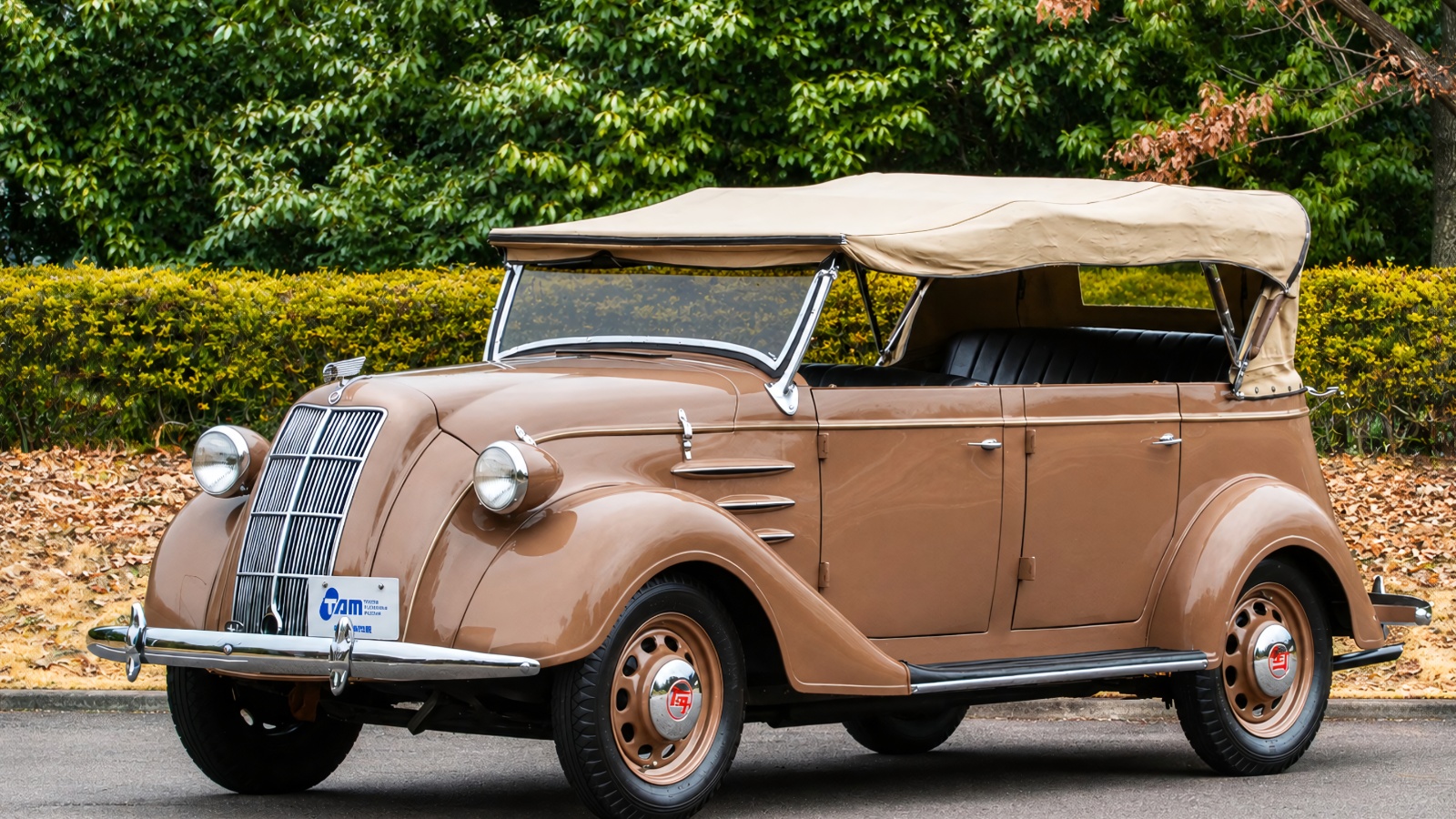
A few years later, in 1929, he sold the international patent rights for that loom technology to a British company for a substantial sum, directing the proceeds toward automotive research led by his son. By 1933, a dedicated automotive division had formed within the company, eventually producing the Model A1 prototype in 1935 and the Model AA in 1936.
As that automotive ambition grew, so did the sense that a name tied to farming didn’t quite match where the company was headed. Cars represented modern industry, not rice paddies, and that mismatch would soon become impossible to ignore.

The Contest That Changed Everything
Rather than simply deciding internally on a new identity, Toyoda’s leadership opened the decision to the entire country. In July 1936, the automobile department celebrated completing its first passenger car by launching a public design competition for a new logo, an event also intended to boost advertising and sales.
This wasn’t a quiet, low-key affair either. Submissions poured in from across Japan, and at a selection meeting held on September 25, judges chose a winning design from roughly 27,000 total entries.
The winning design featured a circular logo displaying the word “Toyota” written in Japanese characters, a subtle but deliberate move away from the founder’s actual surname.
What makes this contest remarkable is how much thought went into evaluating not just the visual logo itself, but the underlying word choice baked into that design. Judges weren’t simply picking whichever entry looked most attractive on paper.
They were essentially voting on an entirely new corporate identity, one that would need to work internationally, sound clean when spoken aloud, and carry positive associations for a company about to compete on a global stage.
The formal name change itself took effect the following year, in 1937, officially separating the public-facing brand from the founding family’s personal surname for good.
Also Read: GR Yaris Rally Test Ends in Flip for Toyota Chairman Akio Toyoda
Why Eight Strokes Meant A Lot
Numbers carry serious cultural weight in Japan, and nowhere does that show up more clearly than in this specific naming decision. Japanese written characters get evaluated partly through something called jikaku, essentially a count of the total brush strokes required to write a given word, and this stroke count carries genuine symbolic meaning beyond pure aesthetics.
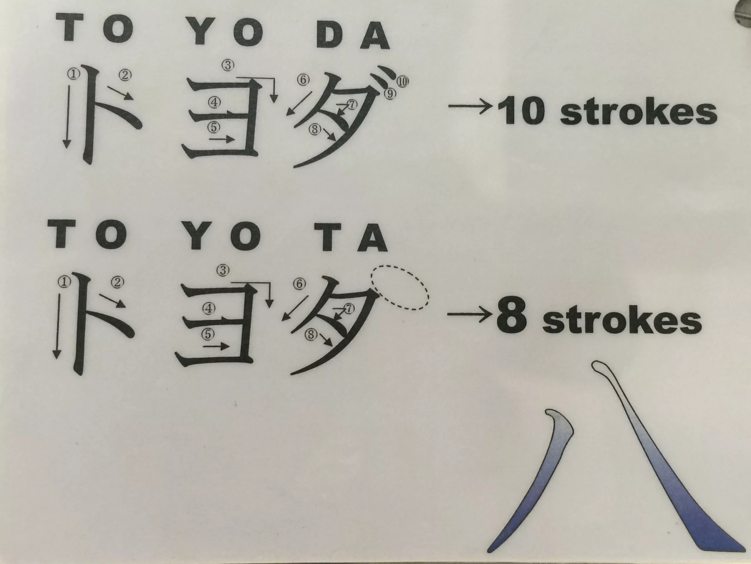
Eight strokes specifically are believed to connect directly to wealth and good fortune, and “Toyota,” written in katakana script, happens to require exactly eight strokes to complete.
Compare that to the alternative sitting right there in the family name. Written out, “Toyoda” required ten total brush strokes, two more than “Toyota,” and those two extra strokes mattered considerably within traditional Japanese numerology.
Eight has long symbolized prosperity, expansion, and continuous growth throughout Japanese culture, partly because the character’s shape widens gradually from top to bottom, visually suggesting increasing fortune. Ten, by comparison, carries no such lucky reputation.
For a company about to bet everything on manufacturing automobiles at scale, launching under a name mathematically tied to growth and good fortune wasn’t just charming folklore.
It was viewed as a genuinely meaningful business decision, one Toyoda’s leadership took seriously enough to factor directly into their final naming choice alongside more practical branding considerations.
Also Read: Toyota Moves Upmarket With Its Largest Electric SUV to Date
Sound, Simplicity, and Corporate Growth
Luck alone didn’t win this argument, though. Practical branding considerations mattered just as much as the numerology behind eight strokes. Judges specifically noted that Japanese characters spelling “Toyota” appeared visually simpler and less cluttered than “Toyoda” when rendered in commercial design contexts, a meaningful advantage for a logo destined to appear on vehicles, dealership signage, and advertising nationwide.
Pronunciation played its own quiet role too. “Toyota” contains what’s called a voiceless consonant sound in Japanese, generally considered clearer and crisper than the voiced consonant sound found in “Toyoda,” giving the new name a cleaner ring when spoken aloud.
Beyond pure sound and symbolism, there was a deeper strategic motivation driving this entire rebrand. Moving away from the Toyoda name also signaled the company’s transformation from a family-run business into a broader, more public corporate entity, a distinction that mattered enormously as the automaker prepared to scale well beyond its founding family’s direct control.
That single missing letter, easy to overlook today, represented a company consciously stepping out of its founder’s shadow and into an identity built for global ambition, lucky brush strokes included.