
In today’s automotive world, touchscreens have become nearly as essential to a vehicle’s design as its engine or wheels. They dominate dashboards, replacing traditional buttons, knobs, and switches in favor of sleek digital interfaces.
Carmakers love to show off giant center displays, minimalist consoles, and futuristic climate control panels as proof that their vehicles are high-tech and forward-thinking. But for all the aesthetic appeal and promises of streamlined functionality, many of these touch-first systems pose a serious question: are they usable when the car is moving?
Touchscreens may offer versatility, but they come with inherent drawbacks, particularly when it comes to distraction. Unlike physical buttons, which can be operated by feel, touchscreens demand visual engagement. You can’t “feel” your way to the defrost setting or volume control—you have to look, tap, swipe, and sometimes guess.
That’s fine when the vehicle is parked. But once you’re driving, those extra seconds spent interacting with a screen translate into time with your eyes off the road and your attention divided. That makes touchscreens not just frustrating, but potentially dangerous.
Ironically, some of the most advanced or expensive vehicles suffer the most from this issue. Brands like Tesla, Range Rover, and Peugeot may push futuristic interfaces, but they often bury essential controls in deep menus or force drivers to use unreliable touch-sensitive surfaces.
Meanwhile, even mainstream cars like the Honda Civic or Toyota bZ4X have adopted infotainment systems that prioritize style over usability. And while a few vehicles attempt to work around this—Mazda, for instance, disables touchscreens while in motion and uses a rotary dial—the alternative isn’t always better. It often introduces an entirely new set of challenges.
This article highlights ten cars with touchscreen systems that are particularly problematic to use while driving. These aren’t necessarily bad vehicles—some of them are excellent in many respects.
But each one features an infotainment or control interface that, for one reason or another, makes interacting with key functions harder than it should be once you’re on the road.
Whether it’s due to sluggish response times, confusing menu layouts, poor screen placement, or the complete removal of physical controls, these systems prove that a large touchscreen alone doesn’t equal a smart or safe design.
Also Read: Engines That Can Run for 500 Hours Without an Oil Change

1. Tesla Model 3
The Tesla Model 3 was one of the first vehicles to go all-in on a minimalist interior, featuring a central touchscreen as the single point of control for virtually all vehicle operations. This 15-inch landscape-oriented screen houses navigation, climate settings, media, driving mode toggles, and even the glove box release.
While the aesthetic has been praised for its futuristic feel, the functional impact on everyday driving is much less glamorous. Drivers accustomed to tactile controls are often surprised by how dependent the Model 3 is on visual interaction with the screen.
One of the biggest problems arises from the removal of even basic physical inputs. Traditional stalks for wipers, headlight controls, or cruise adjustment are gone or reassigned to steering wheel buttons that require multiple on-screen confirmations.
For instance, adjusting the mirrors or steering wheel position involves navigating to a sub-menu and using the left scroll wheel to make adjustments—an unusually convoluted process for what used to be quick, physical tweaks. This forces the driver to look at the screen for guidance, taking their eyes off the road longer than is safe.
Furthermore, the touchscreen interface lacks consistency in its responsiveness. While it’s generally fast and fluid under optimal conditions, it can lag slightly in cold weather or after software updates.
There’s also a certain brittleness to the user experience. A missed tap or wrong menu selection means you often have to backtrack through layers of UI. This adds cognitive load, which is a critical safety concern when you’re meant to be focusing on navigating traffic, road signs, and pedestrians.
Even though Tesla incorporates voice controls to reduce the need for touch interaction, these systems are not yet intelligent or reliable enough to be the primary method of input. Drivers report frequent misunderstandings of voice commands or the assistant failing to activate entirely.
This inconsistency makes the user wary of depending on it, especially for critical functions like defrosting the windshield or changing drive modes. When voice control doesn’t work, you’re back to tapping through menus—and again, this isn’t ideal while in motion.
Lastly, software updates, while often seen as a strength, are a double-edged sword. Tesla’s interface is subject to change with regular firmware upgrades, meaning even experienced owners can find familiar features relocated or modified overnight.
While these updates improve capability, they disrupt muscle memory and can force drivers to relearn critical interactions. This inconsistency undermines usability and creates a moving target for what should be intuitive operation, especially while driving.

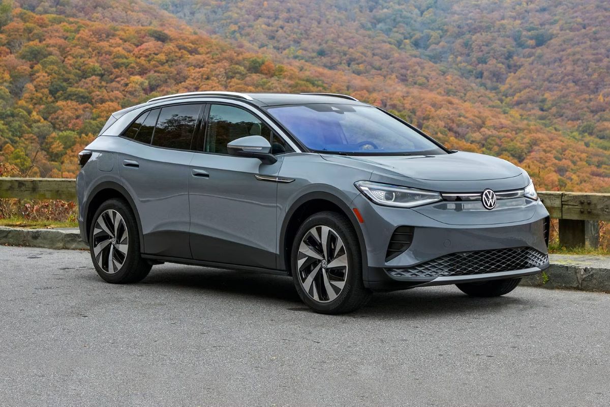
2. Volkswagen ID.4
The Volkswagen ID.4, the brand’s fully electric compact SUV, aims to be approachable and family-friendly. However, the infotainment experience stands in stark contrast to the vehicle’s otherwise practical nature. The primary 12-inch touchscreen replaces most physical buttons, including critical systems like HVAC controls and lighting.
The design leans into futuristic minimalism, but ends up making simple tasks unnecessarily complex and time-consuming, especially when driving.
Many drivers have reported that the screen interface is unintuitive and difficult to navigate. Functions are buried within layers of menus, requiring excessive taps to accomplish basic adjustments.
Adjusting the fan speed, for example, is not possible from the home screen—you must tap the climate icon, then navigate a separate climate interface. This workflow may seem trivial while parked, but it becomes significantly more dangerous when the car is in motion and the driver is trying to focus on the road.
Perhaps the most egregious design flaw is the set of capacitive sliders placed beneath the screen for volume and temperature adjustments.
These sliders are difficult to use even when stationary—they’re not backlit, lack tactile definition, and are easy to accidentally brush. At night, they’re nearly invisible unless you already know their location. Many users end up taking their eyes off the road to make basic changes they once could do by feel in older vehicles.
Adding to the frustration is the screen’s sluggishness. Transitions between menus lag slightly, and some users report random freezes or delayed inputs, especially when booting up the car. This lag undermines the confidence required to interact with a digital system while moving.
The feedback loop between input and response is too slow to allow quick, instinctive adjustments, making it feel like you’re working against the system rather than with it.
While Volkswagen has pledged to improve the system through software updates, these fixes are slow to arrive and don’t always resolve the deeper usability concerns.
In its current form, the ID.4’s infotainment system is a case study in poor ergonomics—one where the pursuit of a clean interface resulted in a frustrating, impractical driving experience. For a car that markets itself as user-friendly, the touchscreen control scheme is ironically one of its most user-hostile features.

3. Ford Mustang Mach-E
Ford’s Mustang Mach-E brings bold design and impressive electric performance, but its infotainment system remains a polarizing element. The massive 15.5-inch vertical touchscreen takes center stage, controlling nearly every function in the vehicle.
It certainly looks impressive, but when it comes to day-to-day usability, especially while driving, the design proves to be more form than function. The sheer scale of the touchscreen introduces challenges.
Because the interface is vertically oriented, the reach from the driver’s seat to the upper or lower corners requires noticeable hand movement, especially for those with shorter arms.
This physical stretch, combined with the lack of physical redundancy for most controls, means drivers must commit their attention and often shift posture just to execute basic actions like adjusting cabin temperature or switching audio sources.
Ford’s software interface, known as SYNC 4A, is relatively sleek but suffers from complexity. Many functions are hidden under tiles or submenus, meaning a driver must not only locate the correct icon but also navigate deeper levels to perform tasks.
For instance, adjusting advanced driver-assist features or selecting regenerative braking levels can take several steps, each demanding focus and interaction. This complexity adds cognitive load, which is unwelcome during active driving.
The touch interface also poses accuracy issues. Without haptic feedback, the driver cannot confirm inputs by feel alone. This results in more time spent looking at the screen to verify selections. During highway driving or in stop-and-go traffic, this becomes not just inconvenient but potentially hazardous.
Additionally, the climate controls remain on the lower part of the screen, where road glare can reduce visibility and render parts of the interface unreadable during the day.
To its credit, Ford includes voice command and some steering wheel controls as partial workarounds, but these features are not comprehensive. Voice commands are often limited in scope and can misunderstand natural speech, especially with background road noise.
In the end, the Mach-E’s infotainment system may look futuristic, but its lack of practical design considerations makes it a challenging tool to use safely while the vehicle is in motion.

4. Honda Civic
The 11th-generation Honda Civic received praise for its mature styling and upscale interior, but the infotainment system has struggled to meet the same acclaim.
While it includes a welcome physical volume knob and some tactile climate controls, the dependence on a touchscreen for many secondary functions weakens its in-motion usability. The screen size ranges from 7 to 9 inches, depending on the trim level, and in both cases, the interface design leaves much to be desired.
The biggest criticism lies in the depth and structure of the menus. Features like vehicle settings, audio source switching, and smartphone integration require multiple taps and, in some cases, navigating back and forth between screens.
This can feel cumbersome when all you want to do is switch from Bluetooth audio to FM radio or adjust a driver assistance setting. Even experienced users have reported needing several seconds of visual attention to execute these changes.
The touchscreen’s sensitivity and responsiveness are inconsistent, especially in extreme temperatures. Cold weather can cause noticeable input lag, while wearing gloves renders the screen nearly unusable.
These practical constraints can be a real problem in areas with harsh winters or when needing to make quick changes on the road. The lack of tactile response means drivers have to watch the screen to ensure their input registered, which is not ideal for safety.
Glare and fingerprint smudges further complicate visibility. On sunny days, reflections can make parts of the screen unreadable depending on the angle of light.
The screen coating also tends to attract smudges, which obscure icons and reduce legibility. This forces drivers to either strain their eyes or clean the screen frequently, neither of which is are task suited for real-time driving conditions.
Despite Honda’s attempt to blend physical and digital elements, the result is still far from ideal. The system lacks the seamlessness needed for on-the-go adjustments and forces drivers to think too much about the interface rather than operation.
In a car that otherwise excels at being a smart, reliable commuter, the infotainment system feels like an afterthought rather than a carefully integrated component.

5. Subaru Outback
The latest Subaru Outback attempts to modernize its rugged roots with a tablet-style 11.6-inch touchscreen interface. Replacing the former combination of buttons and knobs, the new layout consolidates navigation, climate, radio, and vehicle settings into one digital hub.
While the design is visually clean, the experience of using it, especially while driving, leaves much to be desired. Perhaps the most glaring issue is the interface lag. Inputs are slow to register, particularly during startup or in colder conditions.
When you’re driving and want to quickly adjust fan speed or change the audio source, that delay becomes a serious problem. Not only does it force you to wait, but it also makes you question whether your tap was recognized, often leading to repeated touches and prolonged distraction.
The climate control layout is another major pain point. While the climate settings are pinned to the bottom of the display, adjusting specifics like vent direction or syncing dual zones often requires entering a separate screen.
This breaks the user’s flow and forces a full hand-eye coordination shift away from the road. Additionally, the temperature controls are small on-screen icons that can be difficult to hit accurately while the vehicle is in motion.
Subaru’s software interface feels dated despite its modern appearance. Graphics are bland, and menu transitions are sluggish.
Drivers often report needing to memorize specific locations on the screen to minimize their time looking away from the road—an obvious workaround that shouldn’t be necessary with good design. Moreover, voice control integration is limited, offering only basic functions and frequent misinterpretations.
Subaru’s decision to remove many physical buttons in favor of touchscreen-only controls marks a clear break from the brand’s historically practical ethos.
For a vehicle that’s often marketed toward adventurers and outdoor enthusiasts, who might be adjusting settings with gloves on or in poor lighting, the reliance on slow, finicky touch inputs seems poorly suited.
While the Outback remains a reliable and capable vehicle, its infotainment system has taken a disappointing turn toward style over substance.

6. Toyota bZ4X
The Toyota bZ4X represents the brand’s first major step into the all-electric world, but despite its modern powertrain, the vehicle’s touchscreen interface reflects a clunky and often frustrating user experience.
Unlike previous Toyota models, which favored physical controls and accessible button placement, the bZ4X leans heavily into digital interactions, relying on a large central touchscreen for almost everything from climate adjustments to navigation to drive mode selection.
One of the main problems with the bZ4X interface is the sheer number of features that are buried deep within menus. Simple settings, such as enabling one-pedal driving or viewing charging station information, require navigating through multiple screens.
This type of interface is manageable when parked, but while driving, it demands too much attention and too many sequential steps to be safely used. It reflects an over-engineered approach that ignores real-world use.
Additionally, the interface has been criticized for lacking responsiveness and having inconsistent performance. Touch inputs can lag, particularly when starting the car or transitioning between menus.
Drivers have reported moments where the system freezes entirely or takes several seconds to respond. This makes the touchscreen unreliable as a primary control source—an issue exacerbated when you’re in motion and trying to adjust a setting quickly.
Toyota has also omitted many physical redundancies that could offset the touchscreen’s limitations. There are very few physical buttons on the dashboard, and even those that exist often control limited functions.
For instance, there may be a button for hazard lights, but no knob for temperature or fan speed. This forces drivers to use the screen even for frequent, small adjustments, adding to cognitive load while driving.
To make matters more complicated, Toyota’s voice assistant, which is meant to serve as a safer alternative to touch inputs, often fails to understand commands clearly or offers limited contextual flexibility.
The system lacks the intuitive design and accuracy required to be a reliable assistant, and drivers often find themselves defaulting back to the touchscreen. For a car meant to represent the future of the brand, the bZ4X’s user interface feels like a step backward in terms of driving ergonomics and real-world usability.

7. Mazda CX-30
Mazda has always been known for crafting cars that put the driver at the center of the experience, and the CX-30 is no exception when it comes to handling and comfort. However, the vehicle takes a unique approach to infotainment—one that avoids touchscreens entirely while the car is in motion.
Mazda disables touchscreen functionality once the vehicle starts moving, requiring drivers to use a rotary controller located near the gear shifter instead.
While this seems like a safe, thoughtful design choice on paper, it introduces its own set of complications. The rotary dial system is not as intuitive as Mazda might hope.
It forces the driver to rotate, push, and scroll through nested menus to perform simple tasks like changing radio stations or connecting Bluetooth devices. For those accustomed to touch-based navigation, this interface can feel dated and overly complicated.
The design also limits flexibility. Since the touchscreen is disabled during driving, tasks that might take a single tap on other vehicles require multiple steps. For instance, navigating through media sources involves moving through various menus and submenus, making even basic actions feel like a chore.
This design slows down interactions and extends the amount of time your hand is off the wheel and your mind is off the road. Another challenge with the rotary system is that it lacks context sensitivity. You can’t always tell what options will be available after your next click, and the learning curve is steep.
The graphical user interface isn’t especially helpful either, as it lacks visual cues or animations that guide the user. Instead of making the experience seamless, the system often forces you to stop and think about how to navigate, which detracts from focus while driving.
Although Mazda’s decision to limit touchscreen use was made with safety in mind, it ends up creating an awkward middle ground that is neither tactile enough to be fully intuitive nor flexible enough to allow for quick adjustments.
The CX-30’s infotainment system stands as a case where good intentions result in a complicated, indirect interaction model that doesn’t live up to real-world needs.

8. Hyundai Ioniq 5
The Hyundai Ioniq 5 is one of the most visually striking electric vehicles on the market, and it’s loaded with high-tech features. Inside, the vehicle boasts a dual-screen setup: a digital instrument cluster and a touchscreen infotainment display, both stretching across the dashboard.
This ultra-modern layout is intended to create a seamless digital environment, but it unfortunately prioritizes design over ease of use, particularly while driving.
The main touchscreen houses most of the vehicle’s controls, including media, navigation, and vehicle settings. While the screen is bright and responsive under most conditions, the menu structure is deeper than necessary.
Adjusting regenerative braking levels, turning on seat heating, or switching between drive modes often involves multiple taps through icons and submenus. This makes performing simple tasks more demanding than they should be during motion.
Beneath the main display is a separate capacitive touch panel for climate control, which many drivers find difficult to operate. It looks sleek but lacks any tactile feedback, making it almost impossible to use by feel.
During bumpy or uneven road conditions, making precise inputs becomes frustrating. Furthermore, the icons on the panel are small and hard to read without taking your eyes off the road.
The Ioniq 5 does offer voice control and some steering wheel buttons as partial workarounds, but they’re not comprehensive. Voice commands frequently misinterpret input or fail to respond quickly.
Steering wheel buttons are limited to a few audio and drive assistance features, so for anything beyond basic adjustments, drivers are forced to go back to the screen or capacitive panel.
Ultimately, while the Ioniq 5 delivers an impressive EV experience, its touchscreen interface feels more suited for a stationary demo than actual road use.
Hyundai’s bold leap into tech-forward design hasn’t fully considered the real-world needs of drivers who require quick, reliable, and low-distraction control while moving. The result is a user interface that impresses at first glance but frustrates over time.

9. Peugeot 3008
The Peugeot 3008 is one of the more visually adventurous compact SUVs on the market, thanks in large part to its i-Cockpit layout. With a high-mounted instrument cluster and a central touchscreen flanked by metallic shortcut keys, the interior appears futuristic and upscale.
However, in practice, the touchscreen interface often becomes a point of friction, particularly for tasks that need to be performed while driving.
One core issue is the dependency on the touchscreen for nearly all key functions, despite the presence of shortcut keys. These physical “piano keys” are designed to take you to main menus, such as climate or navigation, but they don’t offer direct control.
Instead, they simply open a menu on the touchscreen, where you must complete the task. This two-step interaction defeats the purpose of having physical buttons and slows down usability.
Another frequent complaint is the laggy and sometimes inconsistent screen performance. Touch inputs can be delayed, and transitioning between screens can stutter slightly, which adds to the frustration of trying to quickly adjust settings.
This becomes especially problematic when the vehicle is in motion, as the driver is forced to take their eyes off the road to verify that the system is working as intended.
Additionally, the screen layout can be overly complex. Icons are small, and information is packed tightly into each screen, making it difficult to find what you’re looking for without careful attention.
Glare from sunlight and fingerprint smudges can obscure parts of the screen, making visibility worse. These design choices result in a UI that requires visual focus and deliberate interaction, both of which are not ideal while driving.
Finally, the system doesn’t support full physical redundancy for key driving controls. Climate settings, radio tuning, and seat heaters must all be accessed via the touchscreen, forcing a constant shift of attention.
While the 3008’s cabin may look cutting-edge, the experience of using the screen during daily commutes or long drives reveals a fundamental mismatch between design aspirations and real-world practicality.

10. Range Rover Evoque
The Range Rover Evoque is a premium compact SUV that exudes style and luxury, both inside and out. Its dual-screen infotainment system looks impressive, offering a high-resolution top screen for media and navigation, and a lower screen for climate control and vehicle settings. However, this layered digital approach comes with serious usability trade-offs when the vehicle is in motion.
The biggest issue with the Evoque’s system is that both screens are touch-sensitive and require deliberate, precise interaction. Unlike traditional buttons or knobs, which can be adjusted with minimal visual confirmation, these digital interfaces offer no tactile cues.
Adjusting the seat heaters or climate fan requires looking at the lower screen and navigating several taps. This inherently demands driver attention and removes their focus from the road.
Another complication is the system’s sensitivity and input lag. Although it looks polished, the touchscreen occasionally ignores or misreads finger presses, especially in colder temperatures or during rapid taps.
This can force drivers to repeat actions or watch the screen longer to ensure their input has registered. Such delays might not seem major, but they add up in terms of distraction and driver stress.
Sunlight glare and screen reflectivity also present issues. The lower screen is angled in such a way that, depending on the time of day, reflections can make the icons nearly invisible.
Furthermore, the system doesn’t always retain the previous state when restarting the vehicle, meaning some settings must be re-entered each time you drive, adding yet more screen interaction that should have been automatic.
Even though the Evoque includes voice commands and some steering wheel controls, these are often too limited to replace the need for screen use.
Voice recognition isn’t context-aware enough, and it can’t access deeper settings. In the end, while the Evoque’s infotainment system delivers visual wow-factor in spades, it fails to deliver the seamless, glance-free interaction expected in a vehicle of its class and price point.
Also Read: Engines That Can Run for 500 Hours Without an Oil Change
The evolution of in-car technology has led to dazzling digital displays, minimalistic dashboards, and touch-sensitive surfaces that wouldn’t look out of place in a sci-fi movie. But the push toward eliminating buttons in favor of expansive touchscreen systems has, in many cases, gone too far.
As this list of ten vehicles has shown, the result is a driving experience that is less intuitive, less safe, and—ironically—less functional than the supposedly outdated layouts of the past.
A major flaw of many touchscreen systems is their complete reliance on visual interaction. Drivers can no longer adjust the temperature, skip a song, or activate defrost without looking away from the road. That’s a fundamental problem in any vehicle, especially when you consider the very real safety risks of distracted driving.
Even in premium or electric vehicles, where you might expect thoughtful design, infotainment interfaces are too often layered, slow, or needlessly complex. Whether it’s the slow response of Subaru’s interface, the visual overload in Peugeot’s, or the complete touchscreen dependency in the Tesla Model 3, these systems ask too much of the driver at the wrong moments.
Manufacturers clearly want to impress with technology, but they need to reconsider how it’s implemented. A flashy screen doesn’t automatically translate to a better user experience. In fact, the most effective in-car systems are often the ones that combine digital flexibility with analog simplicity.
Physical knobs and buttons still have an important role to play, particularly for high-frequency controls like volume, temperature, and defrost. Tactile feedback, muscle memory, and ease of access all contribute to safer driving—and that’s something screens alone can’t replicate.
There is hope, though. As feedback continues to pour in from owners and safety experts, some automakers are starting to listen. Companies like BMW and Hyundai are beginning to reintroduce physical controls for core features, and voice assistant technology is gradually improving. But progress remains slow, and too many vehicles continue to prioritize aesthetics over ergonomics.
In the end, technology in a car should empower the driver, not distract them. Touchscreens can be part of that equation, but not the whole solution. Until automakers find the right balance, drivers must remain cautious and aware that in many modern cars, the hardest part of driving may not be the road—it may be trying to turn the AC down without crashing.