
In the modern automotive world, the smartphone has become just as essential to the driving experience as the steering wheel itself. Navigation, music, messaging, digital keys, and emergency contact systems are all tied to that single device most of us keep within arm’s reach at all times.
In response, car manufacturers have scrambled to integrate smartphones into infotainment systems via platforms like Apple CarPlay and Android Auto.
They’ve added wireless charging pads, Bluetooth connectivity, and voice-command functions. Yet, surprisingly, many of them have completely overlooked one of the simplest, most practical needs of all—a logical, secure place to put your phone.
This is not just an issue of convenience. Poor phone storage design can be distracting, frustrating, and even dangerous. When your phone doesn’t have a secure spot, it’s more likely to fall under a seat, rattle around the center console, or sit precariously in a cup holder that should be holding your drink.
On bumpy roads or during quick stops, your phone may slide off a shallow tray or disconnect from a wireless charger. Worse yet, having to fumble for your phone while driving—especially when it’s being used for GPS—poses a real safety concern.
The issue spans price points and segments. From compact sedans to crossovers and budget hatchbacks to premium brands, there are numerous examples of vehicles that simply didn’t consider smartphone storage when the interior was being designed.
This article looks at ten vehicles that either failed to include a proper space for your phone or implemented such a poorly thought-out solution that it might as well not be there at all. In each case, it’s not just a minor oversight—it’s a frustrating blemish on an otherwise functional cabin.
Whether you’re shopping for a new car or simply want to feel seen in your daily struggle to wrangle your phone while driving, this list highlights how much work automakers still have to do to get this basic element right.
Also read: 5 Cars With Great Cost-to-Performance Ratio and 5 That Miss the Mark

1. Toyota C-HR
The Toyota C-HR tries to sell itself as a youthful, design-forward crossover aimed at urban dwellers and younger drivers. It boasts an eye-catching exterior, decent tech features like Apple CarPlay and Android Auto, and a generally intuitive layout. But for all its modern aspirations, one area where it falters badly is phone storage.
Despite being designed for people who practically live on their smartphones, the C-HR lacks a truly functional or even logical place to put one.
The tiny tray in front of the gear selector is shallow, narrow, and awkwardly shaped. It barely fits a modern phone without a case, and once the vehicle is in motion, phones tend to slide, bounce, or shift into even less convenient places.
On higher trims, Toyota attempts to remedy the situation by including a wireless charging pad. But even this is questionably implemented. The charger is placed at an angle that doesn’t adequately hold the phone in place. During hard braking or even just spirited city driving, the phone tends to slide off the pad, disrupting charging and sometimes sending the device tumbling into the passenger footwell.
Worse still, there’s no non-slip material or boundary to hold the phone steady. It feels like Toyota added the wireless charging feature simply to check a box, rather than integrating it thoughtfully into the interior design.
Many drivers have voiced frustration with the lack of usable storage options, especially given how central smartphones are to modern driving, whether it’s for navigation, hands-free calling, or streaming music. It’s clear the designers focused more on aesthetic flair than on real-world functionality.
With no secondary trays, phone pockets, or even a well-placed USB port to guide placement, drivers are often left tossing their phones into cup holders or armrest bins. For a vehicle aimed at tech-savvy customers, the C-HR’s handling of phone storage is surprisingly shortsighted.

2. Mazda CX-5
The Mazda CX-5 is often praised for its upscale interior, smooth ride, and minimalist design ethos. From a styling perspective, it punches above its weight in the compact SUV segment. However, this pursuit of clean aesthetics comes at the cost of usability, particularly when it comes to phone storage.
The dashboard and center console are streamlined to the point that there’s simply nowhere intuitive to place a smartphone. The small shelf in front of the gear shifter is barely large enough to hold a phone securely, and it’s often blocked by charging cables or awkwardly located USB ports.
In keeping with its elegant approach, Mazda has been slow to adopt wireless charging, and even when it’s available, it’s not integrated particularly well. On upper trims, the wireless pad is hidden within the center armrest console—a space that’s enclosed, poorly ventilated, and out of easy reach.
This makes it inconvenient not just for charging, but also for visibility. If you rely on your phone for navigation and prefer to have it accessible, tucking it inside a closed compartment every time you drive is far from ideal. It feels like Mazda added this feature without reconsidering how people interact with their phones while driving.
The irony is that the CX-5 markets itself as a driver’s car, focused on refined handling, driver engagement, and premium features. Yet it fails in an area that modern drivers engage with constantly. For all its polish and poise, the CX-5 simply doesn’t consider the everyday habits of smartphone users.
Whether you’re trying to quickly stash your phone before a drive, access it at a red light, or just keep it secure while on the road, the CX-5 provides little help. It’s a glaring usability gap in an otherwise well-thought-out vehicle.

3. Subaru Forester
Subaru has long been known for prioritizing practicality, safety, and reliability, and the Forester is a flagship example of that ethos.
It’s spacious, durable, and packed with features that cater to families and outdoor enthusiasts. Yet despite its functional image, the Forester oddly misses the mark on something as simple as where to put your phone.
The only available tray is a small, sloped surface beneath the climate controls. It’s not only too small for modern smartphones with cases, but also angled in such a way that devices regularly slide out during even moderate acceleration or cornering.
What’s worse is that this tray lacks any sort of grip material or edge to prevent your phone from shifting. In a vehicle designed for everything from school drop-offs to mountain trailheads, you’d expect Subaru to include thoughtful, rugged storage options.
Instead, many Forester owners resort to using cup holders as phone storage, which isn’t ideal when you also need somewhere to place your coffee or water bottle.
The center console bin is deep but not optimized for phone use—it’s more of a junk drawer than a quick-access spot. And if your phone is plugged in for Apple CarPlay or Android Auto, cable routing becomes a tangled inconvenience.
Subaru does offer a wireless charging pad in some higher trims, but it’s poorly executed. It’s recessed and located in an area that makes inserting and removing the phone awkward. Plus, the lack of a clamping or gripping mechanism means phones slide around easily, disrupting charging and frustrating users.
For a brand that sells its vehicles based on lifestyle compatibility and real-world practicality, the Forester’s phone storage setup is an uncharacteristic oversight. It feels like the company nailed the macro-level features—space, visibility, comfort—but forgot to sweat the small stuff.

4. Honda Civic (10th Generation)
The 10th-generation Honda Civic, sold from 2016 to 2021, was a bold redesign that combined sharp styling with excellent fuel economy and solid performance. It became a favorite among compact car buyers for its reliability, tech features, and sporty attitude.
However, it also featured one of the most awkward phone storage solutions of any modern vehicle. The dashboard layout includes a two-tiered center console area, with a hidden shelf under the climate controls that seems perfect for storing a phone—until you try to use it.
This lower shelf requires the driver to reach down and back toward the center console—a motion that’s awkward at best and distracting at worst. Not only is the angle uncomfortable, but retrieving your phone while driving can take your eyes off the road for longer than it should.
While the USB port for Apple CarPlay is also located in this area, the layout practically guarantees a mess of tangled cables. Worse, the main upper tray near the shifter is far too small to hold most modern phones, especially if they’re in protective cases. There’s no good option for visibility, no easy access, and certainly no security in keeping your phone stable during a drive.
Wireless charging, when available, doesn’t fix these problems either. Honda placed the charging pad in the same awkward lower tray, meaning it’s still out of sight and hard to access. And because it’s a hidden space, it also suffers from poor airflow—phones can overheat while charging.
This design could have worked if Honda had rethought the access point or improved the ergonomics, but as it stands, the Civic’s center console feels like a classic example of a great idea poorly executed. It’s a reminder that even well-regarded cars can stumble over the simplest features.

5. Jeep Compass
The Jeep Compass tries to straddle the line between urban utility and rugged capability. It offers 4WD, off-road drive modes, and a strong brand identity rooted in exploration and adventure. That makes its failure in the phone storage department especially disappointing.
The Compass includes a small slot beneath the climate controls, which at first glance appears to be a phone tray—but in reality, it’s too narrow and too shallow to hold modern phones securely. Large-screen phones often hang off the edge or fail to sit flush, making the space largely unusable.
This problem becomes even more pronounced once you plug in a charging cable. The USB port placement means the cable sticks out and further prevents the phone from lying flat, creating a jumbled mess of cords and phone edges. For many drivers, this means the phone ends up tossed into a cup holder or slid into the armrest bin—both less-than-ideal alternatives.
For a car that markets itself to road-trippers and everyday adventurers, this kind of oversight in ergonomic layout feels particularly out of touch. Having to fumble for your phone in an emergency or while following GPS directions is both inconvenient and potentially unsafe.
Even in top trims where wireless charging is available, Jeep failed to address the underlying design flaw. The charging pad, where included, is positioned in the same poorly shaped tray and still suffers from grip and placement issues.
Phones can slip out of place during cornering or sudden braking, interrupting the charging process and requiring constant readjustment.
Ultimately, the Compass feels like it was built around capability and aesthetics, but forgot the modern-day realities of smartphone usage, especially in an SUV that targets younger, on-the-go buyers.

6. Chevrolet Spark
The Chevrolet Spark is one of the most affordable vehicles on the market, and while it punches above its weight in terms of tech features like Apple CarPlay and Android Auto, it misses entirely when it comes to a fundamental piece of in-cabin design: where to put your phone.
The Spark’s compact dimensions severely limit space, but even accounting for that, Chevy made almost no attempt to incorporate a dedicated phone tray or secure slot. The most obvious place is a small recessed area in the center console, but it’s shallow, awkwardly shaped, and too small for most phones with cases.
As a result, drivers are left improvising. Some place their phones in the cup holders, which is fine until you need a drink. Others wedge their devices between the seat and the console, which isn’t secure and can be dangerous in sudden stops. There’s no padding or support, meaning phones slide and shift throughout the drive.
The charging cable placement makes things worse, as wires easily tangle or block access to the gear selector. Despite the car’s appeal to budget-conscious, city-dwelling younger drivers, who almost certainly use their phones for navigation or streaming, the Spark simply offers no good solution.
Even higher trims of the Spark fail to solve the issue. There’s no available wireless charging option, and the basic dashboard layout hasn’t changed significantly over the years. This lack of thoughtful integration feels like a missed opportunity for a vehicle that otherwise understands its market well.
With small design tweaks, such as a rubberized tray, a vertical phone slot, or even just a properly sized compartment, Chevrolet could have greatly improved daily usability. As it stands, the Spark makes one thing clear: phone storage was never on the design priority list.

7. Nissan Rogue Sport
The Nissan Rogue Sport slots into the crowded compact SUV category, offering decent cargo space, good ride quality, and competitive pricing. It’s designed for active urbanites and small families, but strangely, the Rogue Sport fails at something that nearly every driver cares about: easy phone access.
The front storage tray, located below the HVAC controls, is too short and too slick to securely hold a modern phone. Without any raised edges or textured material, phones easily slide around during turns or stops. Larger phones, or those in rugged cases, often don’t even fit properly.
This problem is exacerbated by poor cable routing. While USB ports are available, they’re not ideally placed for clean integration with phone storage. Plug in a phone, and the cable bends awkwardly or blocks the gear lever. And although the Rogue Sport includes modern infotainment options, the disconnect between digital integration and physical design is obvious.
The layout feels like it was designed before phones became essential tools for every driver, and hasn’t been meaningfully updated since. It’s an odd oversight in a vehicle that otherwise embraces tech features fairly well.
Even top trims with wireless charging don’t address the core problem. The charging area is cramped and doesn’t hold the phone in place effectively. If you take a corner too quickly, there’s a good chance your phone will shift and disconnect.
In a vehicle that markets itself to connected, always-on consumers, having no secure, user-friendly phone spot is a major letdown. It’s a perfect example of how small design decisions—like the depth and grip of a phone tray—can seriously affect the everyday driving experience.

8. Ford EcoSport
The Ford EcoSport is a compact SUV that tries to deliver flexibility and capability in a small footprint. While it includes modern features like SYNC infotainment and smartphone connectivity, it almost completely ignores the need for logical phone placement.
The tiny, oddly shaped bin at the base of the center stack looks like it might hold a phone—but in reality, it’s too narrow and lacks the depth or width for most modern smartphones. Add a protective case, and your phone either sticks out or doesn’t fit at all.
What’s particularly frustrating is that the USB port is located right near this space, almost taunting you with the suggestion that it’s meant for a phone. Plug your phone in, and the situation gets worse—the cord bends awkwardly, the phone hangs partially off the edge, and nothing feels secure.
Without a usable tray or compartment, most drivers end up using the cup holders, which is inconvenient and clutters the limited space even further. For a vehicle marketed toward young professionals and active drivers, this layout feels like an afterthought.
Wireless charging is only available in higher trims and is poorly implemented. The pad is squeezed near the shifter and fails to hold the phone securely, especially during more dynamic driving. There’s also little to no tactile feedback or visual cue to confirm charging is active, which can leave drivers wondering if their phone is even charging.
The EcoSport’s cabin feels like it was designed before smartphones became the center of the in-car experience. Despite offering the right tech on paper, Ford simply didn’t make space for the devices that tech depends on.

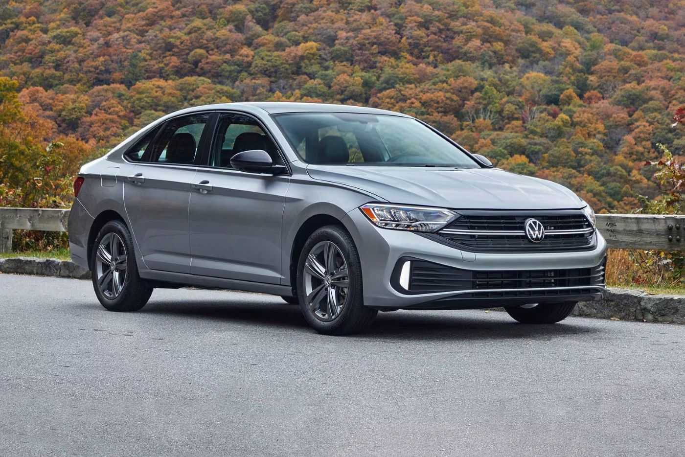
9. Volkswagen Jetta
Volkswagen’s Jetta is known for its refined ride, solid build quality, and understated design. Yet in the era of always-connected driving, the Jetta’s phone storage solution feels like a glaring omission. The small tray beneath the climate controls is the mo
st obvious candidate, but it’s barely wide enough for modern phones.
It’s also too shallow to prevent devices from sliding during even gentle driving maneuvers. If you have a larger phone—or one in a rugged case—it may not fit at all, forcing you to seek less convenient alternatives.
The placement of the USB port doesn’t help the situation either. It’s located near the same shallow tray, which makes plugging in your phone a frustrating experience. Once connected, the cable sticks out and obstructs the tray even more. There’s no clever cable management, no retention bumpers, and no textured grip.
This results in a design that actively works against modern phone usage. Despite the availability of features like Apple CarPlay and Android Auto, the physical infrastructure to support those tools is lacking.
Even wireless charging, offered on higher trims, is compromised. It’s mounted deep under the center stack and requires you to blindly insert your phone into a low, horizontal pocket. There’s no rubberized material to keep the phone secure, and the charger often fails to maintain contact.
All this leads to a disjointed user experience—one that feels more like an afterthought than a deliberate, ergonomic choice. For a vehicle that prides itself on thoughtful engineering, the Jetta stumbles badly in this small but meaningful area.
")
10. Hyundai Kona (First Generation)
The first-generation Hyundai Kona made waves for its bold styling, spirited drive, and affordable pricing. It was a big hit with younger buyers, many of whom rely heavily on their smartphones for navigation, music, and communication.
Yet surprisingly, the Kona’s interior layout makes almost no concession to phone storage needs. The only real option is a small plastic tray in front of the shifter, and even that feels like a leftover gap rather than a purpose-built space. Phones barely fit, often spill over the edges, and lack any retention or grip.
Things get worse when you try to use a charging cable. The cable sticks up awkwardly, interfering with gear shifting or resting directly on top of the phone.
Any attempt at cable management is essentially nonexistent. For such a small vehicle, efficient use of space is critical, but the Kona fails to use even a few extra inches to provide a more secure, ergonomic phone slot. It’s especially surprising given Hyundai’s usually strong attention to interior practicality and tech integration.
Wireless charging is available on later models, but its placement doesn’t help much. The pad is located deep under the center stack in a narrow slot with limited visibility. Phones often lose contact due to a lack of grip, and the charging confirmation indicators are barely noticeable.
For a car aimed squarely at tech-savvy urban drivers, this lack of smartphone storage feels like a misstep. With a few small changes—better material choice, a reshaped tray, or a deeper cubby—the Kona could have vastly improved the daily experience for connected drivers.
Also read: 10 V8 Engines That Keep Running Strong Even After 300,000 Miles of Real-World Abuse
It’s almost comical when you think about it: in a world where cars can drive themselves down the freeway, park without human input, and stream your favorite playlist through cloud-connected apps, some of them still don’t give your phone a proper place to sit.
While automakers have made tremendous strides in smartphone integration from a software standpoint—seamless wireless connectivity, fast charging, robust app ecosystems—the physical accommodations inside the cabin often feel stuck in the past.
The cars on this list span a wide range of makes, models, and market segments, yet they all fall short in the same simple way: they treat your phone like an afterthought. For drivers, especially those who spend a lot of time on the road, this becomes a daily nuisance.
Your phone is your navigator, your playlist curator, your digital key, and your lifeline to the outside world. It deserves a spot in the cabin that’s safe, secure, and intuitive—not a slick tray where it slides off, a tight bin where it won’t fit, or a cup holder where it competes with your morning coffee.
Ultimately, poor phone storage is a symptom of a larger issue in automotive design: the disconnect between form and function. It’s a reminder that no matter how advanced a car’s tech package is, true usability comes down to small details that make the driver’s experience seamless.
As phones continue to evolve, it’s time for automakers to design interiors that fully embrace the realities of modern life, not just through flashy touchscreens and software, but through the thoughtful, tactile features that support how we use our devices every day.
Until then, many drivers will remain stuck choosing between their phone and their drink… and that’s a choice nobody should have to make.