
For a feature as critical as the hazard light button, you’d expect a clear, accessible location—preferably center-dash, bold red triangle, and within easy reach during emergencies. Yet, despite its importance, not every car manufacturer follows this golden rule.
As automotive design becomes more stylized and tech-heavy, some cars bury the hazard button in places that confuse even seasoned drivers. These design choices can be the result of aesthetics, space-saving motives, or an over-reliance on touchscreen interfaces. But when every second counts, fumbling for a button that’s supposed to be a safety essential can be downright dangerous.
Hazard lights, meant to warn other drivers of a sudden stop, breakdown, or road danger, are legally mandated in most countries. Their functionality hasn’t changed much since their introduction decades ago.
But as vehicle interiors have evolved—becoming more minimalist, screen-centric, and “design-forward”—some automakers have compromised usability for sleekness. The results? Buttons hidden under screens, tucked near cupholders, or placed on the ceiling, where no one instinctively looks during a panic.
Drivers often discover the poor placement of these buttons at the worst times—when their car suddenly stalls in the middle of a highway or when navigating low-visibility conditions.
While some cars bury these controls due to poor design judgment, others are simply victims of experimental ergonomics. In any case, the misplacement of hazard light buttons turns a simple task into a confusing ordeal.
In this article, we’ll spotlight six cars infamous for hiding their hazard buttons in unintuitive locations. These models span a range of brands—luxury, mainstream, and even electric—and they all share one common flaw: you can’t find the hazard light button fast when you need it.
Whether you’re a current owner, potential buyer, or just fascinated by quirky design flaws, you’ll want to know which vehicles to watch out for—and what exactly makes their hazard button so hard to locate.
Also Read: Top 10 Worst and 10 Best Trucks for Towing

1. Tesla Model 3
Tesla’s minimalist interior design has been praised for ushering in a new era of automotive aesthetics. The Model 3 embodies this vision with a sparse dashboard, one large central touchscreen, and nearly no physical controls. While this approach gives the cabin a futuristic and clutter-free look, it also removes the tactile familiarity that drivers are used to.
One of the most glaring examples is the placement of the hazard light button—not on the dashboard or steering wheel, but tucked above the rearview mirror on the overhead console. It’s a choice that looks sleek but proves confusing and impractical in an emergency.
This overhead placement is particularly problematic because it lies well outside the driver’s natural line of sight. When something goes wrong on the road, the first instinct is to reach for the dashboard, not look up.
Even experienced Model 3 drivers can struggle to locate the button quickly if they haven’t trained themselves to reach upward in stressful moments. It’s a counterintuitive move that undermines the entire point of the hazard system: fast activation during urgent situations.
Tesla could argue that their design is intentional, to reduce dashboard distraction and promote a serene cabin environment. However, hazard lights are a rare exception to the design-over-function rule. These are emergency tools, not aesthetic decisions.
There’s also the issue of physical reach. For shorter drivers or those wearing bulky coats in winter, accessing the button on the ceiling may take longer than it should. That delay could be dangerous during a sudden stop or accident.
Even more frustrating is that Tesla’s software-first approach means many new drivers instinctively search the touchscreen for the hazard function.
The irony? It’s one of the few controls that remains physical, but it’s also one of the hardest to find. In pursuit of innovation, Tesla overlooked a key usability principle: emergencies don’t wait for design flair. Sometimes, old-fashioned visibility beats high-tech subtlety.

2. BMW i3
The BMW i3 stands out for its sustainable build and futuristic approach, but that same vision creates complications when it comes to everyday usability. One major critique centers on the hazard button’s poor placement—tucked high on the dashboard above the infotainment screen.
It’s small, flat, and blends in with the trim, making it easy to miss when quick action is needed. Drivers familiar with more traditional layouts may waste valuable seconds searching for what should be the most obvious button in the car.
Adding to the confusion is the symmetry of the i3’s center dash. BMW has designed it to look balanced and sleek, with few protruding elements. Unfortunately, this aesthetic results in uniformity where standout features should exist.
The hazard light button doesn’t pop visually; it’s barely larger or more colorful than the surrounding buttons. During a breakdown or emergency stop, this subtlety becomes a liability rather than a virtue.
The i3’s elevated screen and layered dashboard add another ergonomic challenge. Reaching the hazard button requires not just visual scanning, but also a precise arm movement, which becomes a distraction during high-pressure moments.
Moreover, since the button is placed near the top edge of the dashboard, it may be blocked from view by sunlight or interior reflections, compounding the difficulty of locating it when it truly matters.
BMW likely intended the hazard button’s placement to preserve the “clean energy” aesthetic of the i3’s interior. However, this comes at the cost of usability—an ironic trade-off in a car built with forward-thinking safety and efficiency goals in mind.
When it comes to core safety functions like emergency flashers, it’s better to be obvious than elegant. For all the i3’s innovation, the hazard button remains a frustrating blemish on an otherwise thoughtful design.

3. Range Rover Velar
The Range Rover Velar is often praised for its sleek interior, which uses dual touchscreens to control nearly every function in the vehicle. But this tech-forward design has one serious drawback: the hazard lights are not controlled by a physical button.
Instead, they are tucked into the digital interface of the lower touchscreen—a placement that can lead to dangerous delays when drivers need to act quickly.
Digital interfaces, while modern and customizable, introduce complications in emergencies. The hazard light control in the Velar is often nested within a set of icons, requiring drivers to tap through menus or recall its location from memory.
Unlike a tactile button that can be pressed without looking, this digital implementation requires both visual attention and physical precision. That’s not ideal when you’re pulled over on the side of the road with a flat tire or stalled engine.
Compounding the issue is the potential for touchscreen lag or misreads. If the system is booting up, frozen, or unresponsive due to cold weather, you might be left with no quick way to activate your emergency flashers.
While this is rare, it’s not unheard of—and it adds unnecessary stress during already tense situations. Physical buttons offer reliability that digital interfaces simply can’t match under every condition.
Land Rover’s design philosophy seems to favor futuristic luxury over practicality, and in many cases, that works. But when it comes to emergency functions, form should never overshadow function. A simple red triangle button on the dash could coexist with the modern interface without compromising aesthetics.
Instead, Velar owners are left with a beautiful system that stumbles on one of the most basic driving needs: making your presence known during a roadside emergency.

4. Fiat 500
The Fiat 500’s retro-modern charm makes it one of the most eye-catching city cars on the market, but its interior design decisions haven’t always prioritized user experience.
One standout flaw is the placement of the hazard light button, which is small, poorly marked, and surrounded by a sea of similarly styled controls. For a car marketed for quick urban maneuverability, its safety features should be just as agile—and this button simply isn’t.
The center dash is compact, and everything is clustered for space efficiency. But the hazard button, instead of being prominently placed and brightly colored, is nestled inconspicuously among window and lock controls.
There’s little visual differentiation. During a fast-moving scenario, like suddenly stopping for a pedestrian or avoiding a collision, the driver may end up pressing the wrong button entirely or wasting time locating the correct one.
This issue becomes even more frustrating when you consider how often hazard lights are needed in tight city spaces. Double parking, blocking traffic momentarily, or warning others during a quick exit from a narrow street—these are common in urban environments.
A quick flick of a clearly marked hazard light switch should be second nature. But with the Fiat 500, the process feels more like a visual puzzle than an intuitive safety action.
To Fiat’s credit, later versions have slightly adjusted the layout to improve usability, but many models on the road still have the original, confusing design.
The Fiat 500’s quirky design ethos is part of its appeal, but quirk should never compromise driver safety. The hazard light button is a perfect example of why style needs to yield, at least a little, when it comes to essential vehicle controls.

5. Audi A3 (Pre-2020 Models)
Audi is generally known for its interior ergonomics and intuitive layouts, but some pre-2020 A3 models made a puzzling mistake with the hazard light button.
It’s located on the dash, but it’s small, recessed, and visually camouflaged among other toggle switches. This placement makes it remarkably easy to miss, especially for new drivers unfamiliar with Audi’s control design.
The hazard light symbol is present, of course, but it lacks the bold red color and larger size typically associated with emergency buttons. The understated appearance blends in with nearby controls like traction and drive mode selectors. The button doesn’t stand out unless you’re specifically looking for it, which defeats the entire purpose of an emergency signal meant to be activated at a glance.
In real-world conditions, this creates a serious usability issue. Imagine stalling in heavy traffic, needing to quickly warn other drivers, but having to hunt through uniform buttons.
The panic of the situation compounds the difficulty. Instead of a quick press, the driver might accidentally toggle a different function, or worse, be unable to locate the button at all. In these moments, poor design transforms a minor inconvenience into a potential safety hazard.
To Audi’s credit, newer versions of the A3 have improved button visibility and spacing, but thousands of drivers are still behind the wheels of earlier models.
It’s a cautionary tale about how even a brand known for high-quality engineering can make missteps when trying to prioritize aesthetic uniformity. When it comes to emergency features, usability should always trump subtlety.

6. Mini Cooper (Recent Generations)
Mini Coopers are known for their vibrant personality and retro design, but that distinct look can sometimes undermine functionality. A perfect example is the hazard light button.
On recent generations of the Mini Cooper, it’s located beneath the infotainment controls or nestled awkwardly beneath the central air vents. Styled like a toggle switch, it’s easy to confuse with other similar controls, particularly during a high-stress moment when clarity is critical.
The entire dashboard layout in Minis leans heavily into visual charm. Lights, toggle switches, and circular displays create a cockpit-like feel that’s both fun and nostalgic. However, this design introduces complexity.
The hazard button doesn’t stand out and may be obscured by hand placement or shadows, depending on the time of day. Worse, some drivers instinctively look to the steering column or upper dash first—places where hazard buttons traditionally reside.
This placement becomes a bigger issue in urban driving scenarios where hazard lights are frequently used. Whether you’re pulling over to load items, stopping for a passenger, or navigating tight alleys, you need a button you can press without hesitation.
Mini’s design forces a pause, a visual confirmation, and sometimes even a double-check before activation. That hesitation, while small, can matter more than most realize.
Despite the Mini’s iconic style and cheeky appeal, the hazard light button serves as a reminder that not all vintage-inspired designs translate well into modern usability standards.
In striving to preserve the aesthetic of classic Minis, the brand has created a cabin experience that’s more focused on form than emergency readiness. A well-placed hazard button wouldn’t compromise the car’s identity, but its current placement certainly compromises its practicality.

7. Mercedes-Benz CLA-Class (Pre-2020 Models)
Mercedes-Benz vehicles are generally known for luxurious interiors and precise engineering, but in the CLA-Class models produced before 2020, one glaring usability flaw is the location and styling of the hazard light button.
Tucked away just below the central air vents and in line with other minor controls, the button is small and lacks the visual prominence you’d expect from an emergency feature. It can easily be mistaken for a climate control or a parking assist switch, especially if you’re unfamiliar with the vehicle.
The lack of color contrast adds to the confusion. Most hazard light buttons are marked with a bright red triangle to stand out clearly against the dashboard. But in the CLA-Class, it’s barely distinguishable from surrounding controls, with only a slight gloss finish setting it apart. In a stressful driving situation, you need to identify and activate that button within a second or two. Unfortunately, the design demands more attention than should be necessary, delaying reaction time.
This layout might work fine in calm conditions when you’re just exploring the vehicle, but things change dramatically in an emergency. Imagine navigating through heavy fog, your car breaks down, and now you need to signal other drivers as quickly as possible.
You reach toward the dash, glance quickly, and pause—where is it? That moment of hesitation, caused by subtle design, turns a simple task into a safety concern. Mercedes’s attempt to preserve a clean interface inadvertently disrupts the very purpose of hazard lights.
Later models improved upon this by giving the button more spacing and clearer markings, but for thousands of drivers still using the older CLA-Class, the challenge remains.
It’s a reminder that even premium brands can miss the mark when trying to balance aesthetics with function. In the case of emergency signals, clarity and accessibility should always be non-negotiable, regardless of the car’s luxury status.

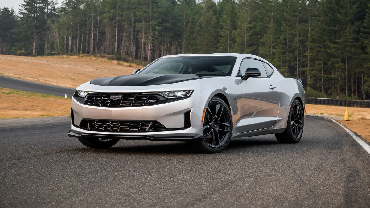
8. Chevrolet Camaro (Fifth Generation)
The fifth-generation Chevrolet Camaro, produced from 2010 to 2015, delivers on muscle and aggressive styling, but that aggressive design extends into the cockpit in ways that complicate basic functions.
The hazard light button is located atop the steering column housing—a spot that feels like an afterthought. It’s not immediately visible from the driver’s seated position, and since it’s not on the dash or integrated into the central console, it’s easy to forget it even exists.
Unlike traditional placements that allow for a glance-and-press activation, this setup requires spatial awareness. Drivers often need to lean forward and look over the steering wheel or grope around blindly to find the button. During a breakdown or quick pullover, this is far from ideal. Worse, because the button is set in a flat housing, it lacks a tactile edge or contour, making it hard to locate by feel alone.
The rationale behind this positioning likely stems from Chevrolet’s focus on preserving the Camaro’s retro-inspired dashboard.
The wide central console is clean, the infotainment system is compact, and the switchgear is minimal. But the hazard button seems to have been squeezed in wherever space was available, rather than being prioritized as a critical feature. This “squeeze it in” approach compromises the muscle car’s usability when something goes wrong on the road.
For drivers used to standard button layouts, this can be disorienting. And for those in a panic—maybe after swerving to avoid a collision or experiencing mechanical failure—it adds unnecessary stress.
A car designed to feel powerful and responsive should also provide immediate access to its emergency signals. Unfortunately, in the Camaro’s case, finding the hazard button can feel like a scavenger hunt in the heat of the moment.

9. Volkswagen Golf Mk6
The Volkswagen Golf Mk6, sold between 2008 and 2013, is generally a well-loved compact with a reputation for reliability and driver-friendliness. But its hazard light button placement leaves much to be desired.
It’s centered on the dashboard, above the infotainment system and between the air vents—but it’s relatively small, and surrounded by buttons that are similarly shaped and sized. The lack of color distinction in some trims makes it visually blend in with nearby controls.
On paper, the location sounds ideal: central and within easy reach. But in practice, the problem is how much it blends into its surroundings. There’s no prominent contrast, especially in models where the button is dark gray or black instead of red.
If you’re not used to the interior, you could spend several seconds scanning the dash just to pick it out, which isn’t acceptable during a roadside emergency or sudden stop in bad weather.
Another issue is that the infotainment system and AC controls often draw the eye downward. Because the hazard button sits slightly higher, it escapes a driver’s natural line of vision.
Some users even report confusing it with seat heater or defrost buttons due to the uniform shape and placement. Without a bold red triangle or distinct shape, the hazard button simply doesn’t grab attention the way it should.
Volkswagen’s conservative interior design usually favors logic over flash, but in this case, restraint worked against functionality. Hazard lights need to scream for attention, not whisper from the sidelines. Later Golf models made the hazard button larger and more visible, but for many Mk6 owners, it’s a hidden gem in the worst possible way: one you have to dig for in a crisis.

10. Hyundai Sonata (2011–2014)
The 2011–2014 Hyundai Sonata offered a major design refresh that brought sleeker lines and a more modern cockpit to the midsize sedan segment. Unfortunately, this redesign also included a questionable decision when it came to the hazard light button.
Instead of placing it prominently on the upper dashboard or center console, it was positioned between two thin vertical air vents, high up and close to the windshield. This awkward placement made it both visually and physically difficult to locate quickly.
While the button does have the traditional red triangle icon, its placement high on the dash means it’s partly obscured by reflections during daylight and hard to reach for shorter drivers. You have to lean forward or raise your hand in a slightly uncomfortable angle to press it—something not everyone can or will do instinctively during an emergency.
It’s not in the natural sweep of your hand when moving from the steering wheel to the center dash. The surrounding design symmetry adds to the issue.
The air vents and climate controls all have a uniform, button-heavy look. The hazard switch doesn’t stand out the way it should. Drivers have reported accidentally hitting adjacent controls like the air circulation button or defroster in their haste, which leads to distraction and frustration when speed and clarity are most needed.
Hyundai corrected this flaw in later generations by lowering and enlarging the hazard button, making it more prominent and ergonomic. But this earlier version remains a solid example of how design can unintentionally obscure functionality.
A safety feature meant to provide immediate visual signaling shouldn’t require a reach, a scan, or a guess. Especially in a family sedan, the expectation is intuitive use—and on this count, the Sonata missed the mark.
Also Read: Top 10 Worst and 10 Best Trucks for Towing
Why Visibility Still Matters in an Age of Automotive Innovation
In a world where cars practically drive themselves, park on command, and flash ambient lighting to match your mood, it’s baffling that one of the most essential safety functions—the hazard light button—continues to be overlooked in vehicle design.
The examples outlined throughout this article reflect a broader issue within the automotive industry: the tension between design innovation and functional usability. Whether it’s a Tesla Model 3 with a ceiling-mounted switch or a Range Rover Velar burying the function in a touchscreen menu, the trend is clear—some automakers are prioritizing style, minimalism, and digital integration at the cost of driver readiness.
Hazard lights are not a convenience feature. They are an essential part of road safety protocol, providing a universal, instantly understood signal to alert other drivers of potential danger. Whether you’re pulled over on a busy highway, stuck in heavy fog, or assisting someone else in distress, those blinking amber lights are one of the few tools you have to communicate urgency without words. Delaying their activation—even by a few seconds—can lead to confusion, increased risk of accidents, or worse, total invisibility during a crisis.
It’s not just about bad placement—it’s about violating driver expectations. For decades, drivers have been trained to look to the center dash for a large, red triangle. That muscle memory matters in emergencies when panic short-circuits logical thinking.
By relocating the hazard button to obscure places—like overhead panels, touchscreen menus, or flat-black toggles between identical switches—manufacturers are not just redesigning the cabin; they’re redefining instinct. And unfortunately, instinct doesn’t update as quickly as software.
This issue also highlights a missed opportunity for carmakers to strike a balance between form and function. There’s no fundamental reason why a vehicle can’t have both a beautiful, modern interior and a marked, easily accessible hazard switch. In fact, many luxury brands, like Lexus or Volvo, still manage to offer cutting-edge interiors without sacrificing the visibility of crucial controls. It’s not about tradition; it’s about common sense. A red triangle doesn’t ruin a design—it reinforces a commitment to safety.
Furthermore, this discussion reflects a deeper concern about how automakers view human interaction in vehicles. As more features move to digital interfaces, the importance of haptic feedback and quick visual recognition increases. Drivers shouldn’t need a tutorial or a search bar to activate emergency lights.
Unlike adjusting ambient lighting or choosing a playlist, hazard lights are not a secondary function—they’re often the first line of defense in a dangerous scenario. Treating them as just another icon in a crowded menu is a serious misstep in user experience design.
There’s also a responsibility on the part of consumers. Drivers should take a moment to familiarize themselves with the location of critical controls whenever they get into a new vehicle, rented, borrowed, or newly purchased. Knowing how to activate your hazards, defrosters, and parking brake without thinking is part of responsible driving. Still, that burden shouldn’t rest solely on the user. Good design should anticipate need and reduce the likelihood of error, not increase it.
As car interiors continue to evolve—with touchscreens, voice controls, and AI assistants—it’s imperative that manufacturers do not lose sight of tactile immediacy. A well-placed button might not win design awards, but it can prevent accidents, save lives, and restore a sense of confidence in how we interact with our increasingly complex machines.
In the end, it’s not about nostalgia—it’s about designing for real human behavior. Emergencies demand simplicity, not elegance. And until every automaker treats the hazard light button like the lifeline it is, there will always be cars on the road that force drivers to search when they should be seen.