
The dashboard is where a car communicates with its driver—it’s more than just a display panel; it’s the nerve center of the driving experience.
Over the past two decades, dashboard design has transformed dramatically, shifting from analog simplicity to digital sophistication.
Some vehicles today sport instrument clusters and infotainment layouts that feel futuristic, elegant, and driver-focused, turning every drive into an experience.
These cool dash designs often feature crisp digital displays, ambient lighting, clever button integration, and seamless materials that elevate the entire cabin’s feel.
However, not all cars have kept pace with the times. Some dashboards still look and feel like they belong in the early 2000s, either because the manufacturer chose to stick with outdated aesthetics, reused old parts-bin components, or simply avoided modern updates to cut costs.
These models may offer solid reliability and performance, but their interior presentation leaves drivers wanting—especially when modern competitors offer much more polish for similar prices.
In this article, we’ll explore both extremes. First, we’ll highlight five vehicles with standout dash designs that feel modern, exciting, and well-thought-out.
Then, we’ll look at five cars that feel frozen in time—models whose dashboards are in desperate need of a refresh. In today’s competitive market, these details matter more than ever.
Also Read: 5 Cars That Are Easy to Park and 5 That Always Hit the Curb
5 Cars With Cool Dash Designs
When a car rolls off the lot, the driver’s first ongoing interaction isn’t with the engine or suspension—it’s with the dashboard.
It’s the one component that faces you every time you drive, framing everything from your speed and music to climate controls and navigation.
In an era where drivers expect connectivity, customization, and sleek aesthetics, dash design has become a key differentiator in the automotive world.
The best dashboards combine form and function, giving drivers intuitive control while delivering a visual experience that feels premium and engaging.
Cool dash design isn’t just about throwing a screen in the center or adding colored trim. It’s about thoughtful execution—placing controls where they’re needed, creating a cohesive look that matches the vehicle’s purpose, and incorporating materials that feel good to the touch.
Whether it’s a wraparound digital cockpit, floating screens with ambient lighting, or clever touch-and-tactile control blends, these elements signal a modern, driver-centric approach.
Manufacturers are now competing not just on performance specs, but on how the car feels inside, especially at eye level. A bold, futuristic dash can completely transform the vibe of a vehicle—even in a non-luxury segment.
In the next five entries, we’ll showcase cars that stand out for their dash design. These are not necessarily the most expensive or technologically complex vehicles—but each one delivers a look and feel inside the cabin that sets it apart.
Some prioritize minimalism with clean layouts and subtle lighting, while others go all-in with digital dynamism. Either way, they’ve raised the bar for what a modern dashboard can and should be.
Let’s look at five vehicles that got it right—where the moment you sit behind the wheel, you know you’re driving something special.
1. 2023 Hyundai Ioniq 5
The Hyundai Ioniq 5 is one of the boldest statements in EV design—not just on the outside, but behind the wheel as well. Step into the cabin, and the dashboard immediately sets a futuristic yet calming tone.
It’s a masterclass in clean, user-friendly design that avoids clutter without sacrificing functionality. Hyundai has taken a minimalist approach but infused it with tech-forward features that feel intuitive rather than overwhelming.
The Ioniq 5’s dash layout is dominated by two 12.3-inch displays—one for the digital gauge cluster and another for infotainment—mounted side by side in a seamless housing that floats horizontally across the dash.
This configuration is not only sleek, but also easy to read at a glance. Unlike traditional cockpits that cocoon the driver, this layout keeps the cabin open and airy, especially when paired with the Ioniq 5’s flat floor and spacious interior.
One of the standout elements is the use of eco-friendly materials that still look upscale. The matte-finish dash trim, minimalist air vents, and optional ambient lighting give it a high-end feel without relying on piano black plastics or excessive chrome. Even the steering wheel has a clean, badge-free face, adding to the futuristic motif.
Functionally, the dashboard is a breath of fresh air. Touch controls are blended with physical toggles for climate settings, striking a balance between tactile control and screen real estate.
There’s no traditional center console blocking legroom—instead, the center armrest slides and opens up more flexible space, a rarity in vehicles at this price point.

Perhaps most importantly, the Ioniq 5’s interface is quick and easy to learn. The infotainment is responsive, the menus are logically arranged, and even first-time users can operate navigation, audio, and vehicle settings without confusion.
It’s the kind of dash that feels like it belongs in a concept car—but it’s fully realized, available today, and positioned at an accessible price point.
In a sea of new EVs trying to out-tech each other, the Ioniq 5’s dash design manages to feel premium, futuristic, and comfortable all at once. It sets a new standard—not just for Hyundai, but for mainstream vehicles everywhere.
2. 2024 Mercedes-Benz E-Class
Mercedes-Benz has long been associated with refined interiors, but the 2024 E-Class takes the concept of a luxury dashboard to a whole new level.
With the introduction of the MBUX Superscreen, the E-Class blends the sophistication of German craftsmanship with the digital prowess of a high-end tech product. This dash isn’t just a display of features—it’s an experience in itself.
The focal point is the MBUX Superscreen, a massive digital glass panel that stretches across nearly the entire dashboard.
Unlike the Hyperscreen in the EQS, which combines several screens under one curved surface, the Superscreen layout feels more driver-oriented and elegant.
It includes a large central touchscreen, a driver information display, and an optional passenger display, each housed in a seamless, visually integrated structure. The aesthetic effect is cinematic—yet it doesn’t feel overwhelming.
Ambient lighting also plays a starring role. Mercedes has added contour lighting that wraps around the dash and doors, responding to drive modes, climate settings, or even music. This is not just for show—it creates a feeling of motion and emotion, turning everyday drives into multisensory journeys.
Beyond the visuals, the dash is highly functional. The interface is powered by MBUX with AI learning, voice activation, and haptic touch responses.

The menus are intuitive, and personalization is deep, with driver profiles, theme modes, and shortcut customization. Plus, the infotainment system supports third-party apps like Zoom or TikTok, showing how dashboards are now merging into lifestyle tech.
Materials are also top-tier. The dash combines real wood, metal trims, and soft-touch surfaces in a layout that’s elegant without being over-designed. The HVAC vents are sculpted into the display housing, giving the dash a clean, uninterrupted flow.
In the E-Class, Mercedes isn’t just selling luxury—it’s redefining what it means for a dashboard to be immersive, beautiful, and intelligent. The design feels like it belongs in a top-tier lounge, not just a mid-size sedan.
For those seeking a vehicle where the interior matches the innovation of the drivetrain, the E-Class delivers one of the coolest and most cohesive dash designs on the market today.
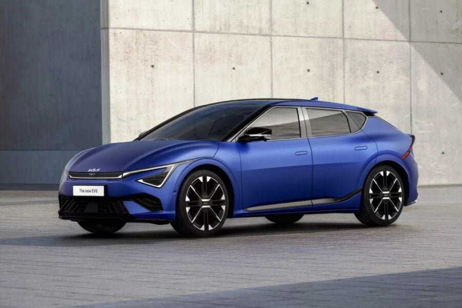
3. 2023 Kia EV6
Kia has been steadily redefining its brand identity, and nowhere is that more evident than inside the 2023 EV6.
While the exterior showcases athletic, aerodynamic lines, it’s the dashboard that really seals the futuristic feel of this all-electric crossover. Kia didn’t just modernize the dash—they reimagined how drivers interact with a vehicle at every level.
The EV6 dash design revolves around a dual-screen curved panel, housing a 12.3-inch digital instrument cluster and a 12.3-inch infotainment display in one sweeping, slightly arched glass unit.
This setup isn’t just eye-catching—it’s ergonomically angled toward the driver, giving a cockpit-style command center without sacrificing the airy openness of the cabin.
What makes the EV6 stand out is its minimalism paired with clever tech. There are almost no physical buttons cluttering the center of the dashboard.
Instead, Kia employs a dual-function control panel below the infotainment screen that can toggle between climate controls and media/navigation shortcuts. It’s a simple yet brilliant feature that keeps the interface clean while retaining real-world usability.
Ambient lighting and high-quality materials enhance the dash’s premium feel, especially in GT-Line and GT trims.
The dashboard uses textured surfaces and sustainable materials—a nod to the EV’s environmentally conscious roots—while still feeling modern and comfortable. The layered dash layout gives a sense of depth without overcomplicating the look.
In terms of interface, the EV6’s infotainment system is snappy and logically structured. The screen graphics are crisp, and wireless smartphone integration is standard.
Kia’s user interface also avoids the buried-menu syndrome common in rival systems, making adjustments on the fly far less frustrating.

Another cool touch: the dash area includes flush-mounted air vents and subtle angular accents that echo the vehicle’s exterior styling. Even the steering wheel has a distinctive two-spoke design with thumb-touch controls that feel intuitive without being distracting.
All told, the EV6 offers a perfect blend of aesthetic flair and practical design. It’s futuristic without being alienating, minimalist without being sparse, and tech-rich without being overwhelming.
In the increasingly crowded EV market, the EV6’s dashboard stands out not just for how it looks—but for how seamlessly it integrates into everyday use.
4. 2024 Lucid Air
The Lucid Air is one of the most advanced EVs on the road, but what truly sets it apart—beyond range and performance—is its interior environment, particularly the dashboard.
Where many automakers chase screen size for the sake of novelty, Lucid takes a refined and architectural approach. The result is a dash that feels more like a luxury suite’s control center than a traditional automobile interior.
The centerpiece is the 34-inch curved Glass Cockpit display, which spans from the left of the steering wheel to the center of the dash.
This display is divided into three distinct zones: a digital gauge cluster, vehicle controls, and infotainment, all intuitively grouped. The glass panel floats above the dash, creating a sense of lightness and space.
Beneath this is a retractable Pilot Panel, a secondary touchscreen set lower into the center console for deeper navigation, climate, and personalization options.
What’s remarkable is how Lucid avoids tech overload. Everything feels intentional. The color scheme is warm and calming, often inspired by Californian landscapes like Mojave or Santa Monica.
The materials are top-shelf: real wood inlays, suede microfiber trim, and soft, leatherlike surfaces that wrap across the upper dashboard. It’s a cabin that feels like a lounge, not a laboratory.
Ambient lighting is subtle but strategic, flowing behind key lines on the dash and around the floating center screen.
The minimalistic steering wheel houses capacitive controls and haptic feedback, preserving the clean aesthetic while still giving the driver functional access.
Lucid’s approach to interface design also stands out. The system is responsive and doesn’t bury important functions in endless submenus.
The voice assistant is fast and proactive, and over-the-air updates continue to enhance its functionality without requiring hardware changes.

What makes the Lucid Air’s dash design truly cool is its balance between digital sophistication and serene elegance. It doesn’t scream for attention; it invites you into a space that feels modern yet timeless.
For anyone seeking the cutting edge of automotive design, the Lucid Air’s dashboard isn’t just impressive—it’s one of the finest examples of what the future can look like when done right.
5. 2023 Genesis GV80
Genesis, Hyundai’s luxury division, has quickly emerged as a serious competitor to European premium brands, and the GV80 exemplifies just how far they’ve come.
Step inside this midsize luxury SUV and you’re immediately struck by the dashboard—an elegant blend of aesthetics, ergonomics, and modern tech. It doesn’t just look cool; it feels like it belongs in a boutique hotel suite rather than a vehicle.
The GV80’s dashboard design is anchored by a 14.5-inch widescreen display that floats elegantly above the dash, not jammed into it. This design choice keeps the screen within line of sight while preserving the openness of the cabin.
Instead of overwhelming the user with touch-only controls, Genesis cleverly integrates a rotary dial interface, a knurled metal volume knob, and slimline climate touch controls below a thin row of vents—each designed with premium tactility.
The materials used across the dash are exceptional. Open-pore wood, aluminum accents, and supple leather or leatherette stretch across the dashboard in a horizontal layout that emphasizes width and serenity. The color palettes are upscale, often with two-tone themes that feel fresh, not forced.
One of the most distinctive design elements is the two-spoke steering wheel, which reinforces the minimalist approach. While polarizing to some, it adds character and doesn’t distract from the dash’s clean symmetry.
The 12.3-inch 3D digital instrument cluster behind the wheel is not only technologically advanced, but also visually mesmerizing, using eye-tracking to deliver realistic depth to the display.
Ambient lighting wraps the dashboard’s edges subtly, enhancing the interior atmosphere without being flashy. At night, the glow feels refined and cocooning—luxury without pretense.

Genesis also scores high on interface simplicity. The infotainment is intuitive, logically structured, and responsive. Drivers can control it via touch, rotary dial, or voice, giving multiple options for different preferences and driving situations.
In the GV80, Genesis has shown that you don’t need to be BMW or Audi to create a cutting-edge luxury interior.
This dashboard is a triumph in balanced design: it’s luxurious but approachable, tech-forward but never cold. It’s the kind of dash that invites admiration—and once experienced, it leaves a lasting impression.
5 Cars That Feel 20 Years Old
While many automakers are pushing the envelope with dashboard innovation, some vehicles still cling to designs that feel woefully out of date.
Whether due to cost-cutting, outdated platforms, or an overly conservative approach to interior styling, these dashboards can make an otherwise capable car feel stuck in the early 2000s.
In a world where even budget models now offer sleek displays and cohesive user interfaces, an old-school dash can become a major turn-off for buyers.
A dashboard that feels 20 years old isn’t just about aesthetics. It’s also about ergonomics, user experience, and overall cabin ambiance.
When drivers are greeted by small monochrome screens, thick plastic panels, oversized buttons, and center stacks that look like a relic from the flip-phone era, it’s hard to feel excited about the daily commute.
These outdated designs often come with cumbersome infotainment controls, limited customization, and zero wow factor—especially noticeable when sitting next to a more modern rival on a dealer lot.
This section isn’t about mocking affordable cars or targeting base trims. Rather, it highlights vehicles that, even in their current model years, haven’t evolved their dash design in meaningful ways.
Some of these cars are mechanically sound or even fun to drive—but their dashboards can instantly age them, especially in a market where tech and design are key selling points.
We’re spotlighting five cars whose dashboards fail to meet modern expectations. Whether it’s a lack of screens, uninspired layouts, or carryover components from previous generations, these interiors need a rethink. Some might be due for a redesign soon, while others seem trapped in a design time loop.
Let’s take a closer look at five vehicles that could seriously benefit from a dash upgrade—and what their shortcomings tell us about where the industry once was, and where it needs to go.
1. 2024 Nissan Frontier
The Nissan Frontier may have finally received a long-overdue redesign in 2022 after nearly two decades, but some elements—especially the dashboard—still feel like they belong to a previous era.
Despite updates to the powertrain and bodywork, the interior layout and design language of the Frontier remain surprisingly behind the curve, especially when compared to rivals like the Ford Ranger or Toyota Tacoma.
At first glance, the dashboard in the 2024 Frontier seems functional—but “functional” doesn’t mean modern. The center stack is bulky, with thick plastic framing that feels more at home in a 2005 work truck.
The infotainment screen is modest at 8 or 9 inches, depending on trim, and while it technically offers modern features like Apple CarPlay and Android Auto, the housing and layout around it look like they were pulled straight from the last decade.
The software interface, too, feels outdated, with sluggish response times and menus that lack polish.
One of the biggest visual drawbacks is the abundance of hard plastics across the dashboard. While durability matters in a midsize pickup, that shouldn’t preclude better material choices—especially in higher trims.
The button layout is also cluttered and not particularly intuitive, with HVAC controls and auxiliary buttons that appear oversized and awkwardly placed, further emphasizing the old-school feel.
Even more telling is the instrument cluster, which still uses large analog dials flanking a tiny central digital screen.
This layout is straight out of early-2000s design playbooks and doesn’t hold up against the full-digital or semi-digital gauge clusters now common even in compact crossovers.
There’s a sense that Nissan did just enough to bring the Frontier up to basic modern standards without fully committing to a contemporary, competitive interior.

The dashboard, in particular, feels like a leftover from an era when trucks were purely utilitarian—a strategy that may no longer work in a market where buyers expect rugged performance with a side of refinement.
The Frontier remains a solid truck for its mechanical reliability, but its dashboard is a stark reminder of how long Nissan went without refreshing this model.
For drivers who care about interior design and user experience, the Frontier’s dash feels like a time capsule from the past—and not in a nostalgic way.
2. 2024 Dodge Charger
The Dodge Charger may be a beloved nameplate for muscle car enthusiasts, but its dashboard design in the current generation is beginning to show its age—badly.
Originally introduced in 2011 and only modestly updated since then, the Charger’s dash lacks the refinement, technology, and visual appeal expected in 2024. For all its power under the hood, the interior feels stuck in the past, particularly when it comes to its dated dash layout.
The design is centered around a low-mounted infotainment screen that ranges from 7 to 8.4 inches, depending on the trim.
While Uconnect has been praised for its usability, the screen’s bezel is thick and surrounded by bulky plastic, instantly evoking dashboard aesthetics from the early 2010s. The system’s graphics and response times are decent, but they don’t make up for the overall clunky visual presentation.
Even worse is the overuse of rubberized plastics and generic black surfaces that span the dash. These materials might be durable, but they don’t convey any sense of luxury or evolution, even in the pricier trims like the R/T or Scat Pack.
The gauge cluster isn’t much better. Analog dials are still standard, flanking a small digital display that feels rudimentary compared to fully digital cockpits found in similarly priced vehicles.
The dash layout itself is uninspired. Buttons and knobs feel oversized, and while that may appeal to some who like a “no-nonsense” interface, the lack of sophistication is hard to ignore.
The HVAC and audio controls look like they haven’t changed in a decade, and the basic horizontal dash shape lacks depth, contour, or any distinctive design flourishes.
What’s particularly disappointing is that the Charger competes in a segment where buyers are increasingly looking for performance and polish.

The outdated dash undermines the car’s potential as a modern muscle sedan. It tells a story of a vehicle that hasn’t kept pace with interior innovation, instead relying on nostalgia and brute power to carry the experience.
Until Dodge delivers its long-promised next-generation Charger, the dashboard in the current model will continue to feel like a throwback—only not in the retro-cool way the brand probably intended.
3. 2024 Mitsubishi Mirage
The Mitsubishi Mirage is one of the most affordable new cars on the market, and while that’s part of its appeal, it also explains why its dashboard looks like it was lifted straight from a 2004 econobox.
The Mirage’s entire interior feels barebones, but it’s the dashboard that truly shows how far behind this vehicle is in design evolution.
At the center of the dash is a tiny 7-inch infotainment screen that looks lost in a sea of hard, matte-black plastic.
The screen is responsive enough and includes Apple CarPlay and Android Auto, but the surrounding design—flat surfaces, oversized knobs, and basic button controls—feels less like minimalist chic and more like cost-cutting in its most obvious form.
There’s no attempt at integration or layering. The dash is slab-sided, with no curves, textures, or materials that break up the monotony.
The HVAC controls are dial-based and extremely basic, with a design that hasn’t changed in over a decade. While simplicity can be appreciated, in the Mirage it comes off as dated and utilitarian rather than clean and modern.
Even more telling is the instrument cluster, which features basic analog gauges and a digital readout that resembles calculators from the early 2000s.
There’s no flair, no ambient lighting, and certainly no high-end finishes. The dashboard doesn’t attempt to elevate the driving experience in any way—it just exists to house controls and nothing more.
To its credit, the dashboard is functional, and for buyers simply seeking a reliable, fuel-efficient commuter, it gets the job done.
But even among budget cars, competitors like the Nissan Versa and Kia Rio offer more thoughtfully designed cabins. In contrast, the Mirage’s dash feels like it was never updated because it was never meant to impress.

Ultimately, the 2024 Mirage’s dashboard is a reminder that while low cost is attractive, outdated design can still weigh heavily on perceived value.
It’s a car that meets basic needs but makes zero effort to modernize where it counts—and in today’s automotive landscape, that makes the dashboard feel like a relic from a much older era.
4. 2024 Jeep Wrangler (Non-Luxury Trims)
The Jeep Wrangler remains a symbol of rugged adventure and off-road freedom, but in the lower and mid-tier trims, its dashboard still reflects a utilitarian design ethos that feels more 2005 than 2024.
While the Rubicon 392 and High Altitude trims receive more upscale treatments, base models like the Sport and Willys still carry over much of the dated dashboard architecture—an approach that stands out in today’s tech-focused market.
The layout of the Wrangler’s dash is inherently boxy and flat, echoing the vehicle’s exterior aesthetic. That consistency is intentional, but it doesn’t help when it results in an interior that lacks visual depth and modern flair.
Hard plastics dominate the entire dash, and while they’re washable and durable—important traits for serious off-roaders—they also make the interior feel more like a work truck than a $35,000-plus SUV.
The infotainment screen is small (typically 7 inches) in lower trims and is framed by thick bezels that look bulky and dated.
Uconnect is still a user-friendly system, but the presentation is far from sleek. Below the screen, a cluster of climate and media buttons looks busy and industrial, rather than streamlined and polished.
One area where the outdated vibe really comes through is the instrument cluster. Analog dials flank a tiny monochrome driver display that hasn’t meaningfully evolved in years.
Compared to digital gauge clusters available in similarly priced competitors like the Ford Bronco or even a Toyota RAV4, the Wrangler’s display feels like a throwback to an era when simple was synonymous with cheap.

To be fair, Jeep owners often value function over form, and the Wrangler’s interior serves its purpose. However, that doesn’t excuse its refusal to keep up with modern design cues—especially when the market increasingly expects utility and sophistication.
The result is a dashboard that feels like it hasn’t grown with the times. For all its iconic charm and off-road capability, the Wrangler’s dash in lower trims feels stuck in the past—more at home on the trail in 2004 than in a dealership showroom in 2024.
5. 2024 Toyota 4Runner
The Toyota 4Runner is a legend in the world of rugged, go-anywhere SUVs—but its dashboard design hasn’t kept pace with the evolving expectations of modern drivers.
Now in its fifteenth model year without a full redesign, the 4Runner’s interior, especially the dash, looks and feels like a time capsule from the early 2010s—and in some ways, even earlier.
At the core of the issue is a boxy, utilitarian dashboard layout with large swaths of hard plastic and oversized buttons. While this may make sense for trail use, it doesn’t excuse the lack of refinement or modern tech integration.
The infotainment screen maxes out at 8 inches, but it’s mounted in a recessed position that makes it feel small and inaccessible compared to floating or wide-format screens in newer rivals. The software interface itself is dated, with sluggish animations, basic menu design, and slow response times.
The instrument cluster is another relic, with analog gauges and a dated, low-resolution digital display in between. It lacks the customization and clarity offered by digital cockpits now common in vehicles that cost less.
Even the steering wheel controls and dash buttons feel like they’re from an older parts bin—functional, yes, but also plain and visually unappealing.
The overall lack of innovation is even more noticeable when you compare the 4Runner to other off-road capable SUVs like the Ford Bronco, which manages to balance ruggedness with style and tech.
Toyota’s own RAV4 and Highlander also offer more modern dash layouts, making the 4Runner feel even more out of sync with the brand’s interior evolution.
What’s most frustrating is that the 4Runner has the potential to be a top-tier adventure vehicle across the board. Mechanically, it’s durable and trusted.

But the dashboard fails to inspire, instead sending a clear signal that interior modernization was not a priority. For drivers who care about having a cabin that matches the capability and price point, the 4Runner’s dashboard design can be a major disappointment.
A full redesign is expected soon—and not a moment too soon. Because while nostalgia has its place, a $50,000 SUV shouldn’t feel like it’s borrowing its dash from a two-decade-old blueprint.
In today’s automotive landscape, the dashboard is no longer just a panel of controls—it’s the focal point of the driving experience. It’s where form meets function, where first impressions are made, and where technology either shines or disappoints.
Across the two ends of the design spectrum, we’ve seen how much a dashboard can influence how drivers perceive a vehicle, even when performance and reliability are held constant.
The five cars with cool dash designs exemplify how thoughtful execution can elevate a vehicle’s entire identity.
Whether it’s the ultra-clean layout of the Tesla Model 3, the futuristic edge of the Hyundai Ioniq 5, or the upscale refinement found in the Genesis GV80, these dashboards don’t just keep up with the times—they set the tone for the entire cabin.
They embrace digital technology without sacrificing tactile control, and they show how design can enhance usability, ambiance, and emotional appeal.
In contrast, the five vehicles that still feel 20 years old highlight the downside of stagnation. The Nissan Frontier and Toyota 4Runner, for example, may be durable and trusted, but their dashboards drag down the overall experience.
These interiors are outpaced not just by premium rivals, but even by more affordable, forward-thinking models within their own brands. A lack of evolution in design can make a vehicle feel outdated before it even hits the road.
This contrast matters. Buyers today aren’t just choosing a car for its horsepower or gas mileage—they’re choosing a space they’ll spend hours in every week. A dash that feels modern reinforces value, while one that feels dated can be a dealbreaker, even in a vehicle with otherwise strong attributes.
Ultimately, dashboard design is a mirror. It reflects how much a manufacturer respects the driver’s daily experience. The best ones show innovation, attention to detail, and a commitment to progress.
The worst remind us that falling behind on the inside is just as damaging as lagging under the hood. As the market continues to evolve, it’s clear: dashboard design is no longer optional—it’s a statement of who the car is, and who it’s for.
Also Read: 5 Cars With Anti-Theft Ratings Through the Roof and 5 That Are Sitting Ducks