
Automotive design has evolved far beyond basic transportation. Today, cars reflect identity, taste, and intent. Among the many design philosophies, minimalism has become a quiet but powerful statement.
It’s about clarity, proportion, and restraint removing excess to focus on what truly matters. Some cars master this art perfectly, creating designs that feel timeless, balanced, and elegant without needing bold graphics or unnecessary surfaces.
These vehicles express confidence through simplicity, proving that refinement often comes from subtraction rather than addition.
On the other hand, not every automaker understands where to stop. In the pursuit of standing out, some brands overload their cars with exaggerated body lines, complex shapes, oversized grilles, or too many interior screens.
These design choices, while intended to impress, can end up feeling cluttered, artificial, or visually tiring. Instead of communicating strength or sophistication, such cars risk losing the harmony that makes great design memorable.
The purpose of this piece is to highlight both ends of that spectrum. It looks at five cars that have mastered minimalist design vehicles that prove simplicity can be beautiful, purposeful, and enduring.
Then, it examines five others that push things too far, where ambition overtakes restraint and the result feels forced rather than refined.
Each example has been chosen for its visual statement, the coherence between its form and function, and the emotional reaction it creates.
Whether it’s the understated poise of a sedan that ages gracefully or the overcomplicated front fascia of a modern SUV, these cars reveal how design decisions influence more than appearance they affect how a car feels, how it’s used, and how it’s remembered.
Also Read: 5 Trucks From the 80s That Outlast Modern Ones vs 5 That Don’t
5 Cars That Nail Minimalist Design
Minimalist car design isn’t about being plain it’s about achieving harmony between form, proportion, and purpose. The finest examples of minimalist design use subtlety to make a lasting impression. Every surface, curve, and line serves a reason.
There’s no visual noise or unnecessary detail just the essentials, refined to perfection. These cars command attention not by shouting, but by speaking quietly and clearly through precision and balance.
Automotive minimalism is as much about philosophy as it is about aesthetics. Designers who embrace this approach focus on proportion, texture, and silhouette rather than ornamentation.
The result is a vehicle that feels timeless, one that doesn’t rely on trends or flash to remain appealing. The interiors of such cars follow the same principle: clean layouts, intuitive controls, and an absence of distraction. Drivers feel a sense of calm and control because nothing feels forced or excessive.
The cars featured here stand as proof that simplicity can create stronger emotional responses than complexity ever could.
Whether they are luxury sedans, compact coupes, or electric vehicles, these models demonstrate restraint and thoughtful design choices that never go out of style. They show how powerful minimalism can be when every detail feels intentional.
Each of the five vehicles chosen reflects a different interpretation of minimalism some through timeless bodywork, others through futuristic clarity. Yet all share a common language of purpose and poise.
By stripping away clutter and focusing on proportion and purity, these cars set a design standard that others strive to reach. They prove that true design excellence is not about doing more, but about doing enough, precisely and beautifully.
1. Tesla Model 3
The Tesla Model 3 is one of the most recognizable examples of minimalist car design in modern times. Its form reflects an intentional simplicity that aligns with the brand’s futuristic philosophy.
The exterior is clean and sculpted, defined by smooth surfaces, simple curves, and a lack of unnecessary detailing. There are no fake vents, oversized grilles, or excessive lines the car’s confidence comes from its purity of proportion.
The low, flowing roofline and balanced stance give it a sleek, timeless appearance that continues to look fresh years after its debut.
Inside, the Model 3 takes minimalism even further. The dashboard is an open, uncluttered space dominated by a single central touchscreen that manages nearly every vehicle function. Traditional buttons and switches are nearly absent, replaced by digital controls designed for clarity.
This approach divides opinion, but it undeniably supports the minimalist aesthetic. The horizontal wood or metal trim that runs across the cabin adds warmth without clutter. Combined with the expansive glass roof, the interior feels airy and forward-thinking.

What makes the Model 3 worth mentioning here is not just its design restraint but how that restraint aligns with its purpose. The car’s simplicity reflects Tesla’s mission efficiency, innovation, and user focus.
It’s minimalism with intent, both functionally and visually. The clean surfaces contribute to aerodynamic performance, while the absence of decorative noise keeps the design timeless.
The Model 3 proves that futuristic design doesn’t need excess to feel advanced. It shows that simplicity, when paired with technology and thoughtful execution, can become iconic.
2. Volvo S90
The Volvo S90 embodies Scandinavian design purity elegance achieved through understatement. From its first impression, the S90 stands out for what it doesn’t try to do.
There are no aggressive creases, oversized air intakes, or exaggerated proportions. Instead, it presents long, flowing lines, balanced surfaces, and perfect symmetry.
The front grille and Thor’s Hammer headlights are distinct yet refined, creating a confident identity without feeling loud. The restrained use of chrome complements the design instead of overpowering it, reinforcing Volvo’s philosophy of simplicity paired with strength.
Inside, the S90 continues this disciplined approach. The cabin is calm, open, and inviting, with natural materials and a thoughtful layout. Every element feels purposefully placed, from the vertical touchscreen to the slim air vents and uncluttered center console.
There’s a sense of peace and precision that encourages relaxation rather than distraction. The combination of soft leather, wood inlays, and matte finishes reinforces the brand’s commitment to craftsmanship without ostentation.
This car’s minimalist success lies in how it balances modernity with warmth. While many luxury sedans chase boldness or excess, the S90 stays true to a design language that values restraint.

It communicates sophistication not through showiness, but through proportion, texture, and quiet confidence. The S90’s elegance comes from harmony between technology, materials, and form.
Volvo’s designers have long believed that less can be more when executed with intent, and the S90 stands as proof. It’s a reminder that genuine luxury doesn’t require extravagance. It requires precision, honesty, and timeless design choices that remain beautiful for years to come.
3. Mazda MX-5 Miata
The Mazda MX-5 Miata represents how simplicity and precision can create emotional connection through design. Every line and surface on this car serves a purpose, echoing Mazda’s “Kodo: Soul of Motion” philosophy.
Rather than relying on sharp creases or aggressive shapes, the Miata’s body flows naturally from front to rear, creating a sense of motion even when parked.
Its long hood, compact cabin, and balanced proportions evoke classic sports car styling without feeling nostalgic or forced. The result is an elegant form that feels timeless, athletic, and approachable.
The Miata’s minimalism extends to its interior. The cockpit is driver-centered, with controls placed intuitively for function over flair. There are no excessive buttons, unnecessary touch panels, or complicated interfaces everything exists to support the driving experience.
The dashboard is low and uncluttered, emphasizing outward visibility and openness. Even materials are chosen thoughtfully, offering durability and tactile satisfaction without the need for flash or ornamentation.

What makes the MX-5’s minimalist design special is how it aligns with the car’s purpose. It’s light, focused, and pure a machine built for connection rather than complexity.
The exterior’s restraint mirrors its mechanical simplicity, reflecting Mazda’s understanding that great design should complement, not overshadow, the driving experience.
The Miata’s enduring appeal proves that simplicity never goes out of style. Its design avoids gimmicks, relying on proportion and balance rather than excess. It’s the kind of minimalism that speaks not through silence, but through perfect harmony between form and function.
4. Porsche 911 (992 Generation)
Few cars achieve timeless design better than the Porsche 911, particularly in its 992 generation. The car’s shape is instantly recognisable smooth, clean, and perfectly balanced. Porsche has refined this silhouette over decades, carefully modernizing it while preserving the simplicity that defines the brand.
The 911’s minimalist success lies in proportion: a gently sloping roofline, wide stance, and subtle contours that give it presence without aggression. The detailing is precise, with narrow LED light strips, flush-fitting elements, and restrained use of chrome or gloss accents.
Inside, the 911 continues its design discipline. The dashboard layout is clean and symmetrical, blending analog and digital features seamlessly. Switchgear is reduced but tactile, maintaining a focus on driver engagement rather than technology overload.
Materials feel premium yet understated leather, aluminum, and soft-touch plastics are used sparingly and purposefully. Everything is crafted with intent, giving the driver a sense of precision and clarity.
The 911’s enduring design appeal lies in its refusal to chase trends. It’s minimalist not through emptiness, but through consistency.

Each new generation builds upon the last with small, meaningful refinements rather than dramatic reinvention. This approach gives 911 an ageless quality, modern yet familiar, functional yet elegant.
Why it deserves a place here is simple: it proves that design longevity comes from restraint. Porsche understands that removing distraction enhances identity.
The 992 continues that philosophy flawlessly, showing how purity of form and function can create a lasting emotional connection with drivers.
5. Audi A7
The Audi A7 stands as one of the finest examples of modern minimalist luxury design. Every line and proportion feels deliberate, reflecting the brand’s belief in form following function.
The A7’s fastback silhouette is elegant yet understated, blending coupe-like grace with sedan practicality. The front fascia is sculpted but not aggressive, with a clean single-frame grille and sleek LED headlights that express confidence without excess.
The side profile is where the A7’s character shines a smooth, uninterrupted arc from nose to tail that creates a sense of motion and refinement. The result is design purity rooted in precision, not flamboyance.
Inside, the A7 continues this focus on simplicity and balance. The cabin’s design philosophy emphasizes clarity and light, achieved through clean lines, seamless screens, and carefully chosen materials. While technology plays a central role, it’s presented with discretion.
The dual touchscreen layout integrates into the dashboard without visual clutter, maintaining symmetry and calmness. Even the ambient lighting and switchgear avoid unnecessary flash, reinforcing a feeling of effortless sophistication.
What makes the A7 worth discussing is how it balances luxury with restraint. Many premium sedans attempt to impress through complexity, but the A7 demonstrates that confidence can be quiet.

The car feels meticulously designed, not decorated. Every element, from the tight panel gaps to the subtle metallic accents, shows intent and craftsmanship. The A7’s minimalist success lies in its timelessness. It doesn’t rely on trends or overstatement, and that makes it enduring.
It embodies what Audi calls “Vorsprung durch Technik”, not through showiness, but through clarity of purpose and engineering precision. The A7 proves that true luxury lies in refinemen,t the ability to make less look infinitely more.
5 Cars That Overdo It
Design, at its best, communicates purpose and balance. Yet there are moments when automakers push too far trying to appear futuristic, sporty, or luxurious only to end up with cars that feel exaggerated.
In an effort to stand out, some designs forget restraint and drown in unnecessary flourishes, oversized grilles, complicated surfaces, or interiors that confuse more than they impress. The goal of this section is to highlight such cases vehicles where “more” becomes a weakness rather than a strength.
Excessive styling can come from many motivations. Sometimes it’s about grabbing attention in a crowded market; other times, it’s the result of trying to merge too many ideas into one car. The outcome often feels like disjointed designs that aim for drama but lose coherence.
What’s missing is the calm confidence that characterizes truly timeless cars. Instead, we see visual noise: patterns, textures, lighting, and shapes that compete rather than harmonize. The result is a car that may photograph well in marketing materials but feels overwhelming in person.
The purpose of writing about these cars is not to criticize creativity but to understand how imbalance affects perception. Good design should guide the eye effortlessly; bad design fights for attention.
When a car’s styling distracts from its proportions or its function, it stops being elegant and starts being exhausting. This list reflects vehicles that crossed that line where ambition overshadowed simplicity.
Each example here shows how the pursuit of boldness can sometimes obscure beauty. These cars remind us that design isn’t about shouting the loudest; it’s about clarity, proportion, and confidence.
By examining what goes wrong when design becomes overdone, we better appreciate why minimalism matters and how restraint remains the truest sign of lasting appeal.
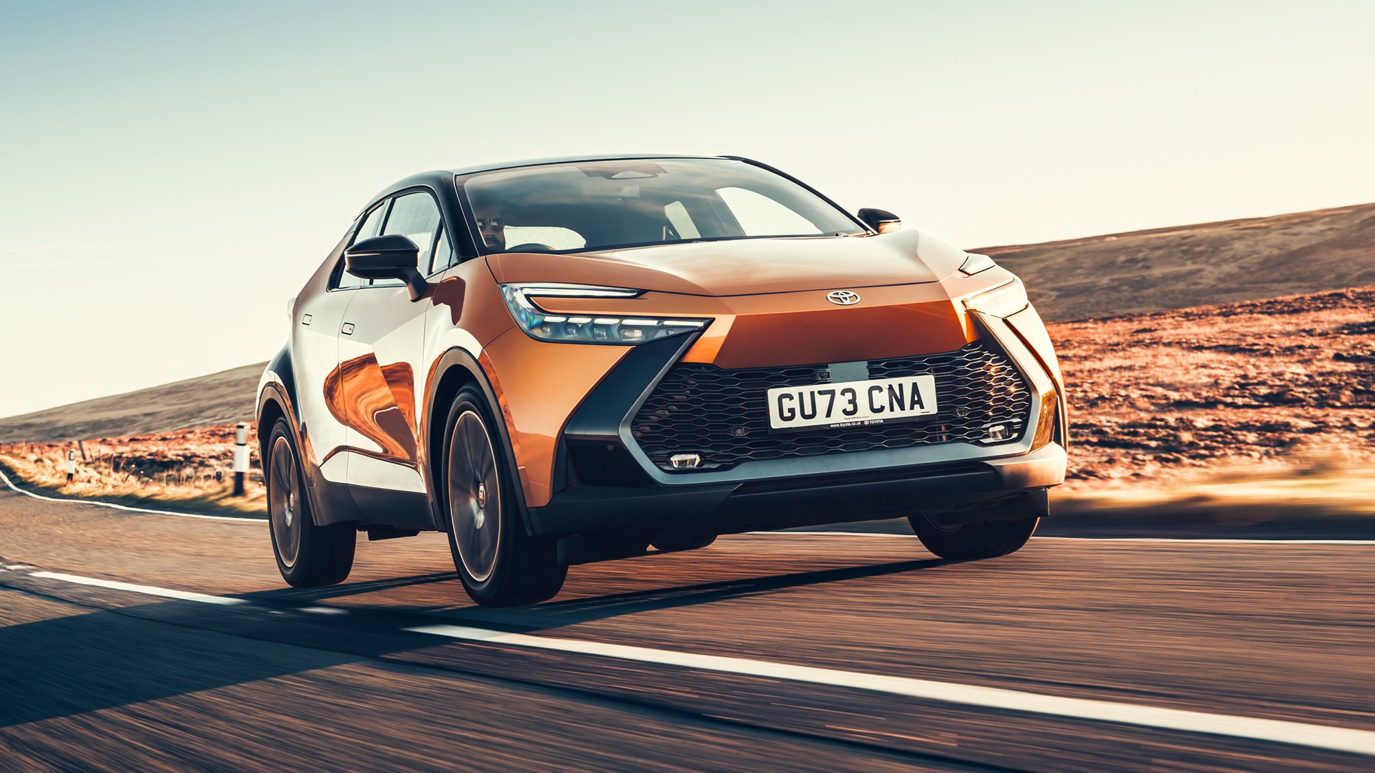
1. Toyota C-HR
The Toyota C-HR is a clear case of a car that tries too hard to stand out. When it first arrived, Toyota marketed it as a bold, youthful alternative to conventional crossovers a design meant to grab attention from every angle.
While it certainly achieved that, the problem lies in how much is happening all at once. The C-HR’s body features aggressive cuts, exaggerated curves, and intersecting lines that seem to compete rather than complement.
The high-mounted rear door handles, oversized rear haunches, and narrow window openings add drama, but they also make the design feel heavy and restless.
From the front, the C-HR is filled with conflicting elements sharp headlights, a large grille, and deep creases that fight for visual space. Instead of conveying confidence, it comes across as cluttered.
The car feels like it’s wearing too many design ideas layered on top of one another. While some might appreciate the individuality, it sacrifices long-term appeal for short-term impact. It’s a design that tries to be futuristic but ends up feeling forced.

Inside, the C-HR continues this theme of excess. The dashboard angles, contrasting materials, and mixed textures create visual busyness. The intent to look sporty is clear, but it doesn’t feel cohesive. Simplicity would have allowed its interior layout to breathe.
The reason for including the C-HR here is its missed opportunity. Beneath the dramatic skin lies a competent, efficient vehicle with good build quality.
Yet its exterior and interior both overcompensate, prioritizing shock value over design clarity. The C-HR serves as a reminder that being memorable isn’t about shouting it’s about refinement.
2. BMW X6
The BMW X6 is one of the most polarizing vehicles in modern automotive design. When it debuted, it aimed to blend the practicality of an SUV with the style of a coupe a daring idea that unfortunately resulted in a design that feels overcomplicated and unbalanced.
Its proportions are its biggest challenge: a tall, bulky body combined with a sloping roofline creates a visual contradiction. The coupe-style rear sacrifices elegance for shock, while the exaggerated grille and oversized air intakes give it an unnecessarily aggressive face.
The issue isn’t ambition but excess. BMW tried to create something sporty and luxurious simultaneously, but the X6’s design overwhelms with too many competing cues.
The wide haunches, layered surfaces, and intricate lighting details feel like visual noise rather than refinement. The vehicle’s size amplifies every flourish, making it feel more theatrical than graceful.
Inside, the X6 fares better in terms of quality, but even here, restraint takes a back seat. Chrome trim, sculpted panels, and multiple materials vie for attention.

The abundance of technology screens and textures breaks the sense of calm that defines good design. It’s an interior that impresses initially but tires over time.
The X6 is included here because it illustrates what happens when design identity becomes a spectacle. Instead of elegance, it delivers drama; instead of balance, it leans on excess.
BMW is known for clean, driver-focused design, yet the X6 feels like a departure from that principle. It’s a car that might turn heads, but not for the right reasons.
3. Lexus RX (Current Generation)
The Lexus RX has always been a successful luxury SUV, but its latest generation takes styling intensity to a level that borders on excess. Lexus calls it bold design language, but in execution, it often feels like visual overload.
The front end dominates with a massive spindle grille that stretches almost to the ground, framed by angular headlights and layered body creases. Each element demands attention, leaving little room for the design to breathe.
Rather than elegance, the RX presents constant tension, as though it’s trying to appear futuristic through sharpness alone.
From the side, the design complexity continues. The floating roof effect, strong character lines, and intricate taillight arrangement all compete for focus.
There’s little continuity between front, side, and rear; it feels as though each section was styled independently. The end result lacks cohesion every detail tries to stand out, creating an exhausting visual rhythm.
Inside, the RX blends quality materials with high-tech appeal, yet even here, simplicity struggles to emerge. The dashboard features multiple layers, intersecting surfaces, and a combination of screens and buttons that feel unnecessarily busy.
The craftsmanship is excellent, but the design language doesn’t match the calmness luxury buyers often seek.

The RX earns its place here because it demonstrates how over-design can undermine sophistication. Lexus has the engineering skill and comfort refinement to rival the best, yet its styling seems determined to dominate the conversation.
A cleaner, more restrained aesthetic would highlight its strengths rather than distract from them. The RX shows that sometimes, refinement isn’t about standing out it’s about knowing when to stop.
4. Hyundai Kona (Previous Generation)
The first-generation Hyundai Kona was designed to grab attention in the crowded compact crossover market, but its execution went too far. The car’s front fascia became infamous for its abundance of layers: split headlights, a large honeycomb grille, and heavy cladding that created visual chaos.
The result was more confusing than confident. Instead of cohesion, it appeared as if several unrelated designs were combined into one. The attempt to look edgy made it appear restless.
The body lines, exaggerated fenders, and thick black plastic trim added to the sense of overcomplication. The proportions were decent, yet the sheer number of shapes and contrasting textures made it difficult for the eye to rest.
From certain angles, the Kona looked busy rather than balanced. While Hyundai intended to stand apart from conservative rivals, the design leaned toward caricature.

Inside, the Kona offered comfort and practicality, but its interior design also suffered from overthinking. The mixture of bold accents, layered panels, and contrasting materials disrupted any sense of unity. What could have been a clean, youthful design became something that felt cluttered and inconsistent.
This car deserves mention because it represents how excess can overshadow innovation. Hyundai had the right foundation an efficient, affordable compact crossover but the styling overwhelmed its strengths.
Later redesigns addressed many of these issues by simplifying surfaces and refining the proportions. The Kona’s early design serves as a lesson: confidence in design doesn’t come from adding more, but from knowing what to leave out.
5. Nissan Juke
Few modern vehicles illustrate design excess as clearly as the Nissan Juke. When it debuted, it was intended to be a bold, youthful crossover that broke away from convention. While it certainly succeeded in drawing attention, it did so by abandoning restraint almost entirely.
The Juke’s front design is its most divisive element round headlights positioned low on the bumper, thin daytime running lights placed high near the hood, and an oversized grille all compete for attention. Instead of harmony, the result feels fragmented, as if the front of the car is made of several unrelated ideas.
The side profile is equally unconventional, with swollen fenders and a tapering roofline that create exaggerated proportions. The rear door handles are hidden near the C-pillar, a design decision meant to appear sleek but one that disrupts visual flow.
The rear end, with its high-set taillights and heavy sculpting, only adds to the complexity. Rather than projecting confidence, the Juke often feels like it’s trying too hard to be different for the sake of being different.

Inside, the theme continues with a mix of vibrant colors, circular controls, and motorcycle-inspired design cues.
While playful, it lacks the visual balance seen in better-executed compact crossovers. The combination of shapes and textures competes for attention, leaving little sense of calm or cohesion.
The reason for including the Juke here is not to criticise creativity, it’s to show the fine line between distinctive and disordered. The Juke’s boldness made it memorable, but it also limited its long-term appeal.
Design that relies on shock value often fades quickly, and the Juke proves that excess can age faster than simplicity. It remains a case study in how restraint defines timelessness, while overdesign risks instant dating.
Design in cars reveals as much about purpose as it does about personality. The vehicles that embrace minimalism like the Tesla Model 3, Volvo S90, and Porsche 911, prove that clarity, proportion, and restraint create lasting appeal.
Their beauty lies in precision rather than decoration. In contrast, cars such as the Toyota C-HR, BMW X6, and Nissan Juke show how excess can overshadow intent. When designers add too many lines, textures, or features, identity becomes noise.
This contrast reminds us that timeless automotive design isn’t about boldness alone it’s about knowing when simplicity speaks louder than complexity.
Also Read: 5 Sedans That Still Turn Heads vs 5 That Blend In