
In modern vehicles, the touchscreen has quietly become the most frequently touched component after the steering wheel it sets the tone for how drivers interact with everything from climate settings to navigation to entertainment.
As automakers have pushed harder toward digital-first dashboards, the gap between friendly, intuitive systems and frustrating, tap-miss nightmares has widened dramatically.
On one end, you have vehicles whose screens feel like refined extensions of your fingertips responsive, logically arranged, and forgiving even when the road is rough.
On the other, some interfaces seem almost intentionally difficult: tiny icons, laggy responses, hard-to-find menus, and glossy panels that register every accidental brush except the one you want.
In daily driving, where attention must remain primarily on the road, that difference can transform a touchscreen from a small convenience into a genuine safety or fatigue factor.
That is why this comparison matters. Touchscreens are no longer add-on features they are operational hubs. When they work well, they enhance confidence, reduce distraction, and make the car feel like a well-trained assistant.
When they don’t, even simple tasks like adjusting temperature become multi-step exercises in annoyance.
This article examines both extremes: five models that excel in delivering friendly, predictable screen experiences, and five that too often leave drivers tapping repeatedly, missing icons, or diving through confusing submenus.
Each selection is explained in 300 words, focusing on what makes the interface notably good or notably problematic, and why it stood out as worth writing about. The goal is not to criticize technology itself but to highlight design choices that either respect or complicate the driver’s attention.
In an era where screens dominate dashboards, understanding which systems elevate the driving experience and which ones diminish it helps buyers choose cars that work with them, not against them.
Also Read: 5 Cars for New Orleans Flood-Prone Areas vs 5 That Suffer Water Damage
5 Models With Friendly Touchscreens
Touchscreens have become the central command hubs in modern vehicles, shaping how drivers interact with nearly every system inside the cabin.
From navigation to climate control to smartphone integration, these digital panels now influence not only convenience but also safety and comfort.
Yet while many carmakers rush to add bigger screens, brighter graphics, and flashier interfaces, only a select few manage to create touchscreens that genuinely feel friendly systems that remove friction instead of adding it.
That is why highlighting these five models matters. They stand out not because they overwhelm the driver with futuristic theatrics, but because they respect the reality of everyday driving.
Friendly touchscreens share a set of traits that transform them from mere features into tools that actively support the driving experience. They respond instantly to inputs, minimizing the need to look twice or re-tap a stubborn icon.
They organize menus in intuitive ways, letting the driver reach essential functions without digging through confusing submenus. Their icons are large enough to touch accurately on bumpy roads, their layouts are uncluttered, and their graphics balance clarity with visual appeal.
Some even pair digital displays with physical knobs and buttons, creating a hybrid control scheme that acknowledges that not every action needs to be performed on a screen.
These five models were chosen because they consistently deliver that blend of responsiveness, simplicity, and thoughtful design. They have touchscreens that reduce distraction rather than cause it, and they manage to feel modern while remaining welcoming to drivers who may not be tech-savvy.
Each model demonstrates a different approach to user-friendly interaction some rely on elegant minimalism, others on smart structure, and some on intuitive physical-digital integration but all share the same goal: making in-car technology feel effortless. This section explores why each one excels and what makes its touchscreen truly driver-friendly.
1. Honda Accord
The Honda Accord earns a place on this list because its touchscreen design shows an uncommon level of empathy for real-world driving behavior. Many manufacturers chase flashiness oversized animations, deep menus, or overly stylized controls but Honda goes in a refreshingly different direction.
The Accord’s interface is simple in the best possible way: large tiles, thick borders, generous spacing, and a home screen layout that feels instantly understandable even to someone unfamiliar with modern infotainment systems.
I’m writing about it because it represents the ideal middle ground between modernity and usability an approach many competitors could learn from.
Responsiveness is one of its strongest qualities. Every tap registers immediately, giving drivers the confidence that the system isn’t second-guessing or lagging behind them. This matters because hesitation in a touchscreen forces drivers to look back at the display to check whether their input registered.
The Accord avoids that tension entirely. Brightness management is another strength. Even in glaring sunlight, the panel remains readable, helped along by smart contrast ratios that keep critical icons visible without overwhelming the eyes at night.
Physical volume and tuning knobs flank the screen, an important choice because it acknowledges that some tasks are still more intuitive with tactile controls.

Honda does not force everything through the touchscreen; instead, it blends digital controls with well-placed physical redundancy. This hybrid philosophy is exactly why the Accord is worth highlighting it does not treat technology as a gimmick but as a tool.
The menu structure is straightforward, with main categories reachable in a single tap and secondary options no more than two levels deep. Nothing feels hidden, mislabeled, or rearranged for style over function.
Overall, the Accord’s touchscreen stands as a model of clarity, confidence, and driver respect delivering friendliness not through complexity, but through intelligent restraint.
2. Hyundai Tucson
The Hyundai Tucson earns its entry among friendly touchscreens because it showcases how thoughtful visual design can dramatically improve on-road usability.
Where many systems crowd the screen with dense icons or gloss-heavy themes, the Tucson prioritizes readability: crisp typography, wide spacing, and a white-on-dark palette that reduces glare and helps icons remain legible even in fast-moving lighting transitions such as tunnels or tree-lined roads. I chose it for this list because it demonstrates how aesthetic clarity directly supports safer, quicker interactions.
The touchscreen is highly responsive no lag, no stutter, no frozen transitions. The moment the driver taps an option, the panel acknowledges it with clean animation cues that confirm the system is working.
This eliminates the double-tap frustration common in lesser systems. Screens are arranged into intuitive modules: navigation, media, vehicle settings, and climate all have dedicated spaces, and each space uses consistent layout logic.
That consistency allows drivers to “learn” the UI the way they learn the cabin layout intuitively, without needing to retrain their eyes for each submenu.
What sets the Tucson apart, and why it’s worth writing about, is how it simplifies multitasking. For example, dual-pane views let drivers follow navigation while adjusting audio, without having to jump screens. The soft haptic sound feedback is subtle but helpful it lets the driver know their touch was registered without requiring them to visually double-check.
Another underrated feature is how forgiving it is to imperfect touches. The icons are large enough that even bumpy roads rarely cause mis-taps, making the system genuinely usable during motion.

Hyundai’s commitment to accessibility also comes through in the way it supports customizable widget tiles, allowing each driver to bring their most-used functions to the forefront.
In short, the Tucson’s touchscreen succeeds because it minimizes visual stress and maximizes intuitive interaction, making it one of the most user-friendly interfaces available.
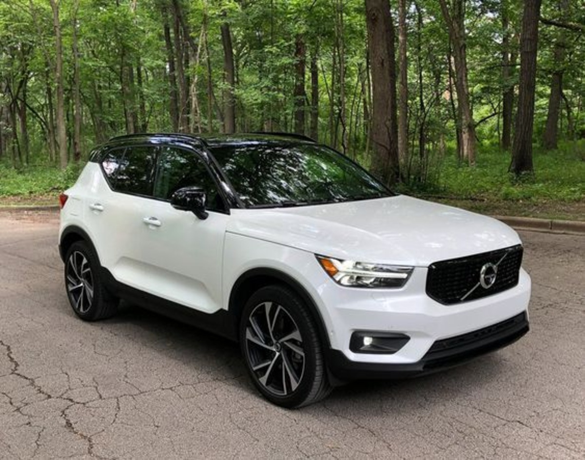
3. Volvo XC40
The Volvo XC40 earns recognition here because it takes a philosophy-driven approach to interface design: reduce clutter, simplify choices, and keep every element purposeful. Volvo interiors have long emphasized calmness, and the XC40’s touchscreen reflects that same Scandinavian clarity.
I’m writing about it because it demonstrates how minimalist design when executed intelligently, can actually enhance usability instead of hiding essential functions.
The system’s structure is arranged like a smartphone grid, but unlike many automotive attempts at this layout, Volvo executes it with exceptional discipline.
There are no oversized banners, auto-playing graphics, or confusing nested folders. Instead, the main screen displays large, evenly spaced tiles that guide the driver to core functions without hesitation.
The entire interface feels predictable, which is important because predictability reduces how long the driver’s eyes leave the road.
Responsiveness plays a major role in why the XC40’s screen belongs on this list. Every swipe is smooth, every tap triggers an immediate response, and transitions avoid unnecessary visual embellishments.
The result is a system that behaves like a tool rather than a novelty. The voice assistant integration also helps reduce touches by enabling natural-language input for navigation, media, and communication, cutting down the need to navigate multi-step menus.

The placement of the screen slightly recessed, with anti-glare coating that keeps reflections at bay. Volvo knows that even the most user-friendly interface becomes difficult to use when sunlight washes out crucial controls.
This attention to the physical environment around the touchscreen is part of what makes the XC40 worth spotlighting.
Customizable shortcuts let drivers keep core functions accessible at all times, and Volvo’s consistent iconography prevents confusion between related functions.
Overall, the XC40’s touchscreen succeeds not through flashiness but through discipline: it offers drivers only what they need, exactly where they expect it, with no unnecessary complexity.
4. Toyota Camry
The Toyota Camry earns its place among friendly touchscreens because it prioritizes consistency and ease of use above digital theatrics.
Toyota understands that many drivers prefer familiarity over experimental interfaces, and the result is an infotainment system that feels grounded, dependable, and deeply intuitive.
I’m writing about it because its touchscreen proves that reliability is a design virtue, especially in daily commuting where drivers need quick access, predictable placement, and zero surprises.
One of the Camry’s major strengths is its combination of touchscreen and physical controls. Rather than forcing every function into a digital interface, Toyota preserves tactile buttons for frequently used actions like temperature, volume, and menu navigation.
This hybrid setup makes the learning curve almost nonexistent users never have to wonder where core functions are because the cabin provides both visual and tactile cues.
The touchscreen layout itself is simple but extremely effective. Icons are large, text labels are clear, and the interface avoids the overly glossy style that tends to obscure contrast under sunlight.

Every main function is accessible within one or two taps, and the menu structure feels like it was created by observing real drivers rather than designers working in isolation.
Responsiveness is another highlight. The screen rarely misreads input, even when the vehicle hits bumps, making it more forgiving than many competitors.
Toyota emphasizes quick confirmation feedback small animation cues, brief sound ticks, and instant panel transitions so the driver always knows exactly what the system has registered.
What makes the Camry particularly worthy of being written about is its refusal to complicate simple tasks. Bluetooth connections work reliably, smartphone integration is seamless, and the UI never forces unnecessary steps just to modify basic settings.
The Camry’s touchscreen may not try to impress with futuristic visuals, but it excels in the one metric that matters most: it works effortlessly every time.
5. Kia Sportage
The Kia Sportage stands out because it blends modern design with genuinely user-friendly functionality a combination many automakers struggle to balance. I’m writing about it because its touchscreen offers a polished, visually appealing experience without compromising practicality.
Kia has invested heavily in UI research, and the Sportage showcases the payoff: large icons, clear labeling, and a menu structure built around real driving habits rather than abstract design philosophies.
The screen responds quickly to touch inputs, with minimal lag and fluid transitions between menus. The responsiveness matters most during tasks like zooming the map, switching media sources, or adjusting vehicle settings on the move.
The Sportage avoids the common trap of cramming too many functions onto one screen. Instead, it organizes key categories into distinct clusters: navigation, media, climate, and vehicle settings each with enough space to prevent accidental taps.

Kia also incorporates smart dual-function controls beneath the screen that can toggle between climate and media roles, offering the benefits of physical buttons while conserving space.
This flexibility is clever because it preserves minimalism without removing tactile interaction entirely. It’s a thoughtful compromise that supports usability rather than complicating it.
The graphics themselves are crisp and modern, using high contrast for readability during bright daytime driving. Night mode is equally well executed, dimming appropriately to prevent eye fatigue without making icons hard to see.
Kia’s use of gently animated transitions helps the driver maintain situational awareness the screen never jumps abruptly or floods the user with too much information at once.
Wireless smartphone integration is stable and easy to initiate, reducing the fiddling often required in competing systems.
What makes the Sportage worth highlighting is how consistently it delivers ease of use: whether navigating a dense city or a rough rural road, the touchscreen remains predictable, forgiving, and free of the clutter that plagues less refined designs.
5 Tap-Miss Nightmares
Not all touchscreens are created with the driver’s best interest in mind. For every vehicle that offers a clean, responsive, intuitive interface, there is another that turns everyday tasks into small moments of irritation or worse, distraction.
These are the touchscreens that demand more attention than they deserve, systems that force drivers to re-tap icons, squint at tiny labels, swipe through multiple layers of menus, or wait for laggy animations to finish before anything happens.
And when you’re on the move, even minor friction can quickly become a frustrating, sometimes unsafe experience. That is why it’s important to examine the models that fall into the category of “Tap-Miss Nightmares.”
These are vehicles where the touchscreen becomes the bottleneck of the entire cabin experience. Inputs fail to register consistently. Buttons are positioned too close together. Climate controls are buried inside submenus.
Maps freeze or misinterpret gestures. Brightness levels are poorly balanced. Or the interface is simply overloaded with visual clutter that overwhelms rather than helps.
In many cases, these issues stem not from hardware limitations but from questionable design decisions choices that prioritize aesthetics over usability, complexity over clarity, and sleek minimalism over practical interaction.
This part of the article highlights five models that demonstrate how poor touchscreen design can hinder even an otherwise well-built vehicle.
The goal is not to criticize the cars as a whole, but to focus on why their digital interfaces fall short and how that affects the daily driving experience.
Each vehicle earns its place on this list because its touchscreen consistently disrupts rather than assists, creating scenarios where the driver is forced into unnecessary taps, longer glances, or frustrating workarounds.
By understanding these shortcomings, drivers can better evaluate which vehicles align with their expectations and which ones might turn simple actions into constant tap-miss trouble.
1. Chevrolet Blazer
The Chevrolet Blazer is a strong performer in many areas, but its touchscreen becomes a consistent point of frustration for drivers who expect smooth, intuitive operation.
The main issue and the reason it earns a spot in this Tap-Miss Nightmares list is its reliance on very small icons placed too close together, making accurate tapping difficult even on smooth roads, let alone while driving over bumps or uneven terrain.
This design flaw creates unnecessary re-taps, forcing drivers to glance longer at the screen just to confirm their input actually registered.
Responsiveness is another concern. While the hardware is capable, the system occasionally hesitates, particularly when switching between audio sources or pulling up navigation.
This delay breaks the natural rhythm of driving and introduces an annoying uncertainty: “Did it tap or not?” That uncertainty is exactly why the Blazer’s touchscreen stands out as worth critiquing it adds mental load where none should exist.
Menu organization, too, complicates things. Certain functions such as climate shortcuts, advanced audio controls, and driver-assistance settings are buried beneath several layers of submenus. Instead of grouping related features logically, the Blazer scatters key options across multiple panels, forcing repetitive navigation and extra touches.

The screen’s glossy finish makes glare a frequent issue. On bright afternoons, reflections wash out smaller labels and icons, requiring drivers to adjust their seating angle or increase brightness something that should not be necessary during routine use.
While the Blazer’s overall cabin is stylish and modern, its touchscreen design leans too heavily on aesthetics at the expense of practicality.
The result is a digital interface that demands more attention than it deserves, making even simple tasks feel like careful operations. This is exactly why it belongs in the Tap-Miss Nightmares category: the system looks sharp but behaves like an obstacle, not a tool.
2. Mazda CX-30
The Mazda CX-30 finds itself in this Tap-Miss Nightmares list because of a touchscreen experience that prioritizes visual elegance over driver usability. Mazda traditionally focuses on driver-centric ergonomics, but in this case, the screen’s layout and interaction style create real-world complications.
The core problem is the system’s over-stylized design, which looks sleek but places thin text labels and minimalist icons in positions that require precision touches precision that’s difficult to maintain while the vehicle is in motion.
There is also a slight delay between input and response. It’s not long, but long enough for the driver to question whether the touch was detected. This leads to double-tapping, which then causes the system to misinterpret commands.
It becomes a cycle: tap, wait, tap again, then undo the unintended selection. This friction is precisely why the CX-30 earns a spot here its interface introduces unnecessary complication where smooth flow should exist.
Menu structures present another problem. Mazda’s system often nests functions under vague labels, making drivers dig deeper than expected for simple adjustments. The CX-30’s designers clearly wanted a clean, sparse interface, but in doing so, they sacrificed the immediacy that drivers need from in-car technology.

Brightness and contrast can also be inconsistent. Some screens appear darker than others, and daytime reflections often distort the finer text elements. And because key controls, such as media options and vehicle settings, use smaller touch zones than competing vehicles, the driver must aim more carefully than should be required.
The CX-30’s touchscreen is beautiful to look at but frustrating to use an example of design overshadowing functionality.
It belongs in this nightmare category because it introduces friction, hesitation, and extra taps into the everyday driving routine, ultimately making the interface feel more like an artistic display than a practical control panel.
3. Volkswagen Atlas
The Volkswagen Atlas makes this list because its touchscreen suffers from an unfortunate combination of lag, clutter, and deeply buried settings. VW typically aims for premium simplicity, yet the Atlas’s interface feels like multiple design ideas collided without alignment.
This inconsistency is exactly why it deserves spotlighting as a Tap-Miss Nightmare: it constantly disrupts the driver’s flow with hesitation and guesswork.
Lag is one of the biggest culprits. Inputs take a noticeable moment to register, especially when switching between navigation, system settings, and smartphone integration. This makes quick adjustments nearly impossible, and drivers must keep looking at the screen longer than is safe or comfortable just to confirm execution.
The layout amplifies the problem. Icons are packed tightly near the edges, and certain screens overload the driver with too many options at once. Instead of presenting features in logical, digestible groups, the Atlas clusters controls in ways that feel overwhelming, resulting in frequent mis-taps.
Another complication lies in the depth of the menus. Adjusting sound settings, customizing vehicle assistance features, or modifying display options requires trekking through multi-layered paths. Each step introduces more icons and labels that lack intuitive placement or naming, forcing the driver to stop and think about where things might be hidden.

The glossy finish adds another layer of difficulty. Even mild sunlight creates reflections that scatter across the interface, making it hard to see smaller controls without increasing brightness yet increasing brightness creates glare at night.
The Atlas touchscreen deserves to be classified as a nightmare because it constantly interrupts the driving routine. It demands too much attention, too much navigation, and too much patience.
Instead of supporting the driver, it slows them down, turning simple interactions into multi-step exercises that detract from the experience of an otherwise capable vehicle.
4. Nissan Pathfinder
The Nissan Pathfinder enters this list because its touchscreen struggles with both responsiveness and organization, creating an experience where drivers frequently tap twice, hunt for settings, or wonder whether the system is working at all.
This combination of slowness and confusion makes it a textbook Tap-Miss Nightmare one where the technology actively distracts from the driving experience.
The most immediate issue is lag. Inputs often take a fraction too long to register, but that fraction is enough to make drivers re-tap.
When inputs finally stack, the system may skip past intended selections, forcing the user to backtrack. This stop-and-start rhythm feels outdated in an era where fast, smartphone-like responsiveness is the norm.
The menu structure adds to the frustration. While the Pathfinder offers many features, they are spread out in unintuitive ways.
Some climate functions remain accessible, while others hide in submenus. Audio settings are fragmented across multiple panels, requiring the driver to remember where each piece is located rather than relying on logical organization.
Another factor is screen sensitivity. The touch zones on the Pathfinder tend to be inconsistent sometimes too sensitive, reacting to unintended brushes, and other times requiring firmer presses. This inconsistency leads directly to the tap-miss experience that defines this list.

The visuals also lag behind competitors. Fonts are small, icons lack sharpness, and the interface appears dated compared to modern standards. Combined with a reflective surface that struggles under sunlight, the screen becomes even more difficult to read and operate in real driving conditions.
The Pathfinder’s touchscreen belongs in this section because it repeatedly interrupts the flow of driving tasks. Instead of enabling effortless control, it forces drivers to adapt to its limitations. The overall experience feels fragmented, slow, and mentally taxing qualities that earn it a solid place among tap-miss nightmares.
5. Ford Explorer
The Ford Explorer closes this Tap-Miss Nightmares list because its touchscreen leans too heavily on digital control, resulting in a system overloaded with features yet difficult to navigate efficiently.
Ford aims for modernity, but the execution creates friction in everyday use an example of technology trying to do too much, too quickly, without prioritizing ease of interaction.
One of the biggest issues is screen overload. Many Explorer screens pack excessive information into a single view: multiple rows of icons, scrolling lists, tiny sub-options, and layered settings that crowd the panel.
This density makes it difficult for drivers to locate what they need, especially during motion, where precision tapping becomes nearly impossible.
Responsiveness is inconsistent. Some screens react instantly, while others hesitate, particularly during navigation or phone-link transitions. This unpredictability forces drivers to watch the screen longer than intended, waiting for confirmation before moving on.
Ford also places climate controls exclusively within the touchscreen on certain trims. This decision increases dependency on the digital panel and makes routine adjustments like changing temperature or fan speed more complex than necessary. Needing multiple taps for simple climate changes is exactly why this model deserves attention in a tap-miss context.

Another flaw is the slider-based volume and temperature controls, which look modern but are extremely fussy. Sliders require sustained finger movement, making them hard to use on bumpy roads and prone to overshooting. A feature meant to appear futuristic instead becomes a daily irritation.
Visual clarity is also a concern. Some menus employ thin fonts and low-contrast color schemes, affecting readability under direct sunlight or glare.
The Ford Explorer earns its place here because its touchscreen amplifies complexity instead of simplifying it. Driver interaction becomes a careful exercise, not an effortless action turning what should be a helpful tool into a frequent source of distraction and frustration.
Also Read: 5 Cars for Milwaukee Snow & Salt vs 5 That Rust Quickly