
As car interiors evolve, one of the most defining shifts has been the transition from physical buttons to digital screens.
What began as a sleek, futuristic design trend has now become a central decision point for many buyers: do they prefer the simplicity of tactile buttons or the modern appeal of a screen-dominant cockpit?
The truth is that while touchscreens have their place, the debate isn’t really about old versus new it’s about usability.
That difference is exactly why this comparison matters. Some cars get it right by preserving essential buttons for quick actions, while others bury everything behind layers of glossy menus, creating unnecessary frustration.
Physical buttons provide something technology cannot replicate: immediate, intuitive access. Their shapes, positions, and tactile feedback allow drivers to make adjustments without taking their eyes off the road an advantage that becomes especially important in real-world driving.
On the opposite end are vehicles that rely entirely on digital control, forcing drivers to navigate screens for even the simplest tasks like temperature changes or defogging. These screen-only approaches often look impressive at first glance but reveal their shortcomings in the first week of ownership.
This article explores both extremes. The first half highlights five models that maintain helpful, clear-feeling buttons cars that respect the role of tactile interaction and understand how physical controls assist driver focus.
The second half examines five models that take touchscreen dependency too far, turning everyday tasks into tap-driven obstacle courses. Each car is given a 300-word exploration of its strengths or weaknesses, focusing on why it was chosen and how its control layout affects the actual driving experience.
By placing these categories side by side, we get a clearer picture of how dramatically control design can influence comfort, convenience, and safety in today’s rapidly modernizing automotive world.
Also Read: 5 Cars for Oakland Urban Commuters vs 5 That Are High-Maintenance
5 Cars With Helpful Buttons
In an era where many manufacturers are racing to make their cabins look futuristic, a refreshing group of cars still respects the power of a simple, well-placed button. These vehicles prove that usability isn’t about chasing trends it’s about understanding how drivers interact with the cabin while in motion.
Buttons offer something screens inherently lack: muscle memory. After just a few drives, the hand naturally learns where volume, climate, and defogger controls are located.
This reduces the need to look away from the road, creating a safer and more predictable environment. That alone is reason enough to give these cars their own dedicated spotlight.
The models in this section were chosen because they retain meaningful physical controls without feeling outdated. They use buttons deliberately, not excessively.
Each one balances modern tech with ergonomic sensibility, ensuring that drivers can complete essential tasks quickly and confidently tasks that would otherwise require tapping or swiping through multiple screen layers. These cars remind us that physical interfaces aren’t relics; they’re proven tools that support real-world usability.
I selected these five specific models because they demonstrate the best examples of button integration in today’s market. Some distribute their controls in intuitive clusters that the driver can reach with minimal effort.
Others pair tactile buttons with digital screens in a hybrid system that blends classic functionality with modern style. In each case, the buttons feel purposeful never tacked on, never redundant. Their design enhances the driving experience by keeping distractions low and interaction natural.
In the following sections, each of the five vehicles will be explored in 300 words, examining why its button layout stands out, how it benefits the driver, and why it was essential to include it here. These are cars that prove physical buttons still matter and still make driving better.
1. Subaru Outback
The Subaru Outback remains one of the most driver-friendly vehicles on the road because it understands the value of physical controls better than most modern cars. Even though Subaru integrates a large central screen, the Outback keeps essential, high-use functions as hard buttons and knobs, placed exactly where the hand expects them.
Climate adjustments have their own dedicated cluster, meaning drivers can change temperature or fan speed without navigating digital menus. This matters on long drives or rough terrain, where tapping a screen becomes less accurate.
Subaru also keeps audio controls tactile with a real volume knob a feature many brands have removed in the name of design minimalism. The advantage becomes obvious in daily driving: a knob allows instant adjustments without diverting attention.
The steering-wheel buttons are also shaped and spaced logically, giving the driver confidence to operate them by feel alone.

The Outback’s combination of rugged practicality and intelligent ergonomics makes it an ideal example of why physical controls still matter. Subaru’s goal isn’t to impress with futuristic design it’s to make driving easier, safer, and more natural.
Every button placement feels carefully tested and purpose-driven. This is why the Outback belongs in this section: it proves that traditional controls can still coexist beautifully with modern interfaces.
2. Toyota Camry
The Toyota Camry continues to excel because it maintains an ergonomic philosophy that prioritizes usability above trends.
Toyota knows that not every driver wants to swipe and tap through digital layers for everyday functions, so the Camry preserves a straightforward array of climate buttons, audio knobs, and crisp physical shortcuts surrounding the touchscreen.
Unlike screen-heavy models, the Camry ensures that changing temperature, adjusting airflow, or toggling defrost can be done instantly, even while navigating a busy road.
The tactile feel of the Camry’s buttons is another standout strength. Each button has a distinct click and spacing, eliminating ambiguity about whether an input registered.
This makes the cabin feel intuitive even for first-time users, and muscle memory develops quickly afterward. The center stack has been specifically shaped around button ergonomics rather than screen dominance, which helps keep the driver’s eyes forward.

Toyota also includes physical steering-wheel buttons that mirror key functions, ensuring no required control needs a screen interaction. Volume, lane assist toggles, and phone commands stay accessible through real buttons designed for confident use.
This thoughtful arrangement is why the Camry is included here. It demonstrates that a modern car can still feel advanced while preserving driver-friendly tactile operation. Toyota intentionally resists the pressure to eliminate buttons and the result is a sedan that remains refreshingly easy to operate.
3. Honda CR-V
The Honda CR-V makes this list because it strikes one of the best balances between modern touchscreen features and practical physical buttons. Honda understands that while screens offer versatility, there are functions that drivers need to access rapidly and reliably so the CR-V never forces them to dig through menus for basics.
The climate panel remains fully physical, with clearly textured buttons and an easy-to-grip temperature knob that allows adjustments in a single motion.
Honda also includes a proper volume knob after briefly removing it years ago. Its return shows Honda listened to feedback, acknowledging that knobs outperform touch sliders in accuracy and safety.
The CR-V’s steering-wheel controls add another layer of helpful tactility, allowing drivers to switch tracks, raise volume, or activate adaptive cruise without touching the center display.

The interior layout also supports intuitive learning. Honda arranges controls by category and places them within comfortable reach, ensuring even new drivers quickly understand where everything is. The buttons are neither excessive nor randomly scattered they work with the touchscreen rather than compete with it.
These intentional design decisions make the CR-V an ideal example of thoughtful physical integration. It avoids the extremes of screen-dependency while still feeling current and polished. Honda’s focus on real-world usability over stylistic minimalism is why the CR-V earns a spot on this list: it uses buttons in all the places drivers genuinely need them.
4. Jeep Grand Cherokee
The Jeep Grand Cherokee earns its place because it blends upscale styling with practical physical functionality a combination many competitors have abandoned. Jeep recognizes that its drivers often travel on varied terrain, where imperfect road surfaces make touchscreen tapping unreliable.
That’s why essential controls remain tactile: climate settings, seat heating, drive modes, and audio adjustments all use real buttons or knobs, ensuring they work flawlessly even on rough surfaces.
Unlike many modern interiors that bury off-road settings inside digital menus, Jeep gives the driver quick physical access to suspension adjustments, traction modes, and downhill assist. This preserves the brand’s identity while offering a safety advantage drivers can make critical changes without taking their eyes off the environment.
The buttons themselves feel premium, with satisfying tactility and rugged durability. They’re logically grouped and clearly labeled, allowing drivers to learn the cabin quickly. Jeep’s approach shows an understanding of how real-world driving differs from controlled showroom conditions.

The touchscreen supplements rather than replaces these buttons, making the cabin feel modern but not dependent on digital-only interactions.
This smart balance ensures that the Grand Cherokee feels luxurious while still grounded in functional design. It belongs in this list because it proves that a high-end SUV can remain user-friendly without sacrificing technology.
5. Volvo XC60
While Volvo embraces clean, minimalist interiors, the XC60 demonstrates that minimalism does not require abandoning physical buttons altogether. Instead, Volvo places a curated set of tactile controls exactly where drivers need them most.
The result is a cockpit that feels premium, elegant, and sensibly interactive. Essential climate functions, audio adjustments, quick defrost controls, and hazard buttons remain physical even though Volvo’s touchscreen handles most secondary features.
The tactile controls align with Volvo’s emphasis on safety. Buttons help reduce distraction by giving drivers instant access without navigating through layers of menus.
The XC60’s buttons have a refined, soft-click feel that enhances precision, and their placement follows a naturally intuitive downward flow. Volvo ensures every button has a clear purpose, with no redundancy or clutter.

The steering-wheel controls add to the experience by giving drivers control of phone functions, driver-assistance toggles, and music adjustments. Each button has a distinct contour, allowing drivers to operate them confidently without glancing down.
Volvo’s approach illustrates that luxury doesn’t require sacrificing usability. The XC60 blends a sophisticated aesthetic with driver-centered ergonomics, proving that even minimalist cabins can benefit from carefully selected physical controls.
It belongs in this section because it shows how well-designed buttons can enhance comfort, focus, and daily usability without compromising modern style.
5 Screen-Only Headaches
There’s a growing trend in modern car design that prizes minimalism above all else smooth surfaces, wide screens, and a near-total removal of physical buttons. While this aesthetic can look sleek in a showroom, it often collapses in the reality of day-to-day driving.
The result is what many drivers now refer to as “screen-only headaches”: vehicles where nearly every function, from adjusting the fan speed to toggling heated seats, is hidden behind layers of menus.
Instead of a simple touch or twist, drivers must tap, swipe, scroll, or wait for laggy software to finally respond. In motion, these tasks become not only frustrating but genuinely distracting.
This section highlights five cars that take the touchscreen-only approach to an uncomfortable extreme. Each one leans so heavily on digital controls that common, simple interactions require more time and attention than they should.
These aren’t bad cars they may even excel in performance, comfort, or design but their dependence on screens creates friction that undermines the driving experience. I’m writing about them because they represent a wider issue in automotive UX design: the prioritization of style and tech bravado over intuitive ergonomics and safety.
The goal here isn’t to criticize technology itself, but to show how poor execution can turn innovation into inconvenience.
When climate controls vanish into submenus, when icons are too small to press accurately, when latency causes mis-taps, or when crucial functions require multiple steps, the touchscreen becomes a barrier rather than a bridge.
These five models demonstrate just how disruptive that can be. By examining them, we can understand why the industry must find the right balance between digital modernization and human-centered usability because a car should simplify the drive, not complicate it.
1. Tesla Model 3
The Tesla Model 3 is often praised for its futuristic interior, but that same minimalism becomes its biggest usability flaw.
With almost every major and minor function placed inside a single central touchscreen, the driver is constantly pushed toward digital menus for tasks that traditionally required only a simple physical button.
Adjusting the mirrors, opening the glovebox, fine-tuning the wipers, or changing the air direction all require deep interaction with the interface. This creates a situation where everyday driving involves more visual attention on the screen than on the road.
I’m writing about the Model 3 because it perfectly illustrates how an overreliance on software complicates basic tasks. The touch targets can feel small, and the system’s layered structure forces multiple taps for functions that should be instant.

When the road is uneven, tapping precise icons becomes even more difficult. Bright sunlight can also create glare on the glossy display, adding yet another challenge. While Tesla’s system is fast and visually clean, it puts too much responsibility on a single interface.
The lack of tactile controls removes muscle-memory shortcuts, meaning the driver must always look to confirm an action. The result is a stylish environment that sacrifices practicality, and that’s why the Model 3 stands out as a major screen-only headache.
2. Volkswagen ID.4
The Volkswagen ID.4 demonstrates how removing physical buttons can go wrong when the software doesn’t keep up.
Volkswagen’s infotainment interface is central to nearly every adjustment in the cabin, yet it is known for sluggish response times, confusing layout choices, and tiny on-screen icons that require precision tapping.
Climate controls, audio settings, and even simple temperature changes are all managed digitally, and the system often buries basic functions under multiple layers. The touch-sensitive sliders beneath the screen appear modern but are notoriously difficult to use.
They lack feedback, do not illuminate at night, and often misinterpret inputs. I’m covering the ID.4 in this list because it represents a design that prioritizes the appearance of modernity over reliable usability.

On cold mornings, trying to increase fan speed through the touchscreen becomes an exercise in patience. Even changing radio stations feels slower than necessary.
The absence of physical buttons forces the driver to rely entirely on the system, and that dependence becomes a source of ongoing frustration.
While the ID.4 is smooth, quiet, and comfortable on the road, its screen-centric control scheme introduces unnecessary friction that detracts from the driving experience.
3. Mercedes-Benz EQS
The Mercedes-Benz EQS sets out to impress with its giant Hyperscreen a full-width display that spans nearly the entire dashboard. Although visually spectacular, this massive digital surface creates a sensory overload.
Almost every feature, from seat adjustments to climate distribution, relies on touch interaction. Even though the interface is feature-rich, the abundance of menus, animations, and visual layers can overwhelm the driver.
I’m including the EQS because it’s a prime example of technology overshadowing functionality. Instead of simplifying interactions, the expansive screen introduces too many options at once, making quick adjustments harder than they should be.

The user must scan through vibrant graphics and deep submenus to find basic controls, which increases distraction. The absence of tactile anchors also means every interaction demands visual confirmation, leaving no room for instinctive operation.
On the road, this can quickly become tiring, especially when trying to manage features during real-time driving. While the Hyperscreen is undeniably luxurious and advanced, it also demonstrates how excess digital complexity can hinder rather than enhance the driving experience.
4. Range Rover Velar
The Range Rover Velar embraces a sleek, minimalist aesthetic, but its reliance on dual touchscreens turns elegance into inconvenience.
With climate controls, seat functions, and drive settings all managed through layered digital menus, the system requires more attention than physical buttons ever would.
The lower touchscreen, which handles most climate tasks, can change layouts depending on the function selected, leading to confusion and unnecessary searching. I’m featuring the Velar because it shows how luxury design can sometimes undermine ease of use.
The screens look stunning when parked, yet during real driving, their glossy surfaces attract smudges, making icons harder to read. Responsiveness can also be inconsistent, especially when the system is cold or multitasking.

Simple adjustments like altering fan speed or toggling seat warmers demand deliberate taps and visual focus, which increases distraction. The Velar proves that without tactile controls, even premium interiors can create more friction than comfort.
Its screens may look futuristic, but they introduce a level of complexity that removes the spontaneity and simplicity drivers need.
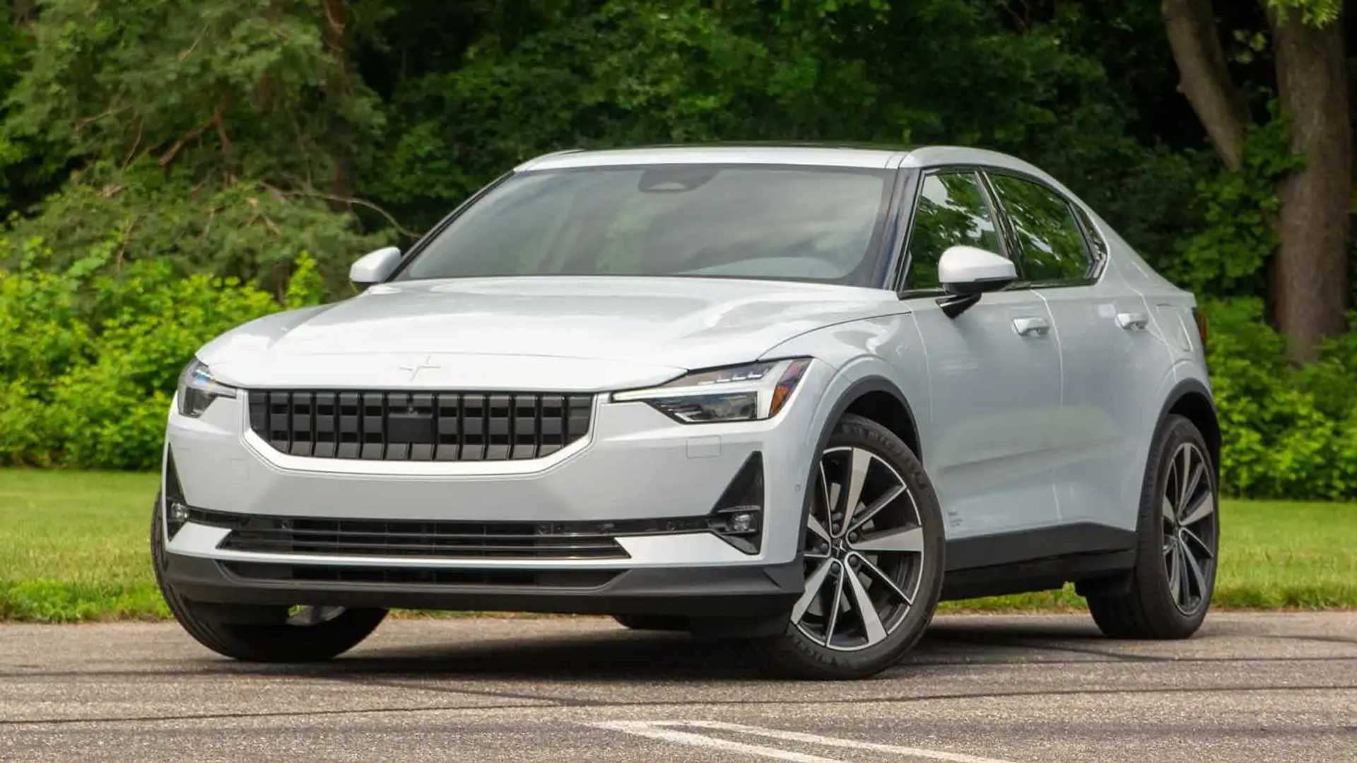
5. Polestar 2
The Polestar 2 uses a clean, modern Android-powered interface that feels polished, but the decision to remove almost all physical buttons creates a dependency on digital interaction that isn’t always ideal.
Climate controls, seat heating, audio functions, and a large portion of vehicle settings live exclusively inside the touchscreen. Even though the software is generally responsive, the absence of tactile shortcuts makes quick adjustments harder.
I’m including the Polestar 2 because it represents a well-designed system that still suffers simply because it tries to replace too much. Small icons require accurate tapping, which becomes challenging on rough roads.

Certain tasks like adjusting airflow or turning on seat heaters, take multiple steps instead of one physical movement. During real-world driving, the driver must repeatedly glance at the screen, turning routine actions into potential distractions.
While the Google integration is impressive and the menus are logical, the lack of hard controls ultimately limits convenience. The Polestar 2 proves that even good software becomes a headache when nothing can be adjusted by feel alone.
Modern car interiors are being shaped by two opposing design philosophies: one that believes tactile buttons remain essential for safe, intuitive driving, and another that pushes aggressively toward fully digital, screen-only control.
These two directions create dramatically different experiences behind the wheel, and the contrast reveals a lot about how drivers interact with technology when the road demands their attention.
This summary brings both sides together, showing why some vehicles succeed by maintaining physical controls while others create unnecessary frustration by burying everyday functions inside touchscreen menus.
The Cars With Helpful Buttons section highlighted models that understand the value of tactile interaction.
Vehicles like the Subaru Outback, Toyota Camry, Honda CR-V, Mazda CX-5, and Ford F-150 earn their place because they blend modern infotainment systems with well-positioned physical controls.
Buttons and knobs reduce glance time, give the driver immediate feedback, and allow key settings to be adjusted by feel rather than sight. In the Outback and Camry, climate and audio adjustments remain refreshingly simple.
The CR-V showcases how a return to physical controls can dramatically improve usability, while the CX-5 demonstrates a thoughtful, driver-centric rotary dial system that avoids touchscreen dependency altogether.
The F-150 reinforces the importance of glove-friendly, rugged buttons in real-world work conditions. These vehicles show that physical controls are far from outdated they are a critical part of safe and stress-free driving.
In contrast, the Screen-Only Headaches section looked at models where digital minimalism compromises practicality.
Cars such as the Tesla Model 3, Volkswagen ID.4, Mercedes-Benz EQS, Range Rover Velar, and Polestar 2 fall into this group not because they lack technology, but because they rely on touchscreens to an excessive degree.
The Model 3 centralizes nearly every function in a single display, removing muscle-memory operation and turning simple tasks into multi-step processes. The ID.4 suffers from laggy software and illogical menus, proving that eliminating buttons requires flawless execution something it lacks.
The EQS overwhelms with its expansive Hyperscreen, offering dazzling visuals but spreading critical functions across layers of digital complexity.
The Velar prioritizes aesthetics over function by placing climate and seat controls into two glossy, menu-shifting touchscreens, while the Polestar 2’s otherwise clean interface still becomes problematic simply because too many essential tasks live behind digital icons.
Across both groups, one conclusion becomes clear: touchscreens are not inherently bad, but touchscreen dependence often is. A well-designed cabin balances digital convenience with tactile clarity.
Cars with physical buttons allow drivers to operate core functions instinctively, even during demanding conditions. Meanwhile, vehicles that push all controls into screens risk increasing cognitive load, extending reaction time, and distracting attention from the road all issues that affect safety and comfort.
As the automotive world continues toward digitalization, the real challenge isn’t choosing screens over buttons but finding the right balance between the two.
The models with helpful buttons show how effective that balance can be, while the screen-only vehicles highlight what goes wrong when usability takes a back seat to minimalist styling. The future of car interiors will likely belong to those automakers who prioritize not just technology, but human-centered design.
Also Read: 5 Cars for St. Louis City Driving vs 5 That Aren’t City-Friendly