
In the modern automotive world, the dashboard has evolved from a simple collection of analog gauges into a sophisticated digital command center.
While technological advancement has brought remarkable benefits to drivers from enhanced safety features to seamless smartphone integration it has also introduced a new challenge: overwhelming complexity.
Today’s vehicles often pack their dashboards with multiple touchscreens, countless menu options, and interfaces that require the same level of concentration as operating a smartphone, all while going through the traffic at highway speeds.
The problem with overcomplicated dashboards goes beyond mere inconvenience. When drivers must go through multiple screens to adjust basic climate controls or struggle to find the right button for essential functions, it creates genuine safety concerns.
The National Highway Traffic Safety Administration has noted that distracted driving remains a leading cause of accidents, and complex infotainment systems contribute significantly to this problem. What was meant to enhance the driving experience has, in many cases, become a source of frustration and distraction.
Automakers have pursued different philosophies in dashboard design. Some have embraced minimalism taken to the extreme, removing physical buttons entirely in favor of touchscreen controls.
Others have created hybrid systems that attempt to balance traditional controls with modern technology, sometimes resulting in a confusing array of overlapping functions.
A few manufacturers have prioritized sleek aesthetics over usability, creating interfaces that look stunning in showroom photos but prove impractical during actual driving.
The vehicles on this list represent some of the most egregious examples of dashboard overcomplication across various segments of the automotive market.
From luxury sedans to electric vehicles, from American muscle cars to European luxury SUVs, these cars demonstrate how the pursuit of innovation can sometimes overshadow common sense.
Each entry showcases different aspects of dashboard design gone wrong whether through excessive touchscreen reliance, counterintuitive menu structures, or simply trying to cram too many features into limited space.
For drivers seeking a straightforward, distraction-free driving experience, these are the vehicles to approach with caution and perhaps a lengthy tutorial session before hitting the road.
1. Tesla Model S and Model X
Tesla revolutionized the automotive industry with its electric vehicles, but its approach to dashboard design has become increasingly controversial.
The Model S and Model X feature a massive 17-inch vertical touchscreen that controls virtually every function of the vehicle, from climate settings to glove box release.
While this minimalist approach looks undeniably futuristic and clean, it creates significant usability challenges that drivers must contend with daily.
The fundamental problem with Tesla’s dashboard philosophy is the near-complete elimination of physical buttons and controls. Functions that traditionally required a simple twist of a knob or press of a button now demand going through touchscreen menus while driving.
Want to adjust the windshield wiper speed? You’ll need to access a menu on the screen. Trying to redirect airflow from the vents? That requires multiple taps on the display. Even adjusting the steering wheel position involves interacting with the touchscreen rather than using a traditional lever.
The learning curve for Tesla’s interface is steep, and even experienced owners report occasional frustration with basic tasks. The touchscreen’s responsiveness can vary, sometimes requiring multiple attempts to register inputs.

In bright sunlight, screen glare can make certain functions difficult to access. During cold weather, the screen may be slower to respond, adding precious seconds to tasks that should be instantaneous.
The lack of tactile feedback means drivers must take their eyes off the road to confirm that they’ve successfully activated the desired function.
Tesla has attempted to address some concerns through software updates, introducing voice commands and steering wheel scroll wheels for certain functions.
However, the voice recognition system doesn’t always understand commands correctly, particularly in noisy environments or with accents. The steering wheel controls, while helpful, can’t access all vehicle functions, forcing drivers back to the touchscreen for many operations.
The over-reliance on the central screen extends to critical safety information as well. The speedometer is displayed on the touchscreen rather than directly in the driver’s line of sight, requiring a significant glance away from the road.
While the Model S eventually added a small driver display behind the steering wheel, the Model 3 and Model Y continue with the single center screen approach.
This design choice prioritizes aesthetics and cost savings over driver ergonomics and safety, creating an environment where accessing basic vehicle functions becomes an exercise in digital navigation rather than intuitive interaction.
2. BMW iDrive System (Various Models)
BMW’s iDrive system, introduced in the early 2000s, was pioneering when it first appeared, but it has evolved into one of the automotive industry’s most complex and divisive interfaces.
Found across BMW’s entire lineup, from the 3 Series to the flagship 7 Series and X7 SUV, the latest iterations of iDrive attempt to offer multiple input methods simultaneously, resulting in a confusing overlap of controls that can overwhelm even tech-savvy drivers.
Modern BMW dashboards feature a combination of touchscreen functionality, the traditional iDrive controller knob, steering wheel buttons, voice commands, and even gesture controls. While having options sounds beneficial in theory, in practice it creates confusion about which method to use for specific tasks.
The gesture control system, for instance, allows drivers to wave their hands in front of the infotainment screen to adjust volume or answer calls. However, these gestures must be precise and deliberate, and accidental activation occurs frequently when reaching for other controls or simply moving naturally while driving.
The menu structure within iDrive has become increasingly deep and nested over the years. Accessing certain settings requires drilling down through multiple submenus, making simple customizations time-consuming and frustrating.

The system offers extensive configurability almost too much with hundreds of settings spread across various categories. Finding a specific option often feels like searching for a needle in a digital haystack. The organization isn’t always logical, with related functions sometimes scattered across different menu sections.
BMW has also fragmented basic controls across multiple locations. Climate controls might be adjusted via the touchscreen, the iDrive controller, voice commands, or dedicated buttons but not all methods access all features.
For example, directing airflow to specific zones might require using the touchscreen, while temperature adjustments can be done with physical buttons. This inconsistency forces drivers to remember multiple interfaces rather than developing muscle memory for a single, reliable method.
The visual design of BMW’s latest iDrive iterations compounds the complexity. The screens display an overwhelming amount of information simultaneously, with multiple widgets, split-screen views, and layered menus all competing for attention.
The curved display in newer models looks impressive but can suffer from viewing angle issues and reflections. Additionally, BMW continues adding features to the system with each model year, from online services to in-car gaming, further cluttering an already dense interface and distracting from the primary purpose: supporting safe, enjoyable driving.
3. Mercedes-Benz MBUX System
Mercedes-Benz’s MBUX (Mercedes-Benz User Experience) system represents the German luxury brand’s attempt to compete with Tesla’s tech-forward approach, but it has introduced its own set of complications.
Debuting in the A-Class and now spreading across Mercedes’ entire lineup, MBUX features dual widescreen displays that blend into a single glass panel stretching across the dashboard. While visually stunning, this system presents numerous usability challenges that can frustrate drivers seeking straightforward functionality.
The MBUX interface relies heavily on touchscreen inputs, though it also incorporates a touchpad on the center console, steering wheel controls, and voice commands activated by saying “Hey Mercedes.”
This multiplicity of input methods creates similar confusion to BMW’s iDrive system. The touchpad, in particular, proves finicky and imprecise, often requiring multiple attempts to select the desired menu option.
The touch-sensitive surfaces on the steering wheel can register unintended inputs from simply gripping the wheel, occasionally changing settings without driver intent.
One of MBUX’s most controversial features is its extensive use of sub-menus and hidden functions. Basic operations like changing drive modes, adjusting suspension settings, or modifying ambient lighting require going through multiple screens.

The system organizes features into various categories, but the logic isn’t always intuitive. For instance, some vehicle settings are found under a “vehicle” menu, while others are tucked away in “displays,” and still others under “system.” Finding a specific function for the first time often requires consulting the owner’s manual or experimenting through trial and error.
The voice recognition system, while more advanced than previous generations, has its own limitations. It struggles with complex commands or multiple requests in a single sentence.
Background noise from the radio, conversations, or road noise can interfere with recognition accuracy. When the system misunderstands a command, it often suggests alternatives that weren’t requested, adding extra steps to accomplish simple tasks.
The wake phrase “Hey Mercedes” must be spoken clearly and deliberately, which feels unnatural during normal conversation and can be awkward with passengers in the vehicle.
Mercedes has also implemented haptic feedback and customizable displays, which sound beneficial but add another layer of complexity. The haptic feedback can be adjusted or disabled, but finding this setting requires predictably diving into menus.
The customizable displays offer dozens of layout options and themes, but deciding which to use and configuring them properly demands significant time investment that many owners simply don’t want to make when they just want to drive their car.
4. Cadillac Escalade with Curved OLED Display
The latest generation Cadillac Escalade showcases American luxury at its most technologically ambitious, featuring a stunning 38-inch curved OLED display that spans the entire dashboard.
This massive screen is actually three displays a 7.2-inch driver display, a 14.2-inch central screen, and a 12.6-inch passenger screen, seamlessly integrated behind a single piece of curved glass. While this creates an undeniably impressive visual statement, it also introduces complexity and distraction that undermines the driving experience.
The sheer size of the display presents its own challenges. Important information is spread across a vast horizontal space, requiring drivers to scan back and forth across the dashboard to monitor different systems.
The central infotainment screen alone is massive, with touch targets for various functions scattered across a large area. Reaching the far edges of the screen, particularly the lower corners, requires leaning forward or extending your arm uncomfortably, which is hardly ideal while maintaining control of a vehicle weighing over three tons.
Cadillac has organized the Escalade’s functions into a tile-based interface that adapts contextually to driving conditions and user behavior. While adaptive interfaces can be helpful, they also introduce unpredictability.

Drivers can’t always rely on muscle memory to find specific functions because the layout shifts. The system learns from usage patterns and prioritizes frequently used features, but this learning period means the interface behaves differently for different drivers, making it confusing when multiple people share the vehicle.
The passenger screen adds another dimension of complexity and potential distraction. It can display navigation, media, or other content independent of the driver’s screen, which is useful for entertainment during long trips. However, the bright OLED display in the driver’s peripheral vision can be distracting, especially at night.
Although privacy features prevent the driver from seeing certain passenger screen content directly, the glow and movement from videos or games remain visible. Adjusting the passenger screen’s content or brightness requires coordination between the driver and the passenger or diving into settings menus.
The Escalade’s user interface also suffers from occasional lag and responsiveness issues despite the impressive hardware. With so much screen real estate and processing power, owners expect an instantaneous response to inputs, but the system sometimes hesitates or requires multiple taps to register commands.
Software updates have improved performance, but the fundamental challenge remains: managing an enormous amount of digital information while operating a large, powerful vehicle demands more attention than traditional, simpler dashboards ever required.
Also Read: 5 Vehicles That Manage Street Parking vs 5 That Need Private Space
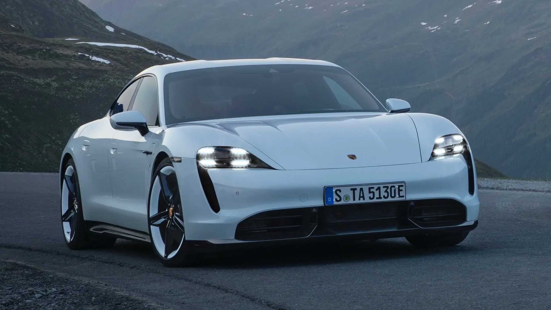
5. Porsche Taycan
Porsche’s first all-electric vehicle, the Taycan, represents the brand’s vision of high-performance driving in the electric age. However, the dashboard design departs significantly from Porsche’s traditionally driver-focused philosophy.
The Taycan features up to four screens depending on the configuration: a digital instrument cluster, a central touchscreen, an optional passenger display, and a lower touchscreen for climate controls.
This screen-heavy approach creates visual clutter and interaction challenges that seem at odds with Porsche’s sports car heritage. The proliferation of screens means constant visual competition for the driver’s attention.
The instrument cluster displays performance metrics and driving information, the central screen handles navigation and media, the lower screen controls climate functions, and the optional passenger screen can show navigation or entertainment content.
During spirited driving, when attention should be focused on the road, these multiple displays present an overwhelming amount of information. The screens use different menu structures and interaction methods, forcing drivers to context-switch between interfaces while driving.
Porsche’s implementation of climate controls on a separate touchscreen deserves particular criticism. Unlike the upper infotainment display, the lower climate screen is touch-sensitive with minimal physical feedback.

Adjusting temperature, fan speed, or airflow direction requires looking down at the screen and carefully tapping the correct virtual button. In a vehicle designed for dynamic driving, this design choice seems particularly misguided.
The screen’s position low on the center stack requires a significant glance away from the road, and the lack of physical buttons means drivers can’t make adjustments by feel alone.
The Taycan’s instrument cluster, while configurable, presents another usability challenge. Drivers can choose from multiple display layouts, including a traditional five-gauge layout, a simplified three-gauge view, or a map-focused configuration.
Each layout presents information differently, and switching between them requires going through menus using steering wheel controls. The configurability is extensive, but it’s overwhelming for drivers who simply want to see speed, battery range, and power output without customizing display layouts.
The interface design feels more complex than necessary for Porsche’s target audience. Many Taycan buyers are experienced performance car enthusiasts who appreciate direct, intuitive controls.
The touchscreen-heavy approach, borrowed from modern consumer electronics, doesn’t translate well to high-performance driving situations.
When going through a winding road at speed, the last thing drivers want is to tap through menus or troubleshoot unresponsive touchscreens, yet the Taycan’s design sometimes demands exactly that.
6. Ram 1500 with Uconnect 5
The Ram 1500 pickup truck is popular among buyers who value capability, comfort, and technology, but the latest Uconnect 5 infotainment system introduces unnecessary complexity to what should be straightforward truck operation.
Available with a massive 12-inch vertical touchscreen, the Uconnect 5 system attempts to modernize the truck’s interior but creates usability challenges particularly problematic for work truck applications and off-road situations.
The vertical orientation of the large touchscreen, while dramatic-looking, presents ergonomic issues in a truck environment. The height of the screen means important functions are positioned either very high (requiring reaching upward) or very low (requiring looking down and away from the road).
Split-screen configurations can display navigation on top and climate controls below, but this separates frequently accessed functions across a large vertical distance. For tall drivers, the top of the screen may be obscured by the sun visor, while shorter drivers might find the upper portions difficult to reach.
Uconnect 5’s menu structure buries many truck-specific functions within multiple layers of touchscreen navigation. Features like trailer brake gain adjustment, differential lock engagement, or off-road mode selection require accessing specific menus rather than dedicated physical switches.

For truck owners who regularly tow trailers or venture off-road, these functions should be immediately accessible. Instead, they’re hidden behind digital interfaces that are difficult to operate while wearing work gloves or driving on rough terrain.
The system’s reliance on touchscreen controls extends to climate functions, with no physical backup buttons for basic operations. In dusty work environments or muddy off-road conditions, the touchscreen can become dirty quickly, making it difficult to register inputs accurately.
The glossy screen surface is particularly problematic in bright sunlight, creating glare that washes out the display and makes certain functions nearly impossible to access.
While the screen includes a brightness adjustment, finding and using this setting when you can’t see the screen clearly presents an obvious chicken-and-egg problem.
Ram has also integrated vehicle settings that affect performance and capability into the Uconnect system, creating situations where adjusting towing parameters or terrain modes requires multiple screen taps.
Competing trucks often provide physical buttons or rotary dials for these critical functions. The touchscreen approach looks modern and saves space, but it compromises the practical usability that truck buyers need and expect from their vehicles.
7. Audi A8 with MMI Touch Response
Audi’s flagship A8 sedan showcases the brand’s MMI (Multi Media Interface) Touch Response system across dual touchscreens that appear sleek and modern but introduce significant complexity and usability concerns.
The system features a 10.1-inch upper screen for infotainment and navigation, plus an 8.6-inch lower screen for climate controls and text input.
While the dual-screen layout provides dedicated spaces for different functions, it also creates confusion about which screen to use for specific tasks and eliminates the intuitive simplicity of physical controls.
The upper touchscreen handles primary infotainment duties, but its menu structure is deeply nested and inconsistent. Common functions require going through multiple levels of menus, and the organization isn’t always logical.
For example, some audio settings are found under media controls, while others are buried in system settings. The touchscreen provides haptic feedback when pressed, which helps confirm inputs, but the feedback is subtle and easily missed when wearing gloves or when road noise is significant.
The glossy screen surface attracts fingerprints and smudges, creating a maintenance issue and potentially obscuring information in certain lighting conditions.

The lower touchscreen dedicates itself primarily to climate control, which sounds convenient but proves problematic in practice. Simple operations like adjusting temperature or changing airflow direction that once required turning a knob now demand looking at a screen and tapping specific areas.
The climate screen includes detailed controls for four-zone climate systems, seat heating and cooling, and air quality settings, but accessing these features means going through sub-menus on a screen positioned low in the center console. This requires a significant glance away from the road, compromising safety for what should be routine adjustments.
Audi has also implemented gesture controls and text input using the lower touchscreen as a writing pad. Drivers can “write” letters with their finger to input navigation destinations or search terms. While this feature demonstrates technical sophistication, it’s impractical while driving.
The system often misinterprets handwriting, requiring multiple attempts to input simple words or addresses. Voice recognition offers an alternative, but like most voice systems, it struggles with unusual place names, accents, or background noise. The result is that drivers often find themselves trying multiple input methods in frustration.
The MMI system’s visual design overwhelms with information density and stylistic elements that prioritize appearance over clarity. Screens display multiple widgets, notifications, and information panels simultaneously, creating visual clutter. The interface uses various fonts, sizes, and colors that look sophisticated in still photos but prove distracting in motion.
For a luxury sedan that should prioritize serene, comfortable transportation, the dashboard demands too much attention and mental energy from drivers who simply want to enjoy the A8’s considerable comfort and refinement.
8. Land Rover Range Rover with Touch Pro Duo
Land Rover’s Touch Pro Duo system, featured in the Range Rover and Range Rover Sport, employs dual 10-inch touchscreens stacked vertically in the center console.
This configuration aims to provide dedicated screens for different functions typically navigation and entertainment on top, climate and vehicle settings below but creates a dashboard environment that feels more like an aircraft cockpit than a luxury SUV.
The system’s complexity is particularly problematic given these vehicles’ intended use for off-road adventures where simple, reliable controls are essential.
The Touch Pro Duo interface suffers from responsiveness issues that have plagued Land Rover’s infotainment systems for years. Despite hardware updates and software revisions, the touchscreens often lag when registering inputs, requiring drivers to tap multiple times or wait for the system to catch up.
This sluggishness is especially frustrating when trying to make quick adjustments while going through challenging terrain or responding to changing weather conditions. The screens occasionally freeze entirely, requiring a system reboot while driving an unacceptable flaw in a vehicle marketed for adventure and remote travel.
The dual-screen layout creates confusion about which screen controls specific functions. Some features can be accessed from either screen, while others are exclusive to one or the other.

The logic governing this separation isn’t always clear, forcing drivers to search both screens to find desired functions. Land Rover includes extensive off-road capabilities and terrain management systems in these vehicles, but accessing and adjusting these critical features requires going through touchscreen menus when drivers should be focusing on obstacles and terrain ahead.
Physical button elimination has been taken to an extreme in the Touch Pro Duo system. Beyond the touchscreens, there are very few tactile controls remaining in the Range Rover’s cabin. Even basic climate controls require using the lower touchscreen, with no physical button backup for adjusting temperature or fan speed.
For a vehicle designed to operate in extreme conditions from desert heat to arctic cold this reliance on touchscreens seems shortsighted. Wearing gloves makes touchscreen operation difficult, cold weather affects screen responsiveness, and dirt or moisture on the screens can prevent proper function entirely.
The system’s complexity extends to the multiple driving modes and vehicle settings available in Land Rover’s terrain response system. While having extensive configurability for off-road driving can be beneficial, the Touch Pro Duo interface makes accessing and understanding these settings unnecessarily complicated.
Multiple sub-menus present numerous options for suspension height, throttle response, traction control settings, and differential locking, but the interface doesn’t clearly explain what each setting does or provide obvious recommendations for specific conditions.
Drivers must either study the owner’s manual extensively or experiment with settings at the wrong moment neither of which is ideal when attempting to traverse challenging terrain.
9. Ford Mustang Mach-E
Ford’s electric Mustang Mach-E represents the brand’s bold step into electrification, but its dashboard design borrows heavily from Tesla’s minimalist-to-a-fault philosophy.
The centerpiece is a massive 15.5-inch vertical touchscreen mounted portrait-style in the center of the dashboard, controlling virtually every vehicle function.
While Ford has retained more physical buttons than Tesla, the Mach-E still suffers from over-reliance on touchscreen controls that compromise usability and driver focus.
The large vertical touchscreen looks impressive and modern but presents the same fundamental issues as other oversized displays. Its height means controls are spread across a large vertical distance, with some functions positioned near the top of the screen (requiring reaching upward and looking away from the road) and others near the bottom (requiring looking down into the center console area).
The portrait orientation feels particularly awkward for displaying navigation maps, which are naturally world-oriented. Split-screen configurations can help, but they reduce the size of individual elements and create visual clutter with information competing for attention.
Ford’s Sync 4 interface running on the touchscreen attempts to organize functions logically, but it still requires too many steps to access basic features.
Climate controls have a persistent bar at the bottom of the screen, which helps, but adjusting fan speed, airflow direction, or defrosting settings requires tapping into expanded menus.

The touchscreen is the sole method for changing drive modes, adjusting steering feel, or modifying the one-pedal driving behavior all functions that drivers might want to adjust frequently and quickly. Physical buttons or a rotary dial would provide faster, safer access to these commonly used features.
The Mach-E’s instrument cluster is a separate 10.2-inch digital display behind the steering wheel, which Ford configures to show basic driving information. However, this screen is smaller than the central display, and Ford prioritizes the touchscreen for most interactions.
The instrument cluster can display navigation prompts and some vehicle settings, but the interface between the two screens isn’t always seamless. Information displayed on one screen doesn’t consistently mirror or complement what’s shown on the other, sometimes forcing drivers to glance back and forth between displays to piece together complete information.
Voice commands via “Okay Ford” offer an alternative to touchscreen interaction, but the system has limitations similar to other voice recognition implementations. It handles simple commands reasonably well but struggles with complex requests or natural language.
The system also requires relatively specific phrasing for certain commands, meaning drivers must learn the “correct” way to ask for functions rather than using intuitive natural language.
When voice commands fail due to misunderstanding, background noise, or system errors, drivers are left going through the touchscreen interface while driving, exactly the distracted driving scenario that voice commands are supposed to prevent.
For an electric vehicle that represents Ford’s technological future, the Mach-E’s dashboard feels like a missed opportunity to truly rethink automotive interfaces rather than simply following Tesla’s problematic example.
Also Read: 5 Cars That Stay Comfortable in LA Traffic vs 5 That Don’t