
Automobiles have changed quickly over the last few decades. Every new model seems to add more features, more technology, and more screens. For many drivers, these additions can be exciting and useful, but for older adults the rapid pace of change can make driving harder.
A senior driver may not want or need an array of buttons, menus, touchpads, or animated displays that shift every time the software updates. Instead, many older adults value straightforward interfaces, big knobs, clear buttons, and predictable behavior.
As vehicles become more computerized, the way drivers interact with them has shifted from mechanical switches to digital menus. Some people find this shift natural, while others feel it increases the risk of distraction and frustration. In everyday driving, the ability to glance at a control and know what it does instantly is important for safety.
A simple design allows the driver to focus on the road and not on figuring out how to change the climate or adjust the radio. This makes the choice of infotainment and controls a real factor in vehicle satisfaction for seniors. For that reason, some SUVs are built with more conventional interfaces that feel familiar to drivers from past generations.
On the other hand, some SUVs have large screens with many layers of options, often prioritizing futuristic looks over fast usability. These designs can be overwhelming, especially if the menus are deep and require attention to navigate. In this article, we look at ten SUVs, five that are known for simpler, senior‑friendly controls and five that are widely recognized for complicated screens with many menus and settings.
Rather than focusing only on performance, price, or styling, this piece zeroes in on how easy it is to operate the essential functions. By examining these vehicles side by side, readers can get a sense of which vehicles make life easier for older drivers and which might challenge their comfort zone.
Readers should keep in mind that individual preferences vary, but for many seniors the core issue is clarity, button feel, and intuitive layout. The goal here is not to rank these vehicles, but to highlight a difference that can matter every time a senior gets behind the wheel.
5 SUVs With Simple Controls for Seniors
")
1. Honda CR‑V
The Honda CR‑V has long been appreciated for its easy‑to‑use interior controls. The climate control features include large knobs and buttons that respond with tactile precision.
The audio system is operated with clear icons and physical buttons rather than hidden menus. When seniors adjust temperature or change radio stations, they can do so without glancing twice.
The steering wheel includes buttons that are spaced well and marked with readable symbols. The infotainment screen is positioned at eye level so it doesn’t force the driver to lower focus.
Most functions are accessible within one or two steps, avoiding deep menu structures. Settings for sound and climate are grouped logically so nothing feels misplaced.
Navigation, when equipped, can be controlled by voice commands or by a rotary dial. Voice controls accept natural speech patterns, helping seniors avoid menu navigation.
Text size on screens can be increased so buttons and instructions are easier to read. The system avoids unnecessary animations that can distract older drivers.
Daytime displays use contrastive backgrounds with large fonts, making everything legible. Brightness and night modes adjust automatically, reducing strain on the eyes.
The CR‑V’s interface does not require a technical background to operate. Functions are predictable, helping seniors feel confident in their control of the vehicle.
Feedback from long‑time owners often notes that buttons feel solid and reassuring. There is minimal reliance on gesture controls or touch zones that react inconsistently.
Even control clusters for heated seats and defrost are simple to locate and use. For a family SUV, the CR‑V focuses on basics rather than technology overload.

2. Toyota RAV4
The Toyota RAV4 is often praised for its intentional simplicity in cabin layout. At the center of the dashboard sits a touchscreen with large, easy‑to‑read icons.
Physical knobs for volume and tuning remain in place so drivers are not forced to tap tiny symbols. Climate functions are controlled by sturdy knobs that respond with firm clicks.
Toyota maintains a consistent interface approach across models so returning users feel at ease. Menus for settings do not bury basic functions beneath layers of submenus.
Unlike some competitors, the RAV4 keeps daily tasks within quick reach. If you want to switch music or change fan speed, it does not take many steps to get there.
The steering wheel offers secondary controls that are clearly labeled and spaced. Voice command options allow drivers to keep their eyes on the road while selecting options.
Large fonts and simple graphics help any driver read information even in bright sunlight. The system avoids excessive color schemes that can make operation visually busy.
Switching between screens does not interrupt what you were doing before. Audio presets, phone connections, and trip information reside on primary tabs.
Bluetooth phone integration is straightforward with clear prompts and buttons. For seniors who appreciate predictability, this layout feels familiar and safe.
Even advanced settings like driver assist features are grouped by purpose. Labels use plain language instead of ambiguous icons that require memorization.
For people who do not want tech complexity, the RAV4 offers a gentle learning curve. Older drivers can operate the essentials with confidence from the start.

3. Subaru Forester
The Subaru Forester interior design emphasizes practicality and accessibility. Large physical buttons sit below the infotainment screen so common functions are easy to find.
The touchscreen itself uses simple tile layouts and does not bury essential features. Climate controls use intuitive symbols with dedicated knobs for heat and fan speed.
Subaru keeps its instrument cluster readable with large text and clear spacing. When headlights or wipers are activated, their controls respond predictably.
The infotainment system allows shortcuts for frequently used functions. Menus do not hide basic tasks beneath an array of secondary options.
The steering wheel provides buttons that are comfortable to reach and easy to differentiate. Phone pairing and media selection occur with understandable prompts.
Volume and media controls remain tactile so drivers feel their input. This reduces the need to stare at the screen while driving. Notifications appear in a straightforward manner without unnecessary animation. Seniors often mention that the Forester does not feel overwhelming at first drive.
Features that are advanced can be turned on or off with simple choices. Navigation, if equipped, can operate with simple voice directions.
Visibility and sightlines in the Forester promote confidence during maneuvers. All key functions feel like they were placed with deliberate intention.
There are no hidden corners in the menu tree for daily tasks. Everything works with a clear sense of purpose rather than flamboyance.

4. Ford Escape
Ford Escape uses a blend of physical controls and touchscreen interaction. Large knobs for volume and temperature are placed where hands expect them.
Buttons for hazard lights, defrost, and fan direction are distinct and easy to locate. Even the touchscreen defaults to a simple home screen with common tasks.
Ford’s interface design allows personalized layouts so frequently used features rise to the top. Drivers can assign shortcuts to functions without stepping into deep setting menus.
The Escape supports voice commands that are designed to answer natural language. With simple prompts, phone calls and media choices can be dictated aloud.
The instrument cluster is clear with bold markings and readable digits at a glance. Daytime and night modes are gentle on the eyes without excessive brightness swings.
Steering wheel controls remain consistent regardless of driving mode selected. This continuity helps seniors get comfortable quickly, even after a break.
Bluetooth and connectivity features do not require complicated steps to pair devices. The system often recognizes previously used devices without repeated input.
Familiar symbols and straightforward labels add to ease of operation. New drivers can understand basic functions without hours of study.
Feedback from drivers who use Escape daily often emphasizes this simplicity. Menus for audio, climate, and phone do not overlap unnecessarily.
Ford avoids hiding secondary functions behind long‑press commands. Keys, knobs, and touch all work together to form a unified experience.

5. Chevrolet Equinox
The Chevrolet Equinox places priority on accessible controls and readable displays. Large physical buttons sit below the dash screen for climate and audio adjustments.
The touchscreen itself uses a grid layout with high‑contrast icons and labels. Simplified home screen options keep the most common tasks visible.
Chevy’s approach keeps basic functions within a single tap from the main page. Audio sources and presets are reachable without scrolling past unrelated menus.
Voice command support enables hands‑free control of common tasks. Phone calls and messages can be handled with audible commands.
The steering wheel features logically placed buttons with noticeable spacing. Volume and track changes are immediate and do not require multi‑step navigation.
Climate options remain predictable whether using knobs or touchscreen taps. This dual approach suits people who like both physical and digital interfaces.
The Equinox’s display avoids flashy graphics that can confuse older eyes. Information is presented without clutter so drivers can interpret it quickly.
Notifications are short and direct, avoiding long explanatory text. Seniors who drive this SUV often remark that nothing feels hidden.
Brightness and night settings can be tuned manually or left on adaptive mode. This helps reduce glare and ensures that icons remain readable at all times.
Chevrolet’s layout keeps buttons familiar and logical by purpose. For drivers who prefer straightforward controls, the Equinox answers that need.
5 SUVs With Overly Complex Screens and Interfaces

1. Tesla Model Y
The Tesla Model Y shifts almost all controls to a central touchscreen. Traditional buttons are nearly absent, requiring drivers to navigate menus.
Climate, suspension, lighting, and even windshield wipers are set through the display. For seniors, this means eyes must leave the road to adjust basic functions.
The screen uses layered menus that require scrolling and tapping to reach settings. There are few physical shortcuts for functions that used to be button‑driven.
Some features require multiple levels of input before they respond. This can make routine adjustments feel like a task.
Navigation and media functions share screen space with driving settings. Accidental touches can change settings unintentionally during operation.
Voice commands exist but require precise phrasing to work as intended. Drivers who are not used to constant screen interaction may feel overwhelmed.
Updates push new layouts and icons without warning, forcing relearning. The lack of familiar knobs and switches removes muscle memory cues.
Brightness and climate controls do not have dedicated physical controls. This can make simple adjustments take longer than expected.
While the technology is innovative, the screen dependency can tax seniors. Many functions demand attention on the display rather than feel on the dash.
There is little tactile feedback to confirm selections without looking. For those who prefer conventional controls, this can reduce confidence.

2. Mercedes‑Benz GLE
The Mercedes‑Benz GLE follows a luxury approach with multiple screens. Driver information sits on a digital cluster that blends into the center display.
Menus are deep, and features are accessed through layers of interface levels. Basic controls may require navigating nested menus instead of immediate buttons.
The touchpad in the center console responds to gestures that do not always feel intuitive. Small icons and scrolling options can be harder to interpret at a glance.
Climate functions are moved into digitized controls rather than dedicated knobs. This blends essential tasks into visually complex screens.
Voice control exists but needs clear phrases to trigger features correctly. The system uses advanced graphics that may distract more than inform.
There is a learning curve to remember where each control lives within menus. Drivers unaccustomed to such systems can feel unsure where to start.
Updates and feature additions adjust how menus are organized. Instead of fixed buttons, many tasks require taps or gestures to activate.
Lighting, comfort, and media settings all live within related menus. This compilation of choices can be rich, but not always straightforward.
Drivers who prefer tactile simplicity may feel the cabin is too tech‑centric. Sometimes the same function appears in multiple menu locations.
This makes first‑time actions less predictable and harder to recall. For seniors used to traditional layouts, this can add cognitive load.

3. BMW X5
The BMW X5 includes a large central display with many options. Menu trees branch outward from main screens into specific categories.
Multiple control means exist, including rotary controllers and touch input. This variety can confuse drivers who do not want to learn several input methods.
The interface balances graphic richness with dense sets of icons. Climate settings are tucked within the screen rather than separate buttons.
Navigation and media controls share real estate and compete for attention. Quick tasks often require searching for the right menu button.
Voice control assists with some functions but still requires accuracy. Not every command has a spoken shortcut, leading drivers back to screens.
Physical buttons exist but are fewer than in simpler layouts. This can give a sense of fragmentation rather than unity in control. The digital instrument cluster changes based on view modes. This dynamic look adds style but means numbers and icons move.
For seniors who prefer stability over change, this unpredictability can frustrate. Some basic tasks may seem buried under sleek visuals.
The X5 interface feels optimized for versatility. But versatility here means more menus instead of fewer direct options. A driver who seeks simplicity may find frequent tasks take longer. This reduces the chance of quick adjustments on the go.

4. Audi Q7
Audi’s Q7 interior features multiple screens and touch‑based controls. Climate settings, once button‑based, are now part of the lower display. Small digital icons replace larger physical buttons that used to occupy the dash. Seniors may find their eyes drawn to locate and capture the right function.
The dual screen design encourages deeper digging into options. Media, navigation, and car settings all reside in separate digital zones. This increases the number of steps to change even minor preferences. Drivers may need repeated glances at the screens rather than quick looks.
Voice control is present but not always responsive without clear dictation. Accented speech or background noise can affect performance further. There remain few tactile anchors to rely on while driving. This can increase distraction for someone who wants a simpler interface.
Gesture controls, where present, add aesthetic flair. However, they often lack the reliability that physical switches provide. This means repeated action may be needed to confirm a setting change. Such repetition can make everyday tasks tedious. For seniors who grew up with conventional knobs, this style can feel distant.
Important functions may be hidden in layers rather than standing out. The interface prioritizes modern looks, which does not always mean faster use. Drivers who favor direct control may find the experience less intuitive.

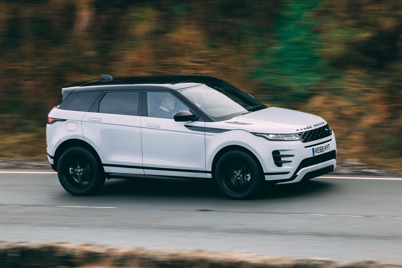
5. Land Rover Range Rover Evoque
The Range Rover Evoque has embraced a sleek interior with minimal buttons. The screens are large and visually striking but ask drivers to navigate deeply. Climate, media, and vehicle settings are part of the same interactive canvas. This makes tasks that used to be simple more involved and screen dependent.
Rotary dials rise and fall but control fewer functions directly. Most adjustments divert attention to digital menus instead. Basic adjustments like fan speed and temperature are not separated out. This can make simple comfort changes a process rather than a tap or turn.
Voice control attempts to lighten the load, but accuracy varies. In cabin noise or accents, the system may misunderstand commands. Text and icon sizes favor stylized design rather than readability. Seniors with vision challenges may struggle with the aesthetic layout.
Updates alter how menus look and where features are hidden. This prevents consistent memory of where tasks reside week to week. Information density on screens is high, meaning eyes must focus more. This takes attention from the driving task itself. Though the Evoque interior is considered elegant by many, elegance here means prioritizing appearance over simplicity.
Drivers who want direct access to essentials may feel challenged. For seniors who prefer proven layouts, this interface can feel distant.