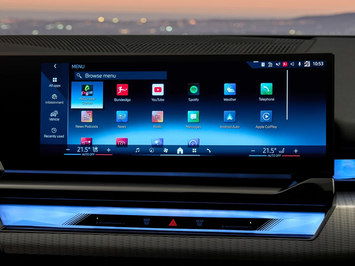
Modern vehicles are defined as much by their software as by their engines. Infotainment systems now control navigation, climate settings, phone connectivity, media playback, vehicle diagnostics, and even driving modes.
In theory, these systems are designed to simplify life behind the wheel. In practice, they can either enhance safety and usability or become a constant source of distraction.
The difference between intuitive and distracting infotainment systems often comes down to design philosophy. Intuitive systems prioritize logical menu structures, quick response times, physical shortcut buttons, and minimal screen clutter.
They reduce the number of steps required to perform common actions and allow drivers to keep their eyes on the road. Clear graphics, responsive touchscreens, and well integrated voice controls can transform daily driving into a seamless experience.
On the other hand, poorly designed systems overwhelm drivers with submenus, delayed inputs, touch sensitive sliders, and buried climate controls.
When basic adjustments require multiple taps or scrolling through digital layers, attention shifts away from traffic conditions. Overly complex interfaces may look modern, but they increase cognitive load and reduce safety.
As vehicles become more connected and software driven, infotainment quality has become a major factor in buyer satisfaction. A powerful engine or comfortable suspension can be overshadowed by a frustrating user interface. Conversely, a well designed system can elevate the entire driving experience.
This article explores both ends of the spectrum. First, we examine five infotainment systems widely regarded as intuitive and user friendly. Then we analyze five systems criticized for constant distraction and overcomplication. Together, they highlight how thoughtful design can either support or undermine the driving experience.
Also Read: 10 Popular Crossovers With Hidden Coolant Leak Problems
5 Infotainment Systems That Are Intuitive
In an era of touchscreen dominance, intuitive infotainment systems stand out by respecting the driver’s time and attention.
The most successful systems combine digital flexibility with physical controls, allowing quick adjustments without deep menu navigation. They are responsive, logically structured, and easy to learn within minutes of use.
An intuitive system minimizes cognitive strain. Large, clearly labeled icons reduce guesswork. Dedicated knobs for volume and climate prevent the need to dig through digital menus. Voice assistants respond quickly and accurately.
Navigation systems display information cleanly without overwhelming graphics. These features may sound simple, but they require disciplined design and extensive user testing.
Another important factor is consistency. When menus follow predictable layouts and similar gestures produce similar outcomes, drivers develop muscle memory. This reduces distraction over time. Lag free performance also plays a major role. Delayed responses can frustrate drivers and tempt repeated taps, increasing attention diversion.
In this section, we focus on five infotainment systems that achieve this balance effectively. Each demonstrates how thoughtful interface design, practical control layouts, and fast processing can make modern vehicles safer and more enjoyable to operate. These systems prove that advanced technology does not have to come at the expense of clarity.
1. Mazda Connect
Mazda Connect stands out in the modern infotainment landscape because it deliberately resists the trend of overwhelming drivers with oversized touchscreens and fully touch dependent controls.
Instead, Mazda has focused on creating a system that minimizes distraction by emphasizing tactile interaction and logical menu organization. At the center of this approach is the rotary control knob located near the gear selector.
This physical controller allows drivers to scroll through menus, select options, and navigate features without repeatedly reaching toward the dashboard.
The benefit of this design becomes clear in real world driving. Rather than hunting for small on screen icons while the vehicle is moving, the driver can rely on muscle memory and tactile feedback.
The menu layout itself is clean and clearly structured, with primary categories such as navigation, communication, entertainment, and settings arranged in an intuitive horizontal format. Submenus are not deeply layered, so commonly used features are accessible within one or two inputs.
Mazda also retains physical buttons for essential functions like climate control and volume adjustment. This separation ensures that frequently used features do not require digital navigation.
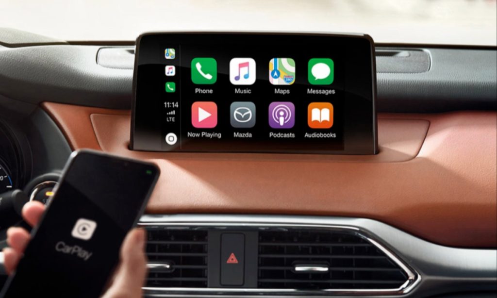
Screen graphics are crisp but not overloaded with unnecessary animations or visual clutter. Response times are consistent, reducing frustration and preventing the repeated tapping that often increases distraction in slower systems.
I am writing about Mazda Connect because it demonstrates that intuitive design does not require flashy visuals or excessive features. Its strength lies in disciplined restraint.
By combining tactile controls with a straightforward digital interface, Mazda has created a system that feels natural within minutes of use. In an era where many infotainment systems compete for attention, Mazda Connect quietly prioritizes driver focus and ease of operation.
2. Toyota Audio Multimedia
Toyota’s Audio Multimedia system reflects a thoughtful evolution toward clarity and responsiveness. Unlike earlier systems that sometimes felt dated or sluggish, the newer interface emphasizes clean design and quick access to essential features.
The home screen is organized into clearly defined sections, typically displaying navigation, audio, phone connectivity, and vehicle information without excessive layering.
Large, well spaced icons improve visibility at a glance. This matters significantly while driving, because drivers can identify and select functions with minimal visual scanning.
Touch inputs register promptly, creating a sense of confidence and reducing the temptation to press buttons multiple times. Faster processing speeds contribute to smoother transitions between menus and applications.
Voice recognition plays a central role in reducing distraction. Drivers can input navigation destinations, adjust cabin temperature, or control media playback using natural language commands.
This hands free functionality allows drivers to maintain focus on the road while interacting with the system. Smartphone integration through widely used connectivity platforms is seamless, enabling easy access to familiar apps without complicated pairing processes.
Importantly, Toyota continues to include physical knobs and shortcut buttons for core adjustments. Volume and tuning controls remain tactile, and climate functions are often separated from the touchscreen interface. This hybrid approach blends digital convenience with traditional accessibility.
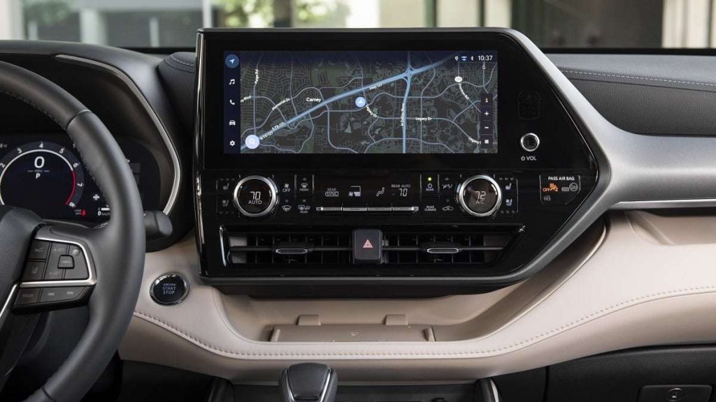
I am including Toyota Audio Multimedia because it exemplifies balance. It does not attempt to impress with overly complex graphics or hidden features.
Instead, it emphasizes usability, consistency, and quick response. By focusing on how drivers actually interact with technology on the road, Toyota has created a system that feels intuitive across a wide range of users.
3. BMW iDrive
BMW iDrive has undergone one of the most notable transformations in automotive infotainment history. Early versions were criticized for complexity, but continuous refinement has shaped it into one of the most intuitive systems available today. Its defining feature remains the multifunction rotary controller positioned within easy reach of the driver.
This controller allows users to scroll, tilt, and press to select, providing a tactile alternative to constant touchscreen interaction. Because it can be operated without direct visual focus, drivers often develop muscle memory for common tasks.
The menu structure is logically arranged into clearly labeled categories such as media, communication, navigation, and vehicle settings. Frequently used functions can be saved to programmable shortcut buttons, further streamlining access.
Modern iDrive versions also incorporate responsive touchscreens and advanced voice commands. The voice assistant understands natural phrasing, enabling drivers to adjust climate settings or set destinations without navigating menus manually.
Graphics are sharp and modern, but information is organized in layers that avoid overwhelming the display.
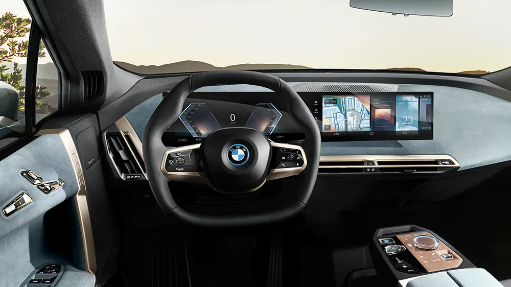
Performance is smooth and lag free, which reduces frustration and distraction. When systems respond immediately, drivers are less likely to repeat commands or divert attention unnecessarily.
I am writing about BMW iDrive because it represents how thoughtful iteration can transform complexity into clarity. By blending tactile controls, digital precision, and strong voice integration, BMW has created a system that supports the driving experience rather than competing with it.
4. Hyundai ccNC Infotainment System
Hyundai’s latest ccNC infotainment system represents a major step forward in intuitive digital design. Unlike earlier interfaces that relied heavily on small icons and layered submenus, this system emphasizes clarity, speed, and visual simplicity.
The wide display integrates digital instrumentation and infotainment into a cohesive layout, yet avoids overwhelming the driver with unnecessary clutter.
The home screen is structured around clearly defined tiles that provide immediate access to navigation, media, phone connectivity, and vehicle settings.
Large text and high contrast graphics improve legibility at a glance, which is crucial when the driver needs information quickly. Touch response is sharp and immediate, minimizing frustration and reducing repeated inputs that can increase distraction.
One of the strongest aspects of the ccNC system is its logical menu hierarchy. Settings are grouped in predictable categories, and transitions between screens are smooth.
Climate controls remain accessible through physical buttons or dedicated touch shortcuts, preventing essential adjustments from being buried within digital layers. This hybrid design reinforces usability while maintaining a modern aesthetic.
Voice recognition has also improved significantly. Drivers can issue conversational commands for navigation, cabin temperature adjustments, and media changes.
The system processes requests quickly, reducing the need for manual interaction. Smartphone integration is seamless, with wireless connectivity providing convenient access to familiar apps.
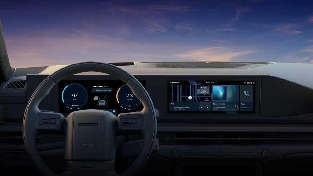
I am including the Hyundai ccNC system because it reflects a thoughtful balance between innovation and practicality. It offers large, visually impressive screens without sacrificing ease of use.
By maintaining physical shortcuts and a clean interface structure, Hyundai demonstrates that advanced technology can remain accessible and intuitive rather than overwhelming.
5. Honda Display Audio
Honda’s Display Audio system has evolved into one of the more straightforward and approachable infotainment interfaces on the market.
Its design philosophy centers on clarity, minimal layering, and responsive performance. The layout is intentionally simple, with large icons arranged in an easy to navigate grid on the home screen.
Drivers can quickly access navigation, media, phone functions, and vehicle settings without scrolling through complex submenus. The screen reacts promptly to touch inputs, reducing lag that often leads to distraction. Clear fonts and uncluttered backgrounds make information readable even during quick glances.
Honda wisely maintains physical knobs for volume and tuning in many models. Climate controls are typically separated from the main screen, ensuring that temperature adjustments do not require digital navigation. This physical and digital blend reduces cognitive load and allows drivers to perform routine actions instinctively.
Voice command integration supports hands free operation. Drivers can request directions, place calls, or change music without removing their hands from the steering wheel. Smartphone connectivity is smooth and reliable, allowing seamless transitions between built in and mobile applications.
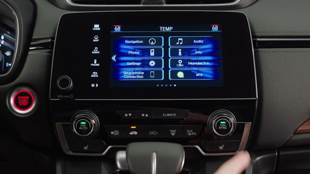
I am writing about Honda Display Audio because it prioritizes function over flash. While it may not feature dramatic animations or overly stylized graphics, it excels in everyday usability.
Its straightforward structure, quick response, and retention of physical controls make it approachable for drivers of all ages. In a market increasingly defined by complex digital interfaces, Honda’s commitment to simplicity stands out as a strength.
5 Infotainment Systems That Distract You Constantly
As infotainment systems grow larger and more feature rich, some have crossed the line from helpful to overwhelming.
In the pursuit of futuristic aesthetics, manufacturers sometimes eliminate physical controls entirely, replacing them with touch sensitive panels and hidden digital layers. While visually striking in a showroom, these systems can demand excessive attention on the road.
Distracting systems often bury basic functions within multiple submenus. Adjusting cabin temperature or fan speed may require navigating through several screens.
Touch sensitive sliders without tactile feedback force drivers to look down repeatedly. Slow processing speeds can further increase frustration, prompting repeated taps and longer visual engagement.
Overly animated graphics and cluttered displays also contribute to cognitive overload. When the interface prioritizes style over clarity, essential information becomes harder to interpret quickly. Even advanced voice systems cannot fully compensate for poor menu design if everyday tasks remain unnecessarily complicated.
In the following section, we examine five infotainment systems frequently criticized for distraction and complexity. Each example highlights how ambitious design choices can unintentionally compromise safety and usability.
1. Ford SYNC 3 Touch Only Configurations
Ford SYNC 3 marked a major improvement over earlier infotainment attempts, but in certain touch heavy configurations it can still become distracting during daily driving.
The system relies primarily on a central touchscreen for navigation, media, phone connectivity, and in some models even climate adjustments. While the graphics are clear and modern, the reliance on touch interaction increases the need for visual attention.
The home screen divides functions into quadrants, which initially appears intuitive. However, accessing deeper settings often requires multiple taps through layered menus.
Adjusting certain vehicle preferences or advanced audio controls demands scrolling and careful selection. When the vehicle is in motion, this process can draw focus away from the road for longer than ideal.
Response times are generally acceptable, but occasional lag can lead to repeated inputs. Even brief delays may cause drivers to look at the screen longer than necessary. In some trims, reduced physical button availability forces reliance on digital controls for functions that could otherwise be handled through tactile switches.
Voice recognition helps mitigate distraction, yet it does not fully eliminate the need for manual interaction. Not all drivers prefer voice commands, and environmental noise can sometimes interfere with accuracy. The absence of strong tactile feedback from on screen buttons further increases dependency on visual confirmation.
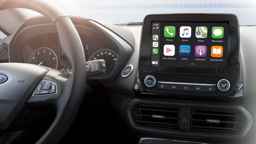
I am writing about Ford SYNC 3 in touch dominant setups because it illustrates how even improved systems can become distracting when physical controls are minimized. While functional and widely adopted, its interface still demands more visual engagement than truly intuitive alternatives.
2. Chevrolet MyLink with Capacitive Controls
Chevrolet MyLink in its capacitive heavy implementations introduced sleek, buttonless surfaces intended to modernize cabin design.
Unfortunately, the shift toward touch sensitive panels often increased driver distraction. Capacitive controls lack physical feedback, requiring drivers to visually confirm each input.
Basic functions such as volume adjustment and menu selection can involve tapping flat surfaces that provide no tactile reassurance. Without the resistance or click of a physical knob, drivers may glance down repeatedly to verify changes. This subtle but persistent distraction accumulates during routine use.
Menu organization in some versions can feel cluttered, especially when multiple apps and settings compete for space on the screen. Icons are not always consistently sized, and certain submenus require additional navigation steps.
While the system supports smartphone integration and voice commands, manual interaction remains common for everyday adjustments.
Screen responsiveness varies depending on hardware generation. In earlier builds, delayed reactions occasionally encouraged repeated taps. This not only frustrates users but also extends the time spent looking away from traffic conditions.
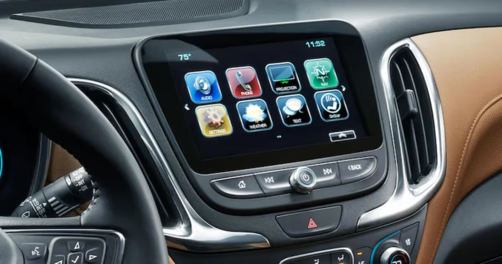
I am including Chevrolet MyLink with capacitive controls because it represents a broader industry trend toward eliminating tactile feedback.
While visually appealing in static settings, the absence of physical interaction can compromise usability in motion. It serves as an example of style overtaking practicality.
3. Lexus Remote Touch Interface
Lexus introduced the Remote Touch interface as a unique alternative to traditional touchscreens. Instead of direct screen interaction, drivers control a cursor using a console mounted touchpad or joystick like controller. While innovative, this approach can create unexpected distraction.
The cursor must be moved across the screen to select icons, similar to operating a laptop. During driving, maintaining steady cursor control can be challenging, particularly on uneven roads. Overshooting targets or selecting unintended options is not uncommon. This forces drivers to refocus on the display for correction.
The system often requires precise movements to highlight small icons. Without strong tactile boundaries, the touchpad may feel sensitive or overly responsive. This sensitivity increases the need for visual confirmation. Menu layers are logically structured, yet the input method itself introduces complexity.
Voice commands are available, but many users still rely on manual navigation for tasks like audio browsing or adjusting settings. Compared to rotary knob systems or simple touchscreens, the Remote Touch approach can feel less natural.
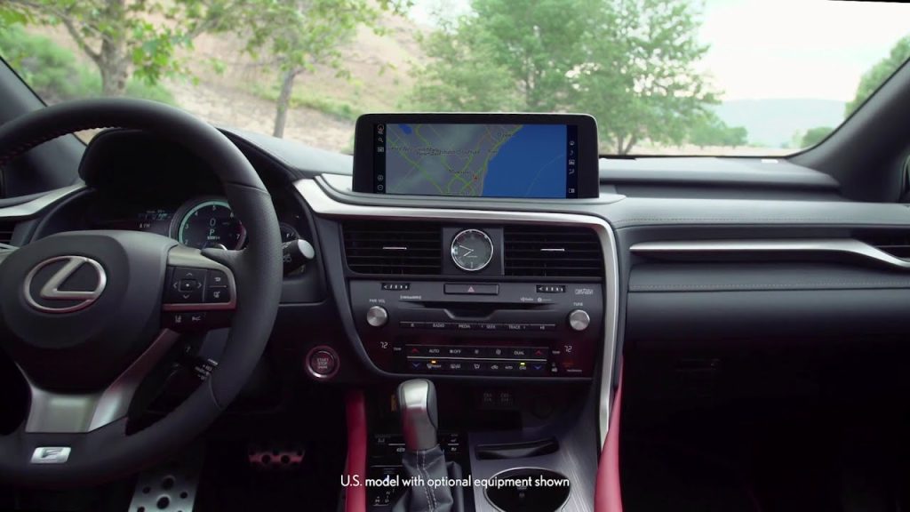
I am writing about the Lexus Remote Touch interface because it demonstrates how alternative input concepts can unintentionally increase cognitive load. While technologically ambitious, its cursor based interaction often demands more attention than traditional controls.
4. Volkswagen MIB Touch Slider System
Volkswagen’s MIB system in its touch slider heavy configuration represents a clear example of modern minimalism creating unintended distraction.
In an effort to produce a clean, futuristic cabin design, Volkswagen removed many traditional physical buttons and replaced them with capacitive touch sliders and digital panels. While visually sleek, this approach often compromises ease of use while driving.
One of the most criticized elements is the touch sensitive slider used for volume and climate temperature adjustments. Without tactile ridges or physical resistance, drivers must glance at the panel to ensure accurate input.
Unlike a traditional knob that can be adjusted by feel alone, these sliders require visual confirmation. In low light conditions, the lack of illuminated markers in earlier versions further complicated operation.
Climate controls integrated into the touchscreen add another layer of distraction. Adjusting fan speed or airflow direction can involve navigating through digital menus instead of pressing dedicated buttons.
This increases the number of interactions required for simple tasks. While the system supports voice commands, many drivers prefer manual adjustments for quick changes.
Menu graphics are clean but sometimes layered in ways that require multiple taps. Even experienced users may need additional attention when switching between vehicle settings and media controls. The overall experience feels modern yet less forgiving during real world driving.
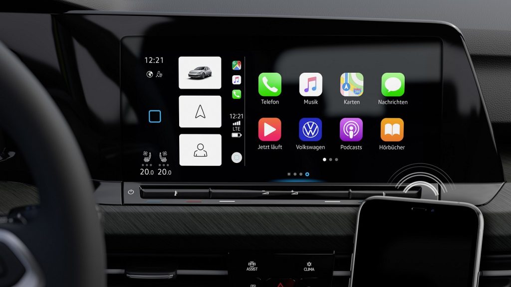
I am including the Volkswagen MIB touch slider system because it highlights how design minimalism can conflict with functional safety. By removing tactile feedback in favor of flat surfaces, it increases visual dependency. The result is a system that looks advanced but often demands more attention than necessary.
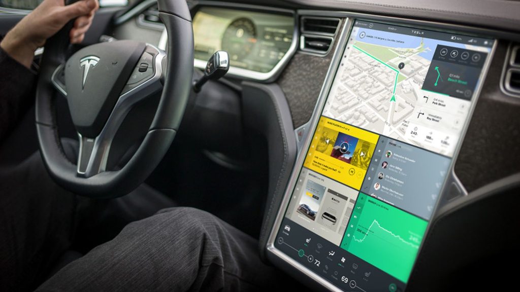
5. Tesla Full Touchscreen Interface
Tesla’s full touchscreen interface is among the most ambitious infotainment systems in the automotive world. Nearly every vehicle function, from climate control to mirror adjustments, is accessed through a large central display.
While the interface is visually impressive and technologically advanced, its heavy reliance on screen based controls can become distracting.
The large display presents abundant information, including navigation, media, vehicle diagnostics, and energy data. However, the absence of physical buttons means even basic adjustments require interacting with the screen.
Changing airflow direction, adjusting wiper speed in certain scenarios, or opening specific vehicle settings often involves navigating digital menus.
The system is generally responsive and features smooth animations. Yet the sheer volume of accessible features can increase cognitive load. Drivers must visually confirm interactions because there is no tactile feedback.
This reliance on visual engagement can draw attention away from traffic conditions for longer periods than traditional control layouts.
Voice commands mitigate some distraction, but not all drivers prefer voice input. Additionally, certain adjustments still require manual selection. The minimalist interior aesthetic eliminates physical redundancy, placing complete trust in the screen interface.
I am writing about Tesla’s full touchscreen system because it represents the extreme end of digital integration. It showcases innovation and flexibility, yet also demonstrates how removing physical controls entirely can elevate distraction risk.
While technologically groundbreaking, its usability depends heavily on driver adaptation and constant visual interaction.
Infotainment systems have become central to the modern driving experience, shaping how drivers interact with navigation, media, climate control, and vehicle settings. As screens grow larger and software becomes more advanced, the gap between intuitive and distracting systems has widened significantly.
Some manufacturers have embraced thoughtful design that prioritizes clarity and safety, while others have pursued digital minimalism or visual drama at the expense of ease of use.
The intuitive systems highlighted in this article share several important traits. Mazda Connect emphasizes a rotary controller and physical shortcuts that reduce the need for constant touchscreen interaction.
Toyota’s Audio Multimedia system focuses on large icons, logical menus, and fast response times. BMW iDrive blends a multifunction controller with strong voice integration and customizable shortcuts. Hyundai’s ccNC interface balances expansive displays with clear menu structure and physical climate access.
Honda’s Display Audio system maintains simplicity, responsive performance, and essential tactile controls. These systems respect the driver’s attention by minimizing unnecessary steps and preserving physical interaction for common tasks.
In contrast, the distracting systems demonstrate how technology can become overwhelming. Certain touch dominant versions of Ford SYNC 3 increase visual engagement due to layered menus and reduced physical buttons.
Chevrolet MyLink with capacitive controls sacrifices tactile feedback, forcing drivers to verify inputs visually. Lexus Remote Touch introduces a cursor based interface that can be difficult to manage while in motion.
Volkswagen’s MIB touch slider system removes traditional knobs, increasing reliance on visual confirmation. Tesla’s full touchscreen interface centralizes nearly every function within a single display, eliminating physical redundancy and raising cognitive load during adjustments.
Ultimately, intuitive infotainment systems reduce distraction by combining clear design, quick response, and tactile accessibility. Distracting systems often prioritize aesthetics or innovation without fully considering real world driving conditions.
As vehicles continue to evolve into software driven platforms, usability will remain just as important as feature count. The most successful systems are those that enhance convenience without competing with the driver’s focus on the road.
Also Read: Top 10 Diesel Trucks That Hold Value Better Than Gold

