
Something interesting is happening in automotive design studios and custom paint shops across the country. Colors that were considered bold, dated, or simply forgotten for decades are reappearing on production vehicles, custom builds, and factory heritage editions with a frequency that is hard to dismiss as a coincidence.
Automakers, restorers, and individual buyers are reaching back to the 1950s color palette with a deliberateness that speaks to how powerfully that decade’s aesthetic has reasserted itself in contemporary car culture.
The 1950s were genuinely extraordinary from a color perspective. American car manufacturers treated paint as part of the entire design statement in a way that had not existed before and would not exist in quite the same form again.
Two-tone combinations, pearlescent finishes, soft pastels applied to large-bodied vehicles, and metallic treatments that caught light in ways the prewar palette never attempted all emerged from that decade. Each color had a name that was itself a design choice, something evocative and aspirational rather than simply descriptive.
What makes this moment particularly interesting is that the return of these colors is not purely nostalgic. Automakers are not simply reprinting old color chips and applying them to new vehicles without consideration.
They are reinterpreting 1950s color philosophy through modern paint technology, producing updated versions of historic shades that retain the emotional resonance of the originals while delivering the durability, depth, and precision required by current production standards.
Custom builders are doing the same thing with even more freedom, mixing historically researched formulas with modern basecoat and clearcoat systems. This page covers ten specific 1950s paint colors that are making genuine returns in current automotive applications, each connected to the original vehicles that made them iconic and to the contemporary cars and trends carrying them forward.
If you have ever looked at a modern car and felt a pull toward something older and more colorful, this list is where that feeling comes from.

1. 1955 Chevrolet Bel Air Tropical Blue, For Contemporary Revival Projects
Tropical Turquoise remains one of the most recognisable colours associated with mid-century American automobiles, and its link with the 1955 Chevrolet Bel Air Sport Coupe is firmly established in automotive history. This shade was carefully balanced, combining a refreshing green influence with a cooling blue presence.
The result was a medium turquoise that felt lively without appearing excessive. When applied to the Bel Air’s flowing body lines and extensive chrome detailing, the colour achieved a visual harmony that few other finishes of the era managed to equal.
The effectiveness of Tropical Turquoise was strengthened by Chevrolet’s thoughtful use of two-tone paint schemes. Pairing the turquoise body with a white or ivory roof created a refined balance between brightness and restraint. The lighter upper section softened the intensity of the colour while allowing the turquoise panels to command attention in a controlled manner. This approach produced a car that appeared confident and polished, appealing to buyers who wanted personality without visual strain.
Contemporary automotive culture continues to draw inspiration from this colour family. Restoration specialists and custom builders working on 1950s vehicles frequently recommend turquoise shades for projects seeking historical accuracy combined with enduring appeal. Paint manufacturers have responded by developing modern formulations that replicate the original hue while providing improved durability and resistance to fading.
These updated coatings allow restored vehicles to retain the character of Tropical Turquoise while benefiting from modern protection standards. Design teams within present-day manufacturers also study colours from this period when developing heritage-influenced palettes. The lasting influence of Tropical Turquoise demonstrates how thoughtful colour selection can define an era and maintain relevance across generations.

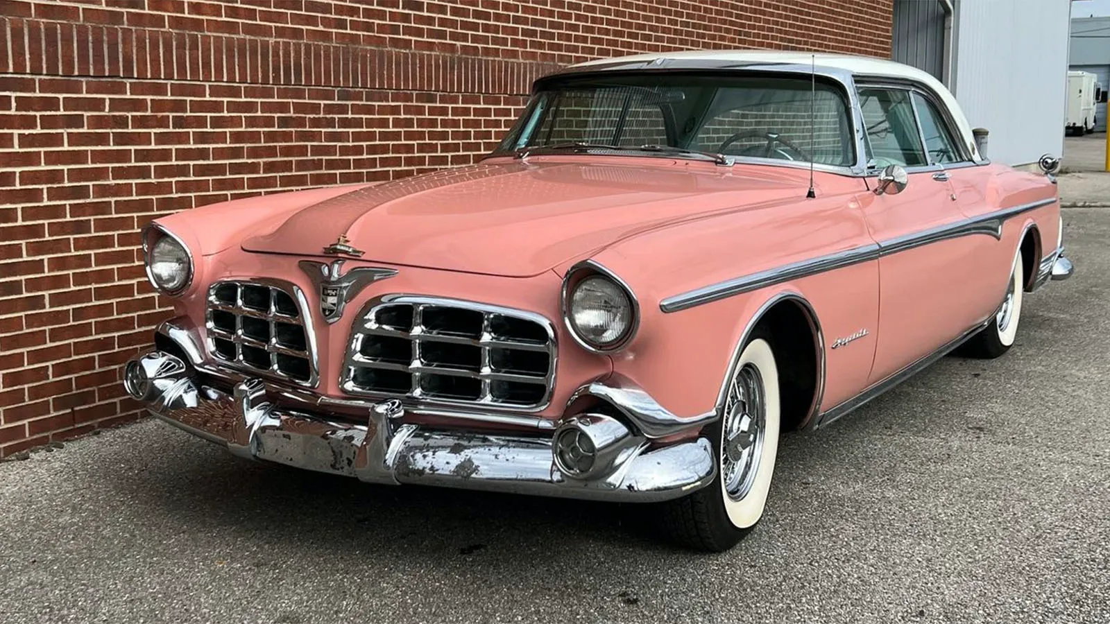
2. Coral Red: The Warm, Refined Alternative Popularised by the 1957 Ford Fairlane
Coral Red represents a distinctive departure from traditional automotive red, blending subtle elements of orange and pink to create a finish that feels warm and approachable. Its association with the 1957 Ford Fairlane 500 Town Victoria highlights how confidently colour was treated during that period. Rather than relying on deep or aggressive reds, Ford introduced a tone that conveyed energy while remaining visually inviting.
This colour worked especially well on the Fairlane’s wide body and pronounced styling features. The gentle warmth of Coral Red complemented chrome accents and horizontal design lines, allowing the vehicle’s proportions to feel balanced rather than overpowering. Buyers seeking individuality without excess found this shade appealing, as it offered personality without straying into harsh visual territory.
Interest in coral-influenced finishes has increased within collector circles, driven by renewed appreciation for rare period-correct colours. Vehicles restored in authentic coral tones tend to attract sustained attention at exhibitions, as the colour distinguishes them clearly from more common finishes. This attention has influenced modern paint suppliers, many of whom now offer coral-inspired options tailored for restoration and custom projects.
Demand from enthusiasts has also shaped market values. Well-preserved examples of the Fairlane finished in original Coral Red often command higher prices than identical models in neutral colours. This pricing behaviour reflects recognition of colour as an essential component of automotive heritage. Coral Red’s continued relevance confirms that thoughtful, unconventional colour choices can remain desirable long after production has ended.
Also Read: 8 Luxury Classics That Are Surprisingly Affordable to Insure

3. Seafoam Green: California Casual Elegance From the 1954 Buick Century Riviera
Seafoam Green is a softer, more muted member of the 1950s green family that occupies a completely different visual and emotional territory from the bold turquoises and saturated aquas that dominate period color discussions. Buick’s application of a seafoam-influenced green to the 1954 Buick Century Riviera hardtop produced a vehicle whose color felt relaxed, sophisticated, and distinctly California in its character, reflecting the growing cultural influence of West Coast lifestyle aesthetics on American product design in the postwar period.
Buick’s 1954 Century was itself a departure from the heavier, more formal Roadmaster positioning that dominated the brand’s lineup, combining a lighter body from the Special with the Roadmaster’s larger engine to produce a vehicle with genuine performance credentials in the mid-1950s sense.
Seafoam Green on this platform communicated that the Century buyer was choosing personality and individuality alongside performance, a buyer profile that was emerging in the mid-decade market as American prosperity enabled more expressive purchasing choices.
Seafoam as a color has experienced a particularly strong return in both automotive and broader design culture in recent years. Automotive design teams at multiple manufacturers cite soft, muted greens as one of the directions receiving increasing attention in color development programs, and early production examples of this trend are already visible in limited edition and special edition model offerings from brands including Mini, Volkswagen, and Hyundai. These contemporary seafoam interpretations are not direct reproductions of 1950s formulations but share the same fundamental color character: enough green to read distinctly, enough grey or sage to feel refined rather than bold.
Contemporary custom builders applying seafoam-family colors to both period American iron and modern performance vehicles consistently report positive audience response, and the color’s association with relaxed, premium California aesthetics gives it a cultural currency that more aggressive period colors do not carry into modern design conversations.

4. Desert Sand: The Understated Classic That the 1956 Mercury Montclair Wore Perfectly
Desert Sand is perhaps the least immediately recognizable color on this list to casual automotive observers, but within the collector and restoration community, it carries considerable prestige as a color that exemplified mid-decade American restraint and sophistication at a time when the market was simultaneously offering the most extravagant color choices in automotive history.
Mercury’s application of a warm, slightly golden sand tone to the 1956 Mercury Montclair Sport Coupe produced a vehicle whose color announced understated confidence rather than the exuberant personality that turquoises and corals projected.
Mercury positioned the Montclair at the top of its lineup for 1956, competing with Buick’s senior models and lower Chrysler products for buyers who wanted near-luxury presentation without full luxury pricing. It was a color for a specific buyer archetype that existed then and exists now, someone who appreciates color precisely because it is not obvious.
Warm, sandy, and greige-adjacent earth tones have been building momentum in automotive production color palettes for several years, driven by the same broader design culture trends that have pushed earth tones into architecture, interior design, and fashion.
This trend has a 1950s precedent in colors like Desert Sand, and automotive journalists and color consultants who have noted the current earth tone trend have made specific connections to mid-century color culture as part of explaining its aesthetic origins.
Production vehicles offering warm sand and desert earth tones in recent model years include offerings from Porsche’s Sand Yellow heritage colors, Toyota’s color palette for the Land Cruiser and Tundra lines, and various truck and SUV brands that have explicitly referenced desert and overland aesthetics in their color naming and marketing.
These contemporary interpretations carry the same fundamental character as Desert Sand on the Montclair: warmth, sophistication, and a deliberate resistance to obvious color choices. Collector examples of the 1956 Mercury Montclair Sport Coupe in Desert Sand with original or period-correct paint command strong auction results that confirm market recognition of this color’s quality and distinctiveness, providing evidence that its understated character was never ordinary but has simply been waiting for the broader culture to recognize it again.

5. Horizon Blue: The Soft, Atmospheric Blue That Defined the 1958 Edsel Citation Beyond Its Reputation
Horizon Blue, as applied to the 1958 Edsel Citation four-door hardtop, stands as one of the most refined pale blue finishes produced during the late 1950s. This colour occupied a restrained space within the blue spectrum, presenting a cool and airy appearance shaped by subtle silvery undertones.
Rather than appearing playful or juvenile, the shade conveyed calm sophistication, allowing the large body surfaces of the Citation to carry light with elegance. When viewed under daylight, the paint reflected a gentle brightness that softened the car’s bold styling rather than competing with it.
The Edsel’s styling has long attracted strong opinions, yet Horizon Blue revealed how colour could rebalance perception. On wide panels and expansive rooflines, this pale blue introduced visual calm, reducing the severity of the car’s controversial design features. The finish photographed exceptionally well, especially in promotional imagery, where its luminous quality gave the vehicle a premium character that showroom criticism often overlooked. Colour choice, in this instance, demonstrated its power to redefine first impressions.
Modern automotive palettes have returned to similar pale blues with cool undertones, particularly among luxury brands seeking understated refinement. These contemporary finishes rely on the same principles that defined Horizon Blue, favouring lightness, restraint, and tonal depth rather than bold saturation. Such colours appeal to buyers who value subtle distinction without visual noise.
Among restorers and custom builders, Horizon Blue remains a respected reference point for period correct projects aimed at elegance rather than theatrical display. Selecting this colour signals a thoughtful engagement with automotive history, acknowledging that even vehicles burdened by reputation can reveal unexpected beauty when presented with the right visual treatment.

6. Autumn Bronze: The Warm Metallic Expression That Gave the 1953 Studebaker Commander Its Timeless Presence
Autumn Bronze on the 1953 Studebaker Commander Starliner hardtop coupe represents a thoughtful union between colour and design. This warm metallic finish blended brown and gold undertones into a surface that conveyed richness without excess. Applied to a body shape widely praised for its advanced proportions, the colour enhanced the Starliner’s flowing lines and subtle curvature, reinforcing the vehicle’s forward-looking character during a period dominated by heavier visual themes.
Bronze carries long-standing associations with durability and substance, qualities that aligned well with Studebaker’s ambition to present the Commander as a refined alternative to larger manufacturers. On automotive sheet metal, Autumn Bronze displayed remarkable adaptability.
Direct light revealed golden warmth, while shaded areas deepened into a restrained brown, giving the vehicle visual depth that changed with movement and environment. This behaviour rewarded close observation rather than immediate spectacle.
Interest in warm metallic finishes has been increasing within contemporary automotive design, influenced by renewed appreciation for mid-century colour intelligence. These tones project maturity and permanence, offering an alternative to bright metallics and neutral greys. The continued relevance of such finishes confirms that Autumn Bronze was far ahead of its time in both restraint and confidence.
Collectors and restoration specialists frequently recommend this colour for Studebaker projects because it respects the vehicle’s design intent while setting it apart from more predictable period choices. At shows and exhibitions, Commander Starliners finished in Autumn Bronze attract sustained attention rooted in appreciation rather than surprise, affirming the colour’s enduring authority within automotive history.

7. Glacier White Pearl: The Luminous White That the 1959 Cadillac Eldorado Biarritz Demanded
White might seem like an obvious choice for any decade’s automotive palette, but Glacier White Pearl on the 1959 Cadillac Eldorado Biarritz convertible was not white in any simple or ordinary sense. Cadillac’s application of a pearlescent white with warm undertones and a subtle luminosity to what remains the most dramatically finned production vehicle in American automotive history created a visual combination that has never been fully surpassed in terms of sheer automotive spectacle.
Glacier White Pearl gave the Biarritz a presence that solid white could not have produced, because the pearl’s depth and luminosity responded to light in ways that made the already extraordinary body design appear almost animated in the right conditions.
Pearl and pearlescent white applications in current automotive production have become substantially more sophisticated over the past decade, with manufacturers developing multi-layer pearl formulations that come closer to the visual character of mid-century pearlescent applications than the simpler mica-based whites of the 1980s and 1990s. Lexus’s Eminent White Pearl, BMW’s Mineral White Metallic, and Genesis’s Snow White Pearl each represent different interpretations of the luminous, multi-depth white philosophy that 1950s Cadillac applications pioneered at the production scale.
High-end custom builders applying Glacier White Pearl or historically researched approximations of it to restored 1959 Cadillac Eldorado Biarritz examples report consistent responses from show audiences that place these cars in a separate category of presence from equivalently spec’d cars in other colors.
The combination of the most dramatic American production body design and a luminous pearl white that amplifies its sculptural qualities creates a visual result that justifies every aspect of the restoration investment required to achieve it correctly.

8. Pompeiian Red: The Deep, Earthy Red That the 1956 Chrysler 300-B Wore With Authority
Pompeiian Red is not the bright, cheerful red that appears in most period automotive discussions. Named with deliberate reference to the deep, earthy terra cotta tones found in ancient Roman decorative art, this is a red with serious brown undertones that produces a color that reads as substantial, authoritative, and historically resonant rather than exciting or celebratory.
Chrysler’s application of this shade to the 1956 Chrysler 300-B hardtop coupe created a vehicle whose color communicated exactly what the 300-B was: a serious, powerful machine built for drivers who wanted performance wrapped in sophisticated visual presentation.
Chrysler’s 300 letter series of the 1950s occupied a unique position in the American market as genuine high-performance vehicles that also carried premium luxury specifications, and the 300-B’s 355-horsepower Hemi engine made it the most powerful American production car of its year. Pompeiian Red on this platform was not a playful color choice. It was a declaration of seriousness and quality that matched the vehicle’s engineering ambitions with equal visual authority.
Deep, earthy, brownish reds have been appearing in current production vehicle palettes with increasing frequency as color designers reach beyond the conventional red family for options that feel more mature and distinctive.
Alfa Romeo’s Etna Red, Audi’s Catalunya Red Metallic, and Porsche’s Carmine Red each represent different positions within the deeper, more earthy red family that Pompeiian Red pioneered in the 1950s production context. These contemporary interpretations carry the same fundamental character: a red that is more sophisticated than it is energetic, more authoritative than it is playful.
Collector market recognition of Pompeiian Red examples of the 1956 Chrysler 300-B is strong and growing, with auction results showing consistent premiums for original or correctly restored examples in this color over equivalent cars in more common black or white applications.
The color’s rarity at original production, combined with its sophisticated character, makes it a prize within Chrysler 300 collector communities that reflects genuine historical appreciation rather than simple vintage nostalgia.

9. Caspian Blue: The Dark, Expressive Blue Forever Linked to the 1957 Pontiac Star Chief Custom Safari
Caspian Blue, as applied to the 1957 Pontiac Star Chief Custom Safari wagon, stands as one of the most emotionally expressive blue finishes of the postwar American automotive period. This paint shade drew its name from the Caspian Sea, a body of water known for dramatic colour variation under changing light.
That same quality defined the finish on the Star Chief, where the paint shifted between deep navy tones in shade and a richer, more luminous blue when sunlight touched its surface. Such visual depth gave the vehicle a commanding presence without relying on brightness or novelty.
Pontiac’s styling philosophy during the late 1950s supported colours of this nature exceptionally well. Long body panels, strong horizontal lines, and expansive sheet metal created uninterrupted surfaces that allowed Caspian Blue to display its layered character fully.
Chrome accents along the sides acted as visual guides, drawing attention to how the colour moved across the body rather than breaking it into fragments. Smaller vehicles of the same era lacked the physical scale required to present this shade with equal authority.
Modern automotive design has renewed interest in deep blues with layered tone and restrained elegance. Contemporary luxury manufacturers now invest heavily in dark blue finishes that project confidence without visual excess. This renewed appreciation mirrors what Pontiac achieved decades earlier with Caspian Blue, confirming that carefully executed colour choices can retain relevance long after production ends.
Collectors and custom builders continue to favour Caspian Blue for restored 1950s station wagons, particularly those with strong proportions and extensive body length. When displayed under proper lighting, a correctly finished Star Chief Custom Safari still commands prolonged attention, proving that this colour remains powerful long after its debut.
Also Read: 8 Iconic Classic Cars That Were Originally Designed for the Military

10. Chartreuse Gold: The Bold Yellow Green Statement Introduced by the 1954 Kaiser Manhattan
Chartreuse Gold, as featured on the 1954 Kaiser Manhattan four-door sedan, represents one of the most daring factory paint decisions of its era. This yellow-green metallic finish challenged accepted ideas of automotive taste at a time when conservative hues dominated showroom floors. Rather than seeking mass appeal, Kaiser chose a colour that demanded engagement, creating a vehicle that provoked immediate reaction rather than quiet acceptance.
The Kaiser Manhattan itself provided an ideal canvas for such a strong colour choice. Clean body lines, balanced proportions, and restrained ornamentation allowed the paint to take visual priority without overwhelming the design. The low beltline and broad surfaces ensured that Chartreuse Gold read as intentional and confident rather than excessive. This harmony between colour and form remains central to its lasting appeal.
Modern automotive culture has gradually reopened space for colours that reject neutrality. High-performance and luxury manufacturers now offer vivid greens and yellow-infused tones to buyers seeking personal distinction through colour. These modern applications follow the same philosophy that guided Kaiser’s designers, treating paint as a statement rather than a background decision.
Interest in Kaiser vehicles has increased as collectors reassess the brand’s design ambition beyond its commercial struggles. Correctly restored Manhattan sedans finished in Chartreuse Gold attract sustained attention at shows, not because of rarity alone, but because the colour communicates design bravery.
Contemporary paint technology now allows this shade to achieve depth, durability, and consistency beyond what mid-century materials could deliver, ensuring its story continues with renewed visual authority.