
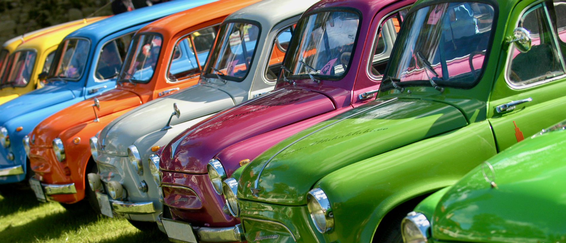
Color is one of those things that either works or it does not, and with classic cars, getting the color right is as important as getting the engine right. A beautiful car in the wrong color is like a great song played in the wrong key. Technically present, technically correct, but missing something essential that makes it feel alive.
Bright primary colors have a specific relationship with classic car design that modern vehicles rarely replicate with the same success. Red, yellow, blue, orange, and their closest relatives do something to a classic car’s body lines that neutral tones and metallic finishes simply cannot achieve.
They make curves look more dramatic. They make horizontal lines look longer and lower. They make a car that was already visually interesting look like it is about to move, even when it is sitting still in a parking lot. Part of this is historical. Classic cars from the 1950s through the early 1980s were designed in an era when color was used aggressively and confidently across consumer products, architecture, and fashion.
Automotive designers of this period understood how to draw body lines that would look spectacular in saturated color, and many of the most celebrated classic designs were conceived with vivid paint in mind from the earliest sketch stage.
Part of it is also the material finish. Single-stage paint systems used on most classic cars through the 1970s produce a depth and richness in primary colors that modern base-coat clear-coat finishes rarely match, because the color and gloss exist in a single layer rather than being separated by a clear coating over a color base.
This list covers 10 classic cars that definitively demonstrate that bright primary colors were not a choice but a calling. These vehicles were born for bold color, and the examples that wear it best stand as some of the most visually arresting machines ever built.

1. Ferrari 250 GT Berlinetta (1959-1962)
Ask anyone outside the automotive enthusiast community to picture a Ferrari, and the image that forms in their mind is almost always red. Not burgundy, not maroon, not crimson. Red. Bright, saturated, unapologetic Rosso Corsa.
And while that association extends across the entire Ferrari brand history, no model makes the case for red as a visual necessity more powerfully than the 1959 to 1962 Ferrari 250 GT Berlinetta, commonly known as the SWB for its short wheelbase configuration.
Pininfarina’s body design for the 250 GT Berlinetta is a masterclass in using surface tension and proportion rather than decoration to achieve visual impact. Long hood, short rear deck, fastback roofline, and wide haunches over the rear wheels create a body that reads as purposeful and athletic from every angle.
In silver, white, or dark blue, this design is beautiful. In Rosso Corsa, it becomes something else entirely, a visual statement so direct and so complete that it requires no supporting context to communicate its message. Red works on the 250 GT Berlinetta for a reason that goes beyond simple color preference.
Ferrari’s designers created body surfaces that catch and reflect light across a wide area, which means that in a saturated color, the car changes dramatically as the viewer moves around it. What appears as a flat red panel from one angle becomes a gradient of crimson to near-orange in bright sunlight from another, and this dynamic quality gives the car a visual life that darker or lighter colors suppress.
Racing provenance adds a dimension to the red 250 GT Berlinetta that other cars cannot claim. These vehicles raced at Le Mans, at the Tour de France Automobile, and at circuits across Europe in competition specification, typically in Italian racing red. When you see a red SWB today, you are not just seeing a color choice. You are seeing a color that was present at racing events where these cars competed against the best drivers and vehicles of their era.
Original factory color documentation for surviving 250 GT Berlinetta examples confirms that Rosso Corsa was by far the most frequently specified exterior finish, which tells you that buyers of these cars at the time understood something that paint trends have never changed: this car was designed for red, and in red, it is among the most beautiful automobiles ever constructed.

2. Chevrolet Camaro SS 396 (1969)
A defining moment in American automotive styling emerged with the 1969 Chevrolet Camaro SS 396, a model that combined assertive engineering with an exceptionally bold colour programme. During this period, Chevrolet introduced a range of vivid factory finishes that aligned closely with the car’s muscular proportions.
Among these, Hugger Orange stood out as a shade that became closely associated with the Camaro identity, while alternatives such as Daytona Yellow, Fathom Green, and Dusk Blue reinforced the brand’s willingness to present performance vehicles with striking visual character.
The relationship between colour and form in the Camaro SS 396 was carefully realised. Its body structure featured a wide stance, a relatively low height, and a long bonnet that transitioned into a short rear section. Pronounced front fenders created a sense of strength, particularly around the wheel arches, where subtle contouring suggested stored power.
Such proportions benefited from colours that could emphasise width and presence rather than vertical height. Saturated tones achieved this effect by spreading evenly across the body panels, thereby highlighting the car’s stance and giving it a more grounded appearance.
Hugger Orange, in particular, assumed a unique position within automotive culture due to its strong association with this model year. The intensity of the shade allowed the Camaro’s clean surfaces to be presented without distraction, ensuring that its design language remained clearly visible.
Daytona Yellow offered a similarly compelling presentation, though it required a body form capable of supporting such brightness. Many vehicles with intricate detailing struggle to maintain visual coherence in yellow, as the colour tends to expose inconsistencies in proportion.
The Camaro’s relatively straightforward surface treatment allowed yellow to appear balanced and confident, reinforcing the impression of speed and width. Production figures indicated that these vibrant finishes were widely accepted by buyers rather than being limited selections.
A considerable portion of vehicles left the factory in such colours, reflecting a strong alignment between design, manufacturing intent, and consumer preference. The result was a model that successfully integrated visual identity with mechanical capability, leaving a lasting impression within the history of American performance automobiles.
Also Read: Top 10 Practical Classic Cars From the 1970s That Make Great Daily Drivers

3. Porsche 911 Carrera RS 2.7 (1973): German Precision Found Its Perfect Color Match
Careful engineering and purposeful styling defined the 1973 Porsche 911 Carrera RS 2.7, a vehicle developed to meet homologation requirements while maintaining usability on public roads. Its visual presentation was closely aligned with its mechanical intent, particularly through the use of Grand Prix White as a base finish combined with Carrera script graphics applied along the lower body panels.
This arrangement functioned as more than a decorative feature; it communicated the car’s motorsport heritage with clarity and precision. Design characteristics of the 911 contributed greatly to the effectiveness of its colour schemes. The vehicle’s proportions included a relatively low roofline, a continuous body surface extending from the front to the rear, and a distinctive rear-engine layout that influenced its visual balance.
These attributes allowed strong colours to define the car as a unified form rather than a collection of separate panels. Solid finishes such as Guards Red and Bahia Red emphasised this continuity, presenting the body as a cohesive structure with minimal interruption.
Blue variants of the Carrera RS 2.7 have attracted particular attention among collectors due to their ability to enhance the car’s sporting presence. Shades such as cobalt and royal blue introduced a sense of depth to the curved surfaces, reinforcing the impression of mechanical precision. When maintained in original condition, such examples command admiration in both private collections and public exhibitions.
Market observations indicate that vehicles retaining their original colour specifications often achieve higher valuations, reflecting the importance of authenticity in collector circles. This trend demonstrates how closely colour selection is tied to the identity of the Carrera RS 2.7.
The integration of engineering, design, and visual presentation ensured that the model remained distinctive, reinforcing its position as one of the most respected performance vehicles of its era.

4. Ford GT40 Mk I (1964-1969): Racing Blue Became This Car’s Permanent Identity
Racing vehicles develop color associations through competition history rather than marketing decisions, and the Ford GT40’s relationship with Gulf Racing’s iconic Gulf Blue and Orange livery is one of the most powerful color associations in motorsport history.
But beyond the Gulf livery that most people picture, the GT40 in solid primary colors, including Ford’s own competition blue and vivid red, presents a case for primary color as a design element that stands completely independent of any specific racing livery’s historical associations.
Low body height of approximately 40 inches, which gave the GT40 its name and its most distinctive proportional characteristic, means that the car presents a visual profile unlike any other vehicle of its era. At 40 inches tall, the GT40 is lower than many racing motorcycles, and this extreme horizontal proportion transforms how color reads on its body surfaces.
Bright primary colors on such a low car create a visual effect that higher-profile vehicles cannot replicate, because the color’s horizontal extent so dramatically exceeds its vertical extent that the eye reads the car as a single bold horizontal statement rather than a three-dimensional object.
Gulf Blue, while technically a light blue rather than a deep primary blue, opened the visual conversation about what blue could accomplish on the GT40’s body. Subsequent owners and restorers who chose solid royal blue or cobalt blue finishes found that deeper blue tones gave the car a visual seriousness that the lighter Gulf shade, beautiful as it is in context, could not quite achieve on a solid-color car without the accompanying orange accents.
Red GT40s occupy a specific place in the car’s visual history because red was a factory color option for road-specification models, and the red GT40 communicates its Italian-fighting purpose with a directness that no other color achieves quite as immediately.
Standing next to a red GT40 Mk I is the automotive equivalent of understanding immediately, without any technical explanation, why Ferrari took this car’s competition presence so seriously during the 1960s.

5. Alfa Romeo Giulia Sprint GTA (1965-1969)
Italy’s racing color is red, and no Italian manufacturer has worn red more consistently or more convincingly than Alfa Romeo across its competition history. Among Alfa Romeo’s most celebrated competition models, the Giulia Sprint GTA of 1965 to 1969 presents red as a color that is not merely applied to the car’s surface but is genuinely part of its identity in a way that changing the color would fundamentally alter what the car communicates about its origins and purpose.
Bertone’s body design for the Giulia Sprint Coupe, which the GTA inherited in lightweight aluminum form, is a study in restrained elegance that uses surface tension rather than decoration to achieve visual interest. Clean greenhouse proportions, a simple shoulder line running from front to rear fender, and a grille treatment that is functional rather than ornamental create a body that looks well-resolved and purposeful without relying on visual complication.
In red, this clean surface language reads as confident and complete, with the color doing the communicative work that other designs might achieve through additional styling elements. Lightweight aluminum body panels on the GTA were painted in Alfa Romeo’s Rosso Corsa in factory racing specification, and the slightly different surface texture that aluminum panels produce under paint compared to steel panels gives a well-prepared GTA an almost translucent quality in red that steel-bodied cars cannot quite match.
Collectors who have examined both steel-bodied Giulia Sprint Coupes and aluminum GTA examples in comparable red paint consistently describe the GTA’s surface as having a quality that is difficult to define precisely but immediately perceptible.
Period racing photographs of GTA examples competing in European Touring Car events through the late 1960s show the car in competition trim with minimal decoration beyond racing numbers and required safety markings, and these images make a more powerful argument for red as the GTA’s defining color than any concours presentation in pristine condition could achieve. Racing context strips away everything secondary and reveals a car that was always, at its foundation, red.

6. Dodge Viper GTS (1996-2002)
Chrysler’s adoption of a vivid blue finish, combined with dual white racing stripes extending from the front fascia to the rear, represented a carefully considered decision that shaped the identity of the Dodge Viper GTS. This colour arrangement was not introduced merely for visual appeal; it established a lasting association between the vehicle and a distinctive aesthetic that became widely recognised during the late twentieth century.
Viper Blue emerged as a defining feature of the model, comparable to how certain colours have become closely linked with other high-performance marques. An appreciation of this colour scheme requires an understanding of the vehicle’s design foundation. Influences from American sports racing heritage were evident throughout the GTS, particularly in its elongated bonnet, pronounced front fenders, and side-mounted exhaust outlets.
Inspiration drawn from earlier performance vehicles associated with Carroll Shelby could be observed in its proportions, which conveyed strength and purpose. The blue and white stripe configuration reinforced this lineage, referencing a tradition rooted in competitive racing history.
Body construction of the Viper GTS relied on wide, uncomplicated surfaces that allowed its bold proportions to be clearly expressed. The expansive fenders accommodated a broad track width without the need for excessive external additions.
This simplicity of form allowed the blue finish to be displayed across large sections of the body, creating a strong visual presence even from a distance. The white stripes introduced a structured graphic element, dividing the colour field in a manner that enhanced the overall composition and conveyed deliberate design intent.
Experience among collectors indicates that this factory colour combination consistently attracts public attention in a manner that alternative finishes seldom achieve. While monochrome versions possess their own appeal, the blue and white arrangement aligns closely with the car’s proportions and purpose, resulting in a more recognisable presentation.
Red examples of the Viper GTS offer a different visual character, emphasising the aggressive nature of its 8.0 litre V10 engine. Both colour options demonstrate that the vehicle’s design accommodates strong visual statements, reflecting an approach that prioritised boldness from the earliest stages of development.

7. Lamborghini Miura P400S (1969-1971)
Visual distinction defined the Lamborghini Miura P400S, a model that represented an ambitious approach to automotive design even before the application of colour. Developed under the direction of Ferruccio Lamborghini and styled by Marcello Gandini at Bertone, the Miura displayed a sculptural form that challenged conventional expectations. Its flowing surfaces and carefully shaped contours created a striking presence that demanded an equally confident colour treatment.
Giallo Fly, the bright yellow offered for the Miura, proved particularly effective in presenting the car’s design. This vivid shade provided clarity to the body’s intricate geometry, allowing its curves and lines to be perceived as a unified composition rather than a collection of separate panels.
Light interacting with the yellow surface produced a continuous visual effect, enhancing the perception of fluidity across the car’s form. Such an outcome could not be achieved as effectively with more subdued colour choices.
The P400S specification introduced refinements that improved both comfort and visual stance. Wider tyres and revised suspension contributed to a lower and more assertive posture, while the inclusion of air conditioning increased usability.
When combined with the brightness of the yellow finish, these physical attributes created a cohesive appearance that conveyed both performance and elegance. Observers often remarked that the car’s presence in person carried an immediacy that static images could not fully represent.
Alternative colours also provided appealing interpretations of the Miura’s design. Orange finishes, for instance, introduced a warmer visual tone that emphasised depth and curvature differently. Red examples maintained a traditional association with Italian performance cars and remained a popular selection among buyers.
Despite these alternatives, many automotive historians and design analysts regard yellow as the most effective representation of the Miura’s styling intent. This preference reflects the manner in which the colour reveals the full character of Gandini’s design, allowing the vehicle’s form to be appreciated in its most coherent and expressive state.

8. Plymouth Barracuda ‘Cuda 440 Six Pack (1970)
Plymouth’s 1970 model year color palette for the Barracuda was assembled with an aggression that matched the performance specifications of the cars it would paint, and Vitamin C Orange, officially designated FC7 in Chrysler’s color coding system, became so identified with the 1970 ‘Cuda that separating the car from the color in the cultural memory of American muscle car enthusiasts is essentially impossible.
E-body Barracuda body design for 1970 was a genuinely new shape that replaced the previous generation’s more conservative proportions with a wider, lower, more dramatic profile. Wide hips over the rear wheels, a long hood with pronounced power bulge, and a short rear deck created a body that communicated physical aggression before any performance specification was consulted.
Vitamin C Orange on this body design worked because the color’s high visibility and warm temperature matched the car’s proportional aggression with a visual energy that cooler or darker colors could not generate.
Chrysler’s E-body was designed with wide surfaces that benefited from bold color presentation, and the 1970 color palette that included Vitamin C Orange, Plum Crazy Purple, and Limelight Green was specifically intended to produce showroom impact at a moment when dealer traffic was increasingly influenced by visual memorability.
A ‘Cuda 440 Six Pack in Vitamin C Orange sitting on a showroom floor required no performance specification discussion to generate buyer interest, because the color accomplished the initial communication more effectively than any conversation about cubic inches or carburetor configuration.

9. Lancia Stratos HF Stradale (1974-1978)
Purpose-built for rally dominance, the Lancia Stratos HF Stradale translated competition intent into a road-legal form that retained the character of its motorsport origins. Its visual identity was never accidental. The use of red went beyond simple preference, as designer Marcello Gandini of Bertone shaped the car with that colour in mind.
Red enhanced the bold proportions of the Stratos, allowing its striking geometry to stand out clearly rather than recede into the background. A highly unconventional structure defined the car’s appearance. The wedge-shaped body featured an extremely short wheelbase, giving it a compact yet aggressive stance.
Its wraparound windscreen created a cockpit-like feel, placing the driver at the centre of the experience, almost as though seated within an aircraft canopy. Traditional design elements such as a pronounced front bonnet were largely absent, replaced by a tightly packaged form that prioritised function.
Such an unusual arrangement required a colour capable of reinforcing its visual strength, and red fulfilled that role by adding depth and intensity to the surfaces. Competition pedigree contributed strongly to the identity of the Stratos HF Stradale. Lancia’s rally cars, often finished in red with distinctive sponsorship markings, achieved success in international events.
Road-going versions carried that association into everyday settings, giving owners a sense of connection to the brand’s racing achievements. Public reaction to red examples tended to be immediate and enthusiastic, reflecting the enduring link between the colour and the car’s rally heritage.
Mechanical configuration matched the dramatic styling. A Ferrari Dino V6 engine, mounted behind the driver in a compact mid-engine layout, delivered performance that aligned closely with the car’s appearance. Power delivery remained responsive, while the lightweight construction supported agile handling.
This harmony between design and engineering ensured that the Stratos HF Stradale was not merely visually striking but also highly capable, offering a driving experience that reflected its origins in competitive rallying.
Also Read: 5 Classic Cars With Unusual Fuel Tank Placements for Their Time

10. Shelby Cobra 427 S/C (1965-1967)
Carroll Shelby’s 427 S/C Cobra sits at the intersection of several automotive history categories simultaneously: it is a racing car, a road car, a design artifact, and a performance benchmark that has influenced American sports car thinking for six decades.
In blue, specifically the vivid medium blue that Shelby American applied to many of the most celebrated 427 examples, it is also one of the most visually persuasive arguments for primary color as an automotive design element that has ever been assembled on four wheels.
427 Cobra body design is aggressively simple. Wide fenders bulging over enormous tires, a short wheelbase, an open cockpit with minimal wind protection, and a front grille opening that communicates air hunger rather than decorative intent. This is a body with no excess and no compromise, and primary blue on its surfaces produces a color statement with the same quality: no excess, no apology, no attempt to soften what the car fundamentally is.
Shelby American’s most celebrated 427 competition examples ran in blue and white, referencing the traditional American racing colors that had appeared on Corvettes and Cunninghams before the Cobra arrived, and road-going 427 S/C examples in comparable blues carried that racing association into every street appearance. Blue on the 427 Cobra does not suggest racing history.
It states it directly through a color language that the entire motorsport community understood without explanation during the car’s production years. Red 427 Cobra examples present the alternative primary color argument with equal force, and owners who have compared blue and red examples in equivalent specification describe them as making different statements about the same car’s character.
Blue suggests control, precision, and racing heritage. Red suggests aggression, power, and physical threat. Both are honest descriptions of what a 427 Cobra actually is, which means both colors work because the car itself contains both qualities simultaneously.