
Modern automobiles have evolved into sophisticated digital environments where software now plays almost as important a role as mechanical engineering. Large displays, touch sensitive controls, and layered infotainment menus are becoming standard even in affordable vehicles.
While this transition reflects technological progress, it has also created an important discussion about whether convenience is sometimes being sacrificed for visual appeal.
For decades, physical knobs and buttons formed the backbone of vehicle interiors. Drivers could adjust temperature, radio volume, or defrosters without even looking down because these controls provided tactile feedback.
This created a natural connection between driver and machine that reduced distraction and improved confidence during long drives or difficult road conditions.
Today, many manufacturers are moving toward minimalist interiors dominated by screens. While this can create a clean and futuristic appearance, it sometimes complicates basic tasks. Simple adjustments may now require multiple taps, menu navigation, or voice commands that do not always work perfectly.
This shift has led some drivers and safety experts to question whether design priorities are always aligned with real driving needs.
At the same time, some automakers continue to demonstrate that modern vehicles can include advanced technology while still preserving intuitive physical controls. These companies understand that innovation should improve usability rather than complicate it.
This article explores both sides by examining vehicles that maintain excellent physical control layouts and others that rely heavily on screens. Together, they show how interior design choices can strongly influence driver comfort, safety, and long term satisfaction.
Also Read: 5 Modern Cars With Spare Tires vs 5 That Only Give You a Repair Kit
5 Vehicles With Intuitive Physical Knobs
Despite the industry wide trend toward touchscreen heavy interiors, some manufacturers still prioritize practical control layouts. These companies recognize that good design is not just about appearance but also about how naturally a driver can interact with the vehicle while staying focused on the road ahead.
Vehicles with well designed physical controls often appeal to experienced drivers who value predictability. When controls remain consistent and easy to locate, drivers develop habits that make daily driving smoother.
This becomes especially valuable during stressful situations such as bad weather, heavy traffic, or unfamiliar routes where quick adjustments may be necessary.
Another important factor is durability of the user experience. Software interfaces can feel outdated within a few years, but a well designed knob or switch can remain functional and intuitive for decades. This makes such vehicles attractive to buyers who keep their cars long term instead of frequently upgrading.
The following vehicles were selected because they demonstrate strong attention to ergonomic fundamentals. Each one shows a different approach to combining modern features with traditional usability, proving that technology does not have to eliminate the advantages of physical controls.
1. Mazda CX-5
Mazda has built its modern interior philosophy around a very simple but often overlooked idea that driving should feel natural and distraction free. The CX-5 demonstrates this clearly by keeping critical functions tied to physical controls rather than hiding everything inside touchscreen layers.
The rotary controller placed near the gear selector allows the driver to interact with the infotainment system through small, controlled hand movements instead of stretching toward the dashboard.
One of the biggest reasons this SUV deserves recognition is the way Mazda studies human behavior when designing controls. The company has openly discussed how drivers lose focus when forced to look down repeatedly.
By keeping climate knobs large, symmetrical, and clearly separated, the CX-5 allows adjustments to be made almost instinctively. Even the resistance of the knobs feels deliberate, giving clear physical feedback.
Another factor that makes this vehicle stand out is how it avoids following trends just for marketing value.

While competitors compete to offer larger and flashier displays, Mazda keeps a moderate screen size and focuses on clarity instead. The system is modern, but it does not attempt to replace controls that already work well in physical form.
This vehicle is included because it represents thoughtful engineering rather than trend chasing. The CX-5 shows that when a manufacturer prioritizes driver focus instead of visual gimmicks, the result is a cabin that feels calm, logical, and genuinely pleasant to use every single day.
2. Honda Accord
The Honda Accord earns its place on this list not because it tries to reinvent the interior experience but because it respects what already works.
In an era where many family sedans are turning into tablet dominated spaces, the Accord quietly continues to offer physical volume and tuning knobs along with clearly separated climate controls. This may seem simple, but in practice it makes the car much easier to live with.
What makes this sedan particularly interesting is how Honda blends familiarity with refinement. The controls are not just physical for the sake of tradition.
They are positioned in a way that feels almost predictable. A driver entering the Accord for the first time can usually operate major functions without needing a learning period. That kind of intuitive understanding is becoming increasingly rare.
This car is also worth discussing because it reflects Honda’s long standing engineering philosophy of reducing driver effort. Instead of adding unnecessary layers of interaction, the Accord focuses on direct responses.

Turn the knob and the temperature changes instantly. Press a button and the response is immediate. There is no delay, no searching through menus, and no uncertainty.
I chose to include the Accord because it demonstrates that usability can still exist in modern mass market vehicles.
It proves that manufacturers do not need luxury pricing or retro design themes to justify physical controls. Sometimes the smartest innovation is simply refusing to complicate something that drivers already find easy to use.
3. Toyota 4Runner
The Toyota 4Runner feels like a deliberate rejection of the touchscreen first philosophy that dominates many modern SUVs.
Step inside and the first impression is not a giant display but a dashboard filled with solid, clearly marked buttons and chunky rotary dials. Everything about the layout communicates durability and purpose rather than visual experimentation.
One of the strongest reasons to include this vehicle is the type of customer it serves. The 4Runner is often bought by people who travel off road, tow equipment, or drive in remote areas. In these situations, simple controls are not just convenient but necessary.
When driving over rough terrain, trying to tap a screen accurately can become frustrating, while a large physical knob can be adjusted even while the vehicle is bouncing over uneven ground.
Another detail that makes the 4Runner interesting is how Toyota embraces mechanical honesty in its design. The switches feel tough and slightly heavy, almost like industrial equipment. This is not accidental.
The vehicle is meant to give the impression that everything will continue working even after years of hard use. This psychological reassurance is something glossy touch panels rarely provide.

I am writing about the 4Runner because it shows that design should reflect purpose. This SUV does not try to impress with futuristic styling.
Instead, it focuses on making sure every control can be used easily in real world conditions. That commitment to functional design makes it a perfect example of why physical controls still matter.
4. Subaru Outback
The Subaru Outback presents a different kind of argument for physical controls. Unlike the rugged simplicity of the 4Runner, the Outback focuses on everyday practicality for drivers who face changing weather and long commutes.
Subaru understands that many of its customers deal with snow, rain, and cold mornings where quick adjustments are part of the daily routine.
What makes the Outback worth discussing is how it mixes digital and physical interaction without making either feel forced. While it does include a modern infotainment display, Subaru has wisely kept important climate adjustments available through real buttons and dials.
Heated seat controls and defroster functions remain easy to reach, which becomes especially important during winter driving.
There is also something notable about how Subaru designs for glove friendly use. Many owners live in colder regions where gloves are common for several months of the year.
Touchscreens can become inconvenient in these situations, but physical switches remain reliable. This shows a deeper understanding of how customers actually use their vehicles rather than how designers imagine they might.
This vehicle is included because it highlights user centered thinking. The Outback demonstrates that keeping certain controls physical is not about resisting technology but about recognizing situations where traditional solutions still provide the best experience.

Its presence on this list comes from this balanced philosophy. Subaru does not avoid modern features, but it refuses to remove practical controls that drivers depend on. That kind of restraint is becoming rare and deserves recognition.
5. Jeep Wrangler
The Jeep Wrangler deserves a place in this discussion because it represents a completely different philosophy from most modern SUVs. This is not a vehicle designed around digital luxury or minimalist design trends. Instead, it is built around usability in unpredictable environments where simplicity can become a major advantage.
Inside the Wrangler, the physical controls immediately stand out because they look and feel purpose built.
Large climate knobs, clearly separated window switches, and dedicated off road function buttons make it obvious that Jeep expects owners to actually use this vehicle in demanding conditions. These are not decorative elements. They are tools meant to be used quickly and confidently.
One of the most interesting reasons to talk about the Wrangler is how it considers situations most vehicles ignore. Imagine driving on a muddy trail, wearing gloves, while the cabin is shaking from uneven terrain.
A smooth glass touchscreen becomes far less practical in that situation. Jeep addresses this by keeping important functions tied to tactile switches that can be operated without precision tapping.

There is also a psychological factor worth mentioning. Physical switches in the Wrangler reinforce the vehicle’s identity as something mechanical and dependable.
They remind the driver that this machine is built for action rather than just appearance. That connection between design and brand identity is something many modern vehicles lose when everything becomes screen based.
I included the Wrangler because it shows that context matters. In a vehicle built for adventure and hands on driving, physical controls are not old fashioned. They are the most logical and effective solution for the job.
5 Vehicles With Distracting Screens
As automotive technology continues to advance, many manufacturers are redefining interiors around large digital displays.
These screens often promise flexibility, software updates, and visual sophistication. At first glance, they can make a vehicle feel advanced and futuristic, which is one reason they have become powerful marketing tools.
However, the growing dependence on touch interfaces has also introduced new concerns. When essential functions are buried inside menus, drivers may need to look away from the road longer than they would with traditional controls.
Even small delays in finding the right setting can increase cognitive load during already demanding driving situations.
Another issue is the lack of tactile reference points. A flat screen does not provide the physical feedback that helps drivers build instinctive habits. Without that feedback, even experienced owners may need to glance down to confirm their input.
Over time, this can make the driving experience feel less natural compared to vehicles that maintain physical interaction points.
The following vehicles were chosen because they illustrate how excessive screen dependence can sometimes complicate usability. This does not mean they are bad vehicles overall. Many offer impressive engineering and performance.
They are included here specifically to highlight how interior design decisions can sometimes prioritize visual impact over everyday ease of use.
1. Tesla Model 3
The Tesla Model 3 is perhaps the most famous example of a vehicle built almost entirely around a touchscreen philosophy. When you enter the cabin, the first thing you notice is what is missing rather than what is present.
There is no traditional instrument cluster in front of the driver, and almost every function is routed through a single central display.
This design is worth discussing because it represents the extreme end of digital minimalism. Adjusting mirrors, changing steering wheel position, opening the glovebox, and even controlling windshield wiper settings often involves navigating the touchscreen.
Tesla designed this to simplify hardware and enable software updates, but it also changes how drivers interact with basic vehicle functions.
Another reason this car is important to mention is how it has influenced the entire industry. Many manufacturers have started copying the large screen approach because Tesla proved it could attract buyers. This makes the Model 3 an important case study in how design trends begin and spread across the automotive world.

I am including this vehicle not as criticism of its innovation but as an example of trade offs. The Model 3 shows how removing physical controls can create a visually clean interior, yet also require drivers to depend heavily on digital interaction.
This makes it one of the clearest demonstrations of how screen focused design can reshape the driving experience in both positive and challenging ways.
2. Volkswagen ID.4
The Volkswagen ID.4 enters this discussion from a different angle. Unlike Tesla, which intentionally removed most buttons as part of a radical design vision, Volkswagen attempted to modernize while still maintaining familiarity.
However, in doing so, it introduced touch sensitive sliders and haptic panels that many drivers find less intuitive than traditional switches.
One major reason this vehicle is included is the feedback it received regarding its interior usability. Temperature and volume are often controlled through touch sliders that lack illumination in some versions, making nighttime adjustments unnecessarily difficult.
This illustrates how replacing simple knobs with touch surfaces can sometimes reduce usability instead of improving it.
There is also an important lesson here about transition phases in automotive design. The ID.4 shows what can happen when manufacturers try to balance cost savings, modern aesthetics, and software driven interfaces at the same time.
The result can sometimes feel like a compromise where neither the digital nor the physical experience feels fully resolved.

This vehicle appears on this list because it highlights how even well respected manufacturers can struggle with interface changes. Volkswagen is known for logical interiors, which makes the ID.4 particularly interesting as an example of how rapidly changing design priorities can sometimes disrupt that reputation.
Its inclusion helps demonstrate that moving toward screens is not automatically a problem. The real issue appears when usability testing does not fully match real driver expectations and everyday habits.
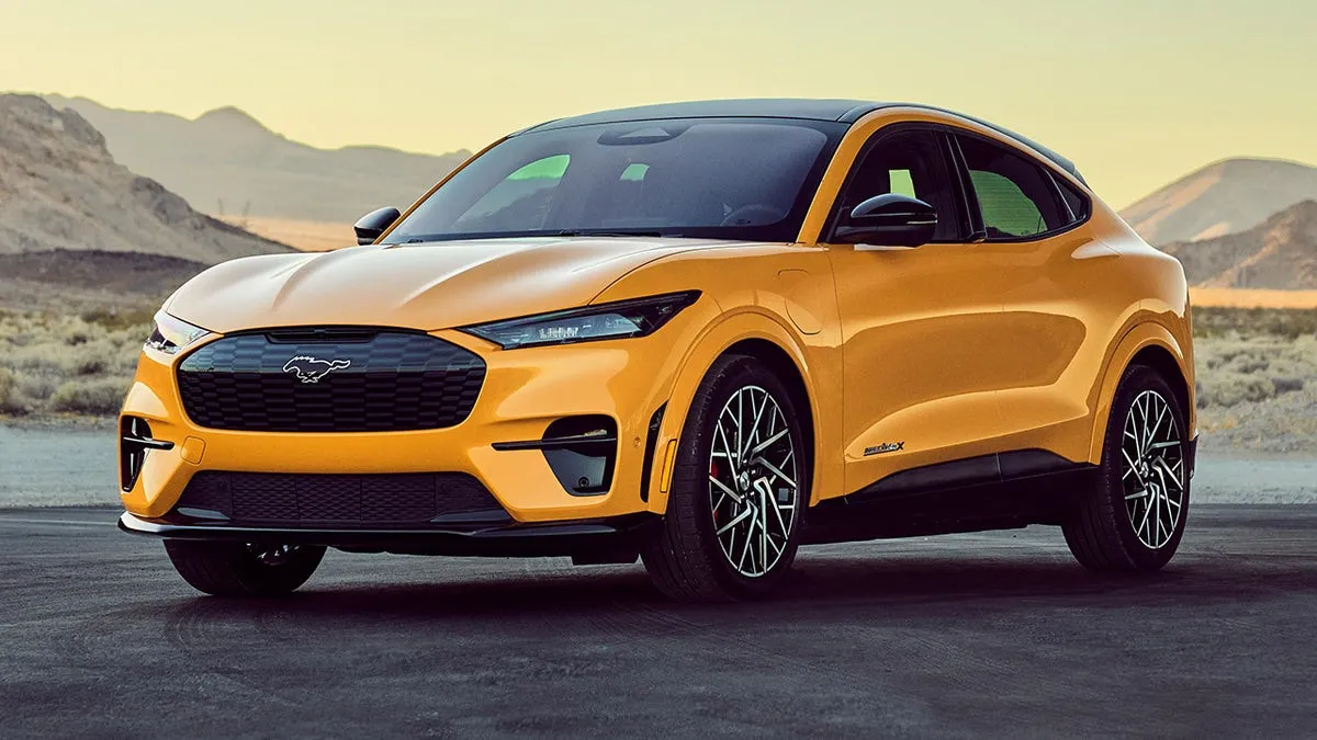
3. Ford Mustang Mach-E
The Ford Mustang Mach-E represents a bold attempt by Ford to redefine what a Mustang could be in the electric era.
While the performance credentials and branding created major discussion, the interior design also became a talking point because of its heavy reliance on a large vertically mounted touchscreen that dominates the center of the dashboard.
This vehicle stands out in this discussion because Ford attempted to combine physical and digital interaction but leaned heavily toward software driven controls.
While there is a physical volume dial integrated into the screen, many other basic features such as drive modes, climate fine tuning, and vehicle settings require navigating digital menus. This creates a situation where drivers may need to divide their attention more than expected.
Another interesting reason to include the Mach-E is how it reflects the pressure traditional manufacturers face when competing with newer electric vehicle companies.
Ford clearly wanted to show that it could match the modern interior feel of newer EV brands. In doing so, it adopted a screen focused layout that sometimes feels more experimental than the company’s traditionally practical interiors.
I am writing about this vehicle because it shows how legacy brands sometimes change their identity while adapting to new markets.

The Mach-E is not poorly designed, but it demonstrates how quickly companies can move away from their historical strengths in ergonomic simplicity when trying to appear technologically competitive.
This example helps illustrate how the race to appear modern can sometimes lead to decisions that may not fully align with the everyday expectations of long time customers who were used to simpler Ford interiors.
4. Volvo EX30
The Volvo EX30 provides another interesting example because it approaches minimalism from a Scandinavian design philosophy that emphasizes cleanliness and simplicity.
At first glance, the interior looks elegant and uncluttered. However, this simplicity often comes from removing physical controls and transferring many functions into a central screen interface.
One reason this vehicle deserves attention is how it centralizes information. Even driver data such as speed is displayed on the center screen instead of directly in front of the driver. While this reduces dashboard complexity, it also changes long established driving habits where critical information normally sits in the direct line of sight.
Another factor that makes the EX30 worth examining is how design priorities can differ from usability priorities. Volvo is known for safety leadership, which makes this approach particularly noteworthy.
By removing many buttons, the company created a visually calming environment, but it also increased dependence on digital navigation for routine adjustments.

This car is included because it shows that even safety focused brands can experiment with bold interface changes. It demonstrates that minimalism can sometimes reach a point where it begins to challenge convenience, especially for drivers who prefer quick, single action adjustments.
Discussing the EX30 helps show that screen dependence is not limited to performance EV companies. It has become a global design direction affecting brands with very different histories and customer expectations.
5. Mercedes-Benz EQS
The Mercedes-Benz EQS shows how even luxury brands known for comfort and refinement are moving toward screen dominated interiors. The most striking feature inside the EQS is the massive dashboard spanning display often referred to as the Hyperscreen.
This wide glass panel stretches across the cabin and integrates multiple displays into what appears to be one continuous surface.
This car is worth including because it shows how luxury manufacturers are redefining what premium interiors look like. Traditionally, luxury meant high quality materials, elegant buttons, and carefully damped switches.
In the EQS, digital presentation becomes the main attraction. The visual impact is impressive, but it also means many traditional controls are now digital rather than physical.
Another reason this vehicle fits this topic is how it demonstrates the complexity that can come with feature rich systems. The EQS offers deep personalization, ambient lighting settings, massage seat programs, and multiple driving environment adjustments.
While impressive, accessing these sometimes requires navigating several interface layers. This raises the question of whether all features need to be so digitally centralized.
I am writing about the EQS because it represents the future direction many luxury cars may follow. It shows how digital immersion is becoming a status symbol in itself. At the same time, it highlights the trade off between visual innovation and immediate usability.
This example completes the list because it proves that screen dependence is not limited to affordable EVs or tech focused startups. It has become a defining characteristic across every price level of the industry.
The automotive industry is currently experiencing a major shift in how drivers interact with their vehicles. Traditional interiors built around physical buttons and rotary knobs are increasingly being replaced by large touchscreens that centralize most functions.
While this change reflects technological advancement and the growing importance of software, it also raises questions about usability, safety, and long term driver comfort.
Vehicles that retain physical knobs demonstrate the lasting value of simplicity and intuitive design. Models such as the Mazda CX-5, Honda Accord, Toyota 4Runner, Subaru Outback, and Jeep Wrangler show that keeping tactile controls can make everyday driving easier.

These vehicles emphasize quick access to essential functions like climate control and audio adjustment without forcing the driver to search through menus. This design approach reduces distraction and allows drivers to rely on muscle memory, which can be especially helpful during demanding driving situations.
Another important strength of these vehicles is their focus on consistency. Physical controls tend to remain reliable and understandable over many years of ownership.
Unlike digital interfaces that may change through updates or feel outdated as technology evolves, a well placed knob or switch continues to function in a predictable way. This makes such vehicles appealing to practical buyers who value durability and ease of use over flashy interior trends.
On the other side, vehicles like the Tesla Model 3, Volkswagen ID.4, Ford Mustang Mach-E, Volvo EX30, and Mercedes-Benz EQS highlight the growing dominance of touchscreen based interiors.
These vehicles often offer impressive graphics, customization options, and futuristic styling. They represent how manufacturers are trying to create technology focused identities that appeal to modern buyers who expect digital integration similar to smartphones and tablets.
However, these screen heavy designs also demonstrate potential drawbacks. When essential functions require multiple taps or menu navigation, even simple adjustments can become distracting.
The absence of tactile feedback may force drivers to look away from the road more often compared to vehicles with dedicated switches. This does not make these vehicles плох choices overall, but it does show how design priorities sometimes favor appearance and innovation over straightforward usability.
Ultimately, this comparison shows that the best vehicle interiors are not defined by how many screens they have but by how naturally drivers can interact with them.
The most successful designs will likely be those that combine modern technology with thoughtful ergonomics, ensuring that innovation improves the driving experience instead of complicating it.
Also Read: 5 Reasons Why Your Old Car Might Be More Reliable Than a 2026 Model