
As automotive technology advances at breakneck speed, the line between innovation and excessive complexity grows increasingly blurred. Today’s vehicles are essentially computers on wheels, with digital interfaces replacing traditional buttons and knobs.
While technological advancements have enhanced safety, efficiency, and entertainment, not all implementations are created equal. Some manufacturers have mastered the art of intuitive design, creating interfaces that feel natural and accessible regardless of the user’s tech-savviness.
Others have prioritized cutting-edge features over usability, resulting in systems that frustrate drivers with convoluted menus, laggy responses, and steep learning curves.
This distinction matters more than ever, as in-car technology has become a decisive factor in purchasing decisions. A J.D. Power study found that 56% of buyers consider the tech package when choosing a vehicle, with many willing to switch brands for better digital experiences.
The quality of a vehicle’s tech integration can make or break the ownership experience, affecting everything from daily commutes to long road trips.
In this comprehensive analysis, we explore five vehicles that exemplify user-friendly tech integration where innovation enhances rather than hinders the driving experience and contrast them with five examples where complexity overshadows convenience.
Whether you’re a tech enthusiast or simply seeking a vehicle that won’t require an engineering degree to operate, this guide will help navigate the increasingly complex world of automotive technology.
5 Cars With User-Friendly Tech
These thoughtfully designed vehicles prioritize intuitive interfaces and logical control layouts that allow drivers to access important functions quickly without distracting from the road ahead.
Their technology seamlessly integrates into the driving experience, offering genuine convenience through well-organized menus, responsive touchscreens, and thoughtful physical buttons for critical functions.
Even tech-averse drivers find these systems approachable and helpful, proving that advanced features don’t require engineering degrees to operate effectively in everyday driving situations.
1. Toyota Camry
The Toyota Camry stands as a masterclass in balancing technological advancement with user-friendly operation. While many manufacturers rush to eliminate physical controls, Toyota has maintained a thoughtful hybrid approach in the Camry, preserving tactile buttons and knobs for critical functions while integrating them seamlessly with digital elements.
At the heart of the Camry’s tech suite is the latest generation of Toyota’s infotainment system, featuring a responsive 9-inch touchscreen that dominates the center console without overwhelming it.
The interface employs a logical tile-based layout with large, clearly labeled icons that minimize distraction while driving. Unlike systems that bury common functions in submenus, the Camry keeps climate controls, audio adjustments, and navigation features accessible within one or two taps.
This design philosophy extends to the standard physical knobs for volume and temperature control functions that benefit from tactile feedback and muscle memory.
Voice recognition represents another area where the Camry excels. Toyota has significantly improved natural language processing, allowing drivers to issue commands conversationally rather than memorizing specific syntax.
Request “Find the nearest gas station” or “Call Mom,” and the system responds promptly without the frustrating misinterpretations common in more complex systems.
This capability is complemented by standard wireless Apple CarPlay and Android Auto, which maintain their native interfaces rather than being awkwardly integrated into Toyota’s ecosystem.

The Camry’s instrument cluster epitomizes clarity, with a customizable 7-inch display nestled between analog gauges in most trims (with a full 12.3-inch digital display available in higher trims).
This setup presents crucial information in an easily digestible format, with thoughtful details like color-coding for different driving modes and progressive alerts that escalate proportionally to urgency. The head-up display projects speed, navigation directions, and safety alerts directly in the driver’s line of sight, minimizing the need to look away from the road.
Toyota’s Safety Sense 2.5+ suite demonstrates how advanced technology can be implemented without complexity. Features like pre-collision braking with pedestrian detection, dynamic radar cruise control, and lane departure alert with steering assist function discreetly in the background, intervening only when necessary.
Controls for these systems are logically organized in the touchscreen’s safety menu, with the option to adjust sensitivity or toggle features through straightforward toggles rather than convoluted submenus.
Perhaps most tellingly, the Camry’s owner’s manual section on technology spans roughly half the pages of its luxury competitors, reflecting Toyota’s commitment to intuitive design that doesn’t require extensive study.
Software updates occur automatically through the car’s built-in cellular connection, eliminating the need for dealer visits or complex user interventions.
This combination of thoughtful physical controls, logical screen layouts, effective voice recognition, and unobtrusive driver aids makes the Camry’s tech suite accessible to drivers of all ages and technical proficiencies, proof that cutting-edge features needn’t come at the expense of usability.
2. Mazda CX-5
The Mazda CX-5 represents a refreshing counterpoint to the industry’s touch-obsessed trajectory, embracing a driver-centric philosophy that prioritizes ergonomics and minimal distraction over flashy screens and feature bloat.
Mazda’s approach stems from extensive human-machine interface research, resulting in a system designed around how drivers interact with technology while in motion.
Central to the CX-5’s unique user experience is the commander control knob, positioned perfectly where the driver’s hand naturally rests on the center console. This tactile interface allows precise navigation through menus without requiring visual attention or the precise finger movements that touchscreens demand on bumpy roads.
The knob provides satisfying physical feedback through gentle detents, supplemented by shortcut buttons for common functions like navigation, music, and home screen. This physical control scheme allows drivers to develop muscle memory, eventually operating the system by touch alone.
The 10.25-inch widescreen display sits atop the dashboard at an optimal viewing angle, positioning information closer to the driver’s line of sight to minimize eyes-off-road time. Unlike touchscreen-centric systems, Mazda deliberately places this screen beyond arm’s reach, encouraging use of the commander knob instead.
The interface employs a clean, horizontally oriented layout with crisp typography and a subdued color palette that reduces visual clutter and cognitive load. Animations are subtle and purposeful rather than flashy distractions.

Voice recognition in the CX-5 prioritizes reliability over breadth, focusing on executing common commands with high accuracy rather than attempting to handle complex natural language processing that often fails in real-world conditions.
The system promptly acknowledges commands with both audio and visual feedback, maintaining the driver’s confidence in the interaction. This realistic approach to voice control acknowledges current technological limitations instead of overpromising capabilities.
Climate controls remain dedicated physical buttons and knobs with tactile differentiation, allowing adjustment without looking away from the road. Mazda’s research shows that touch-based climate controls increase eyes-off-road time by up to 400% compared to physical controls.
Similarly, the volume knob and basic audio controls maintain physical form, acknowledging that some functions benefit from direct manipulation rather than digital abstraction.
The CX-5’s Active Driving Display (Mazda’s head-up display) projects crucial information directly into the driver’s field of vision, including current speed, navigation directions, and safety alerts.
This system uses precise color differentiation and spatial arrangement to communicate information priority, with urgent safety notifications appearing distinct from routine information.
Mazda’s approach to software updates demonstrates similar thoughtfulness. Rather than constant interface changes that force relearning, Mazda makes incremental improvements that maintain operational consistency while enhancing functionality.
This philosophy recognizes that automotive interfaces, unlike consumer electronics, must remain consistently operable in safety-critical situations.
The CX-5’s tech implementation exemplifies the “less is more” design philosophy, focusing on perfecting essential features rather than overwhelming users with options rarely used.
By prioritizing ergonomics, minimal distraction, and consistent operation over touchscreen maximalism, Mazda has created a system that enhances rather than compromises the driving experience, particularly appealing to those who view driving as more than mere transportation.
3. Kia Telluride
The Kia Telluride has earned its reputation as a value leader not just through its spacious interior and refined driving dynamics, but also through a remarkably well-executed technology implementation that delivers premium functionality without the premium learning curve.
Kia’s approach combines intuitive layout, responsive hardware, and thoughtful feature integration that makes advanced technology accessible to everyone.
At the core of Telluride’s user experience is a dual-screen setup that strikes an ideal balance between digital and physical controls. The 12.3-inch touchscreen infotainment display features crisp graphics and a straightforward menu structure using a card-based layout that groups related functions logically.
Unlike competitors that require multiple touches to access common features, Telluride’s system places climate, audio, navigation, and phone controls on a persistent shortcut bar at the bottom of the screen, enabling one-touch access regardless of which menu the user is currently viewing.
Complementing the touchscreen is a thoughtful array of physical buttons and knobs for frequently used functions. Volume and tuning knobs offer tactile feedback, while dedicated climate control buttons allow adjustments without diving into touch menus.
This hybrid approach acknowledges that certain interactions are simply more intuitive with physical controls, especially while driving. The steering wheel controls follow similar principles, with customizable buttons that allow drivers to assign their most-used functions for quick access.
The Telluride’s voice recognition system deserves special mention for its natural language processing capabilities. Rather than requiring specific command phrasing, the system understands conversational requests like “I’m cold” to adjust climate settings or “Find coffee shops near my destination” for navigation.
This flexibility eliminates the frustration of repeatedly rephrasing commands until the system understands a common pain point in less sophisticated implementations.
")
Kia’s UVO connected services platform demonstrates similar user-centricity, offering remote start, climate control, vehicle location, and diagnostic information through a smartphone app with an interface that mirrors the in-car experience for consistency.
Unlike more complex telematics systems, UVO walks users through initial setup with clear instructions and provides plain-language explanations of features without assuming technical knowledge.
The Telluride’s driver assistance technology suite (Highway Driving Assist) exemplifies how advanced features can be implemented without overwhelming complexity.
The system combines adaptive cruise control with lane-keeping assistance and navigation-based speed adjustment, yet its operation remains intuitive through clear visual indicators in the instrument cluster and straightforward activation via steering wheel controls.
Settings for these systems are easily adjusted through a dedicated driver assistance menu with clear explanations of each feature’s function.
Perhaps most impressively, Kia has maintained software consistency across updates, avoiding the radical interface changes that force users to relearn systems with each update.
When new features are added through over-the-air updates, they arrive with interactive tutorials that guide users through functionality without requiring manual consultation.
What makes Telluride’s tech implementation stand out is Kia’s apparent understanding that technology should serve users rather than the reverse.
By focusing on logical organization, consistent behavior, clear feedback, and thoughtful integration of physical controls, Kia has created a tech experience that feels premium not just in features offered but in how effortlessly those features can be accessed proving that sophisticated technology and user-friendliness aren’t mutually exclusive concepts.
4. Hyundai Ioniq 5
The Hyundai Ioniq 5 represents a fresh approach to automotive technology, reimagining the electric vehicle interface from first principles rather than simply digitizing traditional controls.
What makes the Ioniq 5 stand out in the increasingly crowded EV marketplace is how its technological sophistication coexists with remarkable usability, demonstrating that cutting-edge doesn’t have to mean complex. The Ioniq 5’s dual 12.3-inch displays create a panoramic digital cockpit without the overwhelming feel of some competitors’ screens.
The key to this balance lies in Hyundai’s thoughtful segmentation of information: the instrument cluster focuses exclusively on driving-relevant data with customizable layouts that adapt to different driving modes, while the central infotainment screen handles secondary functions through a logically structured menu system.
This clear separation prevents the cognitive overload common in systems that attempt to display too much information simultaneously. Most impressive is Hyundai’s contextual interface design, which anticipates user needs based on vehicle state.
When approaching a charging station, for example, the screen automatically offers charging options and displays battery preconditioning status without requiring driver input.
Similarly, the climate control interface expands when first touched, prioritizing commonly used functions before revealing more granular controls only when needed. This progressive disclosure approach keeps the interface clean while maintaining access to advanced functionality.
Physical controls are strategically preserved where they matter most. The slim, touch-sensitive climate control panel might initially appear to follow the problematic all-touch trend, but Hyundai has incorporated haptic feedback that confirms button presses without requiring visual attention.
Meanwhile, crucial functions retain physical controls: a dedicated row of shortcut buttons below the screen provides one-touch access to navigation, media, phone connectivity, and vehicle settings, while traditional stalks handle turn signals and wipers functions where muscle memory and tactile feedback are paramount.

The Ioniq 5’s charge management system demonstrates how complex functionality can be made accessible through thoughtful design. Rather than confronting users with technical charging terminology, the interface uses plain language and visualizations to communicate charging status, projected completion times, and energy consumption patterns.
Users can easily schedule charging during off-peak electricity rates through a calendar interface that resembles familiar smartphone apps, making an otherwise complex feature immediately understandable.
Augmented reality navigation represents another technological leap made accessible through intuitive implementation. Rather than merely displaying directional arrows, the system overlays guidance instructions on a live camera feed of the road ahead, placing virtual directional markers precisely where turns should be executed.
This spatial mapping of information onto the real world reduces the mental translation typically required when glancing between screens and the road. The Ioniq 5’s smartphone integration goes beyond standard Apple CarPlay and Android Auto by offering Digital Key functionality, allowing the vehicle to be unlocked, started, and even autonomously parked using only a smartphone.
Despite the technical complexity behind these features, the user experience remains straightforward through well-designed app workflows that guide users step-by-step.
Perhaps most telling is Hyundai’s approach to over-the-air updates. Rather than making dramatic interface changes that disorient users, updates arrive with interactive walkthroughs highlighting new features and changes.
This recognition that vehicle interfaces require consistency, unlike consumer electronics, where interface novelty is often prized, demonstrates Hyundai’s understanding that automotive technology must prioritize reliability and predictability alongside innovation.
By focusing on contextual awareness, consistent behavior, appropriate physical controls, and guided feature discovery, the Ioniq 5 creates an advanced technological experience that feels intuitive rather than intimidating proof that the electric vehicle revolution can enhance rather than complicate the driving experience.
Also Read: 5 Vehicles That Thrive in Traffic and 5 That Overheat Fast
5. Subaru Forester
The Subaru Forester has cultivated a fiercely loyal following by blending all-weather capability with a pragmatic approach to technology that prioritizes function over flash.
While its tech implementation lacks the visual drama of some competitors, the Forester demonstrates how thoughtful integration can create an interface that’s immediately comprehensible to both tech enthusiasts and traditionalists alike.
Subaru’s STARLINK infotainment system, featured on an 8-inch touchscreen in most Forester trims, eschews the tablet-like proportions common in current design trends in favor of a size and aspect ratio that integrates naturally with the dashboard.
This dimensional restraint allows for proper spacing of touch targets, reducing the precision required for successful interaction while driving. The interface employs a straightforward grid layout with consistent positioning of critical functions, allowing users to develop spatial memory that reduces the need for visual focus.
Physical controls demonstrate Subaru’s understanding of real-world usability. Climate functions retain dedicated buttons and knobs with distinct shapes and textures that can be operated by touch alone.
The steering wheel maintains physical buttons with tactile differentiation that allows command execution without looking down. Volume and tuning knobs feature the perfect amount of resistance for precise adjustment, even on bumpy forest roads where touchscreen precision would falter.
This commitment to physical controls reflects Subaru’s recognition that its customers often drive in challenging conditions where touchscreen-only interfaces would prove problematic.
The Forester’s driver assistance technology, marketed as EyeSight, demonstrates similar pragmatism. Rather than hiding these features behind complex menus, Subaru provides dedicated buttons for frequently used functions like lane centering and adaptive cruise control.
The system communicates its status through simple visual indicators in the instrument cluster and gentle auditory cues, avoiding the information overload common in more complex implementations. When intervention is required, alerts escalate logically in intensity, creating an intuitive hierarchy of urgency.

Voice recognition in the Forester focuses on reliability over breadth. Rather than attempting to understand every possible natural language variation, the system excels at accurately processing a well-defined set of commands for navigation, phone, and audio control.
This focused approach results in higher success rates for common tasks compared to systems that attempt broader capability but deliver inconsistent results.
Perhaps the Forester’s most unique technical feature is the secondary information display positioned at the top of the dashboard. This segregated screen presents essential information like climate status, all-wheel drive power distribution, and inclinometer readings without cluttering the main interfaces.
This dedicated space for persistent information acknowledges that certain data should remain visible regardless of what’s displayed on the main screen a thoughtful touch for off-road enthusiasts who benefit from continuous access to vehicle status.
Software updates exemplify Subaru’s user-centric philosophy. Rather than forcing radical interface changes with each iteration, updates introduce incremental improvements while maintaining consistent operation.
New features arrive with clear explanations of functionality rather than assuming user discovery, acknowledging that vehicles shouldn’t require constant relearning like consumer electronics.
The Forester’s approach to smartphone integration similarly prioritizes reliability over cutting-edge features. Apple CarPlay and Android Auto implementation focuses on stable connection and consistent performance rather than supporting every possible app interaction.
This restrained approach ensures that core functionality works dependably in varied conditions a priority for the adventure-oriented Subaru customer base.
By emphasizing physical control retention, consistent interface organization, reliable core functionality, and thoughtful information segregation, the Forester creates a tech experience that supports rather than dominates the driving experience.
For owners who view their vehicles as tools rather than tech showcases, this balanced approach to innovation represents exactly the right combination of modern capability and timeless usability.
5 Cars With Over-complicated Tech
These frustrating vehicles bury essential functions beneath layers of confusing menus and unintuitive controls, turning simple tasks like adjusting climate settings into distracting treasure hunts.
Despite their cutting-edge capabilities, these overly complex systems require extensive owner’s manual study and create dangerous distractions as drivers go through multiple screens for basic operations.
The engineering emphasis on feature quantity over usability results in powerful technology that diminishes the driving experience through unnecessary complexity and steep learning curves.
1. Mercedes-Benz S-Class
The Mercedes-Benz S-Class has long served as the technological flagship for the automotive industry, often introducing features that eventually trickle down to mainstream vehicles years later.
The latest generation, however, demonstrates how even the most sophisticated technology can become overwhelmingly complex when design prioritizes “wow factor” over user-centered functionality.
At the heart of the S-Class’s complexity is the mammoth MBUX Hyperscreen system a 56-inch curved glass panel housing three separate displays that stretch across the entire dashboard. While visually stunning, this digital expanse creates a fundamental problem: information overload.
The system can simultaneously display up to 27 different widgets, icons, and controls across its screens, creating a cognitive burden that requires significant concentration to go through, precisely what drivers should avoid while operating a vehicle.
Even Mercedes’ research indicates that most drivers use less than 40% of the available functions, yet all remain perpetually visible, competing for attention.
Voice control, activated by the phrase “Hey Mercedes,” attempts to simplify interaction but introduces frustrations of its own. The system’s natural language processing ambitions exceed its capabilities, creating a gap between expectation and performance.
Commands often require specific phrasing despite marketing claims of conversational ability, and the system frequently activates unintentionally during normal conversation when phrases resembling the wake word are spoken.
More problematically, the voice assistant attempts to control virtually every vehicle function, including those that would be more efficiently managed through physical controls, a classic case of technology seeking problems rather than solving them.
The S-Class’s haptic feedback touchscreen controls represent another well-intentioned but problematic implementation. The steering wheel features touch-sensitive panels that respond to swipes and taps, but lack the physical detents that would confirm without visual verification.

In practice, this requires drivers to look down to confirm successful inputs, increasing eyes-off-road time. Similarly, the console-mounted touchpad controller provides less precise navigation than the previous generation’s rotary dial, making selection errors common, especially on uneven roads.
Perhaps most indicative of the S-Class’s technological excess is its approach to ambient lighting. The vehicle features 250 individually controllable LED elements throughout the cabin, customizable through a bewildering array of 64 base colors and infinite gradient combinations.
While impressive in theory, the system requires going through seven separate menu screens to adjust fully, with options buried under non-intuitive categorizations. This complexity transforms what should be a simple personalization feature into a task requiring dealer demonstration and manual consultation.
The driver assistance package similarly suffers from feature proliferation without corresponding simplification. The S-Class offers 21 separate safety and assistance systems, each with multiple sensitivity settings and interaction preferences.
The owner’s manual dedicates 43 pages solely to explaining these systems’ operation and configuration, more than many entire vehicle manuals from previous decades.
Despite this arsenal of assistance features, user testing reveals that many owners either misunderstand system capabilities or disable advanced functions entirely due to confusion over proper operation.
Software updates, while delivering new capabilities, often reorganize interface elements and workflow patterns with minimal warning, forcing users to relearn basic operations.
Mercedes proudly advertises that the S-Class receives major updates quarterly, but each update can shift menu structures and control behaviors, preventing the development of consistent muscle memory that contributes to operational safety.
2. BMW iDrive 8
BMW’s latest iteration of its pioneering iDrive system represents a cautionary tale of how redesigning a once-intuitive interface can result in a more visually impressive but functionally compromised user experience.
While the eighth-generation iDrive boasts cutting-edge capabilities, its implementation in vehicles like the BMW iX and 7 Series demonstrates how technological advancement can inadvertently create unnecessary complexity.
The system’s most immediately apparent change is the dramatic reduction in physical controls, with BMW removing the dedicated climate control panel in favor of touchscreen integration.
Functions that previously required a single button press now demand multiple screen interactions, forcing drivers to go through menu layers to perform basic tasks like adjusting fan speed or seat heating.
This digital migration contradicts decades of human factors research showing that tactile controls allow adjustment without visual attention a crucial safety consideration while driving.
The few remaining physical controls have been consolidated into a minimalist arrangement that sacrifices differentiation for aesthetic cleanliness, making them difficult to distinguish by touch alone.
BMW’s curved display panel, combining a 12.3-inch instrument cluster and a 14.9-inch infotainment screen, impresses visually but introduces practical complications.
The interface employs a tile-based layout with individually customizable widgets, theoretically offering personalization but creating unpredictable information placement that prevents the development of visual memory.
The system allows extensive customization without providing sensible defaults, overwhelming users with decisions about information hierarchy without guiding principles.
Even basic functions like displaying a full-screen navigation map require understanding the distinction between the “widget” and “app” versions of navigation an unnecessary conceptual layer.

Voice control in iDrive 8, activated by saying “Hey BMW,” exemplifies ambitious technology hampered by inconsistent execution. The natural language system attempts to process conversational commands but frequently misinterprets speech or fails to recognize contextual references.
More concerning is the system’s tendency to interrupt conversations when it mistakenly detects the wake word, creating a boy-who-cried-wolf effect that leads many owners to disable the feature entirely
. When voice commands are successful, the system often requests confirmation for basic actions that should proceed automatically, creating interaction patterns that feel needlessly interrogative rather than assistive.
The controller knob, once the defining feature of iDrive, has been retained but significantly diminished in functionality. While previous generations used the knob as the primary input method with logical mapping between rotation and screen navigation, the new system treats it as a secondary input method with inconsistent behavior across different screens.
Some functions respond to rotational input while others require directional tilting, with no visual indication of which control method applies in any given context. This inconsistency prevents the development of muscle memory that made earlier iDrive versions increasingly intuitive over time.
Perhaps most tellingly, BMW has reconsidered some aspects of iDrive 8’s touch-centric approach, with the company’s head of technical development recently acknowledging that “we moved too far” in eliminating physical controls.
Following customer feedback, BMW has announced plans to reintroduce physical climate controls in future models, a tacit admission that the minimalist approach prioritized design trends over usability.
3. Tesla Model S
The Tesla Model S revolutionized the automotive industry in countless ways, but its radical approach to in-car technology, particularly the decision to concentrate virtually all controls into a single touchscreen, remains controversial from a human-machine interface perspective.
While Tesla deserves credit for pioneering the software-defined vehicle concept, the Model S exemplifies how innovation without usability constraints can create unnecessary complexity for even routine tasks.
Tesla’s minimalist dashboard, dominated by a 17-inch central touchscreen, creates an undeniably clean aesthetic but eliminates the tactile differentiation that allows blind operation of critical controls.
Functions ranging from windshield wipers to headlights to side mirror adjustment require touchscreen interaction, forcing drivers to divert visual attention from the road even for momentary adjustments.
This approach contradicts established human factors research showing that physical controls with distinct shapes and positions can be operated through muscle memory and tactile feedback, while touchscreens demand precise visual targeting that competes with the primary driving task.
The Model S interface further complicates matters through frequent software updates that can dramatically reorganize control layouts and operational logic.
While Tesla owners generally appreciate the continuous evolution of capabilities, these updates often arrive without comprehensive documentation of interface changes, creating a perpetual learning curve.
A particularly illustrative example occurred when Tesla relocated the windshield wiper controls from the steering column stalk (where they exist in virtually all modern vehicles) to a buried touchscreen menu, then later to an auto-mode with manual override through the touchscreen, each change requiring drivers to relearn a basic function typically operated unconsciously.
Voice control capabilities, while improving over time, exhibit significant limitations compared to the marketing promise of full vehicle control. Commands require specific syntax rather than natural language, with a narrow recognition vocabulary that focuses primarily on navigation and entertainment functions while excluding many vehicle controls.

This limitation forces users back to the touchscreen for functions that voice control theoretically should address, negating the potential safety benefits of hands-free operation.
Tesla’s unique approach to driver profiles demonstrates both the promise and problems of its technology implementation. While the system comprehensively saves personalized settings ranging from seat position to acceleration response, accessing these profiles requires going through multiple menu layers.
Switching between drivers becomes a deliberate process requiring several screen interactions, contrasting sharply with the single-button profile selection common in conventional vehicles. This represents a pattern throughout the Tesla interface: advanced capabilities implemented without corresponding simplification of the interaction model.
The Autopilot system similarly combines sophisticated technology with occasionally counterintuitive operation. Activating the system requires precise timing of steering column stalk pulls, with different pull durations and sequences activating different assistance levels.
The system communicates its status primarily through small icons on the digital instrument panel, requiring drivers to interpret subtle visual cues to confirm system engagement. This minimal feedback approach aligns with Tesla’s aesthetic minimalism but creates ambiguity about system status that wouldn’t exist with dedicated physical controls or clear mode indicators.
Perhaps most emblematic of Tesla’s prioritization of technological novelty over usability conventions is the replacement of traditional turn signal stalks with steering wheel buttons in recent Model S refreshes.
This reinvention of a universally standardized control requires conscious thought for a function that should be automatic, with the directional buttons lacking the self-canceling mechanism and tactile feedback that makes conventional turn signals intuitively operable.
The change appears motivated by design differentiation rather than functional improvement, exemplifying how innovation without purpose can complicate rather than enhance the driving experience.
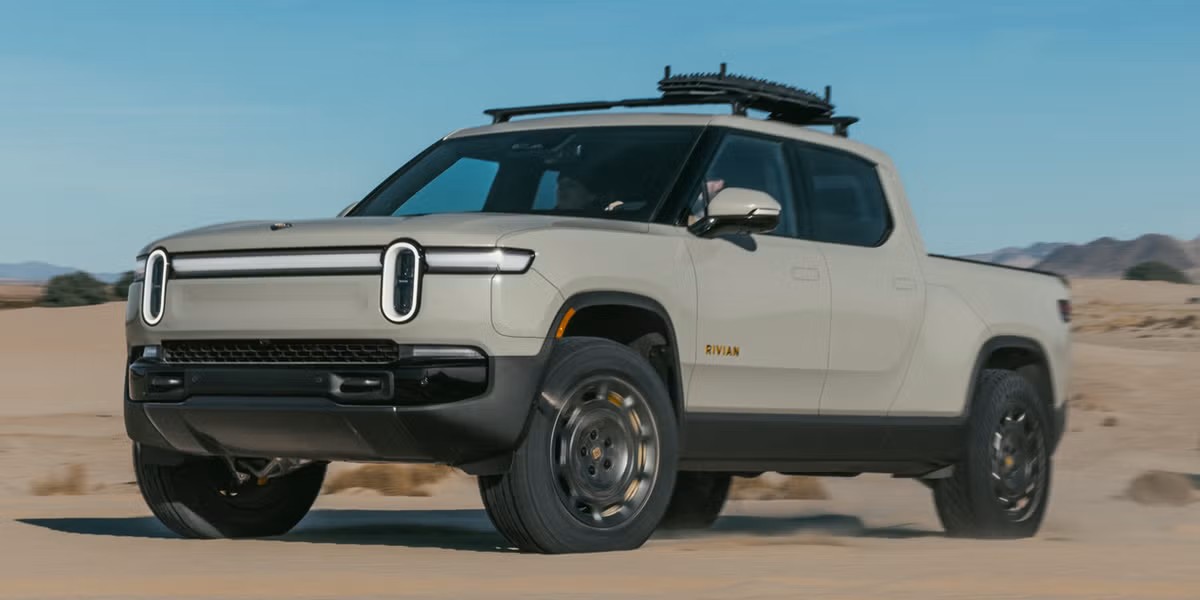
4. Rivian R1T
The Rivian R1T has garnered well-deserved acclaim for reinventing the pickup truck concept around electric propulsion, but its software-centric approach to vehicle controls reveals the challenges facing automotive startups when developing interfaces from scratch.
Despite impressive hardware and genuine innovation, the R1T’s user experience demonstrates how ambitious technology can create unnecessary complexity when not tempered by usability principles.
Central to the R1T’s interface strategy is an expansive 16-inch central touchscreen handling virtually all vehicle functions. While visually impressive, this centralization eliminates the specialized control zones that allow drivers to develop spatial memory for different functions.
Climate controls, drive modes, and vehicle settings all share the same touch surface, requiring precise visual targeting rather than the zone awareness that traditional layout strategies facilitate.
The screen’s bottom-edge positioning of critical controls compounds this issue by placing touch targets in an area prone to accidental activation from resting hands, while simultaneously requiring a significant downw
ard glance away from the road for intentional operation.
Rivian’s commitment to software-defined functionality extends to basic vehicle operations like adjusting mirrors and steering wheel position. Rather than dedicated controls positioned near the elements, they adjust an intuitive mapping that creates a natural association these functions require going multiple menu layers in the touchscreen.
This digital abstraction forces drivers to mentally translate spatial concepts into software workflows, creating cognitive load for operations that should be straightforward. The lack of physical feedback during adjustment further complicates the process, as users must continuously verify changes visually rather than feeling incremental movement through tactile controls.

Drive mode selection highlights another area where the R1T prioritizes technological novelty over operational simplicity. The truck offers eight distinct drive modes affecting everything from suspension height to throttle response, accessed through an elaborate graphical interface resembling a terrain map.
While visually engaging, this representation requires interpretation and precise selection rather than the immediate mode of engagement that would be possible with dedicated buttons or a simple rotary selector. The complex visualization also consumes valuable screen space that could display more immediately relevant information during actual off-road use.
Rivian’s gear selector implementation further demonstrates the company’s willingness to reinvent established conventions without clear usability benefits.
Rather than employing a traditional shifter with spatial positions mapping to drive modes (PRND), the R1T uses a column-mounted toggle that requires learning a new sequence of actions detached from spatial memory.
This redesign creates a learning curve for a fundamental vehicle function that would otherwise be transparent due to industry standardization.
Similar reinvention applies to window controls, which abandon the door-mounted arrangement found in virtually all modern vehicles in favor of center console positioning that eliminates the spatial relationship between control location and the controlled element.
Software updates, while delivering genuine functional improvements, introduce another layer of complexity through their frequency and scope. The R1T receives updates approximately monthly, often with significant interface changes requiring relearning of basic functions.
While Rivian provides release notes documenting these changes, the continuous evolution demands ongoing attention from users, a stark contrast to the set-and-forget nature of conventional vehicle controls.
This approach may appeal to early adopters who enjoy technological exploration but creates friction for mainstream users seeking transportation rather than an ongoing software relationship.
5. Audi Q8 e-tron
The Audi Q8 e-tron (formerly known as the e-tron SUV) exemplifies how even established luxury manufacturers can create unnecessarily complex interfaces in pursuit of technological differentiation.
Audi’s triple-screen setup comprising the Virtual Cockpit instrument display, main infotainment touchscreen, and secondary climate control touchscreen creates an initially impressive but ultimately fragmented user experience that demands significant cognitive investment to master.
What immediately distinguishes the Q8 e-tron’s interface approach is the complete abandonment of physical climate controls in favor of a dedicated lower touchscreen. This screen requires precise finger placement without the benefit of tactile feedback, forcing visual attention away from the road for operations as simple as adjusting temperature or fan speed.
The haptic feedback system attempts to simulate physical buttons through vibration upon activation, but this artificial feedback comes after input confirmation rather than during target acquisition, negating much of the benefit that physical controls provide.
This arrangement proves particularly problematic during winter driving, when glove operation becomes inconsistent or impossible depending on glove material. Menu organization across the dual central touchscreens creates unnecessary cognitive fragmentation.
Functions are split between screens based on Audi’s internal categorization logic rather than user-centered task organization, requiring drivers to remember which screen handles which functions rather than developing an intuitive understanding.
The system’s learning curve is further steepened by context-dependent functionality, where identical gestures produce different results depending on which application is active. This inconsistency prevents the development of reliable muscle memory that would otherwise develop with consistent input-to-outcome relationships.
Audi’s approach to customization further complicates the user experience through excessive options without sensible defaults.
The system offers seven different home screen layouts, 12 instrument cluster configurations, and countless combinations of widget arrangements, theoretically providing personalization but practically overwhelming users with choices that have unclear benefits.
Many owners report settling on a configuration early in ownership and rarely changing it, suggesting that the extensive customization options serve marketing demonstrations better than everyday usability.

Voice control implementation in the Q8 e-tron follows a similar pattern of ambition exceeding execution. The natural language system attempts to process conversational commands but struggles with accents, background noise, and compound requests.
More problematically, the system’s response time frequently exceeds three seconds, an eternity in driver attention terms, creating uncertainty about whether commands were recognized and encouraging repeated input attempts that further complicate interaction.
Unlike systems that provide immediate acknowledgment feedback, Audi’s implementation often leaves drivers waiting for confirmation that their request was understood.
Perhaps most telling is the Q8 e-tron’s owner’s manual approach to technology. The digital user guide spans 134 pages dedicated to infotainment and connectivity features alone not including driver assistance systems or vehicle settings.
This documentation volume reflects the system’s inherent complexity, with many owners reporting reliance on YouTube tutorials rather than official documentation to understand basic functionality. This learning investment contrasts sharply with more intuitive systems that can be operated effectively with minimal instruction.
Audi’s electric vehicle-specific features demonstrate similar complexity challenges. The charging management system offers extensive customization but buries critical functions like charging speed limitation and schedule settings under multiple menu layers with technical terminology that assumes specialized knowledge.
The route planning system, while technically sophisticated in calculating charging stops, presents information through complex screens requiring interpretation rather than the straightforward guidance that would benefit real-world usage.
The Q8 e-tron exemplifies how the pursuit of technological sophistication without corresponding attention to human factors can transform potentially useful innovation into unnecessary complexity.
While technically impressive, the three-screen arrangement creates a fragmented experience requiring significant learning investment complexity that serves brand differentiation better than actual user needs.
For drivers willing to invest in mastering this system, it eventually becomes manageable, but this learning requirement represents a fundamental usability failure in a primary transportation device.
Also Read: 5 Quiet EVs That Are a Dream and 5 That Still Make Noise