
The automotive dashboard has evolved dramatically over the past decade, transitioning from traditional analog instruments to sophisticated digital displays that can present information in countless ways.
This evolution has created a fascinating dichotomy in the automotive world: some manufacturers have embraced minimalist, clarity-focused designs that prioritize essential information delivery, while others have packed their gauge clusters with an overwhelming array of data, graphics, and visual elements that can distract rather than inform.
The importance of gauge cluster design cannot be overstated. When you pay top dollar for a car, it should have a well-thought-out design, and that includes the gauge cluster.
Drivers rely on these displays to make split-second decisions about speed, fuel consumption, engine performance, and countless other vital parameters. A well-designed cluster presents this information clearly and intuitively, allowing drivers to process essential data without taking their eyes off the road for extended periods.
The digital gauge cluster is part of the car dashboard electronics, and it provides information to the driver in a timely manner & displays various types of vehicle information and passenger comfort information to enable the driver to enjoy a stress-free ride.
However, the challenge lies in balancing comprehensive information delivery with visual clarity. While technology has made it possible to display virtually unlimited data on dashboard screens, the human brain’s ability to process this information quickly and safely remains unchanged.
This comprehensive analysis examines ten vehicles that represent opposite ends of the gauge cluster design spectrum, highlighting how different approaches to information presentation can dramatically impact the driving experience.
5 Cars with Clear Gauge Clusters
These problematic instrument designs suffer from information overload that creates visual chaos and impedes quick interpretation of essential driving data during critical moments.
The Pagani Huayra exemplifies this issue where “there’s so much going on in there it’s hard to unpack” according to automotive experts. Complex digital displays often compound the problem by presenting too many menu options and customizable elements that distract from core functions.
Poor contrast ratios, small fonts, and cramped layouts force drivers to spend excessive time deciphering information that should be instantly readable.
These cluttered clusters demonstrate how more features don’t always translate to better functionality, often creating dangerous distractions that compromise safety through information overload.
1. Porsche 911 (992 Generation)
The Porsche 911’s gauge cluster represents the pinnacle of automotive minimalism and functional clarity. Porsche’s design philosophy centers on the principle that less is more, and this is perfectly exemplified in their approach to the 911’s instrument panel.
The cluster features a prominent central analog tachometer flanked by two smaller digital displays, creating a layout that is both aesthetically pleasing and functionally superior.
The central tachometer serves as the focal point, which is particularly appropriate for a sports car where engine RPM is crucial information. The analog needle provides instant visual feedback about engine speed, allowing drivers to make quick decisions about gear changes without having to process numerical data. The tachometer’s design is clean and uncluttered, with clear markings and a logical progression that makes it easy to read at a glance.
The two flanking digital displays are masterfully designed to provide essential information without overwhelming the driver.
")
The left display typically shows speed, fuel level, and other basic vehicle information, while the right display can be customized to show navigation data, trip information, or performance metrics. The displays use high-contrast fonts and clear iconography that remain legible in all lighting conditions.
What makes the 911’s cluster particularly effective is its consistency with Porsche’s heritage while embracing modern technology. The design pays homage to classic Porsche clusters while incorporating contemporary digital elements seamlessly. The color scheme is deliberately restrained, using white backgrounds with black text and minimal use of color accents, ensuring that important information stands out without visual distraction.
The cluster’s brilliance lies in its adaptability. Drivers can customize the digital displays to show the information most relevant to their driving style, whether that’s performance data for track days or efficiency metrics for daily commuting. This customization capability doesn’t come at the expense of simplicity the core layout remains consistent and intuitive regardless of the selected display mode.
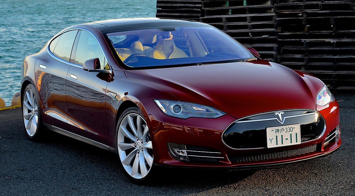
2. Tesla Model S
Tesla’s approach to gauge cluster design represents a radical departure from traditional automotive interfaces, yet it achieves remarkable clarity through its minimalist philosophy.
The Model S features a single 17-inch vertical touchscreen that serves as the primary interface for vehicle information and controls, complemented by a smaller driver display behind the steering wheel that focuses exclusively on essential driving information.
The driver display is a masterclass in information prioritization. It shows only the most critical data: speed, gear selection, Autopilot status, and turn-by-turn navigation.
This selective approach eliminates the visual clutter that plagues many modern vehicles, allowing drivers to process vital information instantly. The display uses a clean, modern typography and a high-contrast color scheme that ensures excellent visibility in all lighting conditions.
Tesla’s digital approach allows for dynamic information presentation that adapts to driving conditions. During normal driving, the display shows basic information in a clean, uncluttered layout.

When using Autopilot, the display transforms to show a simplified representation of the vehicle’s surroundings, providing confidence-inspiring feedback about the system’s operation without overwhelming the driver with unnecessary detail.
The integration between the driver display and the main touchscreen creates a cohesive information ecosystem. Critical information is duplicated appropriately between the two displays, ensuring that drivers always have access to essential data without having to look away from the road.
The main touchscreen handles secondary functions like climate control, media, and vehicle settings, keeping the driver display focused on its primary purpose. What sets Tesla’s approach apart is its commitment to over-the-air updates that continuously improve the interface.
The company regularly refines the display layout, typography, and information hierarchy based on real-world usage data and user feedback. This iterative improvement process has resulted in a gauge cluster that becomes more intuitive and effective over time, rather than becoming outdated as technology advances.
3. BMW i3
The BMW i3’s gauge cluster embodies the company’s vision of sustainable mobility through its clean, futuristic design that perfectly complements the vehicle’s electric powertrain.
The cluster features a unique floating display concept that appears to hover above the dashboard, creating an impression of lightness and technological sophistication that aligns with the i3’s innovative character.
The display layout is deliberately simple, focusing on the information most relevant to electric vehicle operation. The central element is a large, easy-to-read speedometer that uses a clean analog-style design with digital readouts.
Surrounding this are displays for battery charge level, range estimation, and energy consumption, all presented in a clear, hierarchical manner that makes it easy to understand the vehicle’s status at a glance.
BMW’s use of color in the i3’s cluster is particularly noteworthy. The display employs a sophisticated blue and white color scheme that not only looks modern and appealing but also serves functional purposes.

Blue elements indicate electric-specific information, while white provides general vehicle data. This color coding system helps drivers quickly identify the type of information they’re viewing, reducing cognitive load and improving safety.
The cluster’s design philosophy extends beyond mere aesthetics to encompass sustainability principles. The display is designed to be energy-efficient, using LED backlighting and optimized graphics that minimize power consumption.
This attention to efficiency reflects BMW’s comprehensive approach to sustainable mobility, where every component is optimized for environmental impact.
The i3’s cluster also demonstrates excellent adaptability to different driving modes. In Eco Pro mode, the display emphasizes efficiency metrics and provides coaching tips to help drivers maximize range.
In Comfort mode, the focus shifts to providing a more traditional driving experience with conventional gauges and information displays. This mode-dependent customization ensures that the cluster remains relevant and useful regardless of the driver’s priorities.
4. Audi Virtual Cockpit
Lots of automakers offer reconfigurable gauge clusters, but Audi’s virtual cockpit is easily the best. You can have a big central tach with other important driver information, or you can turn the whole screen into a giant map.
It’s easy to use, and it feels like the future. The Virtual Cockpit represents a perfect balance between comprehensive information delivery and visual clarity, setting the standard for digital instrument clusters across the automotive industry.
The 12.3-inch high-resolution display serves as a completely digital replacement for traditional analog gauges, but Audi’s design team has carefully maintained the familiar visual metaphors that drivers expect.
The default view presents virtual analog gauges for speed and engine RPM, complete with realistic needle animations and clear numerical readouts. This approach provides the quick visual feedback benefits of analog instruments while offering the flexibility and customization options of digital displays.
")
What makes the Virtual Cockpit particularly effective is its intelligent information layering. The system presents information in a logical hierarchy, with the most important data prominently displayed and secondary information available through subtle menu navigation.
The display can be customized to emphasize different types of information – from performance metrics for spirited driving to efficiency data for economical operation without cluttering the interface.
The integration of navigation information directly into the gauge cluster is a standout feature. Instead of requiring drivers to look away from the road to check directions on a separate screen, the Virtual Cockpit can display a large, detailed map directly in the driver’s line of sight.
The map integration is seamless, with route information and turn-by-turn directions presented clearly without overwhelming other essential vehicle data.
Audi’s attention to visual design details the Virtual Cockpit beyond mere functionality. The graphics are crisp and modern, with carefully chosen typography and color schemes that remain legible in all lighting conditions.
The animations are smooth and purposeful, providing valuable feedback without being distracting. The result is a gauge cluster that feels both familiar and futuristic, making advanced technology accessible to drivers of all experience levels.
Also Read: 5 Legendary Japanese Cars and 5 That Hurt the Reputation
5. Mazda MX-5 Miata
The Mazda MX-5 Miata’s gauge cluster exemplifies the “less is more” philosophy that defines this iconic sports car. In a world where digital displays are increasingly common, Mazda has chosen to retain traditional analog gauges for the MX-5, and this decision perfectly aligns with the car’s back-to-basics approach to driving enjoyment.
The cluster features three prominent analog gauges arranged in a classic sports car layout: a large central tachometer flanked by smaller speedometer and fuel level gauges.
This arrangement prioritizes the tachometer, which is appropriate for a car designed to be driven enthusiastically. The analog needle provides instant visual feedback about engine speed, allowing drivers to make precise gear changes without having to process numerical data.
The gauge faces are designed with exceptional clarity, using high-contrast white backgrounds with black numbers and markings. The typography is clean and easy to read, with appropriate sizing that ensures excellent visibility even during spirited driving. The needle design is thin and precise, minimizing parallax errors and providing accurate readings from any viewing angle.

What makes the MX-5’s cluster particularly effective is its integration with the car’s design philosophy. The gauges are housed in a simple, unadorned bezel that focuses attention on the instruments themselves rather than decorative elements.
The layout is intuitive and logical, with frequently referenced information positioned for easy access without taking attention away from the road. The cluster also includes a small digital display that provides additional information such as gear position, trip data, and vehicle settings.
This display is carefully sized and positioned to provide useful information without competing with the primary analog gauges. The integration of digital and analog elements creates a cohesive interface that combines the best aspects of both technologies.
The MX-5’s commitment to analog gauges reflects Mazda’s understanding that some aspects of the driving experience are best served by traditional solutions.
The instant visual feedback provided by analog needles, combined with the satisfying physical interaction of the car’s controls, creates a driving experience that feels authentic and engaging in an increasingly digital automotive world.
5 Cars with Cluttered Gauge Clusters
These problematic instrument designs suffer from information overload that creates visual chaos and impedes quick interpretation of essential driving data during critical moments.
The Pagani Huayra exemplifies this issue, where “there’s so much going on in there it’s hard to unpack” according to automotive experts. Complex digital displays often compound the problem by presenting too many menu options and customizable elements that distract from core functions.
Poor contrast ratios, small fonts, and cramped layouts force drivers to spend excessive time deciphering information that should be instantly readable.
These cluttered clusters demonstrate how more features don’t always translate to better functionality, often creating dangerous distractions that compromise safety through information overload.
1. Cadillac Escalade
The Cadillac Escalade’s gauge cluster represents the antithesis of minimalist design, featuring a 38-inch curved OLED display that spans the entire width of the dashboard. While technologically impressive, this massive screen often overwhelms drivers with an abundance of information that can be difficult to process quickly and safely.
The cluster attempts to present comprehensive vehicle information across multiple zones, but the sheer amount of data available can be counterproductive.
The display shows everything from traditional gauges and navigation to media information, climate controls, and vehicle settings simultaneously. This all-in-one approach, while comprehensive, creates a visually busy environment that can distract from essential driving information.
The Escalade’s cluster suffers from poor information hierarchy. With so much screen real estate available, designers have filled it with numerous data points, graphics, and visual elements that compete for attention.
Critical information like speed and fuel level can become lost among less important displays, requiring drivers to search for essential data rather than finding it instantly.

The visual design compounds these issues with an overuse of colors, gradients, and decorative elements that prioritize visual impact over functional clarity.
The cluster often resembles a computer desktop more than a focused driving instrument, with multiple windows, menus, and overlapping information displays that can confuse rather than inform.
Navigation integration, while feature-rich, often dominates the display at the expense of other important information. The large map display can be helpful for route guidance, but it frequently obscures traditional gauges and vehicle status indicators.
The system’s complexity requires multiple menu levels and touch interactions, increasing the time drivers must spend looking away from the road to access basic functions.
The Escalade’s cluster also struggles with consistency. Different driving modes and settings can dramatically change the display layout, forcing drivers to relearn the interface depending on their selected configuration. This inconsistency can be particularly problematic during night driving or emergencies when quick information access is crucial.
2. Mercedes-Benz S-Class (W223)
The latest Mercedes-Benz S-Class features the MBUX Hyperscreen, a 56-inch curved display that spans the entire dashboard width. While undeniably impressive from a technological standpoint, this massive interface can overwhelm drivers with its abundance of information and complex interaction requirements.
The Hyperscreen attempts to replace traditional automotive controls with a comprehensive digital interface, but this approach often sacrifices usability for a technological showcase.
The driver’s section of the display presents traditional gauge information alongside multimedia controls, navigation, and vehicle settings in a layout that can be visually overwhelming. The system’s complexity is evident in its menu structure, which requires multiple levels of navigation to access basic functions.
Simple tasks like adjusting climate control or changing radio stations often require multiple touch interactions, taking drivers’ attention away from the road for extended periods. The interface’s responsiveness, while generally good, can lag during complex operations, further increasing interaction time.
")
Visual design issues plague the Hyperscreen implementation. The display uses multiple overlapping windows, transparent elements, and complex graphics that can be difficult to read quickly.
The abundance of visual effects and animations, while impressive, can distract from essential information and make the interface feel more like entertainment technology than safety-critical automotive equipment.
The Mercedes system also struggles with information overload. The display presents numerous data points simultaneously, from traditional vehicle information to social media feeds and entertainment options.
This comprehensive approach can make it difficult for drivers to quickly identify and process the most important information, particularly in stressful driving situations. Customization options, while extensive, add another layer of complexity to the system.
Drivers can modify numerous aspects of the display, but the complexity of these options can make it difficult to create an effective, personalized interface. The learning curve for optimizing the system can be steep, and many drivers may never fully utilize the available customization options.
3. BMW iX
The BMW iX’s gauge cluster represents the company’s vision of future mobility, but its implementation often prioritizes visual impact over functional clarity.
The system features a curved display that attempts to blend traditional gauge layouts with futuristic design elements, but the result can be visually confusing and difficult to read quickly.
The cluster’s design language emphasizes angular graphics, complex animations, and layered information displays that can overwhelm drivers. The system presents multiple data streams simultaneously, from traditional vehicle information to advanced driver assistance system feedback, often without clear visual hierarchy or logical organization.
Color usage in the iX cluster is particularly problematic. The system employs multiple color schemes that change based on driving mode, weather conditions, and system status.
While this dynamic color approach is visually interesting, it can make it difficult for drivers to quickly interpret information, particularly when colors have different meanings in different contexts.

The iX cluster also suffers from over-animation. Many interface elements feature complex motion graphics and transitions that, while visually impressive, can be distracting during driving.
These animations can also make the interface feel less responsive, as drivers must wait for transitions to complete before information becomes fully readable.
Integration with the vehicle’s advanced driver assistance systems creates additional complexity. The cluster attempts to display detailed information about the vehicle’s surroundings, autonomous driving status, and system limitations, but this information is often presented in ways that are difficult to interpret quickly.
The abundance of ADAS-related graphics can obscure traditional vehicle information, making it harder for drivers to monitor basic parameters like speed and fuel level.
Menu navigation in the iX cluster is often unintuitive, requiring multiple interactions to access basic functions. The system’s complexity can make it difficult for drivers to quickly find and adjust important settings, particularly during dynamic driving situations where quick access to information is crucial.
4. Audi A8 L
The Audi A8 L’s gauge cluster, while technologically advanced, often overwhelms drivers with its comprehensive information display and complex interaction requirements.
The system features multiple interconnected displays that attempt to present every available data point simultaneously, creating a visually busy environment that can be difficult to effectively.
The cluster’s design emphasizes comprehensive information delivery over clarity, presenting multiple layers of data that compete for attention. Traditional gauge information is mixed with navigation, media, communication, and vehicle settings in a layout that can be confusing and difficult to prioritize. The system’s attempt to be all-encompassing often results in information overload that can distract from essential driving tasks.
Visual design issues are evident throughout the A8 L cluster. The interface uses multiple overlapping elements, complex graphics, and numerous fonts and colors that can create visual chaos. The system’s emphasis on visual sophistication often comes at the expense of functional clarity, making it difficult for drivers to quickly process essential information.

The A8 L cluster also struggles with consistency across different operating modes. The display layout can change dramatically based on driving mode, navigation status, and system settings, forcing drivers to constantly relearn the interface. This inconsistency can be particularly problematic during long drives or when sharing the vehicle with other drivers.
Touch interaction requirements add another layer of complexity to the A8 L system. Many basic functions require multiple touch inputs, taking drivers’ attention away from the road for extended periods. The system’s responsiveness, while generally adequate, can lag during complex operations, further increasing the time required for basic tasks.
The cluster’s integration with the vehicle’s numerous electronic systems creates additional complexity. The display attempts to present information from dozens of different vehicle systems simultaneously, often without clear organization or logical hierarchy. This comprehensive approach can make it difficult for drivers to quickly identify and respond to important system warnings or status changes.
5. Genesis GV90
The new Genesis G70 Sports Prestige raises the bar with an impressive leap in digital gauge design. Genesis rolled out its 3D gauge cluster technology in 2020 with a 12.3-inch LED screen with 3D capabilities.
However, the GV90’s implementation of this technology often prioritizes visual spectacle over functional clarity, creating a cluster that can be more distracting than helpful.
The 3D gauge effects, while technologically impressive, can be visually overwhelming and difficult to read quickly. The three-dimensional elements create depth and visual interest, but they can also make it harder for drivers to accurately read gauge values, particularly when viewing the display from different angles or in varying lighting conditions.
The GV90 cluster attempts to present comprehensive luxury vehicle information across multiple display zones, but the result often feels cluttered and poorly organized.
The system displays numerous data points simultaneously, from traditional vehicle information to luxury amenities and entertainment options, creating a visually busy environment that can be difficult to move effectively.

Visual design complexity is evident throughout the GV90 cluster. The interface uses multiple graphics styles, complex animations, and layered information displays that can overwhelm drivers.
The system’s emphasis on visual luxury often comes at the expense of functional clarity, making it difficult to quickly process essential driving information.
The cluster’s customization options, while extensive, add another layer of complexity to the system. Drivers can modify numerous aspects of the display, but the abundance of options can make it difficult to create an effective, personalized interface.
The learning curve for optimizing the system can be steep, and the complexity of available options may discourage many drivers from fully utilizing the system’s capabilities.
Integration with the vehicle’s numerous luxury features creates additional visual complexity. The cluster attempts to display information from premium audio systems, massage seats, ambient lighting, and other luxury amenities alongside traditional vehicle data.
This comprehensive approach can make it difficult for drivers to quickly identify and respond to important vehicle information, particularly during challenging driving situations.
Also Read: 5 US-Built Cars That Last and 5 That Shouldn’t Have Left the Factory