
Design in the automotive world is more than just appearance. A well-designed car balances aesthetics, functionality, comfort, and innovation. Good design simplifies the driving experience, enhances safety, and contributes to a car’s personality without forcing style at the expense of purpose.
It’s the thoughtful touches, well-placed controls, intuitive interfaces, clever storage, aerodynamic efficiency, or even simply how it feels to sit behind the wheel, that separate a brilliant design from a clumsy one. Sometimes, the smallest features reveal the most about the thinking that went into the design process. Other times, a car can look great on the outside and still feel awkward or disconnected once you’re using it.
On the other hand, some vehicles roll off production lines with design elements that seem rushed or tacked on at the last minute. These are the cars that suffer from poor ergonomics, confusing layouts, or mismatched aesthetics. Maybe the dashboard feels like an afterthought, or the rear seats were clearly not considered when the rest of the cabin was laid out.
Perhaps it’s a case of trying too hard, like cramming in features just for the sake of trend-chasing, resulting in something less usable or downright frustrating. There’s a noticeable difference between intentional design and something that seems like a compromise or cost-cutting casualty.
It’s important to recognize that not every smart design is revolutionary, and not every flawed one is a complete failure. Some of the smartest designs come from simplicity, things that just work without calling attention to themselves.
And sometimes, what makes a design feel like an afterthought isn’t that it was poorly executed from a technical standpoint, but that it missed the mark in understanding the real-world needs of the people who use it. When design decisions feel disconnected from human behavior, the result often ends up being inefficient or annoying, regardless of how advanced the tech might be.
In this article, we’re looking at ten cars, five that shine with smart, thoughtful design, and five that come off as awkward or ill-considered. This isn’t about bashing any specific brand or idolizing another. It’s about recognizing the cars that got the details right and calling out the ones that missed the mark. These examples are not solely based on popularity or sales but on how well their design choices serve the driver and passengers. Let’s start with five cars that got it right.
5 Cars With Smart Designs

1. Honda Civic (Smart Design)
The Honda Civic has consistently shown what intelligent automotive design can achieve. Across generations, it’s managed to evolve without losing its identity or compromising functionality. One of the strongest elements of the Civic’s design is its ergonomic interior.
Every control is logically placed, the visibility is strong thanks to narrow pillars, and seating comfort is good across trim levels. The car doesn’t overwhelm you with unnecessary buttons or gimmicks; instead, it keeps things clean and focused. Even base models offer a well-thought-out user experience, which is rare in this price segment.
Another smart move is Honda’s approach to packaging. Despite being a compact car, the Civic offers generous interior space, especially for rear-seat passengers. The trunk is also surprisingly deep, and the rear seats fold down flat to expand the cargo area.
This combination of flexibility and efficiency is no accident. Honda’s engineers clearly understood how people use their cars daily, and that understanding shows in every inch of space. Instead of wasting energy on dramatic shapes or confusing tech for its own sake, the Civic leans into usability.
Recent models have refined the Civic’s design further. The infotainment system has improved, the digital displays are clean without being cluttered, and the use of physical knobs where it makes sense (like volume and temperature) shows a willingness to respect the driver’s instincts rather than chasing full digital minimalism. The materials may not be luxurious, but they’re well-chosen and durable. That combination of practical layout, intuitive controls, and simple comfort adds up to a design that just works.
Lastly, the Civic’s exterior also strikes a careful balance. It’s sporty without being aggressive, and the aerodynamic elements are functional rather than decorative. The lines are clean, and nothing feels tacked on. This isn’t a car designed to impress at a car show; it’s designed to be lived with. And in that regard, it excels. The Civic proves that smart design doesn’t have to be flashy; it just has to make sense.
")
2. Mazda3 (Smart Design)
The Mazda3 is another example of how thoughtful design can elevate a car without needing extravagant features. From the moment you sit in the driver’s seat, everything feels purposefully placed. The center console is angled slightly toward the driver, the infotainment screen is positioned for minimal eye movement, and the cabin layout follows a “less is more” philosophy. Mazda’s designers prioritize driver engagement, and it shows in the way the controls respond and how natural the cabin feels.
One standout element is Mazda’s commitment to tactile quality. The buttons and knobs feel solid and consistent. The seats provide excellent support without being bulky or overly firm. Even the steering wheel, with its perfect thickness and intuitive controls, reflects a deeper understanding of what drivers interact with most.
This attention to detail doesn’t always show up on spec sheets, but it becomes obvious when you drive the car every day. Mazda manages to bring a premium feel to a non-luxury price point through intelligent design choices rather than excess.
The exterior of the Mazda3 continues this theme. Its design avoids excessive angles or gimmicks, opting instead for smooth, flowing surfaces that catch light in subtle ways. The car looks refined and balanced, with proportions that feel right.
It doesn’t try too hard to stand out, and in doing so, it does stand out for being so composed. Aerodynamics are clearly considered, but they’re integrated into the design rather than bolted on as a visual afterthought.
Another smart feature is the hatchback version of the Mazda3, which brings a high level of versatility without sacrificing style. While some hatchbacks suffer from awkward proportions, Mazda manages to keep the silhouette tight and attractive. The rear seats fold flat, the cargo floor is relatively low, and the access point is wide, making it easy to load and unload. All of these small details come together to create a car that feels far more premium and carefully engineered than its price tag suggests.

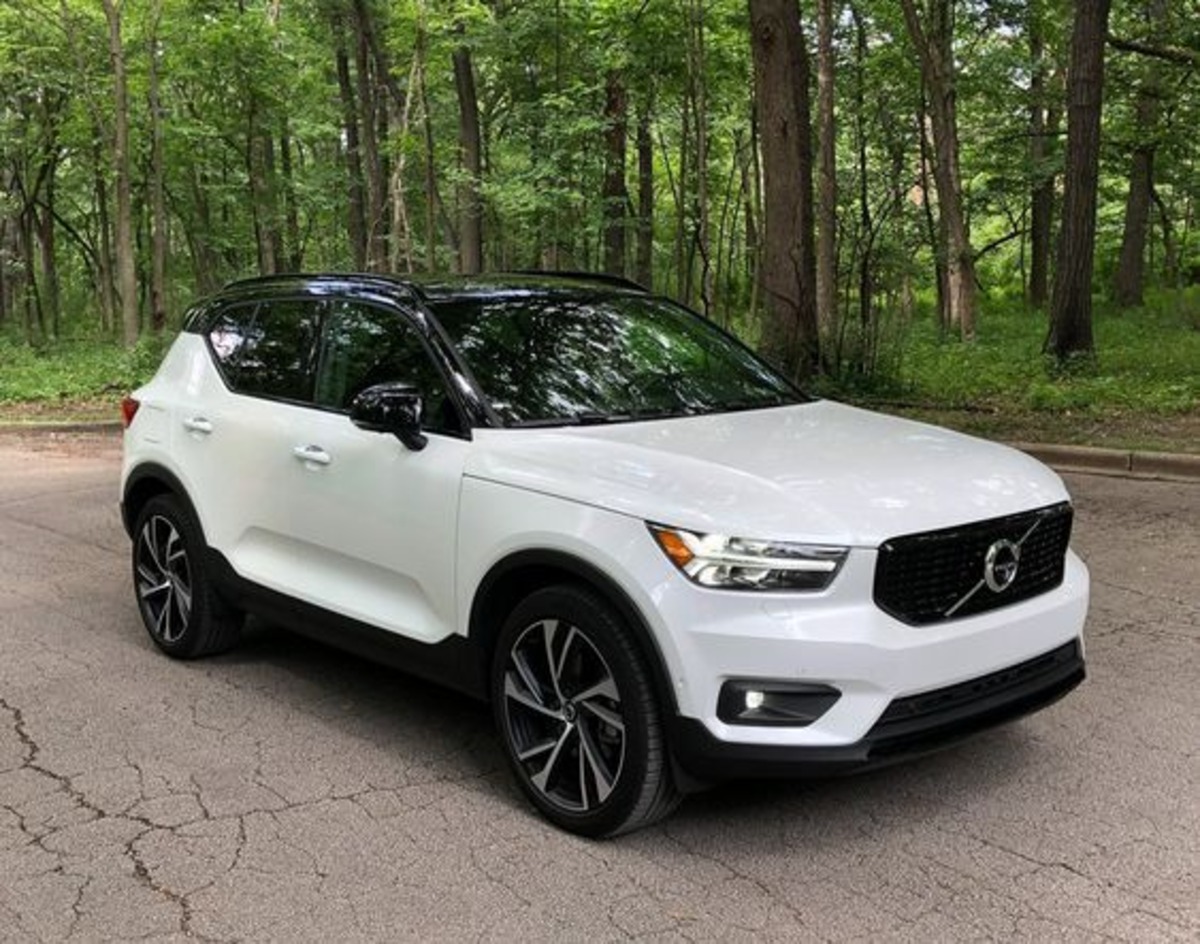
3. Volvo XC40 (Smart Design)
The Volvo XC40 is a masterclass in blending simplicity, utility, and aesthetic clarity. Its cabin is a perfect example of modern Scandinavian design, with clean lines, minimal clutter, and an emphasis on comfort and usability. But what sets the XC40 apart is how its design serves everyday needs.
It features clever storage compartments throughout the cabin, including a removable trash bin in the center console and door pockets large enough to fit laptops or water bottles. These aren’t gimmicks; they reflect real-life usage patterns that other cars often ignore.
The upright design of the XC40 gives it a spacious interior without making it feel boxy or unwieldy. The rear seats offer enough legroom and headroom for adults, and the flat floor design makes it easier for passengers to get in and out. Volvo has also designed the rear cargo area to be especially functional. There’s a folding floor that acts as a divider, shopping bag hooks, and even power outlets in the back, all features that are easy to overlook until you need them.
From a technology perspective, the XC40 balances screen usage with physical interaction in a way that feels neither outdated nor overly digital. The infotainment system is vertically oriented and blends into the dashboard without dominating it. Controls for essential features like climate remain easy to access. Volvo’s approach to safety also enhances the design by integrating advanced driver-assistance systems without making them feel intrusive or clunky.
On the outside, the XC40 is compact enough for city driving but looks substantial. Its design is symmetrical, and the strong shoulders and bold grille give it presence without feeling aggressive. It’s approachable yet confident. Every detail feels considered, from the pixel-style taillights to the contrasting roof color options.
Volvo took the time to make the XC40 not just functional but enjoyable to live with day-to-day. Smart design isn’t just about looks or tech, it’s about how seamlessly a car fits into your life, and the XC40 nails that balance.

4. Hyundai Ioniq 5 (Smart Design)
The Hyundai Ioniq 5 breaks away from traditional EV design clichés with something that feels original and grounded in purpose. Its exterior combines retro inspiration with modern flair, resulting in a distinctive look without being polarizing. But beyond the aesthetics, it’s the layout and use of interior space that show smart design in action.
The Ioniq 5 uses a dedicated EV platform, which allows for a flat floor and stretched wheelbase, creating a surprisingly roomy cabin for a car of its size.
Inside, the design focuses on flexibility. The front seats recline almost flat, there’s a sliding center console, and the rear seats also move forward and backward, something rarely seen in this class. These features allow the driver and passengers to adjust the cabin to their liking, whether for comfort, cargo, or even resting. Hyundai considered how people would use the space, rather than just checking boxes on a feature list.
Tech integration is handled thoughtfully. The dual screens are clear and easy to use, and the climate and drive controls are intuitive. While many modern cars bury everything behind touchscreens, the Ioniq 5 keeps common functions accessible with physical buttons in logical places.
The materials inside also reflect a conscious shift toward sustainability without sacrificing quality. Hyundai incorporates eco-friendly fabrics, recycled plastics, and even plant-based paints, but these elements never feel cheap or performatively “green.” The textures are soft, the surfaces are well-finished, and the cabin experience feels both futuristic and comfortable.
The open space between the front seats also contributes to a sense of calm, breaking away from the closed-off feeling many traditional cabins impose. There’s freedom of movement here, which is rare in this category and price range. This open-plan feeling makes the Ioniq 5 feel more like a modern lounge than a vehicle.
Another highlight is the Ioniq 5’s smart use of lighting. The ambient lighting system is not only customizable but also placed with a sense of mood and function. Light strips subtly trace the cabin’s structure, offering visibility without glare and adding to the car’s sense of space.
At night, this lighting helps define interior contours without overwhelming the eyes, a subtle but thoughtful touch. Even the exterior lighting, with its pixel-themed LED elements, feels coordinated rather than forced. These details, while minor on their own, come together to create an environment that feels coherent and intentional.
On the practical side, the Ioniq 5 offers multiple USB-C ports, a wireless charging pad, and even a 120-volt outlet in the back for powering small appliances or charging devices on the go. That outlet alone turns the car into a mobile power bank, which is a brilliant feature for road trips, work, or emergency use.
There’s also a generous frunk (front trunk) under the hood, made possible by the electric layout. Hyundai has taken full advantage of the EV format here, offering storage and features that combustion engine vehicles could never accommodate so efficiently.
What sets the Ioniq 5 apart is that it rethinks how people interact with a car. Instead of simply electrifying an existing design, Hyundai started fresh and focused on user experience. From the moment you approach it, with its flush door handles and futuristic profile, to the way the cabin adapts to your needs, everything feels designed to make your life easier.
This is the kind of smart design that doesn’t just follow trends, it anticipates them, and builds a genuinely better driving experience around that foresight.

5. Toyota RAV4 (Smart Design)
The Toyota RAV4 is not a car that turns heads for bold design statements, but it stands as a prime example of thoughtful engineering and design that serve daily life. The latest generation of the RAV4 has a confident and rugged appearance, but the real intelligence lies beneath the surface.
It’s a vehicle that consistently delivers on practicality, and its design choices reflect a deep understanding of how people use compact SUVs. It’s not overloaded with unnecessary features, and it doesn’t try to be something it’s not, it’s simply well-balanced and dependable, with a design that reflects those qualities.
Inside, the RAV4 cabin feels both familiar and well-planned. The materials are durable and pleasant, with soft-touch areas where you expect your hands to rest. Controls are placed logically, climate knobs are large and easy to use, even with gloves, and the infotainment screen is placed high enough to glance at without taking your eyes too far off the road.
The visibility from the driver’s seat is also commendable, with large windows and manageable blind spots. These things aren’t glamorous, but they’re critical to good design, and Toyota nailed them.
Another strong point is how Toyota approached storage. The RAV4 includes a shelf integrated into the dashboard for small items like phones and sunglasses, a feature that many vehicles inexplicably overlook. The center console is spacious, the cup holders are well-sized, and the door pockets are usable.
In the back, cargo space is generous, with a wide tailgate opening and a low load floor that makes loading groceries or luggage easier. The rear seats fold down nearly flat, and there’s even a small area under the floor for hidden storage. Every inch of the RAV4 seems to be used with purpose, which reflects well on its design team.
Fuel economy and hybrid integration also show design intelligence. Toyota’s hybrid system is one of the best in the market, offering improved mileage without compromising space or usability. Unlike some hybrids that sacrifice trunk space for battery placement, the RAV4 Hybrid manages to maintain nearly the same cargo area as its gas counterpart.
That kind of smart packaging shows that Toyota was thinking long-term about how the vehicle would be used, not just how it would perform on paper. The RAV4 is a great example of how design can be both invisible and indispensable.
5 Cars That Feel Like Afterthoughts

1. Jeep Compass (Feels Like an Afterthought)
The Jeep Compass has long struggled to find a clear identity, and its design reflects that confusion. It aims to carry the rugged appeal of the larger Grand Cherokee but falls short in execution. The proportions feel awkward, the front grille appears exaggerated on its compact frame, and the stance lacks confidence. It doesn’t commit to being either a city-friendly crossover or a trail-worthy SUV, and that indecisiveness translates into a design that feels like it was put together by a committee rather than a cohesive team.
Inside the cabin, the story doesn’t get much better. While recent models have attempted to improve interior quality, the layout still feels dated and uninspired. Controls are scattered, and the infotainment system, though improved, feels like an add-on rather than an integrated part of the dash.
The center console is cramped, and the storage options are below average. Materials vary wildly between trims, and even on higher-end versions, there’s a sense that corners were cut. Instead of offering a compact SUV that stands out for its smart layout, the Compass feels like it just copied elements from other Jeep models without adapting them to its scale.
Ergonomics are another weak point. The driving position doesn’t feel quite right, with a slightly awkward reach to some controls and a seat that’s less supportive than it should be for long drives. Visibility is hampered by thick rear pillars, and the rear seat experience is underwhelming in terms of both space and comfort.
All of these things add up to a car that might look fine in photos but feels off once you start living with it. It’s the little things, bad cupholder placement, hard-to-reach USB ports, inconsistent touch surfaces- that make it feel like design was a secondary thought.
Even in terms of performance packaging, the Compass doesn’t take full advantage of its platform. It lacks the cargo flexibility of competitors, and while it does offer a Trailhawk trim for off-road use, that version adds weight and cost without resolving the design inefficiencies of the base structure. It’s not that the Compass is a disaster; it’s that it’s uninspired. Every design decision seems to settle for “good enough,” and that’s exactly what makes it feel like an afterthought in an increasingly competitive segment.

2. Mitsubishi Mirage (Feels Like an Afterthought)
The Mitsubishi Mirage is often cited as one of the cheapest new cars on the market, but that low price comes with clear design compromises. From the outside, the Mirage looks like a car built purely to meet a cost goal rather than any kind of design vision.
The shape is basic to the point of being bland, with proportions that feel awkward, too tall for its length, and with wheels that look undersized beneath the high fenders. It’s not just about styling, either. The body lacks aerodynamic smoothness, and there’s no real visual identity beyond the badge. It doesn’t communicate any sense of pride or intention.
Step inside, and the cabin experience unfortunately follows suit. The dashboard is basic and constructed with harsh plastics throughout. The design doesn’t guide your hands or eyes toward the controls; it just presents everything flatly.
Air vents are positioned oddly, the infotainment screen is small and feels tacked on, and there’s little attention given to tactile quality or visual flow. It’s as though the interior was copied from older models and reused without considering how newer drivers interact with vehicles today. There’s no personality, no innovation, just a functional shell.
Ergonomics is weak, especially for taller drivers. The driver’s seat lacks height adjustment, and the posture is too upright with limited lower back support. The steering wheel has minimal adjustability, which further limits comfort for a wide range of body types.
There’s also limited insulation, making road noise a constant presence. These aren’t just budget cutbacks, they’re signs of a car that didn’t get the design attention it needed. Instead of finding clever solutions within its price range, the Mirage cuts corners and leaves obvious problems unaddressed.
Even when it comes to practicality, the Mirage doesn’t make the most of its size. The rear seat space is tight and upright, making it uncomfortable for adults on anything more than short trips. The cargo area is shallow, and the rear seats don’t fold flat, which limits its usefulness.
There are small cars that make excellent use of space with smart folding seats and dual-level cargo floors, but the Mirage ignores these opportunities. It’s a clear example of how a car can meet basic transportation needs but still fail to meet basic design standards.

3. Chevrolet Trax (Older Generation – Feels Like an Afterthought)
While the newer Chevrolet Trax has taken significant strides in design, earlier versions suffered from a lack of vision and felt cobbled together rather than crafted. The original Trax was meant to be an affordable entry into the compact SUV segment, but its appearance made it look more like a bloated hatchback than a confident crossover.
The proportions were off, with an unusually tall roofline and stubby overhangs that didn’t mesh well. It felt like a car designed from leftover pieces of other GM models rather than something created with purpose.
Inside, the original Trax didn’t do itself many favors. The dashboard had a strange motorcycle-inspired gauge cluster that felt out of place in a vehicle aimed at families. Materials were hard and shiny, giving a cheap, rental-car impression. The center stack was tall but not particularly functional, and the infotainment system lagged behind competitors in terms of both screen quality and response time.
Storage compartments were either too shallow or awkwardly placed, and cupholders were placed where elbows wanted to rest. The entire interior seemed like it was patched together from a parts bin without thought for how drivers use their space.

4. Nissan Versa (Feels Like an Afterthought)
The Nissan Versa has long served as one of the most affordable sedans on the market, but earlier versions especially suffered from uninspired design. The exterior was generic to a fault, rounded edges, soft contours, and zero personality. It didn’t present itself as stylish, athletic, or even mature.
Instead, it looked like the kind of car chosen by default rather than desire. While budget constraints influenced the design, there are examples in this segment that managed to maintain character despite their price. The Versa wasn’t one of them.
Inside, the cabin layout did little to inspire confidence. The materials were basic, but beyond that, the layout felt flat and dated. The center console was oddly positioned with too much open plastic surface, and the instrument cluster felt like an afterthought from an earlier decade.
There was a lack of cohesion in the design, the steering wheel looked like it came from a different model, and even the seat fabrics often clashed with the surrounding trim. These mismatches made the car feel older than it was, which didn’t help its appeal in a competitive small-car market.

5. Chrysler 200 (Feels Like an Afterthought)
The Chrysler 200, especially in its later years, is a textbook case of a vehicle that didn’t seem to know what it wanted to be. It attempted to position itself as a mid-size premium sedan but suffered from design choices that left it feeling disjointed.
Its swooping, coupe-like roofline may have looked sleek on the outside, but it significantly compromised rear-seat headroom. This is a classic example of sacrificing function for form, and in a mid-size sedan meant to carry passengers, it was a mistake. The exterior lines didn’t match the car’s dimensions, and the visual proportions never quite clicked.
The interior had a few moments of promise, but they were undermined by inconsistent design language. The rotary gear selector looked modern, but it felt disconnected from the rest of the cabin’s style. The dashboard tried to blend curves and edges, but the mix of textures, plastics, and touch surfaces felt chaotic rather than elegant.
While some trims offered leather and real stitching, others featured materials that felt outdated and low-grade. The inconsistencies between trims made it hard to identify what the Chrysler 200 was trying to be, an affordable family car or a quasi-luxury cruiser.