Car dashboards are supposed to be the central hub for drivers, providing essential information clearly and intuitively. They are meant to balance functionality and style, giving drivers everything they need at a glance. Yet, over the decades, designers sometimes took risks that left people scratching their heads.
Certain dashboards went beyond quirky to downright confusing, with controls placed in strange locations, displays that made no sense, or features that seemed to exist purely for decoration. These dashboards remind us that design is not only about aesthetics but also about usability, and when usability is ignored, the results can be frustrating, funny, or even dangerous.
Some dashboards tried to innovate but overlooked the basics of human behavior, forcing drivers to learn entirely new ways to operate familiar controls.
The evolution of car interiors shows a clear trend: earlier dashboards often prioritized mechanical simplicity, while modern dashboards aim for sleek, futuristic looks. However, some designers took this to extremes, creating environments that were visually impressive but practically impossible to use.
Knobs, buttons, and screens were sometimes scattered across the dash without logic, leaving drivers guessing which control did what. The placement of air vents, speedometers, or even the steering wheel itself could be bewildering.
Some dashboards experimented with digital interfaces long before the technology was ready, producing confusing displays that distracted rather than informed. In these cases, the desire to be unique often outweighed the responsibility to be understandable.
Interestingly, these strange designs sometimes came from manufacturers who were otherwise innovative. They pushed the limits of styling and technology, only to stumble when integrating them into everyday driving. Certain dashboards featured unusual shapes or extreme angles, making them look like something from a sci-fi movie.
Yet when a driver needed to check fuel, temperature, or speed, the information was hidden behind odd panels, obscure symbols, or reflections that made it hard to see. Even when cars performed well mechanically, their dashboards could undermine the entire experience. It shows that no matter how powerful or luxurious a vehicle might be, the dashboard serves as the critical interface between driver and machine.
Drivers often remember these designs vividly because of how frustrating they were to use. Unlike exterior styling, which can be appreciated aesthetically, a confusing dashboard affects daily interaction. People struggled to locate basic functions such as hazard lights, wipers, or climate control.
Some dashboards combined multiple functions into one switch, creating a guessing game for even experienced drivers. While these designs are often mocked today, they were attempts at innovation, highlighting the tension between creativity and clarity. Studying these examples can provide valuable lessons for future automotive design, reminding designers to always consider the human element.
Dashboards that make zero sense become legends in automotive culture. They are frequently discussed in forums, featured in articles, and remembered by car enthusiasts with both amusement and frustration. They reflect a time when aesthetics sometimes outweighed practicality, and experimentation went unchecked.
While most drivers today demand intuitive, easy-to-read displays, these designs serve as a reminder that not all innovations lead to better user experiences. Car dashboards are as much about communication as they are about style, and when communication fails, the result is unforgettable, if bewildering.
These ten examples highlight the most extreme cases where good intentions collided with questionable execution, creating dashboards that continue to baffle long after the cars themselves have disappeared.
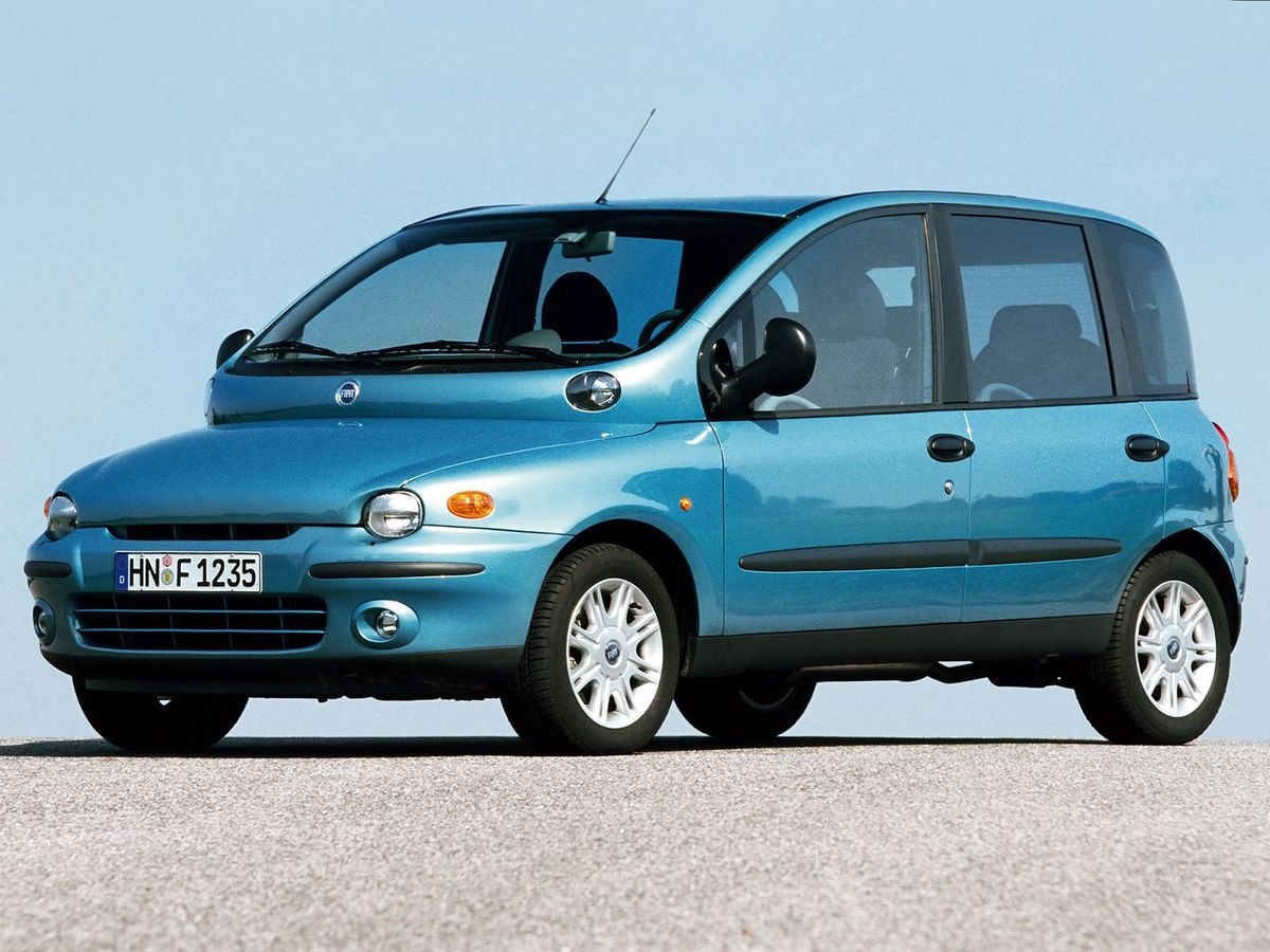
1. Fiat Multipla (1998–2010)
The Fiat Multipla is famous for its odd shape, and its dashboard did not escape scrutiny. Controls were placed at strange angles, and the instrument cluster seemed like it belonged in a different car entirely. Drivers often reported needing to stretch awkwardly to reach essential buttons. The center console looked cluttered and confusing, leaving first-time users unsure which switches controlled what.
The speedometer was offset and unusually small, making quick glances difficult while driving. Air vents were positioned in ways that barely directed airflow toward the driver or passengers. Even experienced Fiat owners sometimes had to consult the manual repeatedly. The dashboard’s layout ignored conventional placement standards entirely.
Some features were hidden behind panels, which needed extra effort to open. Buttons for lights, indicators, and climate control were inconsistently shaped and sized. Mistakes were common, such as turning on the wrong function in a hurry. Despite these flaws, the car had a loyal following because of its versatility and unusual charm.
Ergonomics seemed entirely secondary to the design’s quirky aesthetic. Drivers often joked that the dashboard seemed designed more to confuse than assist. Placement of controls broke intuitive patterns, forcing constant adaptation. This made city driving a challenge for anyone unfamiliar with the car.
The Fiat Multipla’s dashboard is remembered as a classic case of form winning over function. While innovative in some respects, it serves as a cautionary tale. Designers learned that pushing style too far can create unnecessary obstacles. The Multipla remains iconic, but for many, its interior was a daily puzzle.
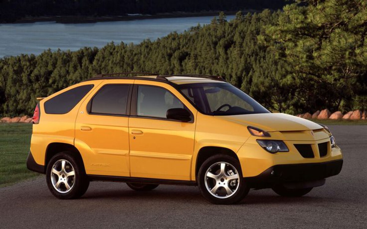
2. Pontiac Aztek (2001–2005)
The Pontiac Aztek tried to look futuristic, but the dashboard was overwhelming and unintuitive. The center console resembled a spacecraft control panel more than a car interior. Drivers had to navigate numerous buttons, knobs, and touchpads without clear guidance.
Climate controls were stacked in an odd formation, often leading to accidental adjustments. The instrument cluster featured unusual shapes and non-standard labeling. Some functions were hidden behind panels that did not clearly indicate their purpose. Drivers often had to memorize each location just to operate the car safely.
Storage compartments were integrated into the dash but interfered with visibility and reach. Cupholders popped out in inconvenient spots, creating more confusion than convenience. Audio and navigation controls were separated, requiring constant attention to operate. The design prioritized appearance over usability.
Even simple tasks like adjusting mirrors or the radio could feel like solving a riddle. Buttons were inconsistent in texture and placement, making it hard to rely on touch alone. Many users admitted to accidentally activating functions they didn’t intend. Despite the car’s versatility, the dashboard remained a daily challenge.
Today, the Pontiac Aztek’s dashboard is a symbol of bad interior design. Critics frequently highlight its lack of logic and driver-centered thinking. Its futuristic ambitions clashed with practical reality. The Aztek is remembered more for interior confusion than performance or innovation.
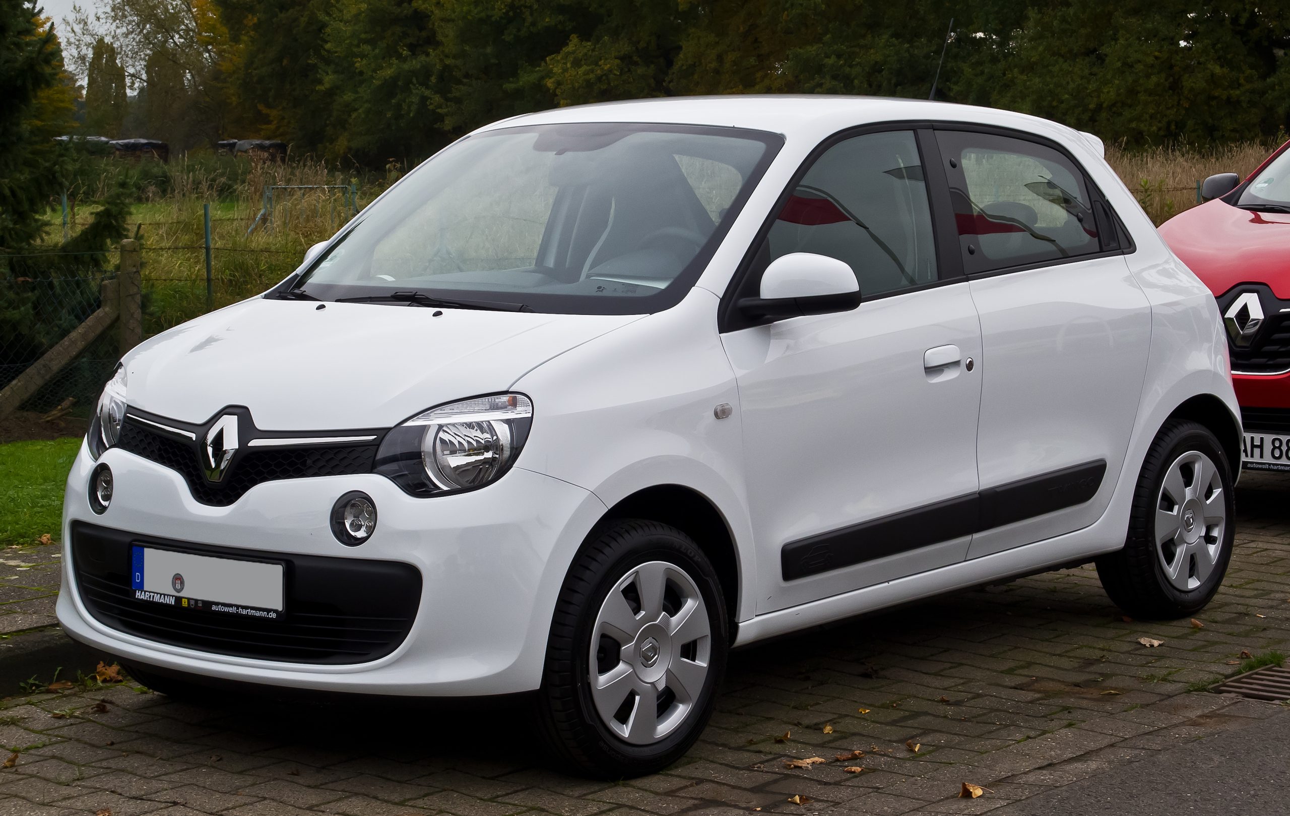
3. Renault Twingo I (1992–2007)
Renault’s first-generation Twingo had a dashboard that confused many drivers at first glance. The speedometer and other essential gauges were oddly shaped and unevenly spaced. Some buttons were grouped by color rather than function, leading to guesswork. The unconventional design aimed to be playful but often backfired.
Controls for heating and ventilation were placed low, requiring drivers to lean forward while operating them. The instrument cluster was sometimes digital, but the displays were minimalistic and not immediately readable. Air vents lacked directional control, reducing comfort during travel. Drivers often found themselves distracted trying to figure out basic functions.
The dashboard attempted modularity, with removable panels and hidden storage spaces. While innovative, it made accessing critical functions cumbersome. Lights, indicators, and wipers were inconsistently arranged, frustrating new users. These quirks became notorious among city drivers.
Ergonomics seemed secondary to style, with curved surfaces that were visually interesting but impractical. Visibility of controls in bright sunlight was poor. Essential warning lights were small and easily overlooked. Daily usability was sacrificed in favor of unique presentation.
Despite its charm and affordability, the Twingo I’s dashboard is remembered for confusion. Critics often cite it as an example of prioritizing novelty over function. Its playful design made it distinct but operationally challenging. It remains a quirky case in automotive interior history.
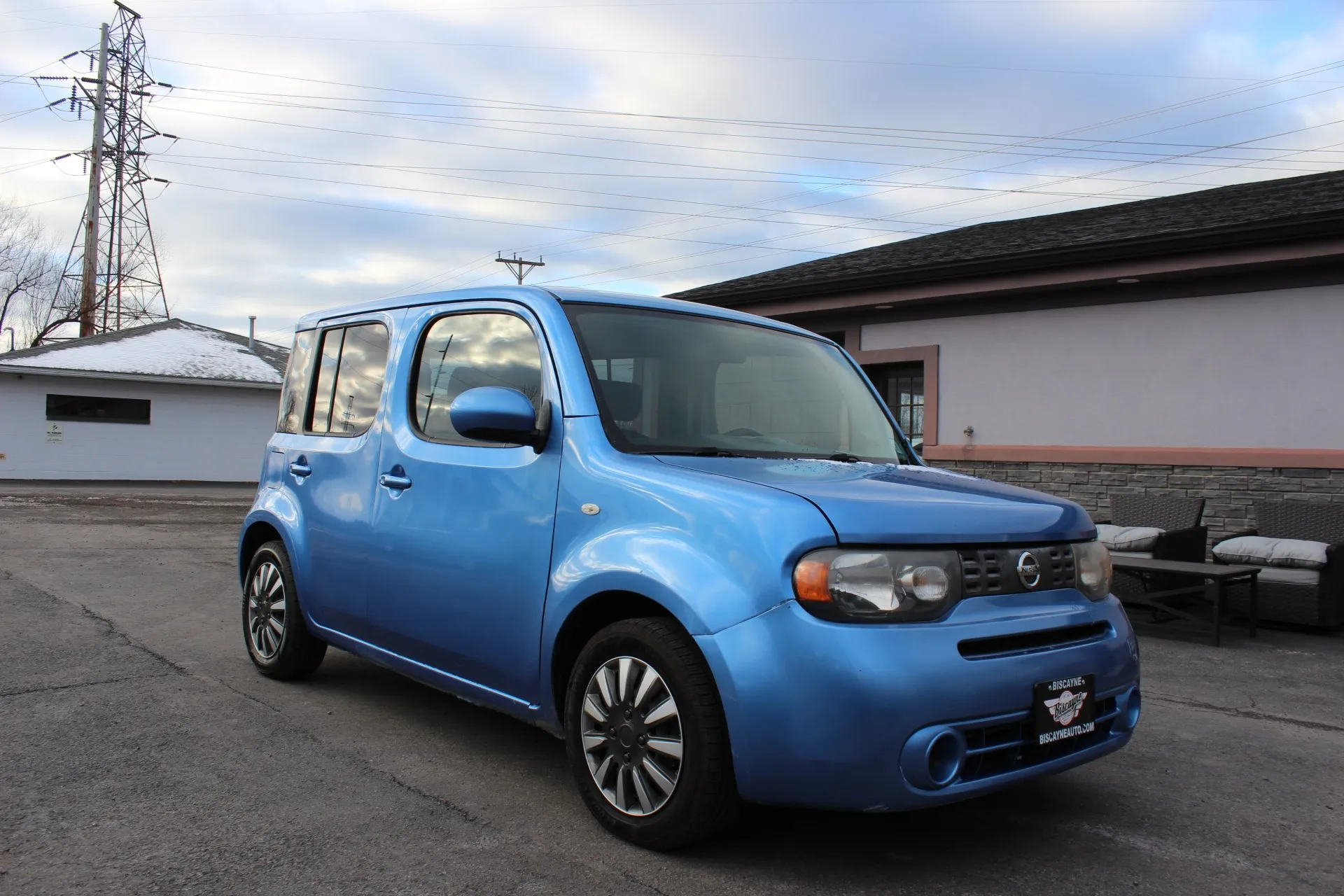
4. Nissan Cube (2009–2014)
The Nissan Cube tried to break away from conventional boxy designs, and its dashboard reflected that ambition. The asymmetrical layout gave the interior a quirky, almost cartoonish feel.
The instrument cluster was placed off-center, closer to the passenger side than the driver, which led to confusion while glancing at speed or fuel levels. Some drivers reported accidentally reading the wrong gauge, making highway driving an extra challenge.
Air vents were oddly positioned, some facing the driver directly and others pointing away entirely. Climate control knobs were unusually large but placed in inconvenient spots, making adjustments while driving awkward. Buttons for basic functions, such as lights and wipers, were small and hard to differentiate by touch alone. Even simple tasks required a careful study of the dashboard before operating safely.
The audio system controls were separated from the main console, requiring drivers to look down and away from the road to operate the radio or CD player. Storage spaces integrated into the dash protruded into legroom for both driver and passenger. Some features, like hazard lights, were tucked away behind other panels, requiring drivers to remember where each button lived. It was a constant exercise in memory and spatial awareness.
The Cube’s designers wanted a playful and futuristic aesthetic, but usability took a backseat. The dashboard had a floating, layered appearance that looked interesting but often blocked sight lines or made reaching controls awkward.
Even experienced drivers needed time to become comfortable with the layout, and some admitted they never fully adjusted. This dashboard became a defining example of how unconventional styling can clash with functionality.
The Cube’s interior showed that creativity must coexist with practicality. While visually distinctive, the dashboard distracted and confused many drivers. It serves as a cautionary tale that interior design should prioritize intuitive control placement over novelty alone. Despite its charm, the Nissan Cube’s dashboard remains one of the most debated in modern car history.

5. Ford Thunderbird (2002–2005)
The retro-styled Ford Thunderbird attempted to merge modern technology with nostalgic design, but the dashboard design puzzled many drivers. The center console was dominated by large circular air vents that overshadowed the speedometer and other gauges.
Drivers reported difficulty reading essential information quickly, especially during nighttime or rainy conditions. Many described the layout as visually striking but practically inconvenient.
Switches for audio, climate, and navigation were scattered across multiple surfaces. Some controls were embedded within the steering column, forcing drivers to adjust their position to reach them.
Key functions like hazard lights or defrost were tucked behind curves in the dash, resulting in frequent accidental activations. The dashboard required a mental map to operate safely, which undermined its nostalgic appeal.
The Thunderbird also featured chrome accents and deep recesses that reflected sunlight, causing glare across the dashboard. Buttons for minor functions, like traction control or wiper speed, were small and often difficult to identify without looking. Drivers had to choose between keeping their eyes on the road or making adjustments, defeating the purpose of a functional dashboard.
Some enthusiasts appreciated the aesthetic approach, arguing that the Thunderbird felt like a car from another era. However, the interior reminded them that style without practicality can become a daily frustration. Even short drives required extra attention to controls, creating a level of cognitive load that modern cars usually avoid. Many drivers ended up ignoring non-essential functions entirely to minimize confusion.
The Ford Thunderbird demonstrates that nostalgia-inspired design can backfire when it interferes with usability. The dashboard’s retro charm could not compensate for poorly thought-out placement of essential features. It remains a symbol of ambitious styling clashing with functional necessity. Drivers still recount the experience as simultaneously memorable and baffling.
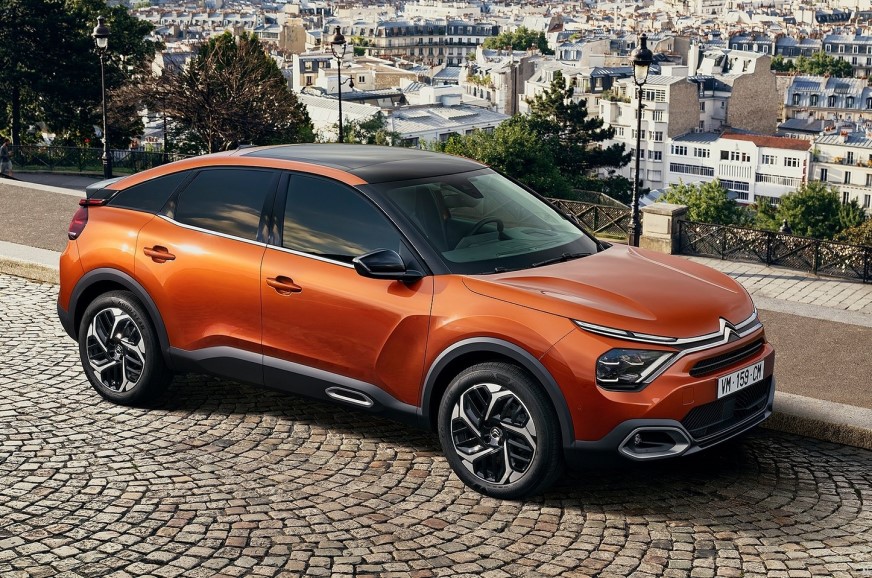
6. Citroën C4 (2004–2010)
The Citroën C4 aimed for futuristic sophistication, but the dashboard design challenged many drivers’ expectations. Central digital displays replaced traditional analog dials, but the screen often presented information in a compact and confusing manner.
Speed, fuel, and engine warnings were condensed, requiring drivers to slow down or look away from the road to interpret them accurately. The innovation, while visually modern, interfered with instinctive driving habits.
Air conditioning and heating controls were embedded within a smooth panel without tactile differentiation. Drivers often struggled to find buttons without visual confirmation, making quick adjustments while moving impossible. Vent placement was inconsistent, resulting in uneven airflow throughout the cabin. Some passengers reported feeling left out of climate control adjustments due to poor reachability.
The instrument cluster itself was positioned unusually high on the dashboard, near the base of the windshield. While meant to improve visibility, it forced drivers to lift their eyes higher than normal, which was uncomfortable during longer trips. Small fonts and unconventional symbols increased the cognitive effort needed to understand the information. It became clear that the dashboard prioritized modernism over intuitive interaction.
Some functions were accessible only through multi-step menus on the digital display. Audio, navigation, and vehicle settings were nested inside layers, making real-time adjustments cumbersome. Even minor changes, such as toggling the trip meter, required multiple button presses. This approach contrasted sharply with the immediacy expected in everyday driving.
The Citroën C4 serves as a reminder that early attempts at fully digital dashboards often failed to account for the driver’s need for clarity. While aesthetically futuristic, the interface demanded extra attention and created frustration. The C4 dashboard is remembered for its ambition and its operational complexity, highlighting the tension between innovation and usability.
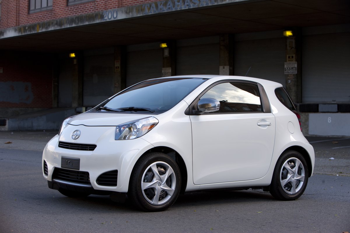
7. Toyota iQ (2008–2015)
The Toyota iQ is a microcar that packed an incredible amount of functionality into a tiny space, but its dashboard defied conventional logic. Essential gauges were compressed and positioned in unusual locations, sometimes forcing drivers to shift position to see them clearly. The layout felt overcrowded despite the car’s compact size. Drivers frequently had to memorize button placement for safe operation.
Air vents were small and placed close together, limiting airflow to passengers. Climate controls were awkwardly grouped and required reaching over the central console, making adjustments inconvenient.
Even the placement of the ignition switch was non-standard, creating a brief but noticeable learning curve for new drivers. Small interiors amplified every design flaw, emphasizing impracticality.
Audio and navigation functions were accessible but not intuitively arranged. Volume knobs were similar in size to other buttons, leading to mistakes. Some toggle switches for minor functions were located near floor-level panels, which could only be reached by leaning or stretching. The iQ’s compactness exaggerated the dashboard’s oddities.
The steering wheel also partially obstructed the instrument cluster in certain positions, forcing drivers to move their hands or adjust the seat repeatedly. Quick glances at speed or fuel often required an awkward change in posture. While the dashboard maximized space usage, it minimized ergonomic efficiency. Drivers had to adapt constantly to maintain safe control.
Despite these flaws, the Toyota iQ gained praise for clever packaging and fuel efficiency. Its dashboard is remembered less for innovation and more for its spatial challenges. This design illustrates the difficulty of combining extreme compactness with functional clarity. It is a classic example of a space-saving car with a zero-sense interior.
