
Infotainment systems have gone from being optional tech flourishes to becoming the digital nerve center of modern vehicles.
What was once just a basic stereo with radio presets has now evolved into complex, touchscreen-driven interfaces capable of handling navigation, audio streaming, climate control, phone calls, voice commands, and even in-vehicle apps.
As cars become more connected, autonomous, and user-experience focused, the infotainment system has transformed into one of the most important aspects of a vehicle, not just for entertainment, but for safety, convenience, and driver engagement.
Yet, for all the attention given to this technology, not every automaker gets it right. The automotive industry continues to struggle with designing infotainment systems that are not only functional but also intuitive.
While some manufacturers understand the importance of simplicity, user-centered design, and fluid operation, others still push convoluted interfaces that confuse, distract, and sometimes even frustrate drivers to the point of disengagement.
These missteps don’t just impact satisfaction—they can also increase cognitive load, delay reaction times, and ultimately affect driver safety.
The best systems do not require instruction manuals or tutorial videos. They just work. They align with how users think, how they’ve been trained by other devices like smartphones and tablets, and how they need to access information while behind the wheel.
These systems rely on natural language voice commands, clearly labeled menus, fast response times, and streamlined layouts. Above all, they respect the user’s time and attention span. The learning curve is practically nonexistent, and familiarity comes within moments of first use.
Conversely, the worst infotainment systems are the ones that defy logic and resist user intuition. They rely on poorly executed concepts, such as laggy touchpads, non-intuitive gesture controls, deeply nested menus, and unresponsive voice assistants.
These systems don’t just present a hurdle during the first few drives; they often remain a source of irritation throughout ownership. Poor design decisions in these interfaces can overshadow even the strongest mechanical engineering beneath the hood.
In this article, we’ll explore five infotainment systems that get it right, offering drivers a seamless, straightforward experience that requires little to no learning. These systems exemplify best-in-class design, blending form with function and accessibility.
Then, we’ll examine five infotainment systems that consistently miss the mark, showing how ambitious concepts can go wrong and how poor execution can derail daily usability.
Whether you’re a first-time car buyer, a tech enthusiast, or someone simply fed up with tapping your way through menu after menu just to change a setting, this breakdown will help clarify what separates the smart systems from the senseless ones.
The goal is not just to name names, but to illustrate the principles behind what makes an infotainment system truly effective—or frustratingly flawed. Because in today’s vehicles, it’s no longer just about how the car drives. It’s about how well it connects with the driver.
Also Read: 10 Cars With Rearview Mirrors That Are Too Small by Today’s Standards
5 Infotainment Systems That Require No Learning

1. Apple CarPlay
Apple CarPlay represents the gold standard in plug-and-play infotainment systems, mainly because it leverages a platform that millions of users are already intimately familiar with: the iPhone.
From the moment you connect your device—either via USB or wirelessly—CarPlay displays a replica of your smartphone’s core interface, complete with familiar icons like Maps, Phone, Music, Messages, and Podcasts.
The interface is so natural to use that there’s essentially no onboarding required. Users who have never driven the vehicle before often feel immediately at home because they’re simply using their phone, just on a bigger screen.
There’s no hunting through obscure menus or learning new gestures—everything just works. What truly sets CarPlay apart is its consistent performance across different manufacturers.
Whether you’re in a Ford, a Mercedes, or a Honda, the CarPlay interface remains the same, which creates a universal experience that removes the variability and confusion often associated with different infotainment systems.
That cross-compatibility makes it one of the most stress-free systems for those who switch between cars regularly, such as renters, rideshare drivers, or households with multiple vehicles.
The system also scales well depending on the screen size—it looks just as good on a small display as it does on a panoramic one—and offers responsive touch feedback without noticeable lag.
Another reason Apple CarPlay feels so seamless is its deep integration with voice controls via Siri. This allows drivers to perform a wide array of tasks without taking their hands off the wheel or eyes off the road. You can ask Siri to read and respond to messages, make calls, start a playlist, or guide you to your next destination.
Everything works using natural language processing, and because it’s part of the iOS ecosystem, it often understands user habits, context, and preferences. There’s no need to learn new command formats—Siri is conversational and adaptive.
CarPlay also benefits from the fact that updates are handled through your iPhone. As Apple rolls out new features, tweaks interfaces, or improves security, you get those enhancements immediately without needing to visit a dealer or install firmware updates on your car.
This regular update cycle keeps the interface fresh and up to date, in contrast to many native car systems that age quickly or feel outdated just a few years in. It ensures CarPlay remains relevant and familiar long-term, without any steep learning curve.
Ultimately, Apple CarPlay succeeds because it doesn’t try to reinvent the wheel. Instead, it brings what works well on a smartphone into the automotive context, minimizing distractions and maximizing usability.
The learning curve is virtually flat, the design is thoughtful and clean, and the functionality covers virtually everything a modern driver could need, making it one of the most user-friendly infotainment systems ever created.

2. Tesla’s Touchscreen Interface
Tesla’s infotainment system is unlike anything else in the automotive industry, and while it may look futuristic and even intimidating at first glance, its genius lies in its simplicity.
Dominated by a massive, tablet-style touchscreen—center-mounted in most models—the interface consolidates virtually every car function into a single, intuitive control hub.
Despite the volume of options available, Tesla’s layout and design make it incredibly easy to navigate, especially for users familiar with smartphones and tablets. The experience feels less like operating a vehicle system and more like browsing an app on an iPad—smooth, responsive, and visually coherent.
One of the most impressive elements of Tesla’s UI design is how logically grouped everything is. Functions are not buried under complex menus or labeled with confusing terminology. Whether you’re adjusting your seat position, tweaking driving dynamics, or selecting a streaming service, everything is where you expect it to be.
There’s a left-side control dock for key driving essentials and a customizable bottom bar for your most-used functions. Tesla’s designers clearly considered how users think, reducing the need for trial-and-error or manual reading.
Moreover, the responsiveness of the screen itself is unmatched in the industry. While many infotainment systems suffer from input lag, poor resolution, or jittery touch feedback, Tesla’s system is buttery smooth.
Swipes and taps register instantly. Animations are fluid. Transitions between screens are seamless. It mirrors the quality users expect from high-end consumer electronics, which is a critical reason why drivers can learn it so quickly. There’s no lag-induced frustration, and the clean UI means nothing gets lost in clutter.
Beyond basic functions, Tesla’s system includes playful, human-centric features that make it approachable. There are Easter eggs, arcade games, streaming apps, and even a “fart mode”—all designed not just to showcase the tech, but to demystify it.
This lightheartedness gives the interface character and encourages users to explore, rather than fear the unfamiliar. Tesla has managed to make a fully digital interface not only practical but engaging, and that builds user confidence from the moment they sit down.
Frequent over-the-air updates are another huge win. Tesla regularly rolls out new features, fixes, and even UI changes based on driver feedback, all delivered via Wi-Fi while the car is parked.
That means the infotainment system evolves, often without the user needing to do anything. This commitment to continuous improvement keeps the system fresh, intuitive, and aligned with user behavior, making Tesla’s interface one of the easiest to use, despite its ambitious scope.

3. Hyundai/Kia’s UVO/Infotainment 2.0 System
Hyundai and Kia have undergone one of the most impressive tech evolutions in the auto industry over the last decade, and their infotainment systems now rival or surpass those of many premium brands.
The UVO and Infotainment 2.0 platforms—used across a wide range of models from the compact Elantra to the luxurious Genesis lineup—offer a near-perfect balance between digital ease and traditional functionality. For drivers who value intuitiveness without sacrificing control, these systems are an ideal middle ground.
At first glance, the user interface impresses with its clarity. Icons are well spaced, labeled in plain language, and categorized in a way that mirrors real-world use.
For example, all media functions are grouped, all vehicle settings are together, and smartphone connectivity is easily accessible from the home screen.
The home menu is customizable, so users can prioritize the functions they use most often. This level of flexibility makes the system feel personal, rather than generic, and allows new users to feel in control from the very start.
Hyundai/Kia also excels at retaining physical controls for vital features. Volume and tuning knobs, real buttons for HVAC settings, and even shortcut keys for navigation and media functions are present across most trims.
These tactile elements complement the touchscreen interface and minimize distraction, especially helpful when driving on rough terrain or in busy traffic. The result is a system that never forces users to rely on touch input alone, which is often a weakness in fully digital systems.
Voice control in UVO has also seen major upgrades. While not quite as powerful as Google Assistant or Siri, the native voice command system is functional and simple to use. Common commands like “Set temperature to 72 degrees” or “Navigate to work” are processed quickly and without the need to memorize rigid phrasing.
Smartphone integration via Android Auto and Apple CarPlay is seamless, with quick load times and reliable performance, rounding out a system that prioritizes real-world use over flashy gimmicks.
In short, Hyundai and Kia’s infotainment systems are an example of practical excellence. They don’t try to dazzle with unnecessary animations or overly modern aesthetics.
Instead, they focus on clear, responsive, and customizable interactions that make sense the moment you sit behind the wheel. For drivers who want to get in and drive without reading a manual, this system is as close to perfect as it gets in the non-luxury segment.

4. BMW iDrive 7.0 & 8.0
BMW’s iDrive has undergone substantial refinement since its rocky debut in the early 2000s, evolving into one of the most sophisticated yet intuitive infotainment systems on the market.
The latest iterations, iDrive 7.0 and 8.0, offer a masterclass in versatility, enabling users to interact with the system in whatever way suits them best: touchscreen, rotary dial, physical buttons, voice control, or even hand gestures.
This flexibility is key to the system’s ease of use and makes it accessible to both tech-savvy users and those who prefer traditional controls.
The visual design of iDrive is one of the cleanest in the industry. The menu layout is consistent and easy to follow, with horizontal scrolling and logical grouping of features. BMW allows users to customize the home screen with widgets, which serve as live previews of key data like navigation, media, weather, or calendar events.
This customization makes frequently used information visible at a glance and reduces the need to dive into menus, cutting down on screen time and mental load.
Voice command functionality is handled by BMW’s Intelligent Personal Assistant, which is responsive and context-aware. You can say “Hey BMW, I’m cold,” and the system knows to increase the cabin temperature.
The assistant learns over time, adapting to user habits and speech patterns, and integrates with vehicle systems in a way that feels cohesive rather than bolted on. This natural language interface minimizes the need for memorization and is especially helpful for drivers unfamiliar with BMW’s terminology or menu structure.
The rotary dial remains a standout feature. While touchscreens can be tricky while driving, especially on rough roads, the dial allows for precise control with minimal effort.
It’s intuitive, responsive, and makes scrolling through long lists or zooming in on maps a breeze. Many users find themselves preferring it over touchscreen input once they’ve tried it.
In essence, iDrive 7.0 and 8.0 prove that complexity doesn’t have to be complicated. The system’s multi-modal control approach, customizable interface, and smart voice assistant combine to create an infotainment experience that feels high-tech but not high-effort.
Whether you’re a longtime BMW owner or a new driver, the learning curve is remarkably gentle.

5. Volvo Sensus (Latest Version)
Volvo’s Sensus infotainment system, especially in its latest iterations, is an excellent case study in elegant simplicity. The interface is centered around a vertically oriented touchscreen—a unique design choice that mirrors smartphones and tablets.
This familiar layout immediately reduces the intimidation factor for new users and provides a natural navigation experience. Everything from the climate control to navigation and app integration is housed in this clean, logically structured display.
One of the most commendable aspects of Sensus is its minimalist aesthetic. Unlike systems that clutter the screen with too many icons, Sensus adopts a layered interface that relies on horizontal and vertical swipes. The home screen is divided into tiles representing navigation, media, phone, and other critical functions.
These tiles are interactive and expandable, meaning you can access full controls without jumping into separate menus. This efficient use of space and interaction design makes the system feel modern without overwhelming the user.
Volvo also keeps driver safety at the forefront. Climate control, which is often hidden behind several menus in other systems, is accessible at all times via a persistent strip at the bottom of the screen.
This small but crucial detail reduces distraction and allows users to make quick adjustments without losing focus. Furthermore, key functions such as defrost, camera views, and seat heaters are available with a single tap, ensuring that common tasks don’t become a scavenger hunt.
Voice control in Sensus is enhanced in newer models thanks to Google Assistant integration. Drivers can issue natural commands like “Play jazz on Spotify” or “Take me to the nearest charging station,” and the system responds quickly.
Because it leverages Google’s vast database and AI infrastructure, it’s both accurate and versatile. Combined with built-in Google Maps and Play Store apps, the system becomes a full-service digital assistant on wheels.
Volvo’s attention to detail and user behavior shines through in every aspect of Sensus. It’s calm, composed, and deliberately designed to fade into the background once you know your way around—which happens quickly.
It doesn’t bombard users with notifications or complex animations; instead, it offers a serene and focused digital experience. For those who value simplicity, reliability, and elegance, Volvo Sensus is one of the easiest systems to learn and live with.
5 That Never Make Sense

1. Lexus Remote Touch Interface
Lexus, a brand long celebrated for craftsmanship and quiet luxury, unfortunately misfired when it came to the Remote Touch infotainment interface. Designed to mimic the experience of a computer’s touchpad or joystick, it instead results in a system that feels awkward, distracting, and fundamentally counterintuitive.
The concept sounds innovative on paper: use a physical controller to move a cursor across the infotainment screen, selecting menus and features like you would on a laptop. In practice, however, this breaks one of the golden rules of in-car tech: keep eyes on the road and distractions minimal.
The problem begins with the touchpad’s hyper-sensitivity. The cursor can fly across the screen with the slightest nudge, making it extremely difficult to land precisely on the icon or menu option you want, especially while the car is in motion.
Unlike physical buttons that offer tactile feedback, or even responsive touchscreens that rely on instinctual swipes and taps, Lexus’s Remote Touch requires your visual attention almost constantly. This increases cognitive load and introduces unnecessary frustration into what should be a straightforward interaction.
Additionally, the layout of the infotainment system doesn’t support the complexity of the control device.
Menus are not always logically grouped, icons can be small and difficult to select, and many core functions are buried within multiple layers. You may need to perform four or five steps just to access a basic setting like fan direction or audio equalizer adjustments.
That kind of demand on the driver is not just inconvenient—it borders on unsafe. The system often feels like a tech experiment rather than a practical tool, especially compared to more intuitive interfaces offered by competitors.
Voice recognition isn’t much of a saving grace either. It lacks the natural language processing capabilities found in systems powered by Apple, Google, or even newer proprietary assistants from other automakers.
Responses can be slow, often failing to interpret commands properly, and sometimes forcing the user to revert to the dreaded joystick.
Despite Lexus improving interior materials and cabin quietness, the user interface remains a glaring weakness, undermining what is otherwise a near-perfect luxury driving experience. The Remote Touch interface represents an instance where innovation went too far without grounding itself in real-world usability.

2. Honda’s Pre-2020 Touchscreen System
Honda is typically known for building well-rounded, dependable cars that are easy to live with. However, their infotainment systems from the mid-2010s through 2019 were a clear miss in an otherwise strong portfolio.
These systems were often built around a touch-sensitive interface that ditched almost all physical controls—most notoriously, the volume knob.
What seemed like a modern design decision turned into a persistent annoyance for users, especially while driving. Having to adjust the volume using a slow, imprecise capacitive slider or tap repeatedly on the screen was a user-experience failure in the truest sense.
The touchscreen interface itself also fell short in terms of responsiveness and layout. Input lag was common, making simple actions feel delayed and uncertain. This forced users to repeatedly press icons or tap back and forth between menus, creating unnecessary distractions.
The menu structure lacked cohesion and often buried key functions behind several layers. For example, altering equalizer settings, changing Bluetooth devices, or modifying driver assistance features typically requires four or more interactions—far too much for anyone trying to remain focused on the road.
In terms of visuals and user feedback, the design felt outdated even when it was new. The graphics were flat, the iconography uninspired, and transitions between screens were sluggish.
Furthermore, despite Honda’s efforts to integrate smartphone functionality, Apple CarPlay and Android Auto often experienced slow boot-up times and frequent connection issues.
Bluetooth pairing was also inconsistent, leading many users to forgo the system altogether in favor of using their phones manually, defeating the purpose of having an infotainment system at all.
Adding to the woes, voice control was limited and felt tacked on rather than integral. Commands needed to be spoken in an exact format to be understood, which discouraged natural use.
Simple tasks like changing a playlist or navigating to a point of interest were unreliable through voice, making it yet another underdeveloped feature.
Although Honda eventually acknowledged these criticisms and reinstated physical volume knobs in later models, this generation of infotainment systems remains a case study in how minimalism and tech for its own sake can compromise usability and driver satisfaction.

3. Subaru Starlink
Subaru’s Starlink infotainment system is a frustrating contradiction. The brand’s ethos—safety, practicality, and ease of use—fails to translate into its digital interface. Starlink feels dated, confusing, and in many cases, unfinished.
The visual design is one of the first red flags: it features low-resolution icons that look more at home on a children’s tablet than in a modern car. The aesthetics might be forgivable if functionality made up for it, but unfortunately, Starlink fails on that front too.
The user interface is poorly organized, often mixing system settings with media options in ways that don’t follow a logical structure. Instead of being able to rely on instinct or previous experience with digital devices, users must manually learn the specific quirks and inconsistencies of Starlink.
Menu options can be buried several layers deep, and key features, such as adjusting the balance and fade of speakers, can take far more time and taps than they should. Navigating through this system while driving is not just inconvenient; it can be a genuine hazard.
Performance is another weak link. The system is plagued with lag, slow boot times, and frequent software freezes. Some users report that the screen goes blank or the audio cuts out randomly, requiring the car to be restarted to restore function.
These bugs create a perception of unreliability that erodes user trust, especially when dealing with navigation or hands-free calls.
Subaru has issued updates to improve stability, but the core issues remain prevalent in many models. For a company that prides itself on dependability and safety, the tech execution here feels surprisingly sloppy.
Integration with smartphone apps is also underwhelming. While Apple CarPlay and Android Auto are available in many Subaru models, their implementation feels like an afterthought.
Connection issues are common, and switching between the vehicle’s native system and your smartphone interface often requires unnecessary steps or resets. Voice control is minimal at best and frequently fails to recognize even simple commands.
The end result is a system that users tolerate rather than appreciate—a digital afterthought in an otherwise smartly engineered vehicle. Starlink consistently ranks among the worst infotainment systems in user satisfaction surveys, and it’s easy to see why.

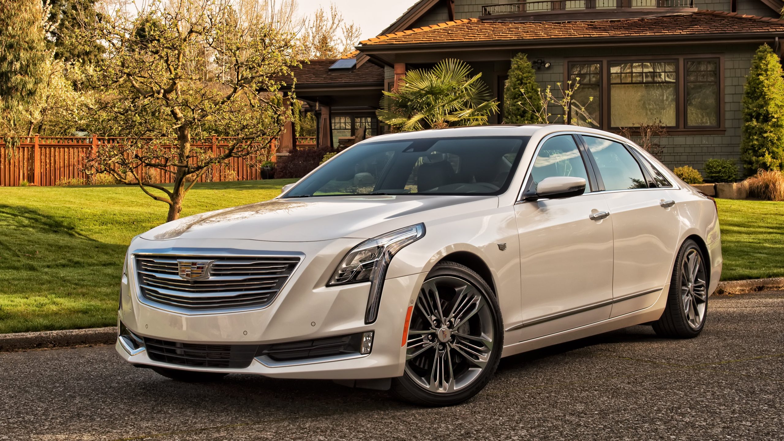
4. Cadillac CUE (Cadillac User Experience)
Cadillac’s CUE system was launched with grand ambitions—to usher in a new era of tech-forward, luxurious driving. Instead, it became a cautionary tale of how not to implement touch-centric controls.
Cadillac removed nearly all physical buttons in favor of a fully touch-sensitive interface backed by haptic feedback. In theory, this should have created a sleek, minimalist experience. In practice, however, it led to massive usability issues that confused and frustrated owners across the board.
First, the touch panel’s haptic feedback was erratic and imprecise. Drivers could never be quite sure whether their input had been registered, especially since visual confirmation was sometimes delayed.
Adjusting the volume or fan speed often took multiple tries, creating a cycle of over-correcting and under-correcting that quickly became infuriating. The lack of tactile differentiation between controls made it impossible to operate the system by feel alone, forcing the driver’s eyes back to the screen repeatedly—something you never want in a car.
Second, the CUE software was sluggish and bug-prone. Boot-up times were slow, and navigating through menus often felt like wading through molasses. Transitions between menus had lag, animations stuttered, and system crashes were not uncommon.
These performance issues weren’t just inconvenient—they directly undermined the system’s goal of luxury and modernity. Even when Cadillac pushed software updates, improvements were minor and sometimes introduced new bugs or compatibility issues.
Moreover, CUE suffered from poor menu design. Frequently used functions were not always easy to find, and customization options were limited. Unlike competitors that allowed drivers to set up shortcuts or modify layouts, CUE felt static and rigid.
Voice control was also a weak spot—commands often failed unless phrased in exact syntax, and natural language queries were rarely understood. Even phone pairing and Bluetooth functionality could be hit or miss, making it difficult to rely on for daily use.
Cadillac eventually phased out this version of CUE in favor of a more balanced and traditional setup with physical knobs and improved software. However, the original CUE system remains infamous among auto reviewers and longtime Cadillac owners.
It serves as a reminder that luxury in tech should never come at the cost of basic usability, and that driver frustration can ruin even the most stylish dashboard.

5. Toyota Entune (Early Versions)
Toyota’s Entune system—especially in its early iterations—was a glaring weak spot in an otherwise solid lineup of vehicles. While Toyota cars are known for reliability and simplicity, Entune often felt like an unnecessary complication.
One of the first signs of trouble was the system’s reliance on a separate mobile app to unlock many features. Instead of providing native navigation, music streaming, or voice functionality, Toyota required users to install and configure an Entune app on their smartphones—an extra step that was both confusing and frustrating for many drivers.
This app-based approach created constant connectivity problems. Features would stop working unless the app was open and actively running on the phone. Even then, Bluetooth pairing was finicky, with connections dropping frequently or not being recognized at all.
Unlike modern systems where smartphone integration is seamless, Entune felt like trying to hold two puzzle pieces together with duct tape. These issues were compounded by long loading times and a clunky interface that often lagged behind user input.
The touchscreen experience wasn’t much better. Responsiveness was inconsistent, icons were small and awkwardly placed, and the menu structure defied logic. Essential tasks like adjusting audio settings, locating destinations, or even setting a favorite radio station required more steps than necessary.
Many features were buried several menus deep, making it nearly impossible to complete quick adjustments while driving. For a brand that markets itself on family-friendly ease of use, Entune often made tech-savvy users feel lost.
Graphics and visual appeal were also sorely lacking. The design language felt about a decade behind competitors, with low-resolution displays, basic fonts, and a lack of polish that undermined the otherwise refined cabins.
Voice recognition was rigid and unhelpful—users had to memorize specific commands to accomplish even basic tasks, and more often than not, the system would misinterpret or reject inputs. Overall, it felt like Toyota had outsourced the design to a tech team unfamiliar with user experience best practices.
Thankfully, Toyota recognized these flaws and made major improvements in recent models, integrating Apple CarPlay and Android Auto as standard features and revamping their in-house UI.
But for anyone who experienced the early Entune systems, the memory lingers as a clear example of how good intentions, like offering app integration, can result in bad design when not executed with the driver in mind.
Also Read: 10 Cars With the Easiest Child Seat Anchor Access
In the rapidly advancing world of automotive technology, the infotainment system has emerged as the new control center—the digital cockpit where communication, entertainment, navigation, and vehicle functions converge.
As more of the car’s core operations are funneled through screens and voice-controlled interfaces, getting this aspect of design right is no longer optional. It directly impacts driver safety, comfort, and satisfaction. What was once a novelty is now a necessity—and it must be treated with the same precision and care as any mechanical component.
The five systems that stood out as requiring no learning curve—Apple CarPlay, Tesla’s touchscreen interface, Hyundai/Kia’s UVO, BMW’s iDrive, and Volvo’s Sensus—all share a commitment to the same core values: clarity, speed, familiarity, and flexibility.
They don’t overwhelm the user with visual clutter or hidden functions. Instead, they embrace intuitive design, fast processing, and clean menu structures.
Most importantly, they give drivers multiple ways to interact—touch, voice, physical buttons—ensuring that the experience remains accessible to people of all tech backgrounds and driving preferences.
On the other hand, the systems that fell short—Lexus’s Remote Touch, Honda’s older touchscreen system, Subaru’s Starlink, Cadillac’s CUE, and Toyota’s early Entune versions—all failed in one or more of those same categories.
Whether it was through laggy performance, overly complicated control schemes, confusing menu layouts, or poor voice command recognition, these systems placed form above function. They often prioritized experimental or minimalist design over practical usability, alienating users who just wanted something simple and effective.