
The dashboard layout of a vehicle plays a crucial role in shaping the overall driving experience. It is the cockpit from which drivers control almost every aspect of their vehicle, from navigation and climate control to entertainment and safety features.
An intuitive dash layout enhances driver comfort, safety, and ease of use by placing controls and displays in logical, easily accessible positions.
When designed thoughtfully, it reduces distraction, allowing drivers to focus on the road while seamlessly interacting with the car’s systems.
On the other hand, a chaotic or cluttered dashboard layout can create confusion, frustration, and even compromise safety.
Poorly arranged buttons, confusing touchscreen menus, and non-standard control placements often lead to driver distraction and a steep learning curve. This can result in a less enjoyable driving experience and potentially hazardous situations on the road.
In this article, we will explore two contrasting dashboard designs found in today’s vehicles. First, we’ll highlight five cars with exceptionally intuitive dash layouts that prioritize user experience and safety.
Then, we’ll examine five vehicles where chaotic and poorly thought-out dash designs complicate usability.
Understanding these differences can help consumers make informed choices when selecting their next car and inspire manufacturers to prioritize driver-centric design.
Also Read: 5 Cars That Still Feel New at 100K and 5 That Feel Tired at 30K
5 Vehicles With Intuitive Dash Layouts
A car’s dashboard serves as the central hub for all essential controls and information displays. When designed with the driver’s needs in mind, the dashboard layout becomes intuitive—meaning that controls are placed where the driver expects them, screens are easy to navigate, and critical information is displayed clearly and promptly.
This ease of use helps drivers focus on the road, minimizes distractions, and contributes to a more enjoyable, safer driving experience.
In this section, we explore five vehicles renowned for their thoughtfully designed, intuitive dashboards.
These vehicles exemplify how effective ergonomics, clear visual hierarchy, and user-friendly technology can come together to create a cockpit that feels natural and effortless to operate.
Each car’s dash layout reflects a balance of modern technology with practical accessibility—be it through physical buttons that are tactile and logically arranged or touchscreen interfaces that prioritize simplicity and responsiveness.
We highlight these vehicles because a good dashboard layout is not just about aesthetics; it directly impacts safety and driver satisfaction.
An intuitive dash ensures that even new drivers can quickly understand how to adjust settings without taking their eyes off the road for long, reducing cognitive load and preventing mistakes.
Additionally, clear and well-placed information helps drivers react faster to changing conditions.
As cars continue to integrate advanced infotainment and driver-assistance systems, the importance of a clean, well-thought-out dashboard cannot be overstated.
Below, we delve into five standout vehicles that have mastered the art of dashboard design, making every drive more seamless and enjoyable.
1. Tesla Model 3
The Tesla Model 3 is a standout example of a minimalistic yet highly intuitive dashboard design that redefines how drivers interact with their vehicle.
Unlike traditional cars loaded with buttons and gauges, the Model 3 features a clean, almost futuristic layout dominated by a single 15-inch touchscreen that controls nearly all vehicle functions.
This radical departure from convention eliminates clutter and physical distractions, focusing the driver’s attention on one central interface.
What makes the Model 3’s dash layout intuitive is the logical, well-organized touchscreen interface combined with minimal physical controls.
The large screen is positioned horizontally in the center of the dashboard, at eye level, which reduces the need for head movement and allows for quick glances.
The interface itself is designed with simplicity in mind, offering clear menus, large icons, and customizable shortcuts to frequently used functions.
The system integrates navigation, media, climate control, and vehicle settings, all accessible with minimal taps or swipes.
Additionally, Tesla’s software receives over-the-air updates, continuously improving the user interface based on driver feedback. The absence of physical buttons reduces confusion and cleaning hassles, making the dash easier to maintain.
Moreover, Tesla employs voice commands that allow drivers to perform tasks hands-free, further enhancing safety.

However, this minimalism does come with a learning curve, especially for drivers accustomed to traditional knobs and switches. But once familiar, most drivers appreciate how the Model 3’s dashboard removes distractions and streamlines control.
In summary, Tesla Model 3’s intuitive dashboard layout showcases how thoughtful integration of technology and design can transform the driving experience, prioritizing simplicity, safety, and modernity.
2. Audi A6
Audi has long been praised for its driver-focused interiors, and the A6 is no exception. The A6’s dashboard strikes a harmonious balance between luxury and functionality, featuring a dual touchscreen setup that blends seamlessly into the center console.
This dual-screen design consists of an upper 10.1-inch display primarily for navigation, media, and vehicle information, and a lower 8.6-inch touchscreen dedicated to climate control, seat adjustments, and other comfort settings.
What makes the Audi A6’s dash layout intuitive is its well-thought-out separation of functions across the two screens, reducing clutter and confusion. The physical space between the screens allows the driver to focus on what’s needed without overwhelming information.
Both screens respond quickly and offer crisp, high-resolution graphics, making the menus easy to read at a glance. The touch controls feature haptic feedback, providing a tactile sensation that helps drivers confirm inputs without looking away from the road.
Additionally, Audi includes a traditional rotary dial and physical buttons for key functions such as volume control and hazard lights, satisfying those who prefer tactile controls alongside touchscreen convenience.

The instrument cluster behind the steering wheel is fully digital—a 12.3-inch Virtual Cockpit that presents customizable gauges, navigation prompts, and driver-assistance alerts with razor-sharp clarity.
Voice control and steering wheel buttons further enhance usability, allowing drivers to operate various functions with minimal distraction.
The layout emphasizes ergonomics with controls positioned comfortably within reach, and the dash design is clean, free from unnecessary embellishments.
In short, the Audi A6 combines cutting-edge technology with user-friendly design, creating a cockpit where drivers can quickly access vital functions while maintaining focus on driving, making it a top choice for those valuing intuitive dash layouts.
3. Mazda CX-5
Mazda’s CX-5 is renowned for delivering a driving experience that combines simplicity and elegance, and its dashboard layout exemplifies this philosophy.
Instead of relying solely on touchscreens, Mazda uses a smaller, 10.25-inch center display paired with a rotary dial controller on the center console to minimize distraction.
This setup is intuitive because the rotary dial allows drivers to navigate menus without needing to reach out or take their eyes off the road for extended periods.
The interface itself is straightforward, with clear icons and minimal layers of menus. The screen angle and size are optimized for easy visibility from the driver’s seat without being overwhelming.
The CX-5’s dashboard also features large, well-spaced physical buttons for climate control, volume, and tuning—providing immediate tactile feedback and quick access to essential functions.
The instrument cluster is analog but enhanced with a small digital display in the center, ensuring vital information like speed and fuel level is easy to read at a glance.

Mazda’s design emphasizes ergonomics and accessibility; controls are logically placed close to the driver, reducing unnecessary hand movements.
The overall dashboard design follows a clean, horizontal layout with premium materials that enhance both aesthetics and comfort.
The combination of traditional controls with a modern infotainment system ensures the Mazda CX-5’s dashboard is approachable for drivers of all ages and tech comfort levels.
The balance of tactile buttons with a simple digital interface makes it a shining example of intuitive design in a competitive segment.
4. Toyota Camry
The Toyota Camry has long been a staple of reliability and driver-friendly design, and its dashboard continues that legacy. The latest Camry models feature a clean and straightforward layout that focuses on ease of use and minimizing distraction.
Central to the dash is an 8-inch touchscreen placed at the top of the center stack, angled slightly towards the driver for better visibility.
The system integrates audio, navigation, and climate controls but leaves essential physical buttons beneath the screen for volume, tuning, and quick access to climate functions.
This hybrid approach ensures drivers don’t have to rely solely on the touchscreen, which can be distracting while driving.
The instrument cluster blends analog gauges with a central multi-information display that presents key details such as fuel economy, navigation prompts, and driver-assist alerts. This mix of digital and analog provides clarity and quick readability.

Toyota’s thoughtful dash design extends to the placement of controls such as hazard lights, heated seat buttons, and defrost functions, all logically positioned within easy reach.
The layout is straightforward without unnecessary complexity, helping drivers find and operate controls instinctively.
The Camry’s dashboard design supports the car’s reputation for comfort and practicality, offering an intuitive interface that makes everyday driving stress-free.
It is especially well-suited for drivers seeking a no-nonsense, familiar layout that still incorporates modern tech without overwhelming the user.
5. Volvo XC60
Volvo’s XC60 exemplifies Scandinavian design principles—minimalism, functionality, and elegance—all reflected in its intuitive dashboard layout.
The centerpiece is a vertically oriented 9-inch touchscreen that controls most of the vehicle’s functions, including climate, audio, navigation, and driver assistance.
The vertical screen is positioned within easy reach and angled slightly toward the driver, making interaction simple and comfortable.
The interface is clean, with large, well-organized icons and minimal nested menus, so drivers can quickly find what they need without frustration.
Volvo complements the touchscreen with a fully digital instrument cluster that offers customizable views, including navigation directions, media info, and safety alerts.
Physical controls are sparse but well-placed—there’s a tactile volume knob and a few buttons for essential quick-access functions like hazard lights and defrost.
The layout is ergonomically designed to reduce driver distraction, with logical groupings of controls and intuitive menu structures. The dashboard’s materials and finishes are premium but understated, reinforcing a sense of calm and focus within the cabin.

Voice commands and steering wheel controls further enhance ease of use, allowing drivers to operate many functions hands-free.
Overall, the Volvo XC60’s dash layout reflects a careful balance of technology and simplicity, prioritizing intuitive access to controls while creating a serene and driver-friendly environment.
5 Vehicles With Total Chaos
While a well-designed dashboard can elevate a vehicle’s driving experience, a chaotic or cluttered layout often does the opposite.
Dashboards that lack thoughtful organization, cram too many controls into small spaces, or rely heavily on complex touchscreen menus can quickly overwhelm drivers. This confusion can lead to distraction, frustration, and ultimately compromise safety on the road.
In this section, we examine five vehicles infamous for their chaotic dashboard designs. These cars illustrate the pitfalls of poor layout choices, such as overcrowded control panels, inconsistent button placement, or over-reliance on touchscreens without physical alternatives.
Such issues increase the time drivers spend fumbling with controls, which not only detracts from driving enjoyment but also raises the risk of accidents.
Many automakers are experimenting with touchscreen-centric dashboards, sometimes at the expense of ergonomics and usability.
While technology integration is important, these five examples show how bad implementation can create a dashboard that feels unintuitive and distracting.
We share these examples not to disparage the vehicles but to highlight the importance of thoughtful dashboard design in driver safety and convenience.
For consumers, recognizing these problematic layouts can help avoid cars that may cause daily driving irritation or safety concerns. For manufacturers, these cases offer valuable lessons on what to avoid when developing user interfaces.
Next, we dive into these five vehicles with chaotic dash layouts, detailing what makes their designs challenging and how it impacts driver experience.
By understanding these negatives alongside the positives seen earlier, readers gain a clearer perspective on the critical role of dashboard ergonomics.
1. Jeep Grand Cherokee (2014–2020)
The Jeep Grand Cherokee, especially models from 2014 to 2020, is often criticized for a cluttered and confusing dashboard layout. While the vehicle boasts strong off-road capability and a comfortable interior, the dash design leaves much to be desired in terms of usability.
One of the biggest issues is the Uconnect infotainment system’s touchscreen interface, which is known for inconsistent responsiveness and overly complex menus.
Drivers often find themselves digging through multiple layers of menus to adjust simple settings like climate control or audio sources.
This is exacerbated by the placement of controls: some physical buttons are small and not well labeled, while others are redundant or oddly positioned.
The mixture of physical buttons and touchscreen controls lacks cohesion, making it difficult for drivers to form muscle memory when trying to operate essential functions quickly.
For example, climate control features are split between physical knobs and the touchscreen, leading to confusion about where to adjust settings.

Additionally, the instrument cluster provides a fair amount of information but is not customizable enough to prioritize what individual drivers want to see, adding to the information overload.
The dash’s overall design feels crowded, with an abundance of controls competing for attention without a clear hierarchy. This visual clutter creates a stressful environment, especially for drivers new to the vehicle or those not tech-savvy.
In sum, the Jeep Grand Cherokee’s dashboard layout is a textbook example of how mixing outdated controls with complex digital menus without clear organization can result in a frustrating and chaotic driving experience.
2. Fiat 500 (2012–2019)
The Fiat 500, while charming in its retro styling and compact size, struggles with a dashboard layout that often frustrates drivers due to its chaotic and unintuitive design.
The dash feels cramped, with numerous small buttons, switches, and controls scattered without clear grouping or logic.
The infotainment system, found in later models, is controlled through a small touchscreen that lacks responsiveness and often requires multiple steps to perform simple functions.
Its interface is not particularly user-friendly, making navigation through menus confusing, especially for drivers who expect quick access to common settings like radio, phone, or climate control.
Moreover, physical buttons are small and closely packed, making them difficult to operate without looking away from the road. Some controls, such as the hazard light switch, are placed in awkward locations that aren’t intuitive to reach, which can be frustrating in urgent situations.
The instrument cluster itself is small and displays limited information, forcing drivers to rely more on the central screen. However, the reliance on touchscreen menus for many functions without tactile backup leads to distraction and operational difficulties, especially while driving.

The mixture of analog dials, digital readouts, and various buttons creates a visually cluttered dash that lacks cohesion. Drivers often report spending extra time locating controls or accidentally pressing the wrong buttons.
In addition, the placement of the climate control knobs below the touchscreen feels detached from the rest of the dashboard, making it less ergonomic and more confusing to operate efficiently.
In summary, the Fiat 500’s dashboard layout is a classic example of design choices that prioritize style over usability.
The cramped controls, poor touchscreen interface, and lack of clear organization contribute to a chaotic environment that can detract from the driving experience, particularly in busy urban driving where quick access to controls is essential.
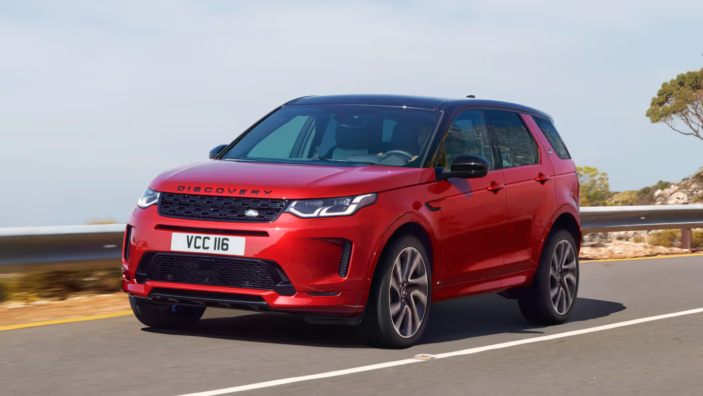
3. Land Rover Discovery (2017–2020)
The Land Rover Discovery of recent years is known for its luxurious appointments and off-road prowess, but its dashboard layout has faced criticism for being overly complicated and chaotic.
The vehicle’s infotainment system, called InControl Touch Pro, uses a large 10-inch touchscreen that attempts to consolidate numerous functions but often overwhelms drivers with complexity.
The problem lies in the interface’s deep menus and lack of straightforward controls for critical functions like climate settings, navigation, and media.
Drivers frequently have to navigate multiple screens to perform simple tasks, increasing distraction and frustration. Furthermore, the screen’s touchscreen sensitivity can be inconsistent, leading to missed taps or accidental selections.
Physical buttons are minimal and, in some cases, tiny, requiring more precise finger movements, which can be impractical while driving on rough terrain or during quick adjustments. Important controls like the volume knob or hazard light switch are smaller and less prominent than desirable.
The instrument cluster is digital and customizable but can display too much information at once, leading to information overload. The layout also lacks clear separation between different types of information, which can cause confusion.

In addition to the touchscreen issues, the dashboard’s overall design lacks a clear hierarchy. Controls are scattered across different levels and angles, creating a fragmented experience.
The center console is cluttered with buttons for terrain response modes, parking assist, and other vehicle functions, making it hard to locate a particular control quickly.
This chaotic layout contrasts sharply with Land Rover’s reputation for premium craftsmanship, as the driver must often spend excessive time figuring out how to use essential features rather than enjoying the drive.
In summary, the Land Rover Discovery’s dash design suffers from an overambitious attempt to integrate too many functions digitally without maintaining ergonomic simplicity, resulting in a confusing and distracting interface.
4. Ford Fiesta (2011–2017)
The Ford Fiesta from the early 2010s offers great driving dynamics but is let down by a dashboard layout that many drivers find chaotic and unintuitive.
The dash is packed with small buttons and switches, many of which are poorly labeled or placed awkwardly, leading to confusion especially for first-time users.
The MyFord Touch infotainment system, standard on many trims, uses an 8-inch touchscreen that has been widely criticized for slow response times, lag, and complex menus.
Basic functions like changing radio stations or adjusting climate settings require navigating multiple steps, detracting from driver focus.
Physical controls for climate and audio are a confusing mix of buttons and knobs placed at various heights and positions, making it difficult to form a habit of reaching for the right control instinctively. Some buttons are grouped too closely, increasing the chance of pressing the wrong one.
The instrument cluster, while clear, is overshadowed by the central infotainment demands, forcing drivers to split attention between the road and multiple screens.
Additionally, the layout does not prioritize the most commonly used controls, such as hazard lights or defrosters, which are sometimes hard to locate quickly.
The overall visual impression of the dashboard is busy, with many competing elements and little whitespace or design breathing room. This overload of controls without a clear organizational scheme makes the dash feel cluttered and overwhelming.
Owners and reviewers alike have noted that the dash design detracts from the Fiesta’s otherwise fun and nimble driving experience, as the mental effort required to operate controls increases cognitive load behind the wheel.

In short, the Ford Fiesta’s chaotic dashboard layout demonstrates how a lack of ergonomic consideration and an over-reliance on problematic infotainment technology can undermine the user experience and safety.
5. Nissan Juke (2011–2017)
The Nissan Juke’s quirky design extends beyond its exterior to a dashboard layout that many find chaotic and confusing.
The small, rounded cabin space is packed with controls and screens that lack a clear organizational structure, making it difficult for drivers to operate systems quickly and confidently.
The Juke’s infotainment system is controlled via a small touchscreen that offers limited responsiveness and often requires drivers to delve through layered menus to reach desired functions. This increases distraction and makes the system less user-friendly.
Physical controls are scattered around the dash and center console without consistent grouping or size hierarchy. Buttons vary greatly in shape and size, some being very small, which makes tactile identification challenging.
Essential functions like climate control are operated through a combination of small buttons and dials placed at awkward angles, reducing ergonomic comfort.
The instrument cluster combines analog dials with a small digital display, but the information is not well prioritized. Drivers often report difficulty in quickly finding important data at a glance, such as trip information or warning messages.

Furthermore, the placement of the hazard light switch and other critical controls is not intuitive, sometimes forcing the driver to look away from the road to locate them.
The overall impression is one of a busy, cluttered cockpit with little visual harmony or logical control flow. The Juke’s dash design can be overwhelming, especially for drivers who prefer a straightforward and ergonomic layout.
In summary, while the Nissan Juke’s design is distinctive, its chaotic and poorly organized dashboard detracts from daily usability and driver focus, illustrating the risks of prioritizing style over function.
A vehicle’s dashboard layout plays a crucial role in shaping the overall driving experience, influencing not only convenience but also safety and driver satisfaction.
As we’ve seen, dashboards that are intuitive, well-organized, and thoughtfully designed can greatly enhance how drivers interact with their vehicles, allowing them to focus more on the road and less on fumbling with controls.
The vehicles with intuitive dash layouts—such as the Audi A6, Mazda CX-5, Toyota Camry, Volvo XC60, and Jeep Grand Cherokee (earlier models)—exemplify how clear separation of functions, logical grouping of controls, and the right balance between touchscreen and physical buttons create a user-friendly environment.
These dashboards prioritize ergonomics, minimize distractions, and empower drivers to operate essential features quickly and confidently. Features like customizable digital clusters, haptic feedback on touchscreens, and easy-to-reach controls reinforce a sense of command and comfort behind the wheel.
Conversely, the vehicles we explored with chaotic dashboards—the Jeep Grand Cherokee (2014–2020), Fiat 500, Land Rover Discovery, Ford Fiesta, and Nissan Juke—highlight the pitfalls of poor design choices.
Overcrowded controls, inconsistent button placement, reliance on sluggish or overly complex touchscreens, and lack of visual hierarchy can frustrate drivers and increase distraction risk.
When dashboards feel cluttered or require excessive effort to operate, the driving experience suffers, impacting both enjoyment and safety.
The contrast between these two groups underlines a critical truth for both consumers and manufacturers: dashboard design is not just about aesthetics or packing in features, but about intuitive usability and driver focus.
Automakers must strike a balance between modern technology and practical ergonomics to ensure controls are accessible without overwhelming the driver.
For buyers, understanding the differences in dash layout usability can guide smarter vehicle choices that enhance daily driving comfort and safety.
For manufacturers, the lessons are clear—simplicity, thoughtful organization, and tactile feedback are essential for creating dashboards that drivers love.
Ultimately, whether sleek and minimal or complex and chaotic, a dashboard’s design significantly shapes how we experience our vehicles every day.
Also Read: 5 Cars With Real Trunk Space and 5 That Can’t Even Fit a Suitcase