Choosing a vehicle is a decision that involves much more than just the external styling or engine specifications. While horsepower, fuel efficiency, and safety ratings often top the list of considerations, the way a driver interacts with a car’s controls can significantly influence the driving experience.
The design and layout of controls inside a vehicle impact not only comfort but also safety. A driver who can easily and quickly operate controls without distraction is less likely to make errors or lose focus on the road.
Intuitive controls help make driving a seamless experience, enabling drivers to concentrate on the road and surroundings rather than fiddling with complicated systems or confusing buttons.
On the other hand, vehicles with poor control layouts can lead to frustration, distraction, and even dangerous situations due to the driver’s inability to operate features smoothly.
Designing a user-friendly vehicle cockpit is no small feat for automakers. The challenge lies in accommodating a growing number of features and technologies, such as advanced climate controls, infotainment systems, driver assistance functions, and smartphone integrations, all while maintaining simplicity and clarity.
The balance between physical buttons and touchscreen interfaces is particularly delicate. While touchscreens offer flexibility and a modern look, they sometimes force drivers to take their eyes off the road longer compared to tactile buttons that can be operated by feel.
The perfect control layout is one that anticipates the driver’s needs, provides clear feedback, and reduces cognitive load, enabling focus on driving conditions.
The variation in vehicle types, from compact cars to large trucks, from economy models to luxury vehicles, means that control designs vary widely. Some manufacturers prioritize minimalism, while others provide extensive customization and feature-rich environments.
Over the past decade, digital interfaces have become increasingly dominant, introducing new challenges in ergonomics and driver interaction. Despite advancements, many drivers still prefer a blend of physical and digital controls that complement each other.
Therefore, the success of a vehicle’s control layout depends heavily on how well these elements are integrated and how the system accommodates both novice and experienced drivers.
In this article, we will look closely at five vehicles that stand out for their intuitive and driver-friendly control layouts. We will analyze the features that make their interiors easy to navigate and operate, highlighting the benefits these designs bring to everyday driving.
In contrast, we will then examine five vehicles that have been criticized for their confusing or poorly designed control systems. By comparing these examples, the article aims to underline the importance of thoughtful control design and the impact it has on driver safety and satisfaction.
Understanding what works and what doesn’t can help manufacturers improve future models and help buyers make informed decisions based on more than just surface impressions.
Also Read: 5 Performance Cars That Stay Valuable And 5 That Become Worthless
5 Vehicles With Intuitive Controls

1. Toyota Camry
The Toyota Camry has long been a benchmark for reliability and user-friendliness, and this reputation extends into its interior control layout. From the moment a driver sits inside, the arrangement of buttons, knobs, and displays feels deliberate and welcoming.
Toyota’s design philosophy prioritizes simplicity and logic, making sure that commonly used functions are immediately accessible and clearly labeled. For example, physical knobs for volume and tuning are large, easy to grip, and distinct in feel, reducing the chance of confusion even while driving.
Similarly, the climate control section features straightforward buttons and dials with intuitive icons that are easy to identify by touch. This physical separation of controls means drivers do not have to memorize complex sequences or use multiple menus for basic adjustments.
The Camry’s touchscreen interface complements these physical controls with a clean, uncluttered layout. Large icons and straightforward menus keep distractions to a minimum, making it quick to switch between media sources, adjust settings, or access navigation.
Toyota limits the number of submenus, so drivers don’t find themselves lost in endless layers. Furthermore, the screen is positioned within the driver’s natural line of sight and angled to reduce glare, which improves visibility in different lighting conditions.
Many drivers appreciate this balance because it allows them to use the touchscreen when necessary but still rely on physical controls for quick changes.
Another aspect is the steering wheel control cluster. Toyota has arranged buttons in logical groups that correspond to their functions, such as audio controls on one side and cruise control or driver assistance features on the other.
These buttons have tactile feedback, so drivers can operate them without looking, fostering confidence and safety. The layout also feels ergonomic, with frequently used buttons placed where the thumbs naturally rest, reducing hand movement and increasing comfort over long drives.
Additionally, Toyota integrates effective voice recognition technology, allowing drivers to control many functions hands-free. Voice commands work well with the Camry’s systems, enabling drivers to adjust music, make calls, or set destinations without diverting their attention.
This voice functionality enhances the vehicle’s intuitive nature by providing an alternative control method that is particularly useful when manual adjustments might be distracting. The Toyota Camry delivers a control system that feels balanced, thoughtful, and accessible to drivers of all ages and experiences.

2. Honda Accord
The Honda Accord has built a reputation for delivering a driving experience that combines performance with practicality, and this extends clearly to its interior control layout. Honda has consistently placed a strong emphasis on separating digital and physical controls, providing a user-friendly interface that reduces distractions.
The physical volume knob and tuning buttons are large and placed prominently within easy reach of the driver. Unlike many vehicles that attempt to minimize physical buttons in favor of touchscreens, Honda retains these essential controls for quick adjustments, especially useful during highway driving or busy city traffic.
Honda’s infotainment system is designed with simplicity and clarity in mind. The home screen divides functions into clearly marked sections such as audio, phone, and navigation. This zoning approach helps drivers find what they need quickly without fumbling through multiple tabs or confusing menus.
The touchscreen itself is responsive and easy to use, but it is also angled toward the driver to reduce reflections and improve readability in sunlight. This thoughtful placement contributes to an ergonomic environment that minimizes the need for head movements, keeping eyes closer to the road.
Steering wheel controls in the Accord are spaced out with enough room to prevent accidental button presses, and they follow a logical grouping strategy. The left side typically manages audio and phone functions, while the right focuses on cruise control and safety assist features.
This consistency allows drivers to develop muscle memory quickly, making the controls almost second nature. The buttons also provide tactile feedback with a firm click, confirming inputs without the need to glance at the controls.
A further strength of the Honda Accord’s control layout is the seamless integration of smartphone connectivity through Apple CarPlay and Android Auto. This system lets drivers use familiar phone interfaces directly through the vehicle’s display, reducing the learning curve and offering alternative ways to interact with music, messages, and navigation.
The blend of physical controls, a clear touchscreen interface, and smartphone integration results in a cockpit that feels accessible and modern without overwhelming the driver.
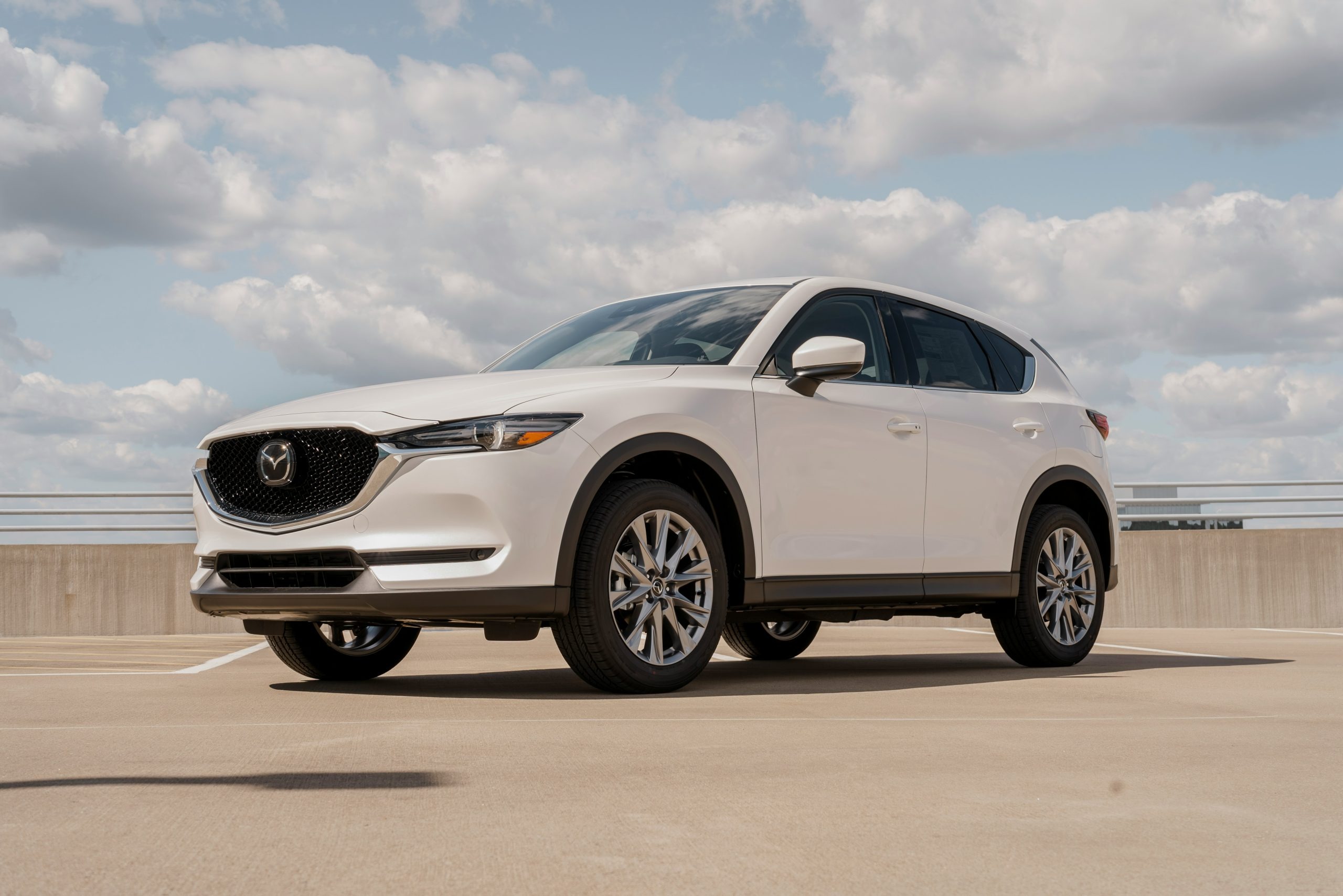
3. Mazda CX-5
Mazda’s CX-5 is widely recognized for its emphasis on driver engagement, and this ethos extends to the vehicle’s control layout. Rather than relying heavily on touchscreen inputs, Mazda employs a unique rotary dial located near the gear selector to operate the infotainment system.
This design allows drivers to make selections and adjustments without having to reach forward or lift their arm excessively, keeping hands comfortably near the driving controls.
The dial rotates, presses, and moves side to side, providing precise control and minimizing the risk of accidental inputs. Drivers appreciate this because it enables them to maintain focus on the road while adjusting music or navigation.
The CX-5’s dashboard is characterized by its minimalist, clean design that reduces clutter and emphasizes functionality. Physical buttons and knobs controlling climate and audio are well spaced and have different shapes and textures, making it easier to identify the right control by feel alone.
This thoughtful differentiation is especially valuable when driving at night or in rough conditions where looking away from the road can be dangerous. The placement of these controls also supports natural hand movements, reducing strain and making the environment more comfortable for longer trips.
Mazda also incorporates a heads-up display (HUD) in the CX-5, which projects important information such as speed, turn-by-turn directions, and safety alerts directly into the driver’s line of sight on the windshield.
This feature complements the vehicle’s intuitive control layout by reducing the need to look down at the dashboard repeatedly. The HUD’s clear presentation and adjustable brightness add an extra layer of safety and convenience.
Steering wheel controls are another highlight. They are designed to be simple and focused, with buttons for volume, phone, and cruise control spaced sufficiently to prevent mistakes.
The tactile feedback on these buttons is firm but smooth, offering confidence when pressing. The CX-5’s control layout reflects Mazda’s philosophy of “less is more,” creating an interior that feels modern yet highly functional, with a focus on minimizing driver distraction and maximizing comfort.

4. Subaru Outback
The Subaru Outback is favored for its practicality and reliability, and the vehicle’s control layout supports this reputation by offering clear and straightforward user interfaces. Unlike some competitors who emphasize digital touchscreens, the Outback uses a combination of tactile buttons and knobs for critical functions like climate control and audio.
These physical controls are designed to be easily reachable and distinguishable, helping drivers operate them without diverting attention from driving. The tactile nature of the controls is particularly appreciated in adverse weather conditions when drivers wear gloves or need to make quick adjustments.
The infotainment touchscreen in the Outback is positioned at an angle that minimizes glare, allowing for good visibility throughout the day. The menus are designed with large icons and simple navigation paths, avoiding deep or complex menu trees.
This layout means drivers can find essential functions like navigation, media, or phone connectivity with minimal effort and without getting distracted. Volume and tuning knobs are separated from the touchscreen controls, enabling rapid manual adjustments.
Subaru’s steering wheel controls are thoughtfully organized, with audio-related buttons on one side and driver assistance features like adaptive cruise control on the other.
This separation prevents accidental presses and simplifies the learning curve for new drivers. The buttons have good spacing and offer clear tactile feedback, allowing drivers to operate them confidently without needing to look down.
Voice recognition technology in the Outback is another advantage that enhances control usability. Drivers can use voice commands to make calls, change music, or adjust navigation, reducing reliance on physical or touchscreen controls while on the move.
This combination of physical buttons, clear touchscreen interface, and effective voice control ensures the Outback’s cockpit is accessible to drivers of varying tech comfort levels, making it a well-rounded and intuitive vehicle.
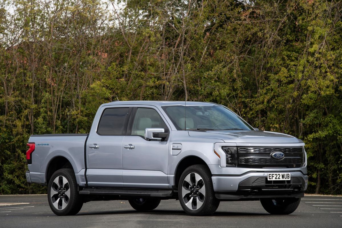
5. Ford F-150
The Ford F-150, as one of the best-selling pickup trucks in the world, has earned praise not only for its rugged capability but also for its practical and well-thought-out control layout. Given the diverse environments in which the F-150 operates, from construction sites to highways, Ford has designed controls that prioritize durability and ease of use.
Physical buttons and switches are large and robust, built to withstand rough use and dirt, yet their placement is intuitive and functional. The size and spacing of controls ensure they can be operated even when wearing gloves, which is an important consideration for many truck owners.
The center console integrates a mix of touchscreen and physical controls, with the latter used primarily for frequently adjusted functions like climate control and audio volume.
The climate control knobs are large and provide firm tactile feedback, making it easy to adjust temperature or fan speed without diverting much attention. Ford’s SYNC infotainment system features an interface designed to be straightforward, combining touchscreen ease with physical shortcuts that prevent the user from getting lost in complex menus.
Steering wheel controls on the F-150 follow a logical layout. Buttons for phone and audio functions are placed on one side, while cruise control and driver-assistance features are on the other.
The buttons are sufficiently large and well-spaced to avoid accidental presses, which is especially critical when driving on uneven terrain or while performing work-related tasks. This separation also helps drivers build familiarity and muscle memory for different functions.
Additionally, Ford includes a responsive voice command system that works well with the truck’s infotainment and phone integration features.
This allows drivers to make calls, change music, or get directions while keeping their hands on the wheel and eyes on the road. The combination of rugged physical controls, a clean digital interface, and effective voice integration ensures the F-150 remains user-friendly even in demanding conditions.
5 Vehicles With Confusing Layouts

1. Tesla Model S (Early Versions)
Tesla’s Model S revolutionized the electric vehicle market with its impressive performance and innovative features, but its early interior control layout drew mixed reactions. The design philosophy behind the Model S pushed traditional vehicle controls aside in favor of a massive central touchscreen that controls nearly every function.
While this approach gave the vehicle a sleek and futuristic appearance, it also introduced a steep learning curve for many drivers.
The reliance on a touchscreen to operate essential functions such as climate control, seat adjustments, and window controls required drivers to take their eyes off the road more frequently than with traditional physical buttons.
This extensive digital control system was praised for its flexibility and ability to receive software updates, but it came at the cost of intuitive usability. Unlike tactile knobs and buttons that provide physical feedback, the touchscreen’s flat interface made it difficult to operate without looking directly at it.
Functions that are typically adjusted instinctively in other cars, like changing temperature or fan speed, often required navigating through menus on the screen. This could increase driver distraction, especially in busy or unexpected driving conditions.
The placement of the touchscreen also affected usability. It’s positioned quite high and large, but the sheer size and number of features packed into the interface meant that users could easily feel overwhelmed.
In some cases, drivers found themselves spending more time trying to locate a setting than focusing on driving. Despite Tesla’s attempts to simplify menus through software updates, the basic reliance on a single touchscreen for all controls continues to divide opinions.
In addition, the early versions of the Model S did not offer physical backup controls for critical functions. For example, changing the volume requires using the screen or steering wheel buttons, which are also digital and can be difficult to operate without looking.

2. Jeep Grand Cherokee (Certain Model Years)
The Jeep Grand Cherokee, particularly in certain model years, struggled with an inconsistent and sometimes confusing interior control layout. While Jeep is known for its rugged vehicles, some versions of the Grand Cherokee attempted to modernize interiors with touchscreen systems that replaced many physical controls, but the execution was uneven.
The infotainment system’s menus were often deep and complex, requiring multiple taps to accomplish tasks that should be simple, such as adjusting climate settings or switching audio inputs.
The touchscreen itself was criticized for lag and inconsistent responsiveness, making user interactions frustrating. When paired with remaining physical controls that were small and poorly labeled, the experience could become bewildering.
The coexistence of physical and touchscreen controls without clear boundaries made it difficult to know which method to use for various functions. This partial digitization without a clear, user-friendly interface was a source of driver distraction and dissatisfaction.
Additionally, the steering wheel buttons were sometimes overly compact and arranged in ways that made it difficult to operate them by feel alone.
Drivers often had to glance down to ensure they were pressing the correct buttons, which is counterproductive to safe driving. The buttons lacked clear differentiation, both tactile and visual, contributing to a steep learning curve for new users.
This inconsistent approach to interior controls in the Grand Cherokee’s design reflected a transitional period where automakers experimented with integrating more digital features without fully resolving ergonomic issues. Unfortunately, this led to a layout that could confuse drivers rather than assist them.

3. Land Rover Discovery
The Land Rover Discovery is often praised for luxury and off-road capability but has been critiqued for its complicated control layout. The vehicle incorporates advanced digital interfaces but struggles with how those systems are integrated into the driver’s environment.
The central touchscreen controls many essential functions, yet the menus are spread across multiple zones and layers, requiring several steps to perform simple tasks. For instance, climate control adjustments are not immediately accessible and often hidden behind menus rather than being assigned to dedicated physical buttons.
Physical controls that do exist tend to be small and placed in locations that are not immediately intuitive. Some buttons are difficult to reach or identify without looking closely, which can lead to confusion or frustration, especially for new users or those driving in challenging conditions.
The center console includes a rotary dial for infotainment controls, which some drivers find unintuitive and cumbersome at first, requiring time and patience to learn.
The steering wheel controls are not standardized, with some buttons performing multiple or unexpected functions depending on the context.
This lack of predictability can cause hesitation and errors when quick inputs are necessary. The design seems to favor showcasing technology over ease of use, which diminishes the sense of driver control and confidence.
Consequently, despite its technological sophistication, the Land Rover Discovery’s control layout may intimidate some drivers or force them to spend more time navigating menus than focusing on driving. This complexity diminishes the vehicle’s user-friendliness.

4. BMW iDrive (Older Generations)
BMW’s iDrive system, while now much improved, faced significant criticism in its earlier iterations for complexity and confusing control layout.
Introduced as a cutting-edge interface designed to reduce dashboard clutter, iDrive replaced many physical buttons with a single rotary knob and a central display. However, this change introduced a steep learning curve for drivers who were accustomed to traditional controls.
The early iDrive menus required multiple steps to access common functions like radio stations, temperature adjustments, or navigation settings.
The menus themselves were sometimes cluttered, with small text and icons that made navigation difficult and distracting. Instead of simplifying operations, the system initially demanded intense focus and memorization of menu structures, which could be frustrating and unsafe while driving.
The rotary knob’s placement and function were designed for convenience, but in practice, many users found the interface unintuitive. Selecting or backing out of menus involved pressing or twisting the knob in ways that were not always immediately clear.
Additionally, the lack of physical buttons for frequent tasks meant that drivers often had to look at the screen to confirm their choices, increasing distraction.
Despite BMW’s efforts to improve iDrive in newer models with touchscreens and more physical buttons, the early generations serve as a reminder that innovative control systems need to prioritize user experience and ease of use. The initial iDrive design sacrificed simplicity for sleekness, resulting in a confusing and sometimes frustrating layout.
5. Nissan Juke
The Nissan Juke’s interior is recognized for its quirky and unique styling, but the control layout has often been cited as a drawback. The placement of buttons and knobs inside the Juke can feel unconventional and awkward, disrupting the natural flow of hand movements while driving.
Some buttons are located in unexpected places, making them difficult to reach without shifting position or looking down. This lack of ergonomic consideration can interfere with safe driving.
The center console combines small physical buttons with touchscreen controls, but the interface lacks clear labeling and intuitive grouping.
Drivers frequently report confusion over which controls operate which functions, especially when switching between audio sources or adjusting climate settings. The mix of physical and digital controls does not seem to follow a logical pattern, increasing the potential for mistakes.
The steering wheel controls in the Juke are cramped and placed unusually, making it difficult for drivers to operate them by feel.
Drivers often have to look away from the road to locate the correct button, which increases distraction and reduces comfort. The buttons’ small size and proximity also raise the risk of pressing the wrong control unintentionally.
Furthermore, the infotainment system itself is less user-friendly compared to competitors. Nested menus, small icons, and unclear touch responses contribute to driver frustration. This confusing layout, combined with the unconventional button placement, results in an interior environment that can.
Also Read: 5 Cars That Stay Valuable Enough to Buy New vs 5 That You Should Always Buy Used
The difference between vehicles with intuitive controls and those with confusing layouts is significant and impacts not just convenience but also safety and driver satisfaction.
Cars like the Toyota Camry, Honda Accord, Mazda CX-5, Subaru Outback, and Ford F-150 provide examples of thoughtful, ergonomic design that anticipates the driver’s needs, offering physical and digital controls that work together seamlessly.
These vehicles maintain a balance where essential functions can be accessed quickly and confidently, reducing distraction and enhancing comfort. Their interiors reflect the importance of feedback, placement, and simplicity in creating a welcoming driving environment.
Conversely, vehicles such as early Tesla Model S versions, certain Jeep Grand Cherokee models, Land Rover Discovery, early BMW iDrive generations, and the Nissan Juke illustrate how complexity, over-reliance on touchscreens, poor button placement, or inconsistent interfaces can detract from the driving experience.
These cars often demand more attention to operate, which can lead to driver frustration and potentially unsafe situations on the road. While technology offers exciting possibilities, it must be integrated thoughtfully with human factors in mind.
The lessons from these examples underline the importance of user-centered design in vehicle controls. As automotive technology continues to evolve, manufacturers have the opportunity and responsibility to prioritize clarity, accessibility, and ergonomic comfort.
This not only improves the enjoyment of driving but plays a critical role in ensuring that drivers can keep their focus where it belongs: on the road ahead.
