Infotainment systems have become essential components of today’s vehicles, transforming the driving experience by combining entertainment, navigation, communication, and vehicle controls into a centralized digital hub.
As automotive technology has advanced, these systems have grown more sophisticated, offering an array of features like smartphone integration, voice commands, real-time traffic updates, and customizable settings. However, this growth in capability has not always been matched by ease of use. For many drivers, the infotainment system can either enhance their experience or create frustration and distraction.
Ease of use in an infotainment system is critical because it affects how safely and comfortably drivers can interact with their vehicle while on the road. A well-designed system allows drivers to accomplish tasks with minimal effort, quickly and intuitively, reducing cognitive load and keeping their focus where it belongs, on driving.
On the other hand, complicated systems with confusing menus, unresponsive controls, or unclear layouts increase distraction and can negatively impact safety and enjoyment.
While some manufacturers have prioritized simplicity and straightforward operation, others have opted to showcase the latest technology, sometimes at the expense of user-friendliness. As a result, there is a wide range of user experiences across different makes and models.
Some vehicles offer infotainment systems that almost “disappear” in their ease of use, requiring very little learning curve even for newcomers. Meanwhile, others present interfaces that feel more like digital puzzles, requiring time, patience, and repeated use to fully master.
This article aims to highlight this contrast by focusing on two groups of vehicles. The first group includes five vehicles known for their easy-to-use infotainment systems. These systems typically offer clear layouts, logical controls, responsive interfaces, and strong smartphone integration without overwhelming the user with excessive complexity.
They provide a model for how modern infotainment should function: feature-rich but accessible, allowing drivers to quickly perform common tasks without frustration or distraction. The second group features five vehicles whose infotainment systems are widely regarded as having steep learning curves.
These systems often feature complex menu structures, heavy reliance on touchscreens with few physical controls, inconsistent responsiveness, or difficult voice recognition. For some users, mastering these systems can feel like a burden, detracting from the vehicle’s other strengths and making everyday use less pleasant or efficient.
By comparing these two groups, this article provides insights into the design philosophies behind infotainment systems and their impact on driver experience. It underscores the importance of usability as a key factor when evaluating new vehicles, particularly as infotainment continues to play an increasingly central role in vehicle operation.
Whether you’re a tech enthusiast or someone who prefers simplicity, understanding these differences can help you choose a vehicle that aligns with your needs and preferences, enhancing your satisfaction and safety on the road.
Also Read: 10 Cars No One Talks About But Run Forever
5 Vehicles With Easy-to-Use Infotainment Systems
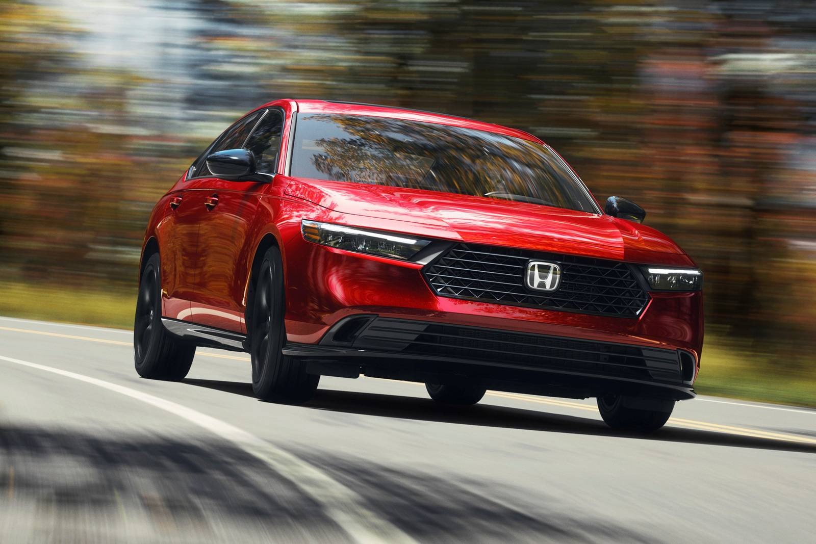
1. Honda Accord
The Honda Accord is known for its practicality, and its infotainment system reflects that same no-nonsense approach. The layout is logical and free of unnecessary flashiness. Whether you’re looking to change a radio station, access Apple CarPlay, or adjust the climate, everything is clearly labeled and intuitively placed.
The physical knobs for volume and tuning also make a big difference in reducing driver distraction. It’s not just about familiarity, it’s about getting tasks done quickly and without hunting through endless options.
What sets the Accord’s system apart is how little time it takes to understand. The 8-inch touchscreen doesn’t try to overwhelm with too many icons or layers of menus. Even for someone who has never used the system before, basic functions are usually no more than one or two taps away.
The touch response is quick and the layout is clean, avoiding the cluttered or over-styled look that plagues many competitors. This contributes to a user experience that feels logical rather than forced.
Another strength is the consistency of its behavior. Inputs work the same way across various menus, and transitions between different parts of the system are smooth. There’s no sudden lag, stutter, or change in logic that would confuse the user.
The voice control works reasonably well, too, though it’s not as advanced as systems in luxury brands. Still, it’s reliable and gets the job done for routine commands like calling a contact or setting a navigation destination.
For families or multi-driver households, the system’s simplicity makes it especially practical. Different users don’t need to spend time re-learning how to perform simple tasks. There’s also good integration with smartphones, with support for both Android Auto and Apple CarPlay available without requiring a deep dive into the settings menu. The Accord’s infotainment system shows that user-friendliness doesn’t have to come at the expense of modern features.
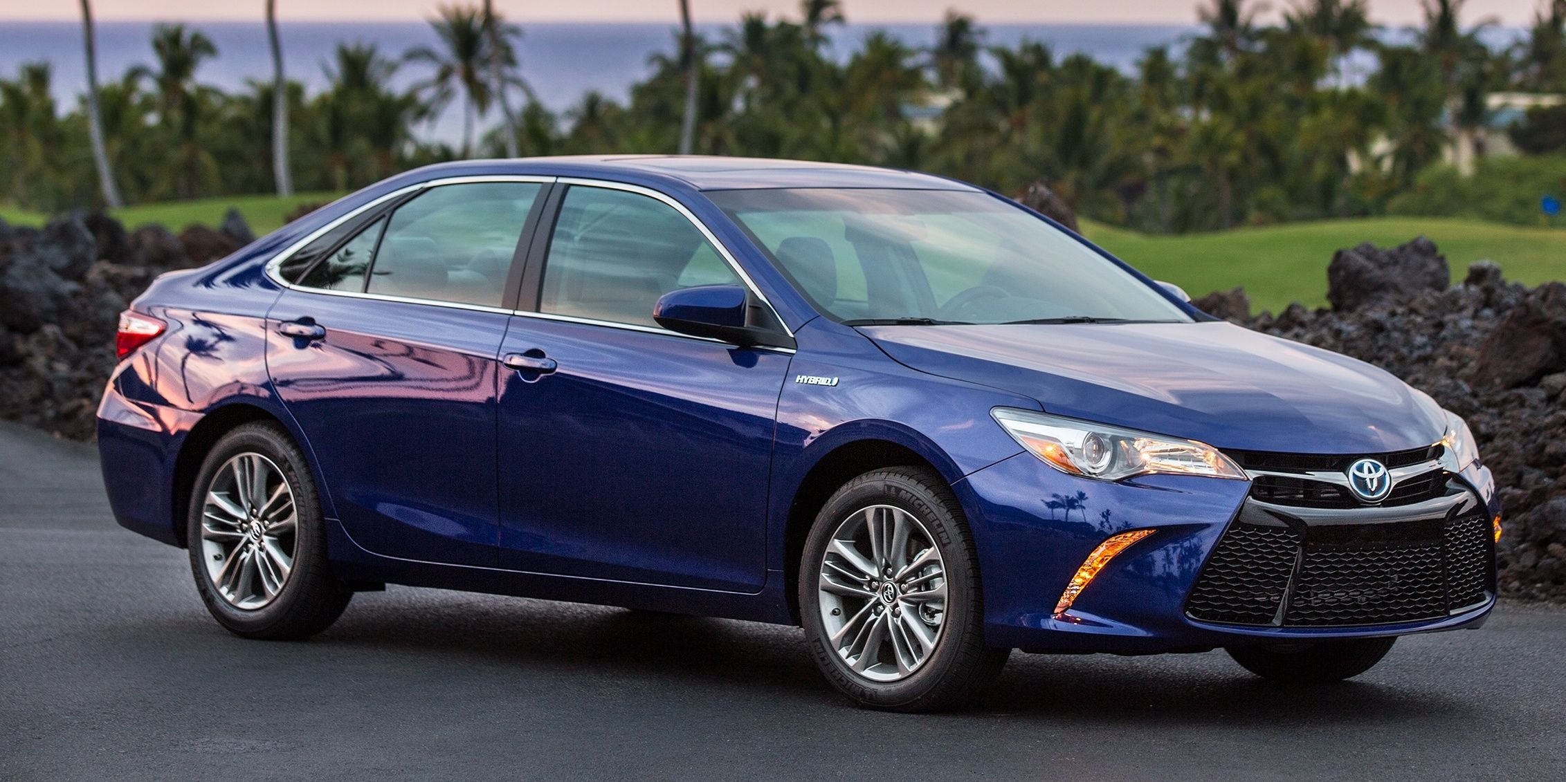
2. Toyota Camry
Toyota’s approach to infotainment is generally conservative, which works in favor of usability. In the Camry, the system is straightforward and doesn’t bury functions beneath complicated gestures or obscure menu paths.
The touchscreen is accompanied by physical buttons and knobs, offering a tactile backup for nearly every function. This dual-control setup is a huge benefit when driving, allowing the driver to make quick adjustments without diverting their attention too much.
The layout follows a sensible logic that feels familiar even to those switching from older vehicles. There’s a clear home screen with large icons for key features like navigation, media, phone, and apps.
Nothing is too small or too closely packed, making it easy to select the correct function with a quick glance or a short tap. The response time is also respectable, not lightning-fast but consistent enough that it doesn’t feel like you’re waiting around for the system to catch up.
Toyota’s infotainment system in the Camry isn’t loaded with flashy graphics or animations, which actually helps keep it efficient and readable. The fonts are large, the colors are high-contrast, and the transitions are minimal.
All of this contributes to reduced eye strain, which is particularly helpful during night driving or on longer trips. There’s also very little in the way of bloatware, so the user isn’t wading through apps they never use.
Another strong point is the setup process for smartphone connectivity. Connecting via Bluetooth or USB is quick, and once set up, the system remembers your preferences reliably.
The Camry also includes a straightforward customization menu where you can rearrange icons and change certain display preferences without needing a user manual. For those who just want the system to work without fuss, the Camry delivers in exactly that way.
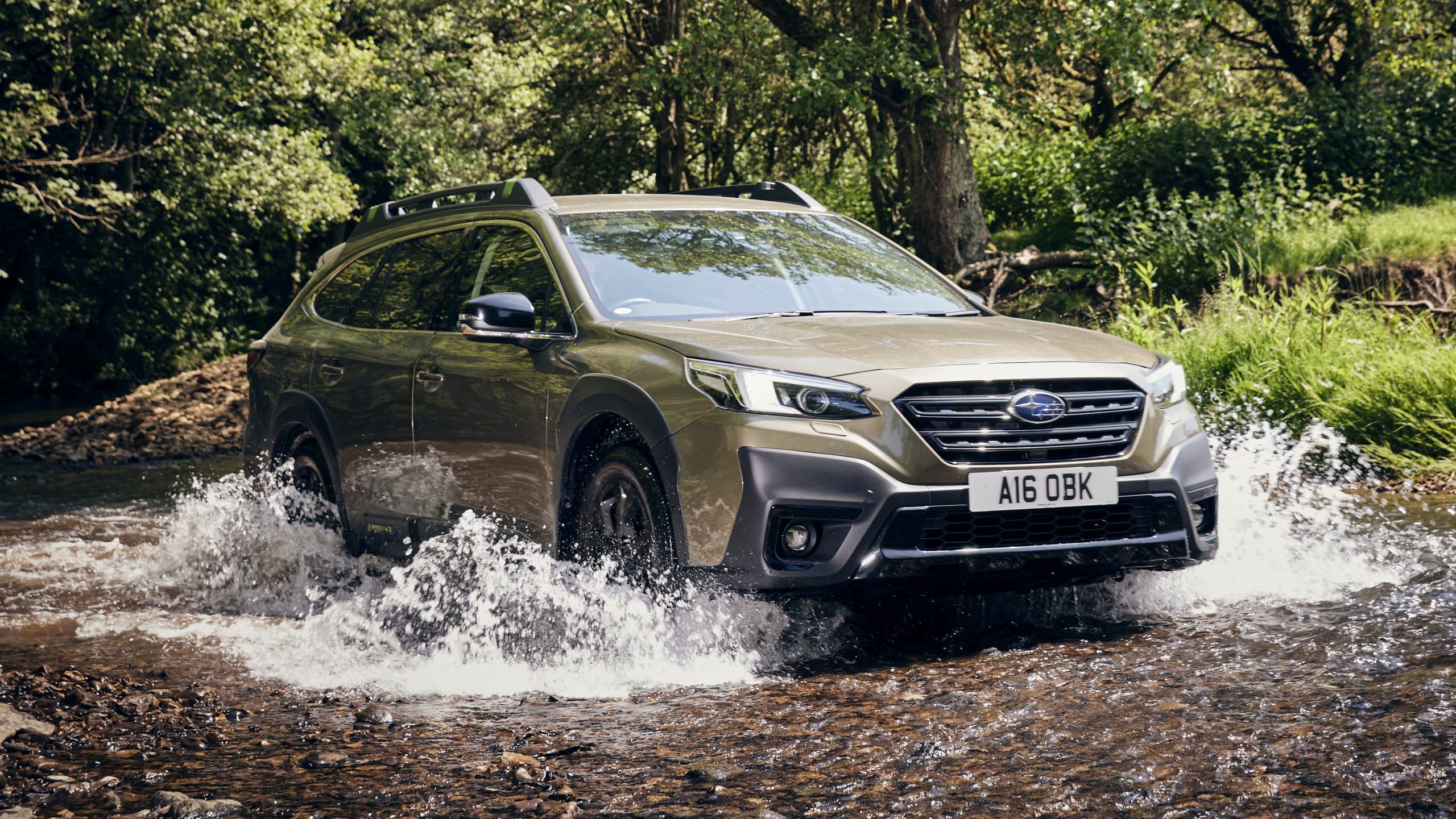
3. Subaru Outback
Subaru has focused on functionality across its entire vehicle lineup, and the Outback’s infotainment system reflects this practical mindset. The system uses a large vertical touchscreen that manages to balance modern looks with real usability.
Key vehicle functions are never more than a few taps away, and the interface isn’t packed with features just for the sake of marketing appeal. It’s easy to navigate and offers helpful visual feedback for each action.
One of the benefits of the vertical layout is the separation of climate controls and infotainment menus. Instead of hiding these in multiple layers, the Outback offers persistent controls that remain accessible regardless of which screen you’re viewing.
This design helps reduce confusion, especially when trying to adjust temperature or fan speed while driving. It’s a smart use of space that many other manufacturers still struggle to get right.
The interface design favors clean icons and large touch targets, which makes it easier to interact with even when the car is moving. Scrolling through menus is smooth, and pages don’t suffer from input lag or freezing.
The screen’s resolution is high enough that text is sharp and easy to read, reducing the mental effort required to interpret information. This is important for keeping attention on the road instead of deciphering a cluttered display.
Subaru has also done well in integrating voice control features that are practical, even if not groundbreaking. Commands for phone calls, navigation, and music playback usually work on the first try.
The system also supports both Apple CarPlay and Android Auto, which appear cleanly and don’t require multiple steps to activate. For tech-savvy users, the system offers just enough flexibility to personalize things, while remaining simple for those who prefer to keep it basic.
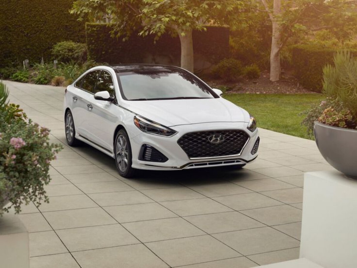
4. Hyundai Sonata
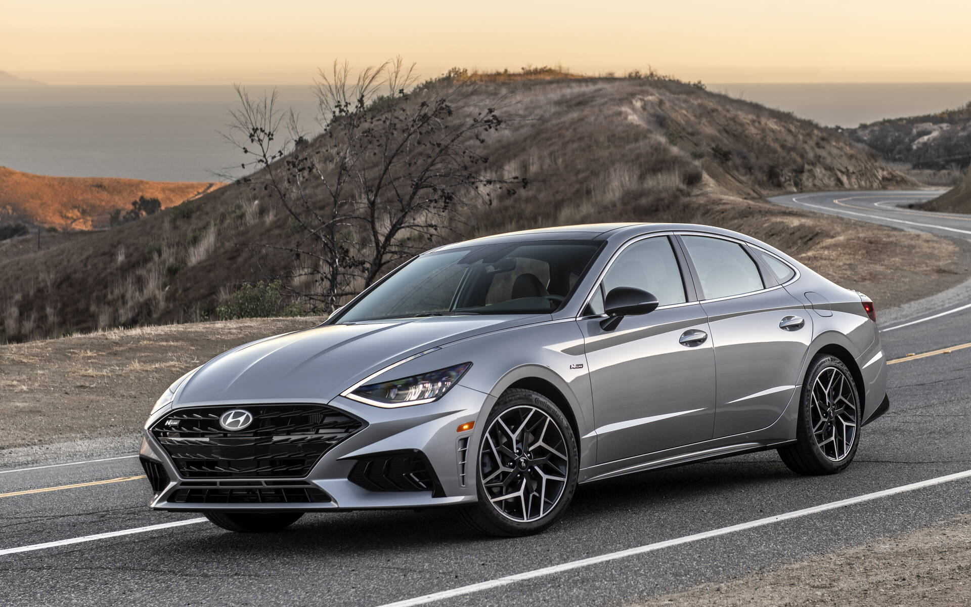
Hyundai has made impressive strides in infotainment usability, and the Sonata’s system is among the easiest to operate in the midsize sedan category. It starts with a high-resolution, wide-format touchscreen that uses a horizontal layout to great effect.
The interface is divided into clear zones, and there are physical buttons below the screen for quick access to core functions like navigation, media, and setup.
Unlike systems that cram too many options onto one screen, the Sonata keeps it clean. Icons are well spaced, logically organized, and easily understandable. There’s also a logical menu hierarchy that doesn’t change from screen to screen, so users always know where they are within the system.
You don’t need to guess how to get back to the home screen or where settings are buried, it’s all quite intuitive once you’ve used it once or twice. Another advantage is how quickly the system responds. Taps register instantly, and transitions are smooth without feeling showy.
Even smaller functions like adjusting sound balance or switching between connected devices are quick and painless. For those who rely on their phone, wireless Apple CarPlay and Android Auto are included in many trims, and they integrate seamlessly without the common glitches found in less refined systems.
Hyundai also deserves credit for thoughtful extras like customizable shortcuts, voice memos, and user profiles that remember your settings. It’s not just about offering features, but making them easy to reach and simple to use. Whether you’re trying to find a nearby gas station or switch audio sources, the experience is consistently logical. This balance of features and simplicity places the Sonata firmly in the “easy to use” category.
5. Kia Telluride
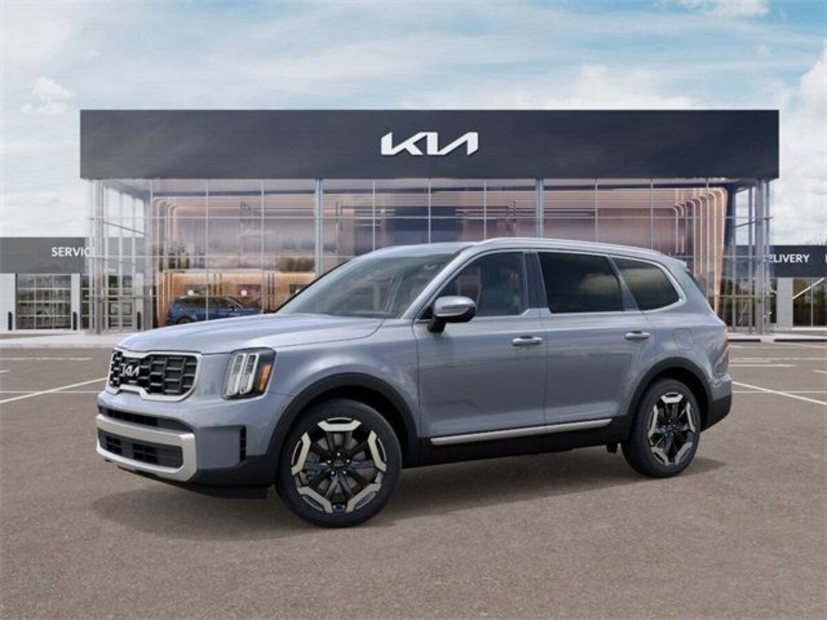
The Kia Telluride combines upscale presentation with straightforward functionality. The infotainment system features a 10.25-inch (or optional 12.3-inch) touchscreen with clean, sharp visuals and an intuitive interface. The home screen is customizable, allowing users to set up their preferred layout, and the system includes actual buttons and knobs alongside the screen, a welcome feature that many drivers still value.
One of the best things about Telluride’s system is how seamlessly it integrates everything without feeling complicated. Navigation, Bluetooth, media, and smartphone apps are easily accessible. Transitions between screens are fluid, and there’s very little input lag. Whether you’re trying to input a new destination or skip a song, the system responds without delay or frustration.
The screen layout is especially user-friendly. Menus are presented in a grid format with large icons, and there’s a consistent style throughout. You won’t find yourself guessing what each symbol means or which menu leads where.
Everything has been designed to reduce the number of taps required to get to the desired function. Even advanced features like multi-device Bluetooth connectivity or voice recognition are available in a way that doesn’t require a long setup process.
Wireless Apple CarPlay and Android Auto also make things easier for modern users, especially when multiple drivers use different platforms. The Telluride remembers different phones and automatically switches between profiles when needed.
With its combination of screen quality, responsiveness, logical layout, and thoughtful touches, the Telluride makes a strong case for how infotainment should be done.
5 Vehicles With Steep Learning Curves in Infotainment
1. BMW X5
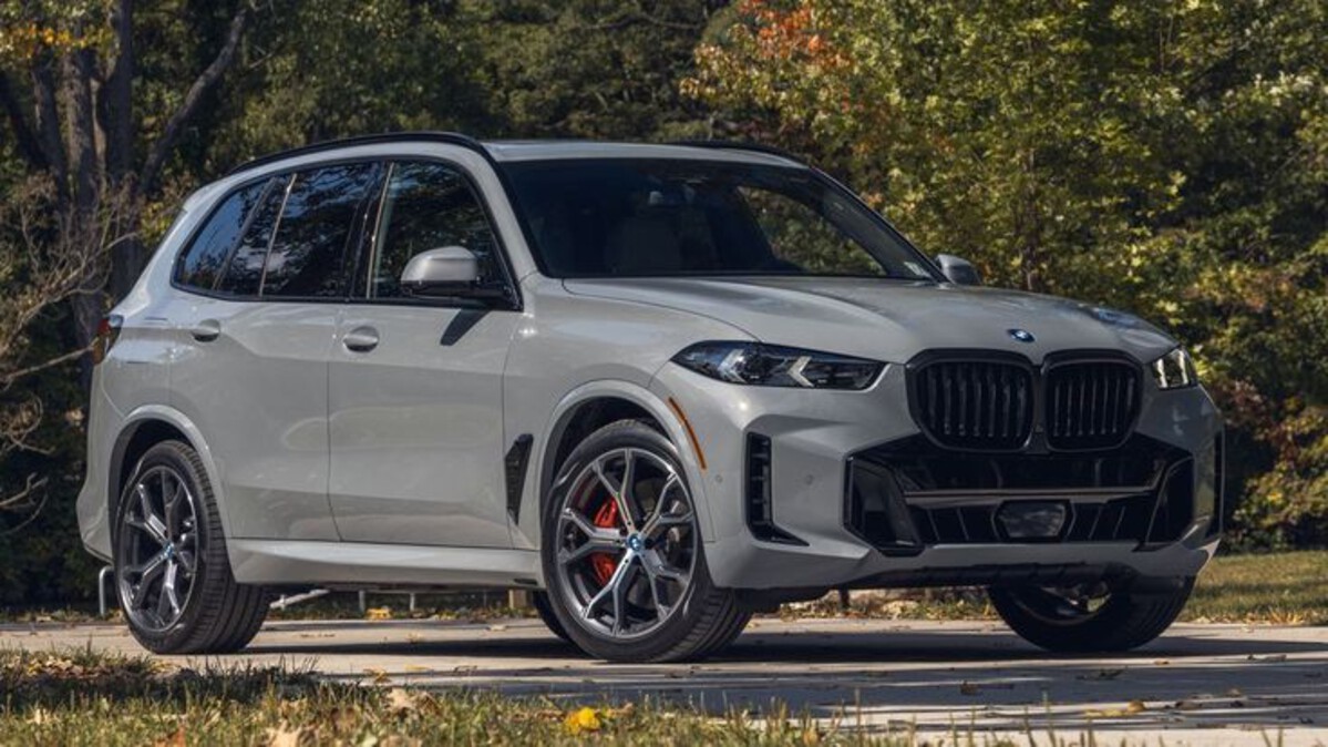
BMW’s iDrive system in the X5 is widely regarded as a technological marvel, but that sophistication comes at a cost. While the system offers a wealth of features, menus, and controls, the interface is notoriously complex and can overwhelm new users.
The system relies heavily on a rotary dial and multiple shortcut buttons placed around it, which at first glance seem like an elegant solution to reduce touchscreen reliance. However, this design requires a learning phase to understand which dial turns or presses control specific functions and how to quickly navigate between screens.
Many users report that the layout can feel inconsistent depending on which mode or feature they are using. For example, accessing navigation settings might require a different series of inputs than adjusting audio preferences. The system often displays submenus that feel buried, forcing users to remember the path back to the main screen.
The abundance of options can make the simple act of changing radio stations or pairing a phone more complicated than it needs to be, especially for those who want quick, distraction-free interactions while driving.
The touchscreen itself is smaller relative to many competitors and less responsive than expected for such a premium vehicle. In some cases, the system also lags slightly when switching between different menus or opening apps, which compounds frustration.
While voice control has improved over recent versions, it is still prone to misunderstandings, requiring users to repeat commands or revert to manual controls. This adds another layer of complexity to what should be basic tasks.
Moreover, the iDrive system’s deep integration with vehicle settings means that adjusting even minor comfort feature, like ambient lighting or seat setting, often requires navigating through the infotainment rather than using dedicated physical controls.
This forces users to spend time learning the menu system thoroughly. In a car that otherwise prides itself on driver-centric design, the infotainment can feel like an obstacle for those who prefer straightforward controls.

2. Mercedes-Benz GLE
The Mercedes-Benz GLE is packed with luxury and tech, but its MBUX infotainment system has a reputation for being less user-friendly than some might expect. The system uses two large screens and a touchpad controller, with a mix of voice commands, touch gestures, and physical buttons.
While this might sound like it offers many input options, the reality is that the controls can feel scattered and inconsistent in their responsiveness. One major source of confusion is the reliance on gestures and touch-sensitive controls on the steering wheel and center console.
Unlike traditional buttons, these require precise movements and can easily be misread by the system, leading to unexpected results. This can frustrate drivers who want quick, reliable adjustments while keeping their eyes on the road. The touchpad, designed to mimic smartphone swiping, often requires practice to master, especially when the vehicle is in motion.
Navigating through the MBUX’s layered menus can be overwhelming. While the system offers a variety of customizable widgets and screens, this level of personalization means there is a lot to configure before the user finds an efficient workflow.
Basic tasks such as setting the navigation or changing the radio station might require multiple taps or gestures, increasing distraction potential. The home screen itself is often dense with options, making it hard to quickly pick out the most commonly used features.
Voice control, although marketed as a key feature, can be hit-or-miss. The “Hey Mercedes” wake word activates the assistant, but the system sometimes struggles with accents or ambient noise, requiring repetition or manual overrides.
The combination of these challenges means that the MBUX system may not be the best choice for drivers seeking a plug-and-play experience without extensive familiarization.
3. Cadillac Escalade
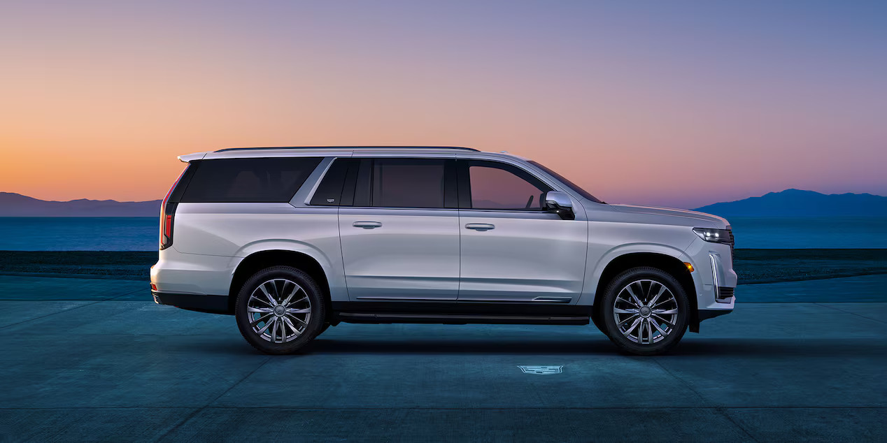
Cadillac’s Escalade brings high-end luxury and a massive infotainment display, but that doesn’t automatically translate into ease of use. The curved OLED screen is visually impressive and packed with features, but the user interface is complex, cluttered, and not always intuitive.
Cadillac aims to offer a comprehensive tech experience, but the result often feels overwhelming, especially for first-time users or those accustomed to simpler systems. The touchscreen incorporates many vehicle controls, from media and navigation to climate and seat functions.
Because so many features are controlled via the screen, drivers often find themselves digging through multiple layers of menus to reach even basic settings. This can distract from driving and requires significant attention to master. The visual design, while striking, sometimes prioritizes style over function, with small buttons and dense layouts that challenge quick glances.
Physical controls are minimal compared to other luxury SUVs, placing more emphasis on touch inputs. This trade-off can be frustrating, as precise inputs are harder to achieve on a moving vehicle, especially without tactile feedback.
While the system includes a rotary knob for volume and a few shortcut buttons, most adjustments require touch interaction. The system also occasionally experiences lag or freezes, which interrupts the user flow and can cause confusion.
Voice recognition is designed to handle natural language commands but is inconsistent in real-world use. The system occasionally misinterprets requests or fails to activate certain functions without manual intervention.
This diminishes the promised hands-free convenience and often forces users to fall back on navigating menus manually. While the Escalade’s infotainment dazzles in terms of hardware, the user experience demands patience and time to fully grasp.
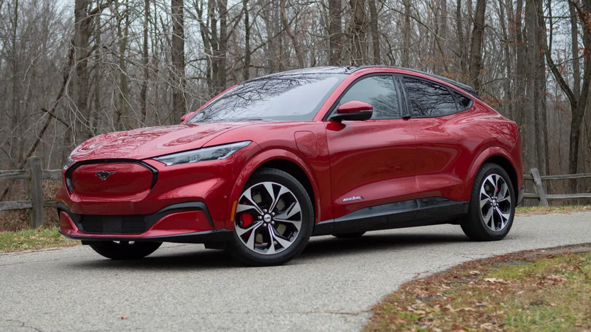
4. Ford Mustang Mach-E
The Mustang Mach-E is a bold step forward for Ford’s electric lineup, but its infotainment system has divided opinion. The centerpiece is a tall, vertical touchscreen with minimal physical buttons, which presents a modern, sleek aesthetic but complicates usability.
Many users find themselves overwhelmed by the extensive use of touch inputs to control everything from climate settings to driving modes, which would traditionally have dedicated knobs or switches.
The vertical screen divides the information logically but forces drivers to take their eyes further away from the road to interact with controls, increasing distraction risk.
Adjusting basic functions like temperature or fan speed requires multiple taps through menus rather than quick rotary inputs. This design choice creates a barrier for users who want fast, tactile feedback without hunting through screens while driving.
Another challenge is the system’s reliance on on-screen gestures, such as swiping or tapping specific areas, which are not always responsive or easy to discover. New users often find themselves frustrated as they learn the necessary motions to complete simple tasks. Additionally, some settings are buried several layers deep, requiring more attention and time than is practical behind the wheel.
The system also integrates voice controls, but these often require very specific phrasing or clear enunciation, limiting their usefulness in everyday driving situations.
While software updates aim to improve responsiveness and add features, early adopters frequently note that the infotainment’s complexity detracts from the vehicle’s appeal. For drivers seeking a simple, straightforward interface, the Mach-E’s system can feel like a barrier.
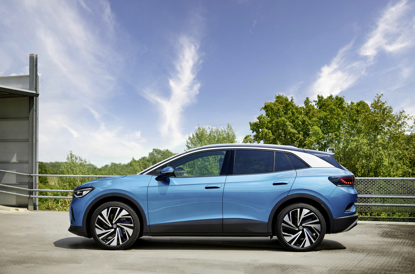
5. Volkswagen ID.4
Volkswagen’s ID.4, as one of the brand’s flagship electric vehicles, features a minimalistic interior design focused on clean lines and fewer physical controls. While this modern approach looks sleek, the infotainment system relies almost entirely on a touchscreen and voice commands, creating a steep learning curve for many drivers accustomed to more traditional setups.
The system uses small, tightly packed icons and menus, which can be difficult to operate accurately while driving. The lack of physical knobs or buttons for critical functions like volume or climate control means users must navigate through multiple screen layers, often requiring several steps to perform simple actions. This can lead to frustration, especially during short trips where convenience is paramount.
Another issue is the system’s occasional lag or delay when processing inputs or switching between menus. Such interruptions disrupt the flow of interaction and make the interface feel less responsive than competitors. While Volkswagen has made strides in voice recognition technology, it still requires clear and specific commands, which limits usability in noisy or dynamic driving environments.
The minimalist design philosophy extends to the lack of detailed feedback when actions are taken. For example, volume changes or temperature adjustments may not have strong visual or tactile confirmation, causing drivers to double-check their inputs. This design trade-off between aesthetics and functionality means the ID.4’s infotainment system often demands a significant adjustment period and ongoing patience.
Also Read: 10 Cars That Can Be Repaired With Only Basic Tools
The evolution of infotainment systems has reshaped how drivers interact with their vehicles, offering unprecedented convenience and functionality. However, this progress has also introduced a challenge: balancing advanced features with usability. As this article has shown, not all infotainment systems succeed equally in this regard.
While some vehicles provide seamless, easy-to-use interfaces that enhance the driving experience, others burden drivers with complicated controls and steep learning curves that can lead to frustration and distraction.
The vehicles with easy-to-use infotainment systems share common traits that make them stand out. Clear, logical layouts with minimal layers of menus allow drivers to access essential functions quickly and intuitively. Physical controls like knobs and buttons supplement touchscreens, giving drivers tactile feedback and reducing reliance on precise touch inputs.
Consistent responsiveness and straightforward voice commands further reduce cognitive load, enabling drivers to keep their attention on the road. Strong smartphone integration, including both Apple CarPlay and Android Auto, is standard, making it simple to connect devices without hassle.
These systems often prioritize the basics and do them well rather than overwhelming users with excessive options. As a result, these vehicles cater to a broad range of drivers, from tech novices to those who simply want reliable, distraction-free operation.
In contrast, vehicles with infotainment systems that have steep learning curves tend to share different characteristics. They often emphasize cutting-edge technology and expansive feature sets, but with complex menu architectures and inconsistent control schemes.
Heavy reliance on touchscreens without adequate physical controls, small icons, laggy performance, or touchpads with unintuitive gestures increases difficulty in performing even simple tasks.
Voice recognition, while frequently touted as a key feature, can be inconsistent and require very specific commands. This complexity often demands significant time and patience to master, which can diminish the enjoyment of the vehicle and create potential distractions.
For drivers seeking convenience and ease, these systems may prove frustrating, highlighting how impressive hardware alone is insufficient without thoughtful interface design.
The usability of an infotainment system is not just a matter of convenience; it directly affects driver safety, comfort, and satisfaction. As vehicles continue to incorporate more technology, the need for well-designed, intuitive user interfaces will only grow.
This article’s comparison serves as a reminder to consumers and manufacturers alike that advanced features must be balanced with straightforward operation. When shopping for a new vehicle, prospective buyers should consider not just the number of features, but how easily they can be accessed and controlled in everyday driving.
Choosing a vehicle with an infotainment system that aligns with personal preferences and driving habits can make a meaningful difference in the ownership experience. For some, the simplicity and reliability of systems in vehicles like the Honda Accord or Toyota Camry will be a welcome relief from complexity.
For others, the challenge of mastering systems like those in the BMW X5 or Mercedes-Benz GLE may be acceptable trade-offs for advanced capabilities, but even then, patience and familiarity are essential.
In the end, technology in vehicles should serve as an aid, not an obstacle. Infotainment systems that achieve this balance contribute to safer, more enjoyable driving. As automakers refine their approaches, the hope is that user experience will take precedence, delivering systems that are both rich in features and effortless to use.

