
Infotainment systems have become a central part of modern vehicles, controlling everything from navigation and audio to climate settings and smartphone integration. As technology advances, carmakers are competing not only on screen size or operating system speed, but also on usability across different driving conditions.
One of the most overlooked factors is screen visibility under bright sunlight. A screen that looks brilliant in a showroom can become practically unreadable on a sunny day, and that affects both safety and convenience.
The placement of the screen, the quality of the panel, the brightness levels, anti-reflective coatings, and even the angle of the dashboard play critical roles in how visible the screen remains under direct sunlight.
Some automakers have started to pay close attention to this issue, building high-resolution displays with adaptive brightness, matte finishes, or deeper dashboard integration to shield screens from glare. Others, however, still produce infotainment units that reflect too much light, forcing drivers to squint or guess what’s on the screen.
Glare issues are more than just an annoyance. When you can’t clearly read your navigation or your rear camera feed, it becomes a serious safety concern. Likewise, fumbling with the interface because of poor visibility can take your eyes off the road for longer than is safe. So while screen size and touch sensitivity are commonly reviewed, visibility in sunlight deserves more attention.
This article highlights five cars that manage infotainment visibility well under bright conditions, and contrasts them with five others that continue to struggle with glare. These insights come from comparative evaluations of screen technology, dashboard design, and real-world user experience. Whether you’re buying a new vehicle or trying to understand what’s missing in your current ride, this breakdown should give a practical sense of how infotainment systems stack up when the sun is high and your patience is low.
Also Read: 5 EVs That Rarely Break Chargers and 5 That Always Fail
5 Cars with Clear Infotainment Screens in Sunlight

1. Tesla Model 3
The Tesla Model 3 features a 15-inch touchscreen that is often praised for its visibility in all lighting conditions. Tesla uses a high-brightness display that automatically adjusts based on ambient lighting. The system can pump out a lot of nits, which helps it stay readable even under direct sunlight. This means drivers don’t have to squint or shade the screen with their hands while navigating or adjusting settings.
Tesla also took a smart approach with the screen’s anti-glare coating. While it’s still a glossy panel, it resists reflections better than many other vehicles in its class. This gives it a balance between visual clarity and usability. When light hits the screen from the side, the image still remains sharp enough to read comfortably. That matters during early morning and late afternoon drives when the sun can hit the cabin at tricky angles.
In terms of placement, the screen is mounted slightly recessed into the dashboard, which prevents it from sticking out too far and catching every stray ray of sunlight. It’s positioned at an angle that keeps it facing the driver more than the sky, which helps reduce glare. The Model 3’s minimalist interior also avoids chrome accents that might add to the reflection problem.
Tesla’s software and hardware work together to enhance visibility. Even when the sun is pouring through the glass roof, the display holds up well. The auto-dimming and ambient light sensors respond quickly, and the brightness range is wide enough to handle everything from bright daylight to nighttime drives without manual intervention.

2. Audi Q8
Audi is known for its attention to detail, and the Q8’s infotainment screen is no exception. The dual touchscreen setup in the Q8 is designed to remain visible under most lighting conditions, even when direct sunlight enters the cabin. The main screen on top controls navigation and media, while the lower screen handles climate controls. Both are integrated into the dashboard with minimal reflection issues.
Audi equips the Q8 with a glossy screen, but it includes a special anti-reflective coating that manages to reduce most of the sunlight problems. Even though the screens are placed prominently on the dashboard, the positioning and tilt are calibrated to minimize direct light hitting the surface at problematic angles. The darker interior materials around the screen also help reduce stray light bouncing into the driver’s eyes.
One of the Q8’s strengths is its use of OLED-style technology for the interface, giving it richer blacks and better contrast. When brightness ramps up automatically during sunny conditions, the image stays crisp and sharp. The MMI interface is also fast and smooth, which makes it easier to interact with even if there is some minor reflection. You don’t have to spend extra time guessing what you tapped.
User reviews and long-term testers have consistently praised the Q8 for how well its screen performs in bright conditions. Unlike some SUVs with larger windows and sunroofs that worsen the glare, the Q8’s screens remain readable even during summer drives or while facing the afternoon sun. Audi’s attention to display quality and dashboard integration pays off here.

3. BMW iX
BMW’s iX takes a very modern approach to interior design, and its infotainment screen visibility has clearly been a focus. The iX comes with a curved dual-screen display that includes both the instrument cluster and infotainment in one sweep. It uses a high-resolution panel that supports strong peak brightness, helping to cut through even the brightest daylight scenarios.
The dashboard layout positions the screen slightly inward and closer to the driver, which limits its exposure to ambient light. BMW also applied a matte-like finish on the glass that diffuses reflections effectively. Unlike some luxury cars that go all-in on gloss and style, the iX takes a more functional approach that benefits the driver in real-world usage.
BMW’s iDrive interface is also designed with contrast in mind. The color palette and fonts are chosen to stand out clearly, even if some reflection gets through. You won’t find thin fonts or washed-out colors here. The UI elements are bold, spaced out well, and backed by deep black levels that help everything pop. The result is a screen that doesn’t demand your attention but supports it naturally.
Another key factor is how well the iX integrates sensor-driven brightness control. It reacts quickly and ramps brightness up without lag, which helps when you’re driving through rapidly changing light conditions like tree-lined roads or open highways. The screen remains usable at all times, and the level of polish in its visibility puts it among the best in this area.

4. Hyundai Ioniq 5
The Hyundai Ioniq 5 is one of the more affordable vehicles to feature a bright, readable screen even under challenging light. The main infotainment screen is a 12.3-inch unit, part of a dual-display layout with the digital gauge cluster. Hyundai focused on usability and simplicity in this EV, and that shows in how well the screen performs when exposed to sunlight.
Unlike many other cars in this price range, the Ioniq 5 uses a screen with a semi-matte finish, which helps break up harsh reflections. While it’s not completely immune to glare, the effect is minimized to the point where you can still interact with it easily. The screen’s brightness level is also higher than most other vehicles in the segment, and it adapts well to ambient light changes.
Hyundai placed the screen flush into a horizontal layout rather than angling it upward toward the windshield, which helps reduce direct sunlight exposure. That design decision alone cuts down a lot of the typical glare you might expect. Since the screen isn’t buried too deeply, it’s still very accessible to both the driver and passenger.
The software interface is another factor. Icons are big, clear, and not overly colorful, which improves legibility. Hyundai seems to have balanced modern style with real-world functionality. It might not match the luxury brands in screen tech, but the Ioniq 5 proves that clear daylight readability isn’t just for premium models. It’s a well-thought-out system that delivers more than it promises.

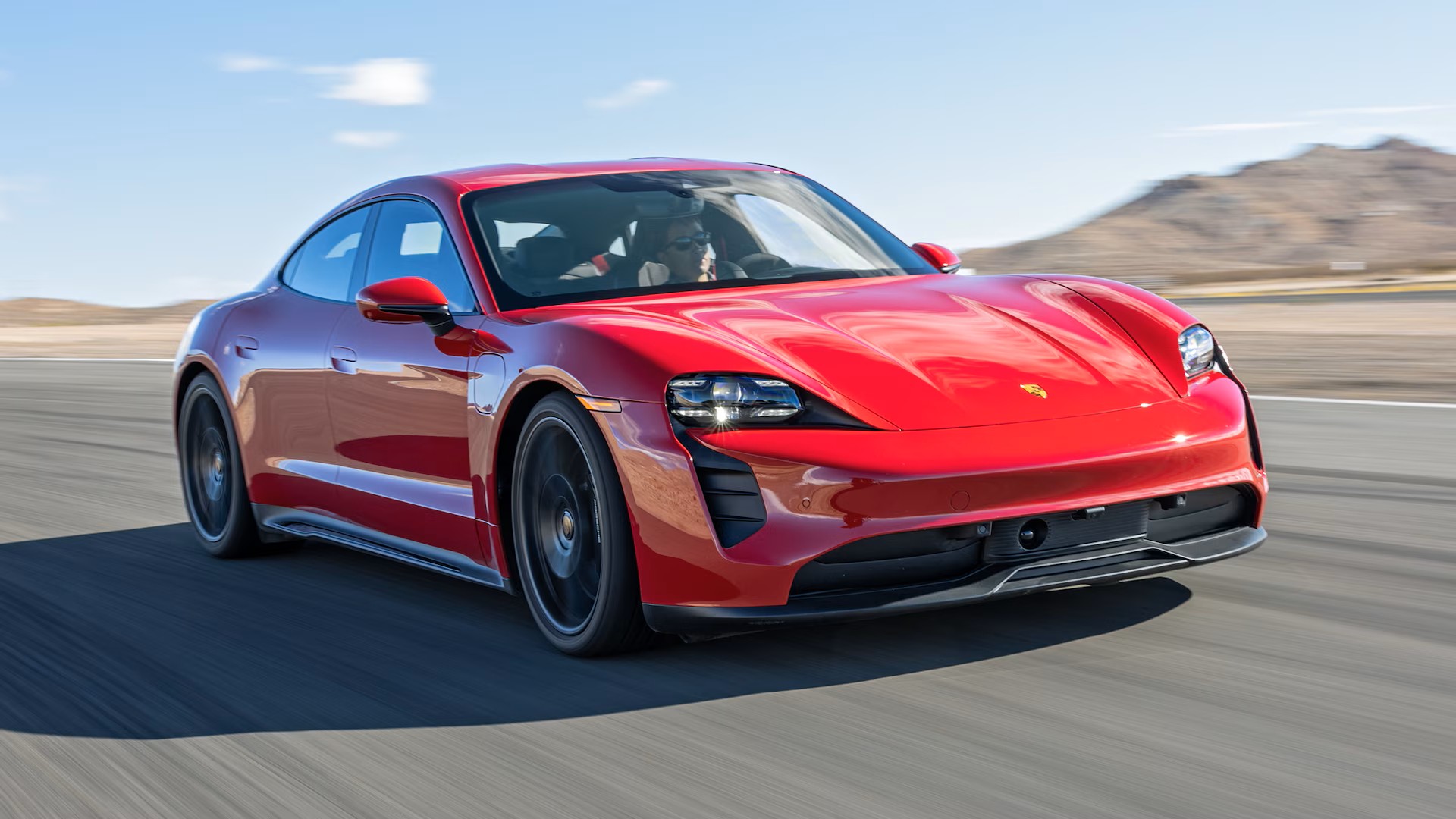
5. Porsche Taycan
Porsche’s Taycan manages to combine luxury design with functional screen visibility. The Taycan features up to three screens, depending on trim level, and the main infotainment display holds up remarkably well under sunlit conditions. This is achieved through a combination of premium materials, dashboard integration, and clever brightness management.
The screen is built into the dashboard at a low angle that naturally reduces the chance of sunlight falling directly on it. Porsche also uses high-brightness panels that can easily adjust to outdoor conditions, ensuring that the graphics remain sharp even during peak sunlight hours. The color balance also leans on strong contrast, which helps icons and text stay readable.
Another interesting point is that Porsche uses an anti-reflective coating that doesn’t interfere with touch sensitivity. Some cheaper coatings can make a screen harder to swipe or tap accurately, but Porsche avoids this issue while still cutting down on visual distractions from reflections. Drivers have noted that even with the sunroof open, the Taycan’s screens remain visible.
Porsche’s UI layout is also clean and optimized for quick glances. Important information like navigation cues or music details are large and centered, minimizing the need for deep interaction when on the move. The system doesn’t feel overloaded with information, which means fewer distractions and better usability under bright conditions. It’s another sign that attention to detail really makes a difference.
5 Cars That Glare Badly in Sunlight

1. Toyota RAV4 (Current Generation)
The Toyota RAV4 is one of the most popular compact SUVs globally, praised for its reliability, practicality, and accessible price. However, when it comes to infotainment screen visibility in sunlight, the RAV4 doesn’t perform particularly well.
The standard 8-inch or available 10.5-inch touchscreen is mounted prominently on top of the dashboard, without any hooding or deep integration that might shield it from ambient light. This design choice leaves the screen exposed to direct sunlight, especially during midday hours or when the sun is positioned at an angle that enters through the side windows or windshield.
The screen itself is glossy and lacks any significant anti-reflective coating. This leads to strong reflections from both sunlight and interior elements like chrome or light-colored trim. In bright conditions, users often find themselves needing to lean in or shade the screen with a hand to read basic information.
The glossy surface acts more like a mirror than a functional interface, making it harder to view maps, read song titles, or operate vehicle settings quickly. This becomes particularly frustrating in stop-and-go traffic or on long highway drives when quick glances should suffice.
Toyota’s interface design also contributes to the visibility issue. The color scheme relies heavily on medium contrasts rather than the high contrast typically seen in more premium systems. Icons can sometimes blend into backgrounds in bright light, and the font choices don’t stand out when viewed at an angle.
Toyota has improved the resolution and responsiveness of its systems over the years, but the usability in direct sunlight hasn’t been a strong point of focus. For many drivers, the actual experience falls short of the expectations created by marketing images taken under perfect lighting conditions.
Another problem lies in the limited brightness range of the display itself. While it’s acceptable under shade or at night, the screen doesn’t appear to ramp up its brightness adequately when exposed to daylight. Some users have noted that the automatic brightness settings are too conservative, leaving the screen dim even when more output is needed.
Manual adjustments can help, but that requires attention while driving, which is less than ideal. As a result, many RAV4 owners report glare and screen washout as a recurring annoyance, one that undermines an otherwise well-rounded driving experience.

2. Subaru Outback
The Subaru Outback is known for its rugged build and practicality, particularly among outdoor enthusiasts and long-distance travelers. However, the infotainment screen in recent models, especially the vertical 11.6-inch display in higher trims, has been a point of frustration due to its poor visibility in bright conditions.
The screen sits in a portrait orientation, mounted centrally and flush against a nearly vertical center stack. While this layout is unique and adds visual flair, it makes the screen more vulnerable to direct sunlight entering through the windshield or side windows during certain times of day.
The screen surface is extremely glossy, and Subaru has not equipped it with any substantial anti-glare treatment. In full sun, it picks up reflections from nearly every direction, including from the driver’s clothing, window trim, and even the back seats.
This makes it difficult to interact with the screen without adjusting your position or blocking the light manually. Users often describe the need to crane their necks or use one hand to shade the display while using the other to operate the controls, a move that compromises both comfort and safety.
Subaru’s infotainment software isn’t optimized for these challenges either. The interface uses thin fonts and subdued color schemes that are hard to read under bright light. Large areas of the screen are often filled with neutral grays or soft blues that wash out easily in sunlight.
Unlike other manufacturers that use bold colors or high contrast to maintain readability, Subaru seems to have prioritized aesthetics over practical visibility. This results in a system that might look sleek in a showroom or at night, but struggles to remain usable in real-world, daytime driving situations.
Additionally, the Outback’s cabin design doesn’t support the screen’s visibility either. The large sunroof in some trims increases light exposure, while the dashboard layout does little to shade or angle the screen away from direct beams. Some users have tried DIY fixes like applying matte screen protectors or tinting the roof glass, but these are only partial solutions.
For a car marketed toward adventure and outdoor use, the inability to read the infotainment system under a bright sky seems like a design oversight that diminishes the vehicle’s user experience.

3. Ford Mustang Mach-E
The Ford Mustang Mach-E is an impressive electric SUV with modern styling and cutting-edge features, but its infotainment system falls short in one particular area: sunlight visibility. The large 15.5-inch portrait-style screen is one of the most noticeable elements of the cabin and a centerpiece of Ford’s tech ambitions.
However, it’s mounted vertically and sits completely exposed on the center stack, without any recessing or shade. While the size is impressive and the touch response is fluid, the screen is prone to excessive glare that can make usage frustrating during daylight driving.
Ford’s display is glossy, highly reflective, and lacks any kind of meaningful anti-glare surface treatment. This becomes particularly problematic during early morning and late afternoon drives when the sun is low in the sky and shines directly onto the screen.
The angle of the screen relative to the windshield exacerbates the issue, catching rays that reflect back into the driver’s eyes or making key controls hard to see. For a car marketed as a modern alternative to traditional SUVs, this design shortcoming clashes with the otherwise futuristic interior.
To make matters worse, the interface design also struggles to compensate for the screen’s limitations. Ford uses bright white backgrounds and a lot of unused space on the interface, which contributes to readability issues under intense lighting.
Many functions are layered within the system, so poor visibility makes navigation and adjustment more time-consuming. Since many basic climate controls are integrated into the touchscreen rather than being physical buttons, the glare problem isn’t just cosmetic, it impacts essential vehicle operation.
The screen does have automatic brightness adjustment, but many users find that it does not react quickly enough to changing conditions. A delay of even a few seconds in brightness increase can be enough to make the screen unusable during crucial moments, such as checking a turn on the map or adjusting the defroster.
Some users have even reported dimming that occurs at the wrong times, making the issue worse. The Mach-E’s infotainment screen is a high-tech showpiece that doesn’t fully hold up when exposed to bright sunlight, despite the car’s many other strengths.

4. Chevrolet Silverado (Recent Models)
The Chevrolet Silverado, particularly in its recent model years, has made strides in cabin technology, offering larger and more feature-rich infotainment screens. However, visibility in bright sunlight remains a persistent issue. In trims that feature the 13.4-inch display, the screen is mounted fairly high on the dashboard without any shading features or deep integration.
Combined with the abundance of glossy surfaces throughout the cabin, this setup leaves the display exposed to direct light and prone to reflection issues that reduce its readability during daytime driving.
Chevy’s choice of screen finish doesn’t help either. The screen is highly polished and reflects everything from the side windows to the driver’s own face. This becomes particularly frustrating when trying to glance at navigation directions or change a music track while driving.
The screen’s gloss finish also attracts smudges and fingerprints, which only become more visible when sunlight hits the surface. These combined effects reduce the clarity of the display and make it harder for drivers to interact with the system quickly and efficiently.
The infotainment interface, while improved in terms of responsiveness and layout, uses relatively fine text and subdued icon colors that don’t contrast well against the background. The user experience suffers under strong sunlight because critical items like menus, vehicle settings, and music information blend into the glare. This makes routine tasks unnecessarily difficult, leading to longer glances at the screen and increased distraction, especially in complex traffic situations or when towing, a key use case for Silverado owners.
Another factor contributing to the issue is the Silverado’s large windshield and upright cabin design, which allows a lot of sunlight to enter the vehicle at steep angles. While this creates an open and airy feel, it also increases the likelihood of glare across various surfaces, including the infotainment screen.
The lack of physical climate and audio controls in some trims means that drivers are more dependent on the screen, which further highlights the visibility problem. For such a capable and versatile truck, the lack of screen clarity under sunlight is a surprising oversight that Chevy needs to address in future updates.

5. Honda Civic (Current Generation)
The current-generation Honda Civic has been widely praised for its sporty design, improved materials, and upgraded tech features. However, one area where it hasn’t quite hit the mark is infotainment screen visibility in bright light.
Depending on the trim, the Civic comes with either a 7-inch or 9-inch touchscreen display mounted near the top of the center stack. Although the screen is within easy reach and looks cleanly integrated, its placement and surface finish contribute to persistent glare issues that are particularly noticeable during sunny drives.
The screen’s glossy surface is the main culprit. It catches reflections from the front windshield and side windows, and these reflections often obscure parts of the screen, making it difficult to interact with while on the move.
The issue is exacerbated by the piano black trim surrounding the screen, which reflects even more light and further distracts the driver’s eyes. In certain lighting conditions, especially with the sun overhead or to the side, the combination of glare and fingerprint smudges makes the screen nearly unreadable.
Another challenge lies in the Civic’s interface design. While Honda has improved its software over the years, the system still uses relatively thin fonts and muted color tones, which don’t stand out well under harsh lighting. Icons can disappear into the background, and menu navigation becomes a challenge when the screen washes out in direct sunlight. Although the interface itself is functional and relatively intuitive, poor screen visibility reduces its effectiveness when it matters most.
Brightness adjustment is included, but lacks the aggressive scaling seen in some other brands. The screen doesn’t always brighten quickly or significantly enough to offset strong ambient light. For a car that targets younger, tech-savvy drivers, this feels like a missed opportunity to refine the user experience.
Instead of enhancing driving with clear, visible tech, the screen often feels like a reflective barrier that gets in the way. If Honda addresses this issue in future updates or models, the Civic’s interior tech could match the rest of its otherwise solid design.
Also Read: 5 EVs That Last for Decades and 5 That Don’t See Year Five
Infotainment systems are now central to how drivers interact with their vehicles, handling everything from directions and media to climate control and smartphone integration. But as this feature has become more advanced and screen-centric, one persistent issue remains under-addressed by many automakers: visibility under bright sunlight.
The usability of a screen isn’t just about its interface design or touch responsiveness; it also depends heavily on how well it handles glare and brightness in real-world conditions. As highlighted by the vehicles in this article, the difference between a well-executed screen and one that becomes nearly unreadable in daylight can be striking.
Vehicles like the Tesla Model 3, BMW iX, Audi Q8, Hyundai Ioniq 5, and Porsche Taycan show that clear, legible screens in sunlight are not only achievable but are becoming expected in modern design.
These models use high-brightness displays, effective screen coatings, smart dashboard placement, and quick-reacting brightness sensors to ensure drivers can interact with their screens safely and efficiently, no matter the lighting conditions. These cars prove that thoughtful design can eliminate one of the most common frustrations drivers face in the digital age.
On the other hand, models like the Toyota RAV4, Subaru Outback, Ford Mustang Mach-E, Chevrolet Silverado, and Honda Civic reveal that screen glare remains a real-world issue in many otherwise capable vehicles. Whether due to glossy finishes, poor placement, limited brightness scaling, or weak interface contrast, these systems fall short in one of the most basic usability categories.
In most cases, the problem could be resolved or significantly reduced with relatively minor design changes, like matte coatings or deeper dashboard integration. Yet they continue to ship with the same frustrating visibility issues, often forcing drivers to compromise safety and convenience.
The evolution of infotainment technology has moved fast, but it’s clear that not all manufacturers have prioritized everyday usability when the sun is shining directly into the cabin. For buyers, especially those who live in sunny climates or drive frequently during daylight hours, infotainment visibility is more than a cosmetic concern; it’s a functional necessity.
As cars become even more reliant on touchscreens to manage key features, screen readability needs to be treated with the same importance as performance, comfort, or fuel economy. Until then, the difference between a great screen and a frustrating one will continue to separate good design from great execution.