
Automobiles are more than just a means of transportation. They are statements of personality, style, and lifestyle. Some cars immediately give off an impression of wealth and refinement, even if their actual price tag sits in a modest range. The sleek lines, thoughtful design, and polished finish of certain models make them appear far more luxurious than they truly are.
Others, on the contrary, can feel dated the moment you lay eyes on them. Outdated shapes, awkward proportions, or lackluster interiors can make a once-proud model look tired, no matter how dependable it may be.
The way a car looks plays an enormous role in how people perceive it, and that perception can affect not only desirability but also resale value and even how the driver feels while behind the wheel.
In recent years, car manufacturers have refined design strategies that blur the line between premium and affordable vehicles. Many budget-friendly cars borrow design cues from luxury counterparts, sharp LED lighting, sculpted body panels, and minimalistic interiors that mimic high-end aesthetics.
On the other side of the market, certain vehicles that once represented innovation have failed to evolve, making them seem stuck in a past era. The distinction between looking expensive and looking outdated often comes down to small design decisions: wheel size, headlight shape, body curvature, or even how chrome and paint are used.
A car’s design can inspire confidence and admiration or disappointment and indifference. Some drivers prefer understated elegance that suggests quality without shouting for attention.
Others like aggressive lines that signal power and boldness. Whether it’s a compact sedan, crossover, or sports car, the magic lies in proportions and details that harmonize with modern trends. Yet not all automakers succeed in achieving this delicate balance. Certain models remain admired for how fresh they appear even years after release, while others quickly lose their visual appeal.
This article highlights five cars that look expensive despite their attainable cost and contrasts them with five that appear outdated despite reliability or heritage.
The aim is not to judge their mechanical performance or brand reputation but to analyze how design and presentation can influence perception. Each vehicle mentioned represents a broader design philosophy, illustrating what makes a car feel timeless versus tired.
5 Cars That Look Expensive

Mazda6
The Mazda6 has long been admired for its premium design, which could easily rival sedans that cost twice as much. Its exterior styling is defined by long, flowing lines that emphasize elegance and sophistication. The elongated hood, gently sloping roofline, and precise LED accents create a visual balance that is uncommon in the midsize sedan segment.
Mazda’s Kodo design philosophy emphasizes the motion of the vehicle even while it is standing still, giving the car a dynamic, alive feeling. Each curve and crease is carefully considered, which conveys a sense of effortlessness and artistry.
Observers often assume this vehicle is significantly more expensive because the proportions feel deliberate and the finish seems painstakingly refined.
The proportions of the Mazda6 are nearly perfect for its class, and its stance communicates athleticism without appearing aggressive. The low ride height and wide track create a planted feel, while the slightly rearward cabin placement evokes classic grand tourer aesthetics.
Small details enhance the illusion of luxury, including the precise panel gaps, minimalistic chrome accents, and the subtle curvature of the wheel arches.
Even at night, the LED headlight and taillight signatures reinforce the sense of sophistication, projecting a glow that suggests a higher-end engineering standard. Its silhouette manages to appear sleek while remaining practical, which makes the Mazda6 one of the few sedans in its class to maintain both elegance and accessibility.
Inside, the cabin continues the same theme of understated elegance. While it is not opulent, the interior feels carefully considered and well-executed. Soft-touch materials line the dashboard and doors, creating a sense of refinement uncommon in this price segment.
The center console, controls, and display screens are arranged to feel intuitive and uncluttered, giving the impression that nothing was added without purpose. This attention to design harmony is what allows the Mazda6 to feel like a more expensive sedan, as it demonstrates thoughtfulness and attention to detail that buyers typically associate with premium brands.
Mazda’s ability to create a vehicle that looks expensive without resorting to flashy ornamentation is a testament to design discipline. By prioritizing proportions, surface treatment, and subtle details, Mazda has produced a midsize sedan that stands out among competitors.
It demonstrates that visual sophistication can be achieved without an inflated price tag, proving that intelligent design is as impactful as brand prestige. The Mazda6 appeals to those who value elegance, restraint, and enduring style, making it one of the most visually compelling sedans in its segment.

Kia Stinger
The Kia Stinger disrupted expectations of what the brand could produce when it first arrived on the market. Its design blends performance cues with a sense of sophistication, producing a vehicle that could easily be mistaken for a luxury European sedan.
The long wheelbase and sweeping roofline evoke classic grand tourers, while the bold front fascia and large wheels project power and presence. Every angle of the Stinger communicates intention, from the quad exhaust outlets at the rear to the aggressive creases along the side panels. Its design stands out in traffic, drawing attention without appearing ostentatious or overdesigned.
Kia’s use of symmetry and proportion in the Stinger creates a vehicle that appears both athletic and elegant. The front grille is bold yet restrained, framed by deep air intakes that suggest capability and performance. The sculpted sides convey motion, while the rear hatch flows seamlessly from the roofline, creating a coupe-like appearance that enhances the sense of speed and style.
These visual cues make the Stinger feel more expensive than its price would suggest, as the design communicates refinement, aggression, and sophistication simultaneously. Even at slower speeds, the car’s stance suggests it is ready for high performance, which adds to its upscale perception.
Inside, the Stinger continues to impress with its attention to materials and layout. The cabin blends soft-touch surfaces, stitched leather, and metallic trim to create an environment that feels thoughtful and well-executed. Controls are logically arranged, and the driver-focused orientation gives the impression of a car built around experience rather than cost-efficiency.
These details the interior from functional to premium, making it easy to forget that this vehicle is from a brand historically associated with mainstream affordability. Each element, from the steering wheel design to the subtle ambient lighting, reinforces the sense that the Stinger belongs in a luxury showroom.
The Kia Stinger demonstrates how effective design can shift perceptions of a brand entirely. By combining proportion, detail, and visual coherence, Kia created a vehicle that looks more expensive than its peers while remaining attainable.
The Stinger’s success is a case study in how careful styling, combined with thoughtful interior execution, can alter public perception. Its ability to convey performance and refinement simultaneously is a rare achievement in the segment and underscores the importance of design in creating aspirational appeal.

2020 Genesis G70 3.3T
The Genesis G70 carries an air of quiet sophistication that allows it to compete visually with well-established European luxury sedans. Its designers borrowed inspiration from classic proportions but added subtle modern twists to produce a vehicle that feels timeless.
The wide, crest-shaped grille commands attention without appearing overbearing, while the split LED headlights add precision and depth to the front end. Sculpted body panels create tension and visual interest without adding unnecessary complexity.
The result is a sedan that radiates confidence and elegance, immediately distinguishing itself from more conventional competitors in its class.
One of the reasons the G70 appears so expensive is its stance and proportions. The car sits low, with broad shoulders that communicate stability and strength. The hood slopes gracefully, flowing seamlessly into the windshield, giving the impression of motion even when stationary.
These design decisions create a sense of athleticism paired with refinement, making the G70 feel like a luxury vehicle from every angle. The paintwork and finish further emphasize this impression, as metallic and deep gloss colors enhance the body lines and add dimension to the sculpted surfaces.
Inside, Genesis continues its focus on thoughtful design. The cabin combines premium materials with an intuitive layout, producing an interior that feels deliberate and well-crafted. Leather, stitching, and metal accents are used in measured doses to create sophistication without excess.
The integration of technology, including a clean digital instrument cluster and modern infotainment screen, adds to the perception of value while maintaining an elegant atmosphere. The interior’s alignment with exterior styling reinforces the idea that this is a complete luxury package rather than a car that simply borrows cues from higher-end brands.
The G70 demonstrates the power of cohesive design language in perception. Its visual identity communicates quality, attention to detail, and a modern sensibility, allowing it to compete with European rivals. Every line, surface, and material choice has a purpose, creating a sense of refinement that extends beyond aesthetics.
By focusing on proportion, surface tension, and harmonious interior-exterior design, Genesis has produced a car that looks and feels far more expensive than its price tag suggests, illustrating the potential of design to transform perception.

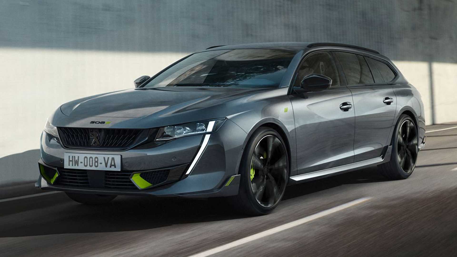
Peugeot 508 SW PSE
The Peugeot 508 stands out for its daring yet refined design, proving that visual identity can rival higher-end vehicles without matching price tags. Its frameless doors, wide stance, and intricate lighting create a vehicle that immediately communicates sophistication.
The fastback roofline adds elegance and gives the car a sense of modernity, while subtle creases and curves along the side panels catch light in a way that makes the body appear sculpted. Observers often mistake the 508 for a premium European sedan because of these deliberate design decisions.
Peugeot’s designers gave the 508 a distinct personality that balances aggression with elegance. The front features narrow headlights integrated with vertical LED strips, creating a sharp, intelligent look. The grille is purposeful and prominent, while the rear design flows naturally from the roofline, giving a cohesive impression of motion.
These details suggest that the car was carefully designed, with every surface contributing to its presence. It does not rely on excessive ornamentation but instead communicates refinement through proportion and harmony.
Inside, the 508’s cabin reinforces the premium perception. The driver-focused cockpit features a compact steering wheel, high-quality materials, and a digital display cluster. Controls are arranged with ergonomic intention, creating an environment that feels modern, luxurious, and practical simultaneously.
Ambient lighting and thoughtful material choices amplify the impression of refinement. Even though it sits in a midrange price bracket, the interior feels like a high-end experience, enhancing the visual appeal of the vehicle.
The 508’s ability to maintain a sense of sophistication stems from its unified design language. It avoids borrowing too heavily from other brands while clearly defining its identity. The car’s exterior and interior complement each other, producing an impression of elegance, care, and precision.
This cohesion allows the 508 to look more expensive than its cost would suggest, highlighting how effective design can a vehicle beyond its category.

2023 Volkswagen Arteon
The Volkswagen Arteon is a study in understated luxury. Its wide stance, smooth surfaces, and gracefully sloped roofline give it an executive presence that feels timeless.
Unlike many vehicles that rely on flashy accents or heavy chrome, the Arteon achieves sophistication through proportion, balance, and refined surface treatment. Its long body and frameless windows create a visual impression similar to European coupes, conveying elegance and thoughtfulness in every angle.
From the front, the Arteon exudes poise and composure. Horizontal lines emphasize width and stability, while the headlights seamlessly integrate into the grille, creating a harmonious face. The subtle curves of the fenders and hood provide movement without appearing fussy, maintaining a sense of simplicity and elegance.
At night, the lighting signature enhances this visual sophistication, reinforcing the perception that the Arteon belongs to a premium category despite its accessible price point.
Inside, the Arteon continues the theme of clean, elegant design. Volkswagen uses high-quality materials and a meticulous fit-and-finish approach that rivals luxury sedans. Ambient lighting, soft-touch surfaces, and logical placement of controls create an interior that feels curated rather than generic.
The cabin maintains a sense of modernity and refinement, enhancing the impression that the vehicle is far more expensive than it actually is.
The Arteon demonstrates that restraint and attention to proportion can be more effective than excessive styling when projecting luxury. Its design communicates maturity, balance, and refinement, proving that high-end perception can be achieved without flashy embellishments.
For buyers who value elegance, practicality, and cohesive design, the Arteon stands out as a rare example of a car that combines all these traits while remaining accessible, proving that sophistication is often a matter of careful planning and thoughtful execution.
5 That Look Outdated

Nissan Altima
Older models of the Nissan Altima often appear outdated compared to modern midsize sedans, primarily because of design choices that no longer align with contemporary aesthetics. The previous-generation Altima featured boxier proportions and less refined body lines, making it look less sleek and dynamic than newer competitors.
Its front fascia, with a conservative grille and relatively plain headlights, lacked the aggression or sophistication seen in rival vehicles.
The stance of these older Altimas often appeared tall and narrow, which diminished the visual impression of stability and presence on the road. While functional, the design failed to communicate excitement or luxury, which made the car feel older than it really was.
The interior of older Altimas also contributes to their outdated feel. While ergonomically adequate, the cabin often relied heavily on hard plastics and less cohesive layouts. Dashboard designs were more utilitarian than stylish, with larger gaps between panels that contrasted sharply with the tight, polished finishes of modern sedans.
Infotainment systems, when present, were typically small and lacked integration with the design, further emphasizing the car’s age. Even materials such as seat fabrics and trim appeared dated, lacking the premium textures and cohesive design language that have become standard in modern vehicles.
These factors combined to make the Altima feel less sophisticated and more like a previous-generation car rather than a competitive midsize sedan.
From a proportion standpoint, older Altimas often looked top-heavy, with wheels that seemed small relative to the body and overhangs that disrupted balance. Compared to competitors such as the Mazda6 or Hyundai Sonata, the visual appeal of the older Altima was muted and conservative.
Its styling choices focused on practicality over presence, which, while functional, meant that the vehicle lacked the visual charisma of rivals that adopted sleeker lines and more athletic stances. The conservative design decisions made it hard for the Altima to compete in a market increasingly driven by design appeal as much as performance or reliability.
The perception of age in older Altima models also stems from color and trim options that have become dated. Earlier paint choices and interior finishes often look dull compared to the richer palettes and textures offered by modern vehicles.
Even details such as lighting signatures, wheel designs, and exterior accents have not aged gracefully, further reinforcing the sense that these cars belong to a previous era. While mechanically competent, older Altimas struggle to project a modern or premium image, which makes them look less attractive and significantly more outdated compared to their contemporaries.

2017 Ford Taurus
The Ford Taurus, particularly models from the mid-2010s, often appears outdated due to its bulkier proportions and styling choices that contrast sharply with contemporary sedans. The front end, dominated by a large grille and relatively simple headlight shapes, gives the Taurus a heavy, less refined appearance.
Side panels are broad and flat, with minimal sculpting, which diminishes a sense of movement or athleticism. Its silhouette, with tall rooflines and a long wheelbase, lacks the visual balance that modern sedans achieve through tapered profiles and sharper lines. This results in a car that can appear cumbersome rather than sleek.
Inside, the Taurus often struggles to compete with the interior sophistication of newer vehicles. Dashboard layouts, while functional, tend to feel segmented and dated, with large bezels and controls that appear oversized. Materials such as plastics and trims are serviceable but lack the refinement seen in more modern interiors, making the cabin feel utilitarian rather than premium.
Infotainment systems from this era were generally less integrated and visually dated, contributing to a perception of the car being behind the times. Even seating and ergonomics, while comfortable, were not presented in a visually appealing way, further reinforcing an outdated impression.
The Taurus’s proportions and stance also contribute to its aged look. Its long front overhang, tall roofline, and narrow track create a sense of imbalance compared to sleeker sedans that employ wider, lower stances for visual appeal. Wheels often appear undersized relative to the car’s bulk, further diminishing aesthetic harmony.
While the vehicle is technically spacious and practical, its dimensions do not translate to modern visual elegance. The bulkiness, combined with relatively muted detailing and lack of modern sculptural body lines, makes it appear heavier and older than its competitors.
Details such as lighting design, trim elements, and paint choices further emphasize the Taurus’s dated appearance. Headlights lack distinctive signatures or modern LED integration, while taillights are simplistic and uninspired. Chrome accents are often excessive or poorly balanced, and exterior finishes feel flat compared to the polished surfaces and dynamic lines of contemporary sedans.
These factors, combined with the conservative design approach, make the Taurus look less appealing in a market where styling increasingly influences perception, leaving it firmly in the category of cars that appear outdated.

Chevrolet Malibu (Older Models)
Older Chevrolet Malibus often suffer from a visual design that now seems outdated, largely due to boxy proportions and lackluster detailing. Early 2010s Malibus featured a squared-off design with minimal emphasis on aerodynamic flow or athletic stance.
The front fascia, dominated by a simple grille and basic headlight shapes, lacked the refinement seen in competitors like the Honda Accord or Toyota Camry.
Side panels were relatively flat and lacked character lines that create depth and visual interest, contributing to a muted presence. While functional and recognizable, the styling failed to capture attention or convey a sense of modernity.
The interior of older Malibus reinforces the perception of being behind the times. Dashboard and console designs were functional but uninspired, with plastics dominating much of the visual space. Infotainment screens were small and lacked integration, controls were often bulky, and trim accents failed to elevate the space.
The seating, while comfortable, featured designs and materials that have not aged gracefully. Ambient lighting was minimal, and even color choices often contributed to an institutional feel. These factors made the cabin appear older and less sophisticated, especially compared to modern midsize sedans that emphasized materials, layout, and cohesive styling.
Proportionally, older Malibus tend to appear boxy and less dynamic. Rooflines are tall, wheel arches relatively understated, and the shape lacks the tension and flow of contemporary designs. The stance feels somewhat top-heavy, and wheels are often undersized relative to the body.
Even subtle details like trim placement and light treatment do little to add sophistication. These proportions, combined with dated exterior details, make the vehicle visually less competitive in a market increasingly focused on sleek, flowing designs and dynamic silhouettes.
Details such as lighting, grille treatment, and chrome placement further reinforce an outdated perception. Headlights and taillights are often simple and lack LED technology or modern signatures, giving the car a utilitarian rather than stylish appearance.
Chrome trim is minimal or awkwardly placed, and exterior paint options tend to be conservative, lacking the depth or metallic appeal of modern choices. These design elements contribute to the sense that older Malibus belong to a previous generation, making them feel less exciting or visually relevant than their contemporary rivals.

Honda Accord (Early 2010s)
Early 2010s Honda Accords, while reliable and mechanically sound, now look outdated due to design elements that no longer align with modern aesthetics. The exterior was dominated by conservative lines, a tall stance, and a front end that lacked dynamic presence.
Headlights were simple, often integrating into a traditional grille without flair, and side panels were flat with limited sculpting. The silhouette was functional but uninspired, making the vehicle appear older compared to sleeker, more aggressive contemporaries. Even the proportions felt less balanced, with overhangs and rooflines that failed to convey motion or elegance.
Inside, early Accords reflected the design norms of their time but now appear dated. The dashboard relied heavily on plastics and large, segmented panels. Infotainment and instrument clusters were smaller and lacked integration, while knobs and buttons were utilitarian rather than stylish.
Seating designs were practical but lacked visual flair, and trim choices were limited in texture and color variety. Ambient lighting was absent or minimal, which reinforced the sense of an older, functional interior rather than a premium, thoughtful design. Compared to modern sedans, these cabins feel static and less engaging.
The proportions of early Accords contributed significantly to their outdated perception. The tall roofline and relatively narrow track created a sense of bulkiness that has since been addressed in newer, lower-profile designs. Wheel designs were simpler and smaller, which reduced the sense of athleticism.
Compared to competitors, early Accords lacked the tension in body lines and flowing silhouettes that communicate motion and style, making them appear conservative and dated despite their reputation for reliability.
Exterior details such as lighting, trim, and grille treatment further emphasize age. Headlights lacked LED technology or signature patterns, taillights were flat, and chrome trim was minimal or poorly balanced. Paint finishes lacked the richness or metallic depth of contemporary vehicles, making the car feel visually older.
While functional and practical, early Accords do not have the refined styling or modernity of newer sedans, which places them firmly in the category of vehicles that look outdated compared to current competitors.

Toyota Camry (Pre-2015 Models)
Pre-2015 Toyota Camrys often appear outdated due to boxy proportions and styling cues that contrast with modern design trends. The exterior featured relatively tall rooflines, flat side panels, and simple lighting clusters that lacked personality or distinctive presence.
The front end, dominated by a straightforward grille and basic headlights, provided minimal visual impact. These cars prioritized practicality over aesthetics, which made them functional and reliable but visually less appealing than contemporaries embracing sleeker, more dynamic silhouettes. The impression is one of age, with proportions and details that have not aged gracefully.
The cabin of pre-2015 Camrys reinforces the perception of being outdated. Dashboard layouts were functional but lacked cohesion, relying heavily on hard plastics. Controls and infotainment systems were basic and visually separated rather than integrated into the design.
Seating materials and designs were serviceable but not visually refined, and interior trim choices were limited in color and texture variety. Ambient lighting was virtually nonexistent, making the interior feel utilitarian rather than stylish. While ergonomically adequate, these interiors feel like products of their time and lack the sophistication of modern cabins.
Proportionally, older Camrys often appear less dynamic. The long wheelbase combined with tall rooflines and modest wheel size gives a top-heavy impression. The body lacks sculpted lines or flowing surfaces that modern sedans use to create motion and elegance.
Compared to vehicles like the Mazda6 or Kia Stinger, these Camrys feel visually static, reinforcing the outdated aesthetic. The balance between practicality and design prioritizes function over visual appeal, leaving the car less striking and modern in appearance.
Exterior details such as lighting clusters, grille treatment, and chrome accents further emphasize the dated look. Headlights and taillights are simple, lacking signature LED or dynamic patterns, while chrome elements are minimal or inconsistently applied. Paint finishes are flat, lacking depth or vibrancy.
Even the wheel designs are unremarkable, which reinforces the perception of an older vehicle. Pre-2015 Camrys remain reliable and practical but fail to convey the visual excitement or refinement expected in modern sedans, making them appear outdated in comparison.