Sedans have long been considered a cornerstone of automotive design, offering a balance of style, comfort, and practicality. They are the vehicles that families, commuters, and driving enthusiasts alike have relied upon for decades. Yet, even within this seemingly stable category, there are models that stumble dramatically due to a single design flaw.
Sometimes it is a mechanical issue, other times it is a styling choice, and occasionally it is a poor decision in ergonomics or safety. Regardless of the type of misstep, these flaws can overshadow an otherwise solid vehicle, leaving it remembered not for its strengths, but for one glaring weakness.
Automakers often strive to innovate, seeking features that will set their sedans apart in a competitive market. Unfortunately, innovation without foresight can backfire, turning what should have been a selling point into a source of frustration. Some of the most talked-about design errors come from seemingly small choices, such as a poorly positioned control, an awkward seating layout, or a strange body shape.
These flaws can affect usability, comfort, and sometimes even safety. Buyers may initially be drawn to a vehicle’s promise, but the reality of daily use exposes the misstep.
Consumer expectations also play a significant role in how design decisions are received. A sedan is often judged by its practicality, interior space, driving comfort, and ease of use. A single design flaw in any of these areas can feel magnified because sedans are held to high standards.
For example, a car with excellent engine performance may still struggle in sales if its interior is cramped or if visibility is limited. Designers must anticipate how ordinary drivers will interact with the car, yet even seasoned professionals occasionally miss the mark.
The impact of a bad design choice is not limited to drivers. It also affects resale value, reputation, and brand perception. A vehicle with one noticeable flaw can see declining interest over time, despite any other improvements or refinements.
Word of mouth, online reviews, and automotive journalism amplify these issues, ensuring that even minor flaws gain widespread attention. For many buyers, avoiding a car with a known design problem becomes more important than seeking one with superior features elsewhere.
This article examines ten sedans that were heavily impacted by a single design decision. Each model had potential, with promising engines, decent styling, or advanced technology, yet one poor choice overshadowed the rest. By looking at these examples, we can understand the delicate balance of design in the automotive world.
The stories of these sedans are cautionary tales that highlight how a single decision can determine a car’s success or failure. Understanding these mistakes also offers lessons for both consumers and designers in assessing the importance of detail in vehicle design.

1. Ford Taurus (1996–1999) – Oval Overload
The 1996 Ford Taurus was intended to push American sedans toward futuristic styling. Its body featured a rounded, oval-heavy design that was meant to stand out from competitors. Unfortunately, the approach alienated many traditional buyers who preferred more conventional lines. The styling was widely criticized for being excessive and awkward.
Inside, the interior tried to match the exterior curves with rounded gauges and controls. This made some buttons hard to locate quickly while driving. The layout sacrificed intuitive ergonomics for design continuity. Drivers found themselves fumbling with basic controls during daily commutes.
The oval theme extended to nearly every panel, including headlamps, taillights, and wheel wells. The extreme curves also created awkward proportions that reduced trunk space. Practicality, a key selling point for sedans, was diminished.
Ford hoped the bold look would create a trend, but competitors did not follow. Instead, sales dropped, and the Taurus became a target for critics and cartoonish comparisons. Public perception is often more critical than engineering success.
This model is remembered for its overdone shapes rather than reliability or performance. The oval-heavy design decision became a lesson in how far styling can go before it hurts a car’s appeal. The Taurus returned to more conventional lines in later generations, acknowledging the misstep.

2. Pontiac Aztek (2001–2005) – Styling That Confused Everyone
The Pontiac Aztek attempted to blend SUV utility with sedan comfort, but its styling backfired spectacularly. Sharp angles clashed with bulky body panels, creating a disjointed appearance. Buyers struggled to understand its identity, leaving it widely mocked.
Inside, the Aztek featured a plastic-heavy cabin with awkward storage compartments. Some elements protruded, making the space feel cramped. The interior design failed to match the car’s supposed versatility.
Practical features like the rear cargo area and removable center console were innovative but overshadowed by the exterior look. The car’s unusual nose and split rear glass were constant targets of criticism. Visibility was also limited due to oddly shaped windows.
Marketing campaigns highlighted the Aztek’s lifestyle flexibility, but the styling distracted from functionality. Even adventurous buyers avoided it. The design alienated a broad audience that might otherwise have appreciated the vehicle’s utility.
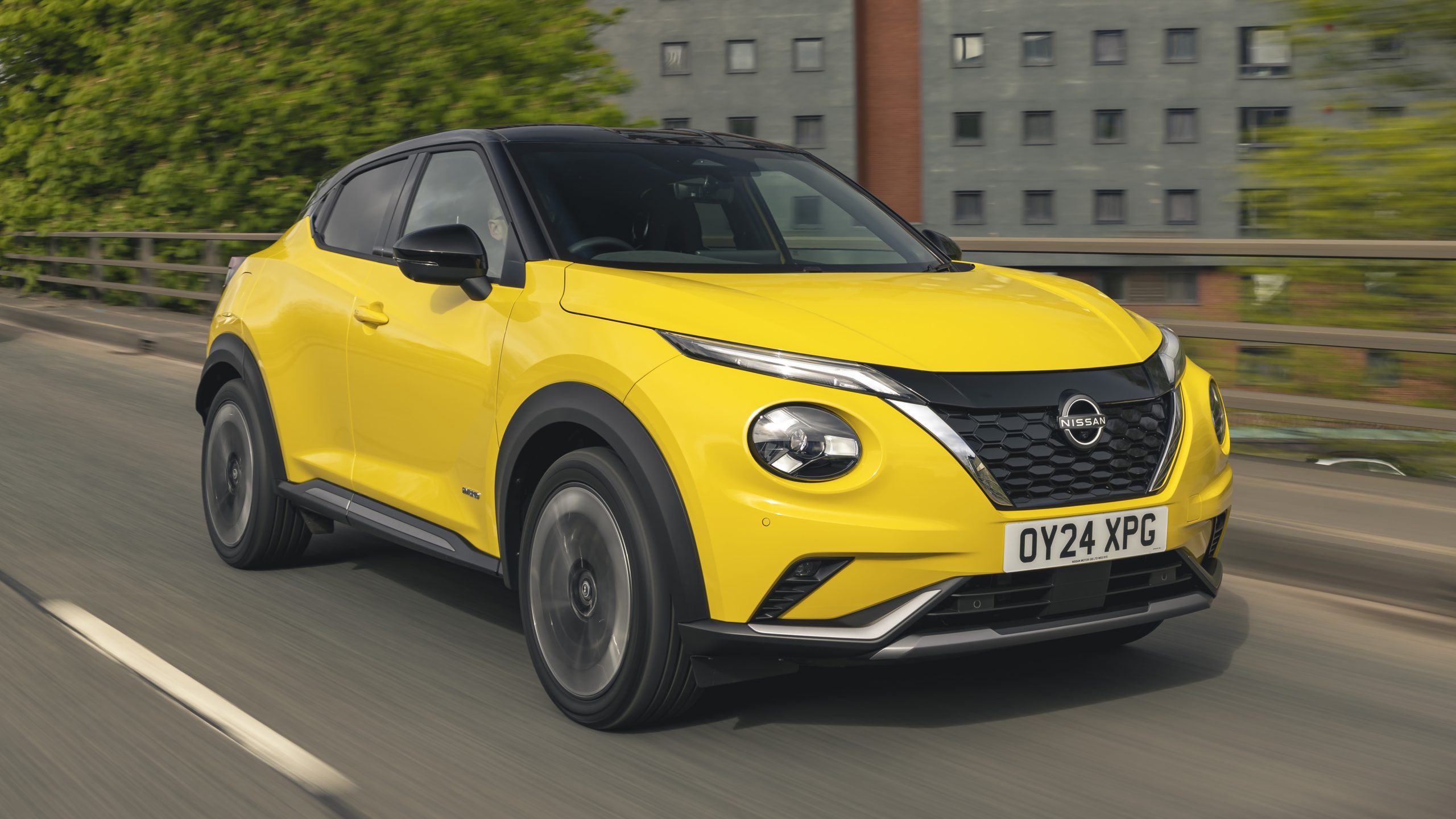
3. Nissan Juke (2011–2017) – Eyes Too Far Apart
The Nissan Juke was praised for its compact size and sporty performance, yet the front end received heavy criticism. Bulbous headlights were placed high and far apart, giving the car a face that many described as awkward or “bug-eyed.” This choice overshadowed driving enjoyment for some buyers.
The small interior was functional, but the odd exterior proportions affected perception of space. Taller passengers found headroom limited. The unusual shape also created blind spots, complicating city driving.
Performance and efficiency were competitive for its class, yet critics rarely mentioned these aspects first. The visual impression dominated first impressions, often discouraging potential buyers. Styling can have an outsized effect on market success.
Nissan defended the design as unique and bold, but the polarizing look limited appeal. Unlike typical hatchbacks or small SUVs, the Juke’s extreme appearance was not widely embraced. Some buyers learned to overlook the design, but it never achieved mainstream acceptance.
This sedan-like crossover illustrates how a single styling choice can define a vehicle’s reputation. Despite being mechanically solid, the front-end design remains the first thing most people remember about it.
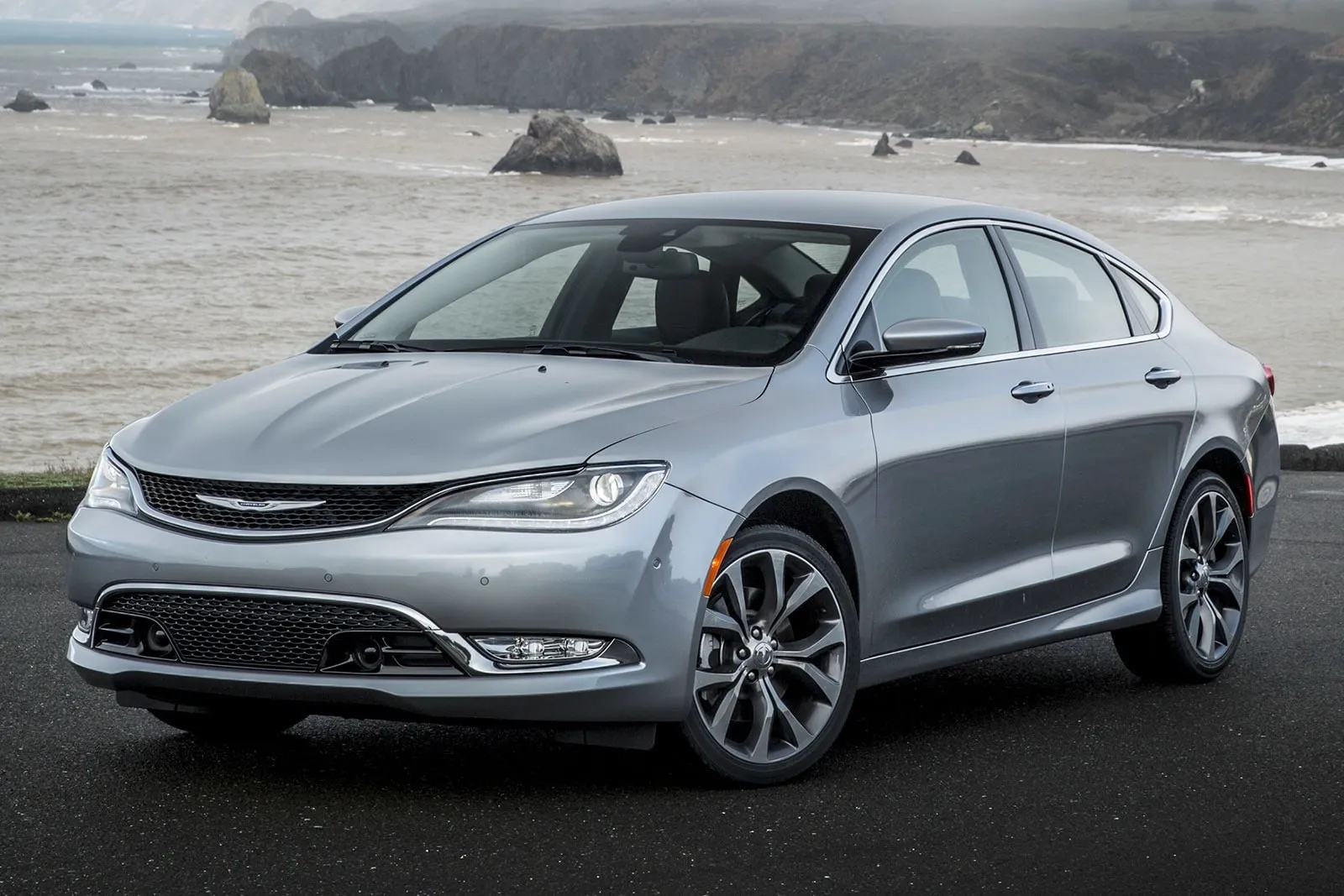
4. Chrysler 200 (2015–2017) – Sloped Roof That Hurt Usability
The Chrysler 200 sought to compete with midsize sedans with sleek styling and modern technology. However, its sharply sloping roofline created serious rear-seat headroom issues. Passengers over six feet tall struggled to sit comfortably.
This design also compromised rear visibility. Drivers had a harder time judging distances and backing up safely. Safety features could not fully offset the ergonomic consequences. The aesthetic decision had practical repercussions.
Cargo capacity suffered as well. The trunk opening was narrower due to the roofline, making loading larger items inconvenient. Families and commuters found the sedan less practical than advertised.
Despite solid engines and quiet rides, the 200’s sloped roof dominated reviews. Buyers prioritized usability, and the design flaw deterred many from considering the car. Features and pricing became secondary concerns.
Chrysler discontinued the 200 after just a few years. The roofline serves as a reminder that style should not come at the expense of core functionality. Designers must weigh appearance against real-world practicality.

5. Volkswagen Passat (B5, 1997–2005) – Complicated Electronics
The B5 generation Passat impressed with European styling and handling, but its electronics became a major headache. The digital climate controls and early infotainment systems were prone to failure. Small malfunctions could lead to large, frustrating problems.
Repairs were costly and often required dealer service, discouraging potential buyers. Reliability concerns overshadowed the car’s otherwise solid engineering. Word spread quickly among automotive enthusiasts and owners.
Interior design was otherwise attractive, with quality materials and comfortable seating. Unfortunately, the electronic systems became the defining feature in reviews. Drivers judged the car more for headaches than comfort.
Even routine functions like power windows and seat adjustments sometimes malfunctioned. What should have been a convenience ended up reducing satisfaction. The car’s reputation suffered despite competent mechanical design.
Volkswagen eventually updated electronic components in later models, but the B5 Passat remains a cautionary tale. A single flawed subsystem can dominate a vehicle’s reputation for years.

6. Honda Accord (2003–2007) – Dashboard Confusion
The early 2000s Honda Accord was praised for reliability and smooth handling, yet the dashboard layout in certain trims caused major confusion. Controls were scattered across multiple levels, forcing drivers to take their eyes off the road.
Buttons for climate, audio, and navigation lacked a logical grouping, creating a learning curve that frustrated new owners. Even longtime Honda fans admitted it was awkward to operate during daily driving, turning a simple adjustment into a distraction.
The digital readouts were not intuitive either. The speedometer, fuel gauge, and warning lights were separated in ways that made quick glances insufficient. Drivers had to shift focus between several small clusters of information.
This affected both convenience and safety, as minor details like turn signal indicators were sometimes overlooked. A car known for practicality was ironically hindered by its interior layout.
Beyond usability, the design decision impacted resale value. Buyers looking for dependable sedans often favored competitors with more straightforward dashboards. While the Accord’s engine and chassis remained solid, the confusing control layout overshadowed its mechanical strengths. It became a common complaint in reviews and forums, reducing enthusiasm for even well-maintained examples.
The problem was exacerbated by minimal customization options. Even higher trims retained the basic design without significant ergonomic improvements. Honda engineers did not anticipate that drivers would prioritize simplicity over additional features, illustrating a disconnect between design intent and user experience.
The dashboard misstep serves as an example of how a single interior choice can undermine a car’s reputation. The 2003–2007 Accord remains a reminder that even reliable sedans can falter when user experience is compromised by poor design decisions.
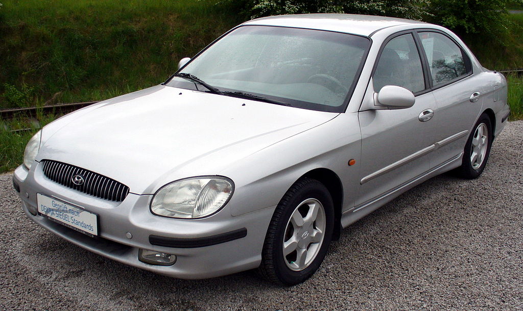
7. Hyundai Sonata (2011–2014) – Confusing Infotainment
Hyundai attempted to modernize the Sonata with a touchscreen-heavy infotainment system, but its implementation created frustration. Buttons were small, menus were nested in confusing layers, and tactile feedback was minimal. Drivers often struggled to make adjustments while keeping attention on the road, leading to complaints about distraction and accessibility.
Physical controls were reduced to a few rotary knobs, forcing interaction primarily through the touchscreen. During driving, minor functions like adjusting the fan speed or radio station became complicated tasks.
Critics noted that the system prioritized style and sleek appearance over simple usability. The focus on a high-tech feel compromised the daily practicality that buyers expected from a midsize sedan.
The infotainment system also experienced frequent glitches. Software freezes, connectivity issues, and delayed responses were common, even in later production years. While the Sonata offered a strong engine lineup and smooth handling, these electronic frustrations dominated the narrative in reviews. Buyers often overlooked mechanical advantages because the interface created consistent annoyance.
Interior quality, otherwise comfortable with spacious seating, was overshadowed by the digital frustration. The high-contrast screens and small buttons did not match the driver-friendly reputation Hyundai had built with earlier models. Convenience became secondary to aesthetics, which limited appeal among family buyers and commuters.
By 2014, Hyundai had redesigned the system, but the 2011–2014 Sonata remains a clear example of how one flawed decision in technology integration can define an entire generation. A well-engineered sedan can fail to impress if everyday usability is compromised by overcomplicated interfaces.
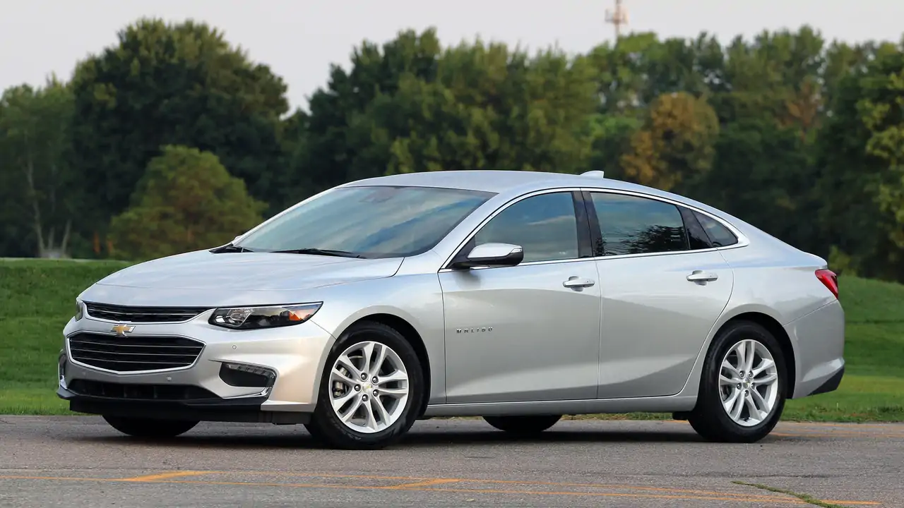
8. Chevrolet Malibu (2013–2015) – Visibility Nightmare
The 2013 Chevrolet Malibu aimed to provide a sleek, modern profile, yet its rear window and thick C-pillars created serious visibility problems. Drivers reported difficulty seeing lane markings, approaching vehicles, and pedestrians when backing up. This flaw forced heavier reliance on mirrors and parking sensors, making parking and city driving stressful for many.
The design choice of sloping rooflines and small rear glass compromised a core expectation of a sedan: clear sightlines. While styling was praised for appearing more upscale than previous models, it came at the cost of safety and comfort. Families with children or taller drivers noticed the restrictions immediately, reducing the appeal for the segment.
Rear passengers also experienced the consequences. The slanted windows and limited headroom created a cramped feel in the back seat. Taller adults were particularly affected, making longer drives less comfortable. Practicality, a traditional strength of the Malibu, was diminished by one major design decision.
Chevrolet offered backup cameras as an option, but many buyers found this insufficient. Safety ratings and crash-test performance could not offset the daily inconvenience of restricted visibility. Reviewers consistently mentioned that the problem dominated the car’s evaluation, despite its otherwise solid powertrain and fuel efficiency.
The Malibu’s visibility issue demonstrates how aesthetics can conflict with essential functional needs. A sedan may impress visually, but drivers prioritize clear sightlines and safe maneuverability above subtle style choices. This generation of Malibu remains notorious for that compromise.

9. Toyota Camry (2012–2014) – Hard Ride Suspension
The Toyota Camry had earned a reputation for comfort and reliability, yet the 2012–2014 generation introduced an overly stiff suspension that surprised buyers. What had once been a smooth, forgiving ride turned jarring on rough roads. The decision to firm up suspension for perceived sportiness alienated the core audience of family and commuter drivers.
Corners were handled more aggressively, but potholes and uneven pavement became more noticeable. Daily commuting and long trips were affected, turning a vehicle known for comfort into a source of annoyance for some owners. Ride quality is a fundamental expectation for midsize sedans, making this misstep especially damaging.
Other aspects, such as cabin quietness and interior ergonomics, remained strong. However, even loyal Toyota fans criticized the trade-off, as smoothness had been one of the Camry’s signature attributes. The suspension change became the focal point of reviews rather than its dependable reliability or fuel efficiency.
Resale value was mildly affected, as buyers sought used models from earlier generations to avoid the firmer ride. This illustrates how one change, aimed at enhancing handling, can have unintended consequences for broader appeal. Consumer priorities in this segment often favor comfort over sport-oriented refinements.
In hindsight, Toyota readjusted the suspension in subsequent years, acknowledging the misalignment between design intentions and customer expectations. The lesson is clear: subtle alterations to core characteristics can ripple through a car’s reputation and market performance.
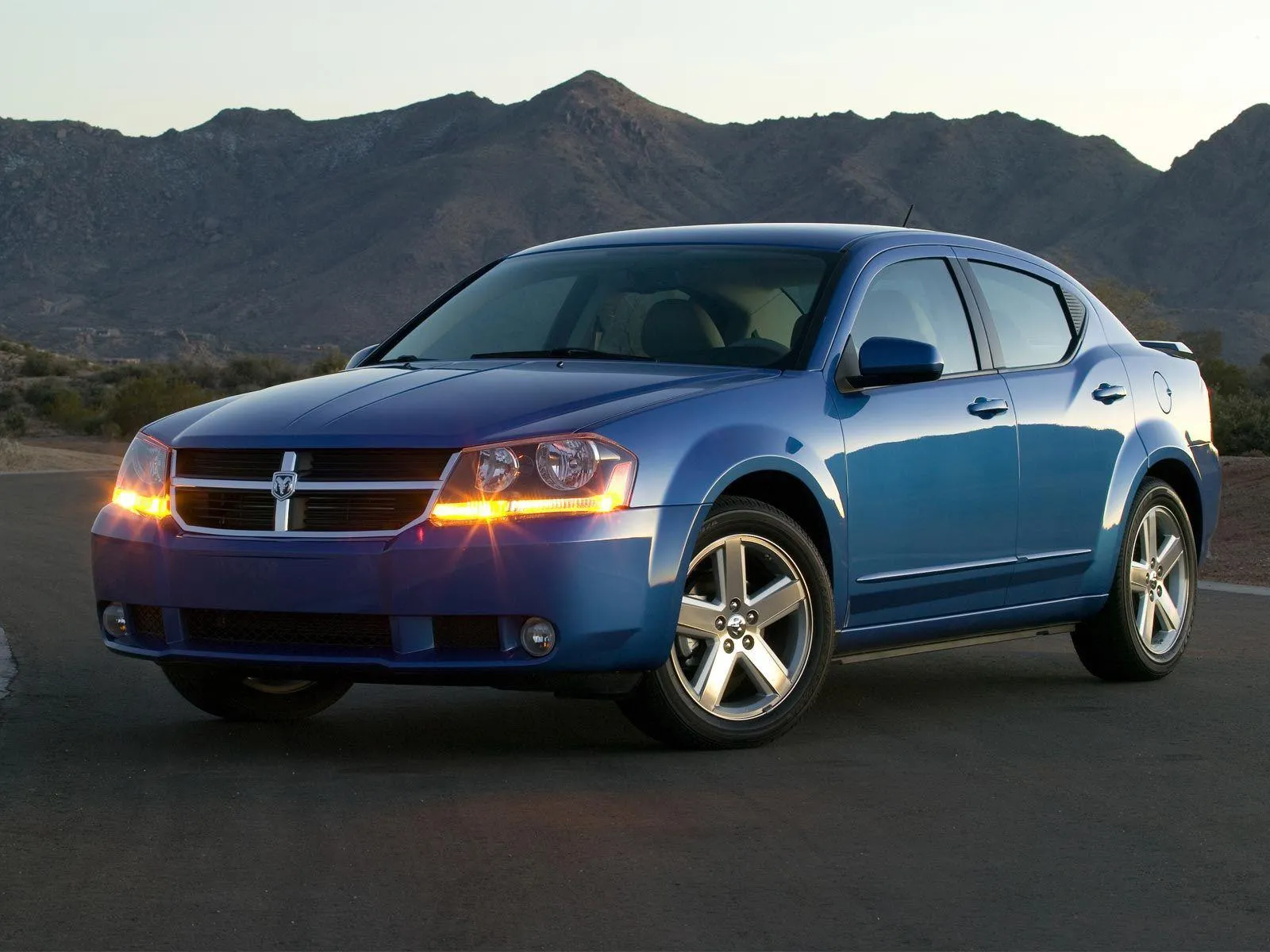
10. Dodge Avenger (2008–2014) – Interior Plastic Overload
The Dodge Avenger offered competitive pricing and solid engines, yet its interior design undermined its appeal. Hard plastics dominated the cabin, creating a cheap feel despite the vehicle’s mid-range positioning. This single design choice made it feel less refined than similarly priced rivals.
Dashboard and door materials were stiff and prone to scratches, while center consoles and control panels appeared flimsy. Even with comfortable seating and ample legroom, the tactile experience was consistently criticized. Drivers and passengers often commented that it did not match the car’s exterior styling or advertised features.
Infotainment and control layout compounded the issue. Buttons and knobs were not integrated with the interior aesthetic, emphasizing a mismatch between design and execution. Small details, such as the texture of surfaces, contributed to the perception of low quality, overshadowing the vehicle’s mechanical strengths.
Practical aspects, including trunk space and cargo versatility, were adequate, but reviews rarely mentioned them first. Media and consumer attention focused on interior quality, which influenced purchasing decisions more than performance or fuel efficiency. One design misjudgment became the defining characteristic of the Avenger’s reputation.
Dodge updated interior materials in later models, but the 2008–2014 Avenger demonstrates how material choices and tactile quality can shape perception. A single design flaw in interior construction can dominate reviews and buyer sentiment, regardless of engine performance or styling.
