
The debate between tactile and touchscreen dashboards has never been more relevant than it is today. As automakers race to modernize their cabins, a critical question has emerged: are physical controls actually better for drivers?
Tactile dashboards those featuring physical knobs, buttons, and switches allow drivers to operate controls without taking their eyes off the road. They offer instant feedback, muscle memory, and reliability in all weather conditions.
Meanwhile, touchscreen-heavy dashboards have flooded the market, often at the expense of usability and safety. What looks stunning in a showroom can become a frustrating, even dangerous, distraction on the highway.
Studies from organizations like AAA and Lund University have consistently shown that touchscreen-heavy systems demand significantly more cognitive attention than physical controls.
In this article, we examine six of the best tactile dashboards available in the USA right now vehicles where designers prioritized driver experience over visual wow factor. Then, we expose six touchscreen disasters where style clearly won over substance.
Whether you’re a daily commuter, a road trip enthusiast, or simply someone who misses buttons, this breakdown will help you understand what truly matters behind the wheel.
The 6 Best Tactile Dashboards in the USA
These thoughtfully designed dashboards prioritize physical buttons, knobs, and tactile controls that allow drivers to adjust settings quickly without taking their eyes off the road. With solid feedback, intuitive layouts, and durable switchgear, they enhance usability and safety during everyday driving.
Their reliability over time also stands out, as mechanical controls tend to age better than purely digital interfaces, maintaining consistent performance without lag or software glitches.
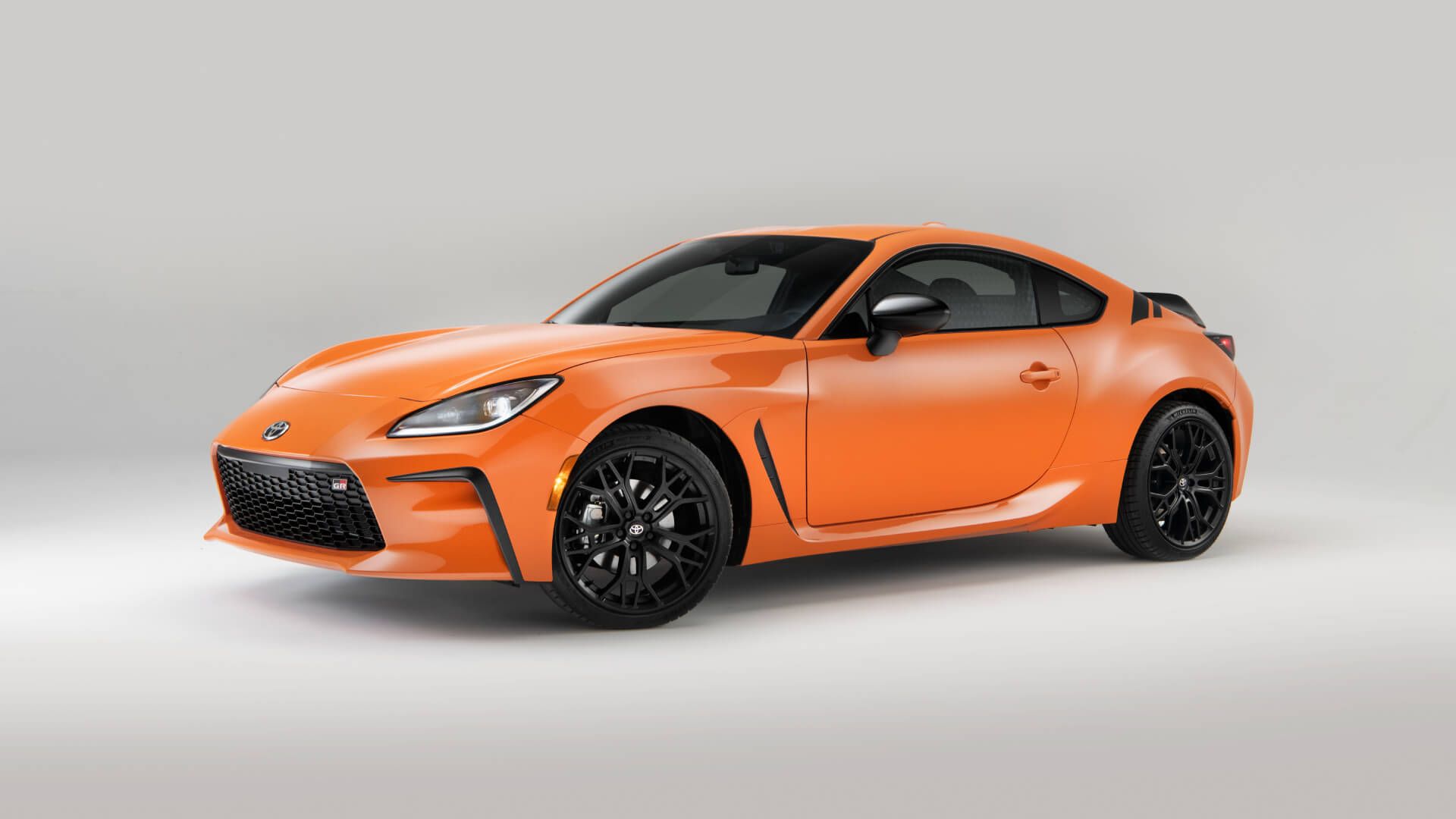
1. Toyota GR86 (2022–Present)
The Toyota GR86 is a sports car that refuses to abandon the driver. Its interior is deliberately minimalist, built around the principle that nothing should distract from the driving experience. Every button has a purpose, and every control is exactly where your hand expects it to be.
The center console is anchored by a traditional HVAC panel with large rotary dials. These dials click satisfyingly into position, giving precise temperature and fan-speed control without a single glance required. The audio controls sit within easy reach, featuring dedicated volume and tuning knobs that respond to even gloved hands.
The infotainment screen is modest in size an 8-inch unit but it is positioned high and angled toward the driver. Physical shortcut buttons flank the display, allowing quick access to navigation, audio, and settings. Toyota resisted the temptation to bury essential functions in sub-menus.
The steering wheel is equally well-considered. It features paddles for rev-matching downshifts and simple, logically grouped buttons for cruise control and audio. Nothing requires a swipe, a tap, or a double-press. The GR86 proves that a sporting driver’s car can be both exciting and ergonomically sensible.
")
The instrument cluster is a traditional analog setup with a large central tachometer. A small multi-information display sits between the gauges, showing only what you actually need. This car communicates through its controls, not around them.
Consumer reviews consistently praise the GR86’s cockpit for feeling focused and intuitive. Driving enthusiasts call it a throwback to an era when cars were designed for drivers, not designers. In a world chasing screens and software updates, the GR86 stands as proof that restraint is a feature.
2. Mazda CX-5 (2023–Present)
Mazda has long positioned itself as the driver-centric alternative in the mainstream market. The CX-5 embodies this philosophy more completely than almost any other vehicle in its segment. Its dashboard is a textbook example of how physical controls and thoughtful design can coexist beautifully.
The centerpiece of the CX-5’s interior is the Commander control a large rotary dial mounted between the front seats. This dial controls the infotainment system entirely, meaning drivers never have to reach up and tap a screen while moving. The system feels intuitive almost immediately, with a logic borrowed from iDrive and MMI systems that experienced drivers will recognize.
HVAC controls are housed in a dedicated panel below the infotainment screen. Three large rotary knobs manage temperature for driver and passenger, along with fan speed. A row of clearly labeled physical buttons handles modes like defrost, recirculation, and seat heating. There is no hunting through menus to turn on the rear defroster.
Mazda has kept the infotainment screen at 10.25 inches, large enough to be useful, but the brand explicitly prevents touchscreen interaction while the vehicle is in motion. This is a deliberate safety choice, forcing drivers to use the rotary controller instead. It sounds limiting but quickly feels liberating.

The steering wheel controls are logically arranged with minimal clutter. Volume, cruise control, and driver assistance functions are all accessible by feel. Mazda’s attention to haptic feedback the way every button and dial feels under your fingers is evident throughout.
The CX-5 regularly tops owner satisfaction surveys for interior quality and usability. It is proof that a family SUV does not need to sacrifice ergonomics to feel modern. Mazda simply prioritized the right things.
3. Subaru Outback (2023–Present)
The Subaru Outback has earned its reputation as the go-anywhere family vehicle. Part of what makes it so dependable on long journeys is a dashboard that never gets in the way. Subaru understands that its customers spend real time behind the wheel in real conditions.
The Outback’s HVAC system features three dedicated physical knobs for temperature, fan speed, and mode selection. These sit below the main screen in a well-organized row, separated by tactile spacing so you can go through them by feel. Heated seat buttons are physical toggles mounted directly in the center console no menu-diving required.
The 11.6-inch portrait-style infotainment screen is large, but Subaru has been careful to retain physical climate controls alongside it. A row of dedicated shortcut buttons below the screen provides direct access to home, audio, navigation, and phone functions. The screen does not swallow the entire dashboard.
Steering wheel controls are chunky, well-spaced, and easy to operate with winter gloves. This matters enormously for Outback owners, many of whom live in snowy climates and depend on their vehicle year-round. Subaru’s engineering is clearly grounded in real-world use cases.

The driver-assistance controls EyeSight, X-Mode terrain management, and hill descent are all physical switches. These are systems you may need quickly and unexpectedly. Burying them in a touchscreen would be genuinely dangerous; Subaru avoided that mistake.
The analog gauge cluster, with a central multi-information display, keeps critical data legible at a glance. The Outback’s interior may not win design awards, but it earns loyalty from the people who actually live in their cars. Functionality over flash, every time.
4. Ford Maverick (2022–Present)
The Ford Maverick was designed as an affordable, practical truck for real people. Its dashboard reflects that mission with remarkable clarity. Ford’s team made deliberate, principled decisions about what to include and what to leave out.
The Maverick’s HVAC controls are entirely physical rotary dial for temperature, rotary dial for fan speed, and a row of push buttons for mode selection. These controls are mounted low but are angled toward the driver for easy reach. They work reliably whether your hands are clean, cold, or wearing work gloves.
The infotainment system is Ford’s SYNC 4 platform on an 8-inch display. The screen is appropriately sized for the vehicle and positioned at a comfortable viewing angle. Physical volume and tuning knobs flank the screen on each side a decision that feels small until you try to adjust audio without these on a competing vehicle.
Ford included a USB-A and USB-C port directly in the dash, along with a wireless charging pad in the center console. But more importantly, they put a physical start button. Simple, tactile, reliable the Maverick doesn’t try to be smarter than its owner.

The gear selector is a traditional rotary dial rather than a push-button arrangement, giving clear tactile feedback of your selected drive mode. The parking brake is a physical lever rather than an electronic button a choice that working drivers genuinely appreciate for its simplicity and reliability.
The Maverick’s interior has been praised as one of the best values in the American automotive market. It is a vehicle that respects the driver’s time and intelligence. Sometimes the best feature is the one that simply works, every single time.
Also Read: 5 SUVs With Durable Rubberized Floors vs 5 With Carpets That Stain Early
5. Porsche 911 (992 Generation)
The Porsche 911 is the gold standard of driver-focused vehicle design. Its dashboard has evolved over decades, but Porsche has stubbornly retained physical controls even as rivals abandoned them entirely. The result is a cockpit that balances heritage with modernity.
The center console of the 992 generation 911 is famous for its symmetrical button layout. Rows of clearly labeled, backlit physical buttons control everything from sport modes to suspension settings to launch control. Each button has a satisfying tactile click and is arranged with logical grouping that experienced 911 drivers can operate entirely by feel.
The HVAC controls in the 911 are a masterclass in ergonomic design. Dual-zone climate control is managed through dedicated dials with a center temperature readout. The fan speed buttons are small but precise, with tactile ridging that distinguishes them from adjacent controls even without looking.
The steering wheel is similarly considered. Sport Plus mode, chassis controls, and adaptive cruise settings are all accessible via physical controls on the wheel and stalk. Porsche knows that at speed, the driver’s hands must remain on the wheel and their eyes on the road.
")
The 10.9-inch touchscreen is present for navigation and media, but it supplements rather than replaces physical controls. The volume knob is physical. The ignition switch is to the left of the steering column a tradition dating to Porsche’s Le Mans racing days, when seconds mattered. That tradition persists because it still matters.
Owning a 911 is about the totality of the driving experience. The dashboard is part of that experience, one that communicates competence, readiness, and focus before the engine even starts. Porsche proves that physical controls are not old-fashioned they are simply correct.
6. Ram 1500 (2023 Classic)
The Ram 1500 Classic stands apart from its more tech-heavy sibling by maintaining a dashboard philosophy rooted in practicality. For contractors, farmers, and fleet operators, this truck delivers a control environment built for the real world.
The Classic’s dashboard is dominated by physical controls with a traditional instrument cluster. HVAC functions are managed through large, easy-to-grip rotary dials that work with one hand and require zero visual attention. The system is robust enough to survive years of dusty, muddy, work-site operation.
The Uconnect infotainment system is present but measured an 8.4-inch screen with physical volume and tuning controls beside it. Ram’s system is consistently rated among the most responsive and user-friendly truck infotainment platforms in the industry. Crucially, it doesn’t try to replace physical controls.
The steering wheel controls are generously sized with pronounced ridging. They control audio, phone, and cruise functions clearly and without confusion. The column-mounted gear selector gives satisfying mechanical feedback with each gear change.

Four-wheel-drive engagement is handled through a physical rotary dial on the center stack. High range, low range, and 2WD modes are selectable with a single turn. There is no mode-confirmation screen, no animated sequence just immediate mechanical response.
The Ram 1500 Classic’s interior acknowledges that drivers of working trucks have more important things to think about than interface design. They need controls that are immediate, reliable, and tactile. Ram delivered exactly that, and working professionals have rewarded the brand with consistent loyalty for it.
The 6 Touchscreen Disasters
These vehicles rely heavily on overcomplicated touchscreen systems that replace essential controls with menus and submenus, often leading to frustration and distraction.
Laggy response times, software bugs, and poor interface design can make simple tasks like adjusting climate or volume unnecessarily difficult. Over time, these systems may suffer from glitches, freezing screens, or unresponsive inputs, turning what should be a modern convenience into a daily usability problem.
1. Tesla Model S (Post-2021 Refresh)
Tesla’s Model S refresh in 2021 replaced the beloved physical stalks on the steering column with capacitive touch buttons embedded in the steering wheel itself. The result was almost universally condemned by automotive journalists and safety advocates alike. Drivers found themselves accidentally activating turn signals, horn, and windshield wipers while simply gripping the wheel.
The cabin of the refreshed Model S is dominated by a 17-inch portrait touchscreen. Every function climate, media, drive modes, mirror adjustments, and steering wheel position is controlled through this one surface. There are no physical climate knobs, no volume dial, and no traditional instrument cluster in front of the driver.
Adjusting the temperature requires taking your eyes off the road, going through to the climate sub-section of the screen, and tapping or swiping to change the setting. At highway speed, this is not a 1-second interaction. Studies of Tesla’s screen interface show it can take 8 to 10 seconds to complete basic climate adjustments equivalent to driving nearly 300 meters on a motorway without looking forward.
")
The yoke steering wheel introduced on the Model S Plaid exacerbated the problem. Without a traditional round wheel, the thumb-operated touch buttons became even harder to locate consistently.
Early owners reported turning on the wipers when trying to indicate and honking the horn accidentally in traffic. These are not minor inconveniences; they are safety failures.
Tesla has since revised its software multiple times to improve the interface experience. Some physical controls have been quietly reintroduced in response to regulatory pressure in Europe. But the underlying philosophy screen first, driver second continues to define Tesla’s interior design language, to the frustration of many owners.
2. Genesis GV70 (First Generation)
The Genesis GV70 is a genuinely beautiful automobile. Its exterior design is striking, its interior materials are luxurious, and its powertrain options are impressive. But its infotainment system is a case study in how sophisticated design can undermine day-to-day usability.
The GV70’s central control interface relies on a 14.5-inch curved touchscreen combined with a rotary controller and touch-sensitive panel. The dual-input system sounds clever but creates confusion in practice. Drivers frequently use the wrong input method for a given function and must backtrack through multiple screens to complete a simple task.
The climate control system is a particular pain point. While there are physical buttons for seat heating and some modes, temperature adjustment requires either touching the main screen or using the rotary controller with a visual confirmation step. In cold weather, when you most urgently need to adjust heat output, the process demands too much attention.
")
The steering wheel’s touch-sensitive buttons flat, capacitive surfaces rather than physical buttons are notoriously prone to accidental activation. The haptic feedback is inconsistent, and the buttons do not light up individually enough to locate by feel alone. In dark or glare-heavy conditions, finding the right control becomes genuinely challenging.
Genesis’s driver-assistance and lane-keeping features are controlled through menus rather than dedicated switches. Turning off lane centering requires three taps through sub-menus. For a driver in flowing traffic who needs to make a quick adjustment, this is an unacceptable delay.
The GV70 is a vehicle with tremendous potential, let down by an interface philosophy that prioritized visual elegance over ergonomic intelligence. Its screen looks stunning. It just doesn’t always work smoothly when you actually need it to.
3. Cadillac Escalade (2021–Present)
The fifth-generation Cadillac Escalade arrived with what the brand proudly called the largest curved OLED display in the automotive industry. Spanning 38 inches across the dashboard in a single curved panel, it encompasses the instrument cluster, an infotainment screen, and a passenger entertainment display. The technology is genuinely impressive. The usability is another matter entirely.
The sheer scale of the display creates a problem: important information is spread across too large an area. Glancing at the instrument cluster means looking far to the left. Checking the navigation requires a glance far to the right. In a vehicle this large often driven in urban environments with constant pedestrian and cyclist hazards that eye movement is significant.
")
Physical climate controls in the Escalade are reduced to a narrow touch-sensitive strip below the main screen. Temperature sliders and fan speed controls are smooth, glossy surfaces with no tactile differentiation. In sunlight, the screen washes out. In darkness, the contrast can be overwhelming. Finding the exact right spot on the strip often requires a look.
The HVAC system for rear passengers requires the front-seat occupant to go through into a sub-menu on the touchscreen. In a vehicle marketed as a luxury family hauler, requiring the driver to manage rear climate through a touchscreen is a significant ergonomic failure.
Cadillac’s Super Cruise driver-assistance system is excellent and rightfully praised. But even accessing Super Cruise settings and adjusting its behavior requires touchscreen navigation that distracts from the moment of engagement. The Escalade is a technological showcase. It is just not always a driver showcase.
4. Volkswagen ID.4 (First Generation)
The Volkswagen ID.4 launched with enormous promise an accessible electric family crossover from a trusted European brand. Its cabin, however, delivered one of the most criticized interface designs in the mainstream EV segment. The culprit was a deceptively simple decision: replacing the volume knob with a capacitive touch slider.
The touch slider runs along the bottom of the infotainment screen. To adjust volume, you swipe your finger along a smooth glass surface with zero physical feedback. The system is inconsistent a light swipe might produce a massive volume jump, while a deliberate swipe sometimes registers nothing at all. In a car otherwise characterized by solidity, this control feels broken.
The dashboard is broadly dominated by the main 12-inch screen for navigation, audio, and many vehicle settings. The touch slider for volume is joined by a similarly capacitive control for temperature another smooth surface requiring visual confirmation to use accurately. These two controls, performed dozens of times per journey, demand far more attention than they should.
")
Even the hazard light button on the original ID.4 was moved to a less intuitive location during the redesign process. Hazard lights are emergency controls they should be reachable by feel in a panic. Thoughtful placement of safety-critical controls was sacrificed for visual cleanliness.
Volkswagen listened to criticism more quickly than many rivals. The ID.4 received substantial interior updates that restored a physical volume knob and improved the climate control interface.
The brand publicly acknowledged the feedback. But the first-generation ID.4 stands as a warning about what happens when design teams prioritize aesthetics over the fundamental needs of the person actually driving the car.
5. BMW iX (First Generation)
BMW built its reputation for driver satisfaction partly on iDrive a rotary controller that set the gold standard for vehicle infotainment interaction. The original iDrive was criticized at launch but refined over twenty years into a genuinely excellent system. Then came the iX, and BMW seemed to forget everything it had learned.
The BMW iX features a 14.9-inch curved touchscreen paired with a smaller 12.3-inch instrument cluster. The iDrive rotary controller is still present, but BMW has progressively moved more functions to the touchscreen, creating a split attention problem where drivers must decide between the two input methods for different tasks. The consistency that made older iDrive systems so intuitive is gone.
The climate controls in the iX are particularly confusing. There are some physical buttons, but temperature adjustment, seat heating, and ventilation modes are spread across both the touchscreen and a small control panel in a way that requires learning and re-learning the layout. Long-term owners report muscle memory failures when switching to other vehicles and back.
")
The touch-sensitive surfaces on the steering wheel replace physical buttons. BMW calls them “curved touch controls” flat, haptic surfaces that look seamless but feel ambiguous in use. In cold weather, especially with winter gloves, these controls become nearly non-functional. For a brand that sells heavily in cold-climate markets across North America and Europe, this is a meaningful design failure.
The ambient lighting system, panoramic roof, and driving mode settings all require touchscreen navigation through menus of varying depth. The iX is a technological tour de force and a genuinely capable electric vehicle. But its interior represents BMW’s most significant ergonomic step backward in two decades.
6. Rivian R1T (First Generation)
The Rivian R1T is one of the most exciting vehicles launched in recent American automotive history. An electric adventure pickup with extraordinary off-road capability, a clever gear tunnel, and genuine outdoor-lifestyle credibility. Its dashboard, unfortunately, tells a different story.
The R1T’s interior is dominated by a 15.6-inch portrait touchscreen. This screen controls almost everything: climate, drive modes, off-road configurations, air suspension height, and audio. For a truck designed to be used in remote locations often dirty-handed, sometimes gloved, frequently in bright sunlight this is a fundamental mismatch between use case and interface design.
The HVAC system requires touchscreen interaction for temperature adjustments. There are no physical climate knobs. In below-freezing conditions, when gloves are necessary and touchscreen accuracy decreases significantly, adjusting the heater mid-drive is a genuine challenge. This is a vehicle marketed to people who camp in January and ski in February.
Drive mode selection for Rivian’s various off-road settings all-terrain, rock crawl, sport requires going through into the touchscreen while positioned on challenging terrain. In a moment when a driver might have one hand on the wheel going through a difficult trail feature, the other should not be occupied with screen navigation. Physical toggles would serve this use case dramatically better.
")
The gear selector is a haptic touch surface on the center console no mechanical lever, no satisfying click. While it functions adequately on pavement, users report confusion on trail when tactile confirmation of gear selection matters most.
Rivian’s over-the-air software updates have improved the interface meaningfully since launch. The brand is clearly listening and iterating. But the R1T’s first-generation interface design represents the clearest possible example of a vehicle’s physical capabilities being undermined by its digital ones. The truck can go anywhere. Its interface sometimes can’t keep up.
Also Read: 5 Trucks With Heavy Duty Cooling for Arizona Heat vs 5 That Overheat Fast