
Car navigation and infotainment systems have become a central part of modern driving. What used to be simple radio and climate controls has now turned into a digital hub that manages maps, music, phone calls, driver assistance settings, and even vehicle performance data.
As vehicles become more connected, the design of these systems plays a major role in how safe and comfortable a driving experience feels.
A well designed navigation interface can reduce stress, improve focus on the road, and make daily commuting more efficient. Drivers rely heavily on clear menus, responsive touch or physical controls, and logical layouts that do not require long periods of attention away from driving. When a system is intuitive, it supports quick decision making and minimizes distraction, especially in dense traffic or unfamiliar routes.
On the other hand, overly complex infotainment systems can demand too much attention. Large touchscreens with deep menu layers, inconsistent controls, or too many features packed into one interface may increase cognitive load.
This can lead to drivers spending more time looking at screens instead of the road, which raises safety concerns. Even advanced systems with many capabilities can become frustrating if they are not designed with simplicity and ergonomics in mind.
Automotive brands differ significantly in how they approach this balance. Some prioritize physical buttons, rotary controllers, and minimal menu structures that are easy to learn.
Others focus on large screens, voice commands, and feature rich ecosystems that attempt to centralize every function into one interface. Both approaches have strengths, but the real difference comes down to how easily a driver can operate the system without losing attention.
This article compares five brands known for generally user friendly navigation systems and five brands often criticized for interfaces that can be distracting due to complexity or heavy reliance on touch based controls.
The goal is to highlight how design choices affect real world usability, comfort, and driving focus. Each brand is evaluated based on common user experiences, interface structure, and ease of operation during everyday driving situations.
5 Brands With User Friendly Navigation

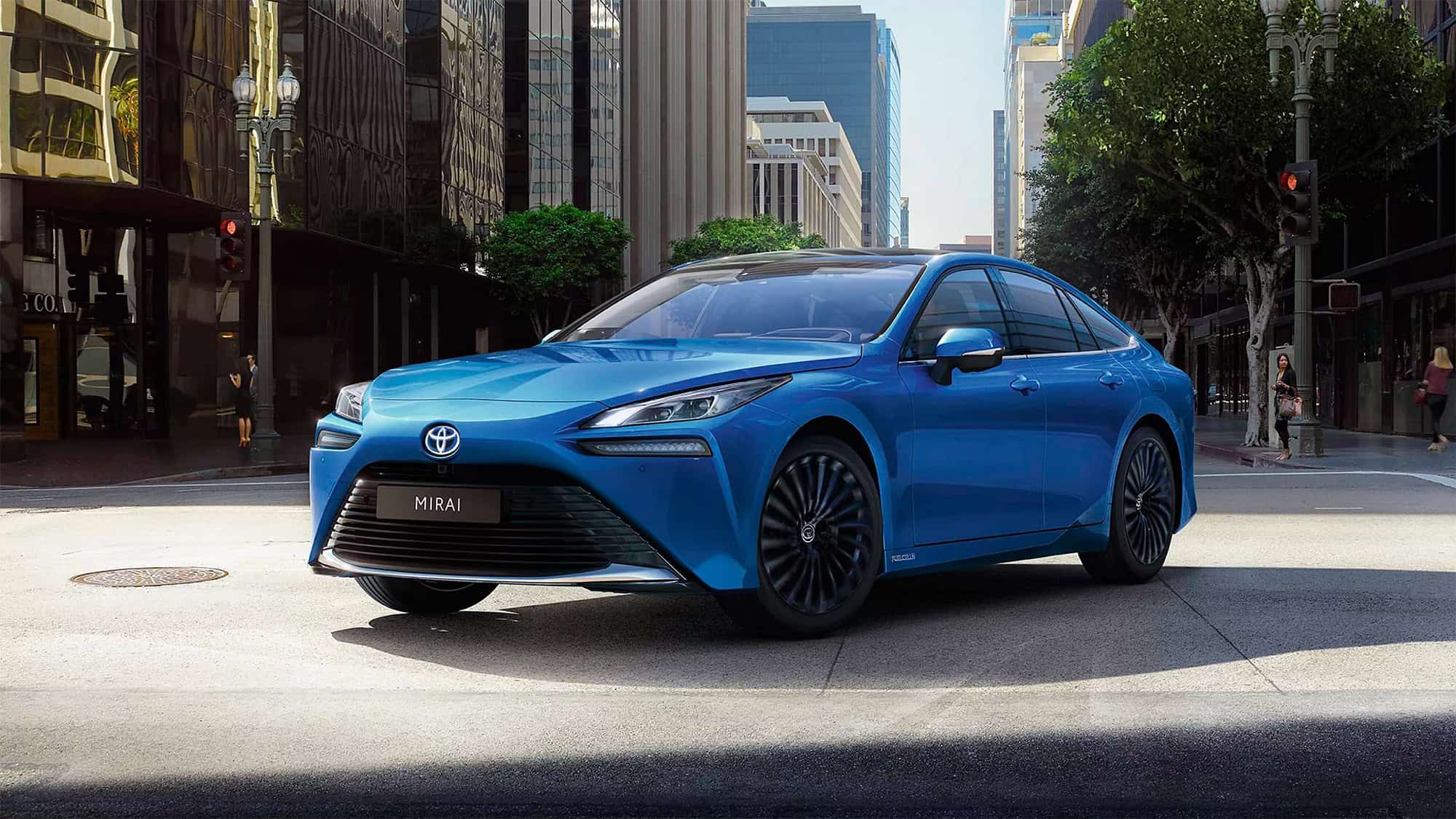
Toyota
Toyota is widely recognized for prioritizing practicality and ease of use in its infotainment systems. The brand typically designs its navigation interface with clear menus, straightforward icons, and minimal unnecessary layers. This makes it easier for drivers of all ages to adapt quickly without needing a long learning period.
Many Toyota models also retain physical buttons and knobs for essential controls such as volume, tuning, and climate settings, which helps reduce reliance on touchscreens while driving. The layout is usually structured in a way that places commonly used features within one or two steps from the home screen, reducing the time spent searching through menus.
Another important strength of Toyota’s navigation approach is consistency across its lineup. Whether a driver is using a compact sedan, a hybrid, or a larger SUV, the interface structure remains familiar. This reduces confusion when switching between models or when multiple drivers share the same vehicle.
The system also avoids unnecessary visual clutter, keeping maps and menus readable even during night driving or in bright sunlight. Route guidance is typically presented in a clear format with simple arrows, distance indicators, and lane guidance where available.
Toyota also focuses on reliable voice command integration that supports basic tasks like setting destinations, searching for points of interest, and making phone calls. While it may not be the most advanced voice assistant in the industry, it performs consistently in everyday driving conditions.
The system is designed to reduce the need for typing or manual input, which helps keep attention on the road. It also responds well to commonly used phrases, making it accessible for first time users without requiring complex commands.
Another aspect that contributes to Toyota’s user friendly design is its stability and responsiveness. The system is generally smooth, with minimal lag when switching between navigation, media, and phone functions.
This predictability helps reduce frustration during driving, especially in traffic situations where quick adjustments are needed. Over time, drivers tend to build muscle memory with the interface, allowing them to operate it with fewer visual checks.
Toyota continues to refine its infotainment systems by improving screen resolution, touch sensitivity, and smartphone integration. Apple CarPlay and Android Auto support is widely available, allowing users to rely on familiar mobile interfaces when needed. This hybrid approach, combining built in navigation with smartphone connectivity, strengthens usability and ensures drivers have multiple simple options for route planning.

Honda
Honda has built a reputation for creating infotainment systems that balance functionality with simplicity. In many of its models, the navigation interface is designed with large icons, clear typography, and a clean layout that reduces confusion.
The menu structure is typically shallow, meaning drivers do not have to navigate through multiple layers to access common features like maps, phone connectivity, or audio settings. This structure helps reduce decision making time while driving.
One of Honda’s strongest advantages is its combination of touchscreen and physical controls. Important functions such as volume adjustment, climate control, and track skipping often have dedicated buttons or knobs.
This hybrid design allows drivers to make quick changes without relying entirely on the screen. It is especially helpful in situations where road conditions require continuous attention, since tactile controls can be used without looking away from the road for long periods.
Honda’s navigation guidance is generally clear and easy to follow. Directions are displayed with simple visuals, supported by voice prompts that reduce the need to constantly monitor the screen. The system focuses on essential driving information such as turn distance, lane guidance, and estimated arrival time, rather than overwhelming the driver with unnecessary details. This makes it suitable for both city driving and long distance travel.
In newer models, Honda has improved system responsiveness and reduced lag compared to older infotainment versions. Screen transitions are smoother, and input recognition is faster when selecting destinations or searching for contacts. This improvement makes the system feel more natural and reduces the friction that drivers sometimes experience when interacting with digital interfaces in motion.
Honda also places strong emphasis on smartphone integration. Apple CarPlay and Android Auto are commonly supported, allowing drivers to switch to familiar mobile navigation apps if preferred. This flexibility improves usability because it reduces the learning curve and allows users to rely on apps they already understand. Combined with a straightforward built in system, this creates a balanced and accessible driving experience.

Volvo
Volvo places a strong emphasis on safety, and this philosophy extends directly into its infotainment and navigation systems. The interface is designed to minimize distraction by using large, readable tiles and a vertically oriented touchscreen layout that resembles a tablet. This structure allows drivers to access key functions with fewer steps and reduces the need for precise tapping while driving.
A key feature of Volvo’s system is its integration with Google built in services in many models. This provides accurate navigation through Google Maps along with voice assistance powered by Google Assistant.
Drivers can use natural language commands, which reduces the need to memorize specific phrases. This makes destination input and route changes much faster and safer, especially during highway driving or in unfamiliar areas.
Volvo also avoids cluttered menus by organizing functions into clearly separated categories. Climate control, media, navigation, and phone settings are all placed in predictable locations on the screen. This reduces mental load and allows drivers to locate functions quickly without searching through nested menus. The interface also uses consistent design patterns across different models, which helps users adapt more easily.
Another important aspect is how Volvo manages in motion usability. Certain non essential functions are limited while the vehicle is moving, encouraging drivers to rely on voice control or preset shortcuts. This design choice reduces unnecessary interaction with the screen and supports safer driving behavior. The system also provides clear visual feedback, making it easier to confirm selections at a glance.
Volvo continues to refine its infotainment experience by improving response speed, map clarity, and system stability. The combination of Google integration and a clean interface layout makes it one of the more straightforward systems to operate in real driving conditions. The focus remains on reducing complexity while maintaining useful connectivity features.

Subaru
Subaru infotainment systems are designed with practicality in mind, particularly for drivers who prioritize straightforward functionality over complex digital features. The navigation interface is generally clean, with clear map displays and simple routing instructions that are easy to understand at a glance. This helps drivers focus on the road rather than the screen.
A major advantage of Subaru systems is the inclusion of physical buttons alongside touchscreen controls. Essential functions such as volume, climate adjustments, and menu navigation can often be handled without relying entirely on the screen. This reduces the need for prolonged visual attention and supports safer interaction during driving, especially on rough or rural roads where stability is important.
Subaru also focuses on reliability and consistency. While the interface may not feature the most advanced graphics or animations, it is stable and predictable across different driving conditions. Drivers typically experience fewer unexpected menu changes or confusing layouts, which helps build familiarity over time. This predictability is valuable for users who prefer a low stress driving environment.
Voice control and smartphone integration are well supported in most Subaru models. Apple CarPlay and Android Auto allow drivers to use familiar navigation apps, reducing the need to learn a new system. This flexibility is particularly useful for users who frequently travel or switch between different vehicles, as it keeps the experience consistent.
Subaru continues to refine its infotainment systems by improving screen responsiveness and simplifying menu structures in newer models. The goal remains focused on reducing complexity and ensuring that essential driving functions are always easy to reach. This practical design approach aligns with the brand’s emphasis on safety and usability.

Lexus
Lexus, Toyota’s luxury division, offers a refined version of Toyota’s user friendly philosophy. Its navigation systems are designed to feel premium while still maintaining clarity and ease of use. The interface uses high quality graphics with a structured layout that avoids unnecessary complexity, ensuring that drivers can access key functions without confusion.
Many Lexus models use a combination of touchscreen displays and a remote touch or trackpad controller. While this may take a short adjustment period, it allows for precise selection once the user becomes familiar with the system. The menu structure is organized logically, with clearly labeled sections for navigation, media, phone, and vehicle settings.
Navigation guidance in Lexus vehicles is detailed yet easy to understand. Lane guidance, intersection views, and turn by turn instructions are displayed in a way that supports quick comprehension. The system avoids overcrowding the screen, focusing instead on essential information that helps drivers make timely decisions.
Lexus also integrates voice commands and smartphone connectivity in a stable and consistent manner. Drivers can perform common tasks such as setting destinations or making calls without heavy manual input. This reduces interaction time with the screen and helps maintain focus on driving.
Another important strength is the system’s refinement in response speed and visual consistency. Transitions between screens are smooth, and map rendering is clear even at higher speeds. Lexus continues to improve usability while maintaining a premium feel, balancing advanced features with practical ease of use.
5 That Distract the Driver

Tesla
Tesla’s infotainment system is heavily centered around a large central touchscreen that controls nearly all vehicle functions. While this design creates a clean, futuristic dashboard with minimal physical buttons, it also means that almost every action requires visual interaction with the screen.
Functions such as adjusting climate settings, changing driving modes, modifying mirror positions, or even opening certain vehicle controls are handled through layered menus. This creates a situation where drivers often need to look at the display for longer than ideal, especially when performing unfamiliar tasks. The lack of tactile controls can also make it harder to operate the system by feel alone, increasing dependence on visual attention.
The navigation system itself is strong, with clear maps, real time traffic information, and efficient route planning. However, the issue is not navigation quality but interaction frequency.
Because so many vehicle features are combined into one interface, drivers may find themselves switching between apps, settings, and navigation screens more often than in traditional systems. Even small adjustments, such as changing fan speed or seat heating, may require multiple taps and screen confirmation. This increases cognitive load during driving, especially in busy traffic or unfamiliar environments.
Tesla does include voice control, and it can handle several commands, but many users still rely on the touchscreen for precision and speed. Voice recognition can also feel limited in certain scenarios, such as when dealing with less common commands or when background noise is present. As a result, drivers may revert to manual interaction more frequently than expected.
Another factor is the learning curve. While the interface appears simple at first glance, the depth of submenus and hidden features can take time to understand. New users often need to explore the system while parked before feeling comfortable using it on the road. This exploratory interaction can indirectly increase distraction during the early ownership period.
Tesla continues to update its software regularly, improving responsiveness and adding new features. However, the core design philosophy remains focused on centralizing control through a single touchscreen, which inherently demands more visual engagement compared to systems that use physical controls.

BMW
BMW’s iDrive system is widely regarded as one of the more advanced infotainment platforms, but its complexity can make it challenging during real world driving situations. The system combines a rotary controller, touchscreen input, steering wheel controls, and voice commands.
While this variety offers flexibility, it can also create uncertainty about the most efficient way to perform a task. Drivers may need to decide between multiple input methods, which can slow down interaction and increase attention spent on the interface.
The menu structure in BMW systems is deep and feature rich. It includes extensive customization options for vehicle settings, driving modes, entertainment, navigation, and connectivity services. While this level of control is appreciated by enthusiasts, it also introduces multiple layers that require navigation through submenus.
Accessing certain functions can take several steps, especially for users who are not fully familiar with the layout. This can lead to longer interaction times while driving.
BMW has improved usability in newer versions by integrating larger touchscreens and better voice recognition. However, the presence of advanced features such as gesture control, detailed driving configurations, and personalized profiles can still add complexity. These features are powerful, but they require attention to operate correctly, which may not always align with safe driving conditions.
Another factor contributing to distraction is the system’s learning curve. Even though experienced users may operate it quickly, new drivers often spend significant time understanding how menus are organized. During this learning phase, more visual attention is directed toward the screen, which can reduce focus on the road.
BMW’s strength lies in performance and customization, but the trade off is that the system can feel mentally demanding during use. The richness of features, while impressive, can increase cognitive load in situations where simplicity would be more beneficial.

Mercedes-Benz
Mercedes-Benz uses the MBUX system, which is known for its high resolution displays, advanced voice assistant, and visually rich interface. The system is designed to deliver a premium digital experience, but the abundance of features and animations can sometimes contribute to distraction. Large screens, dynamic transitions, and multiple display zones create a visually engaging environment that may draw attention away from driving tasks.
The system integrates navigation, entertainment, climate control, and vehicle settings into a unified interface. While this centralization is convenient, it also means that drivers often navigate through multiple menus to access specific functions.
For example, adjusting comfort settings or changing driver assistance features may require several screen interactions. This can increase the time spent looking at the display, especially during complex adjustments.
MBUX includes one of the more advanced voice assistants in the automotive industry, capable of understanding natural speech. However, many drivers still rely on touch input for accuracy and speed in certain situations. This is especially true when dealing with detailed settings or when the system misinterprets commands. As a result, manual interaction with the touchscreen remains common.
Another factor is the level of customization available. While personalization is a strong point, it can also lead to more complex layouts as users modify home screens, shortcuts, and display preferences. Over time, this can make the interface less predictable for occasional users or secondary drivers.
Mercedes-Benz prioritizes luxury and technological depth, but this approach can increase cognitive demand. The combination of visual richness and feature density may require more attention than simpler systems, particularly for drivers who prefer quick, minimal interaction.

Audi
Audi’s MMI system is known for its premium design, high quality displays, and smooth animations, but its structure can involve multiple layers of menus and submenus. While newer versions have improved usability, the system still includes a wide range of features that require navigation through different screens. This can increase the time drivers spend interacting with the interface, especially when adjusting less frequently used settings.
Audi often uses dual screen setups in many models, separating infotainment and climate controls. While this separation can improve organization, it also increases the number of visual points the driver must monitor. Switching attention between screens can contribute to distraction, particularly in fast changing traffic conditions where quick reactions are needed.
The system also emphasizes customization and advanced vehicle settings. Drivers can adjust driving dynamics, lighting configurations, infotainment preferences, and connectivity options. While this flexibility is beneficial, it also adds depth to the menu structure. Accessing these features often requires multiple steps, which can increase interaction time during driving.
Audi’s interface design is visually refined, with high resolution graphics and smooth transitions. However, these visual enhancements can sometimes encourage more screen interaction than necessary. The polished look may draw attention even when the driver only needs to perform a simple task.
Audi continues to improve responsiveness and integrate voice controls, but the system still requires a learning period. New users often spend time exploring menus to understand where features are located, which can increase screen focus during early use. Over time, familiarity reduces this issue, but initial complexity remains a factor.
 — Wash-Out Interior Built for Adventure")
Ford
Ford’s SYNC system has improved significantly over the years, but certain versions and implementations still present usability challenges that can contribute to driver distraction. The system offers a wide range of features including navigation, media control, smartphone integration, and vehicle settings.
However, the organization of these features can vary depending on the model and version, which may create inconsistency in user experience.
In some cases, menu structures involve multiple layers that require several taps to access specific functions. This can increase the amount of time drivers spend interacting with the screen. Even simple adjustments such as changing audio sources or modifying navigation settings may require navigation through nested menus. This can be distracting in situations where quick interaction is needed.
Touchscreen responsiveness has improved in newer versions, but older systems were often criticized for lag or delayed input recognition. Even small delays can cause drivers to repeat actions or spend more time looking at the screen, increasing cognitive load. While improvements have been made, variability across models still affects consistency.
Voice command functionality is available, but performance can vary depending on system generation and environmental conditions. In some cases, drivers may find it faster to use manual controls, which increases reliance on the touchscreen. This can lead to more frequent visual interaction with the interface.
Ford continues to refine SYNC with updates and redesigns aimed at improving usability. However, the combination of feature richness, variable performance, and layered menus can still make the system less intuitive compared to simpler infotainment designs, particularly for drivers seeking minimal interaction while on the road.