
Touchscreens have become the control center of modern cars, replacing traditional buttons and knobs with digital interfaces that promise convenience and flexibility.
From navigation and media to climate controls and vehicle settings, nearly everything now flows through a central display. While this shift has opened the door to advanced features and cleaner interiors, it has also introduced a new challenge that many drivers face daily: usability.
Not all touchscreens are created equal. Some are designed with clarity and logic, allowing drivers to access functions quickly without distraction.
These systems use intuitive layouts, responsive inputs, and well-organized menus that reduce the time your eyes leave the road. In contrast, others try to pack in too many features without a clear structure, resulting in cluttered screens, hidden settings, and frustrating navigation paths.
The difference becomes obvious in real-world driving. A well-designed system allows you to adjust the temperature, switch music, or follow directions with minimal effort. A poorly designed one can turn simple tasks into multi-step processes, forcing you to scroll through layers of menus while trying to stay focused on traffic.
This article highlights both ends of that spectrum. First, we look at cars that get it right, offering touchscreens that feel natural and easy to use. These vehicles prioritize clarity and responsiveness, making everyday interactions smoother. Then, we shift to cars, where confusing menus and complicated layouts create unnecessary friction.
Understanding these differences is essential because touchscreen usability directly affects safety and comfort. It is not just about technology; it is about how easily that technology fits into your daily driving routine.
Also Read: 10 Trucks With Cabins That Fit Three Adults In The Front
8 Cars With Easy-To-Use Touchscreens
A good touchscreen system should feel like an extension of the driver rather than a separate challenge to manage. The best systems are designed with simplicity at their core, ensuring that essential functions are always within easy reach. This reduces distraction and makes the driving experience more intuitive.
One key factor is layout design. Clear icons, logical grouping of features, and minimal layers of menus help drivers find what they need quickly. These systems avoid unnecessary complexity and focus on delivering information in a straightforward manner.
Responsiveness is equally important. A touchscreen that reacts instantly to input creates confidence, while delays or lag can lead to repeated taps and frustration. Smooth performance ensures that interactions remain seamless, even when using multiple features.
We are focusing on these cars because they demonstrate how technology can enhance usability rather than complicate it. Each model listed here takes a slightly different approach, but all of them succeed in making their systems easy to understand and operate.
1. Honda Accord
The Honda Accord sets a strong example of how touchscreen systems should function in everyday driving. Its interface is clean and approachable, allowing drivers to understand it almost immediately without needing time to learn complex menus.
One of the most noticeable strengths is how the system organizes its features. Key functions such as audio, navigation, and climate controls are easy to access from the main screen. This reduces the need to dig through multiple layers, making adjustments quick and straightforward.
Another advantage is the presence of physical controls alongside the touchscreen. These controls complement the digital interface, allowing drivers to perform common actions without relying solely on the screen. This balance improves usability and reduces distraction.

I am including the Accord because it represents a thoughtful approach to technology. It does not try to impress with complexity. Instead, it focuses on delivering a system that works efficiently in real-world conditions, making it a reliable choice for drivers who value ease of use.
2. Toyota Camry
The Toyota Camry takes a slightly different route, emphasizing clarity and consistency in its touchscreen design. The interface feels structured, with clearly defined sections that make it easy to locate different functions.
What stands out is the simplicity of navigation. Moving between menus feels natural, and the system avoids overwhelming the user with too many options at once. This makes it particularly user-friendly for drivers who prefer straightforward interactions.
The screen also responds quickly to inputs, which adds to the full sense of reliability. There is no need to repeat actions or wait for the system to catch up, which helps maintain focus on driving.

I chose the Camry because it highlights how a well-organized system can improve the driving experience. It shows that usability does not require flashy design, just thoughtful execution. For many drivers, this kind of simplicity is exactly what they need in a touchscreen system.
3. Hyundai Elantra
The Hyundai Elantra presents a touchscreen experience that feels immediately approachable, even for drivers who are not particularly tech-savvy. The layout greets you with large, clearly labeled icons that reduce hesitation. There is no sense of intimidation when interacting with the system, which makes a strong first impression.
One of the defining traits here is how information is grouped. Instead of scattering features across multiple layers, the Elantra organizes them into logical categories that are easy to understand. You can move from media to navigation or settings without feeling like you are working through a maze. This structure allows drivers to build familiarity quickly.
The system also benefits from smooth transitions. When switching between screens, the movement feels fluid rather than abrupt. This helps maintain a sense of continuity, making the interface feel predictable. Drivers can rely on it to behave consistently, which reduces the need for trial and error.

Another aspect worth noting is how the touchscreen integrates with the rest of the cabin. It does not try to dominate every function. Instead, it works alongside physical shortcuts that provide quick access to commonly used features. This balance keeps interactions efficient.
I am including the Elantra because it demonstrates how modern design can remain user-friendly. It embraces digital features without overwhelming the driver. For those who want a system that feels intuitive from day one, this car delivers a reassuring experience.
4. Mazda CX-5
The Mazda CX-5 takes a different path by focusing on control and simplicity rather than relying entirely on touch input. While it does have a touchscreen, much of the interaction is handled through a rotary controller. This approach reduces the need to reach forward and tap the screen repeatedly.
What makes this system effective is how it limits complexity. The menus are structured in a way that encourages straightforward navigation. Instead of endless scrolling, the interface presents options in a clean and concise manner. This keeps the driver focused and reduces unnecessary distractions.
Another strength is how the system responds to input. Whether using the controller or the touchscreen, the feedback is immediate and predictable. There is no lag or hesitation, which makes the experience feel polished and reliable.

The visual design also contributes to usability. The graphics are simple and uncluttered, allowing important information to stand out. This clarity makes it easier to read the screen at a glance, which is essential while driving.
I chose the CX-5 because it shows that there is more than one way to create an easy-to-use system. By combining touch functionality with physical controls, it offers flexibility without sacrificing simplicity. For drivers who prefer a more controlled interaction, this setup feels natural and effective.
5. Kia Sportage
The Kia Sportage delivers a touchscreen experience that feels modern without becoming overwhelming. From the moment you interact with the display, there is a clear sense of structure. The home screen presents key functions in a way that feels intentional, allowing drivers to quickly identify where to go without hesitation.
One of the most interesting aspects of the Sportage is how it balances visual appeal with usability. The graphics are sharp and contemporary, yet they do not interfere with readability. Icons are large enough to tap, and menus are arranged in a way that avoids unnecessary depth. This keeps interactions efficient even during busy driving conditions.
Another feature that stands out is the dual-function control panel that switches between climate and media controls. While this might seem like a potential complication, it is executed in a way that remains intuitive once you spend a little time with it. The system adapts to the driver rather than forcing the driver to adapt to it.

The responsiveness of the screen also adds to the experience. Inputs are registered quickly, and transitions between menus feel smooth. This consistency builds confidence, making the system feel dependable over time.
I am including the Sportage because it represents a thoughtful blend of innovation and practicality. It introduces new ideas without losing sight of usability, which makes it a strong choice for drivers who want a modern interface that still feels easy to manage.
6. Subaru Outback
The Subaru Outback takes a slightly more vertical approach with its touchscreen, yet it manages to maintain clarity despite the larger display. The system organizes information in stacked sections, which helps separate different functions without creating confusion.
What makes the Outback effective is how it prioritizes essential controls. Even though many features are integrated into the screen, frequently used functions remain easy to access. This reduces the need to navigate through multiple layers, keeping interactions straightforward.
The interface also benefits from clear labeling. Each section is defined in a way that minimizes guesswork, allowing drivers to understand the layout quickly. This is particularly helpful for those who may not be familiar with advanced infotainment systems.
Another strength is the system’s consistency. Once you learn where things are, they stay there. This predictability makes it easier to build muscle memory, which is crucial for safe and efficient use while driving.

I chose the Outback because it shows that even a larger touchscreen can remain user-friendly if designed correctly. It avoids clutter by organizing information logically, making it a reliable option for drivers who want both size and simplicity.
7. Volkswagen Golf
The Volkswagen Golf delivers a touchscreen experience that focuses on clarity through structure, even though it adopts a minimalist interior design. At first glance, the system may appear simple, but that simplicity works in its favor once you begin interacting with it.
The interface avoids unnecessary visual clutter, allowing the driver to focus on essential functions without distraction.
One of the defining characteristics of the Golf’s system is how it groups information. Instead of presenting everything at once, it divides features into clearly defined sections.
This makes it easier to locate functions such as navigation, media, and vehicle settings without scanning the entire screen. The layout encourages familiarity over time, helping drivers build confidence with repeated use.
Another aspect that contributes to usability is responsiveness. Inputs are registered quickly, and transitions between menus feel smooth. This eliminates the frustration that can come from delayed reactions, making the system feel dependable during everyday driving.
The Golf also benefits from a clean visual style. The fonts are easy to read, and the icons are designed to be recognizable at a glance. This clarity reduces the effort required to interpret the screen, which is especially important when driving in busy conditions.

I am including the Golf because it demonstrates how minimalism can support usability when executed carefully. It does not rely on excessive features or visual effects. Instead, it focuses on delivering a straightforward and reliable experience that drivers can trust.
8. Ford Mustang Mach-E
The Ford Mustang Mach-E introduces a large, vertically oriented touchscreen that could easily become overwhelming, yet it manages to remain accessible through thoughtful organization. Despite the size of the display, the system keeps key functions within easy reach, preventing the interface from feeling intimidating.
What stands out is how the Mach-E handles information density. The screen presents a lot of data, but it does so in a way that maintains clarity. Important controls are anchored in fixed positions, allowing drivers to develop familiarity without needing to search through menus repeatedly.
Another strength is the integration of physical elements. The central rotary dial embedded in the screen provides a tactile way to adjust volume, reducing reliance on touch alone. This combination of digital and physical interaction enhances usability.

The system also adapts well to different driving situations. Whether you are adjusting climate settings or moving through menus, the interface remains predictable. This consistency makes it easier to use without diverting too much attention from the road.
I chose the Mach-E because it shows how a large and feature-rich touchscreen can still feel manageable. It balances innovation with practicality, offering a system that is both modern and approachable.
8 Cars With Confusing Menus
Not every touchscreen system achieves the same level of clarity. Some cars introduce interfaces that feel overly complex, making simple tasks more difficult than they need to be. These systems often prioritize design or feature count over usability, which can lead to frustration during everyday use.
One of the main issues is menu depth. When important functions are buried under multiple layers, drivers are forced to spend more time interacting with the screen. This increases distraction and reduces convenience.
Another factor is an inconsistent layout. If menus are not organized logically, it becomes harder to predict where certain features are located. This lack of structure forces drivers to rely on trial and error rather than instinct.
We are focusing on these cars to highlight how technology can sometimes work against the user. Even with advanced features, a confusing interface can impact the full driving experience.
1. Tesla Model 3
The Tesla Model 3 represents a bold approach to interior design, but its touchscreen system can feel overwhelming for drivers who prefer simplicity. Nearly all controls are routed through a central screen, which removes traditional buttons but introduces a reliance on digital navigation.
One of the biggest challenges is the lack of immediate access to basic functions. Adjusting settings such as mirrors or climate controls often requires moving through multiple menus, which can feel less intuitive compared to physical controls.
The interface also changes depending on context, which can make it harder to build familiarity. Drivers may need time to learn where certain functions are located, and even then, the system can feel less predictable than simpler setups.

I am including the Model 3 because it highlights how innovation can come with trade-offs. It offers advanced features and a clean design, but the complexity of its menus can make everyday interactions more demanding than expected.
2. Mercedes-Benz EQS
The Mercedes-Benz EQS introduces a large, multi-screen setup that aims to deliver a futuristic experience. While visually impressive, the system can feel dense and layered, making it harder to navigate quickly.
A key issue is the amount of information presented at once. Multiple displays show different data simultaneously, which can create a sense of overload. Instead of guiding the driver, the system often requires extra attention to interpret.
The menu structure also adds complexity. With numerous options and submenus, finding specific settings can take longer than expected. This can be frustrating when trying to make quick adjustments while driving.

I chose the EQS because it demonstrates how advanced technology can sometimes compromise usability. It offers a high level of functionality, but the way it is presented can make the experience feel more complicated than necessary.
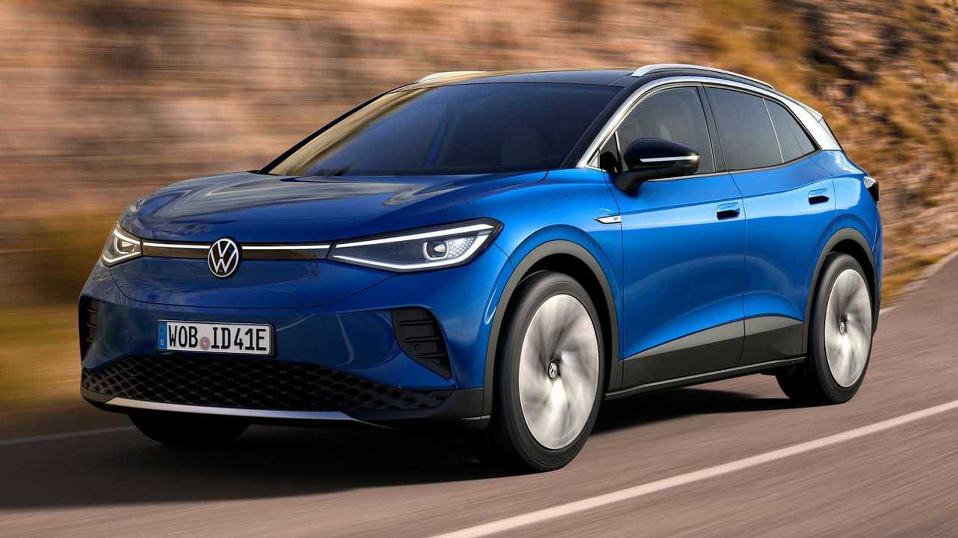
3. Volkswagen ID.4
The Volkswagen ID.4 aims to deliver a clean and futuristic interface, but the execution introduces layers of confusion that become apparent during everyday use. At first glance, the screen looks minimal, yet that minimalism hides a structure that is not always intuitive.
One of the main issues is how functions are distributed. Basic controls are not always where you expect them to be, which forces drivers to pause and search rather than act instinctively. This breaks the natural flow of interaction, especially when you are trying to make quick adjustments while driving.
Another challenge comes from the reliance on touch-sensitive sliders and hidden menus. Without clear physical feedback, it becomes harder to confirm inputs. Drivers may find themselves repeating actions or glancing back at the screen to ensure the command was registered correctly.

The system also struggles with consistency. Certain features appear in different locations depending on context, which makes it difficult to build muscle memory. Instead of becoming easier over time, the interface can continue to feel unpredictable.
I am including ID.4 because it highlights how design simplicity on the surface does not always translate to usability. It offers modern visuals, but the lack of intuitive structure makes it more demanding to operate than it should be.
4. BMW iDrive 8 (as seen in BMW i4)
The latest version of BMW’s iDrive system introduces a highly digital interface, yet it moves away from the simplicity that earlier versions were known for. In vehicles like the i4, the system presents a wide range of features, but the way they are organized can feel overwhelming.
One noticeable issue is the depth of the menus. Accessing certain functions requires going through multiple layers, which increases the time needed to complete simple tasks. This becomes particularly frustrating when trying to adjust settings while on the move.
The visual presentation also adds complexity. The screen is filled with detailed graphics and information, which can make it harder to focus on what matters most. Instead of guiding the driver’s attention, the interface sometimes spreads it too thin.
Another factor is the shift toward touch-based interaction. While the system still offers a controller, many features are designed with touch in mind, which can reduce precision during driving.

I chose iDrive 8 because it represents a transition toward more advanced but less straightforward systems. It offers impressive technology, yet the learning curve and layered menus can make it feel less user-friendly than expected.
5. Lexus NX
The Lexus NX introduces a redesigned touchscreen that aims to modernize the brand’s interface, but in doing so, it creates a system that can feel more complicated than necessary. At first glance, the layout appears clean, yet once you begin interacting with it, the layering becomes more apparent.
One of the main concerns is how certain controls are positioned. Frequently used functions are not always placed in the most accessible areas, which forces drivers to reach or search longer than expected. This interrupts the natural rhythm of driving, especially when quick adjustments are needed.
Another issue lies in how menus are structured. Instead of presenting options in a straightforward sequence, the system sometimes groups them in ways that are not immediately logical. This requires a period of learning, and even then, moving through the interface can feel less efficient than it should be.

The touchscreen itself is responsive, but responsiveness alone does not solve the problem of complexity. When too many options are presented without clear prioritization, the experience becomes more demanding.
I am including the NX because it shows how an attempt to modernize can introduce new challenges. It improves in some areas, yet the added layers of interaction make it harder to use intuitively on a daily basis.
6. Ford Escape
The Ford Escape features a touchscreen system that offers a wide range of functions, but the way those functions are organized can feel scattered. Instead of guiding the user through a clear path, the interface often requires extra steps to reach simple controls.
One noticeable issue is the inconsistency in menu placement. Certain features appear in different sections depending on how you access them, which can make it harder to remember their location. This lack of predictability forces drivers to rely on trial and error.
The visual layout also contributes to the confusion. While the graphics are modern, the arrangement of icons and menus does not always follow a clear hierarchy. Important controls can blend in with less critical ones, making them harder to locate quickly.

Another factor is how the system handles transitions. Moving between screens can feel less fluid, which adds to the sense of complexity. Instead of feeling seamless, the experience can feel slightly disjointed.
I chose the Escape because it represents a case where functionality outweighs clarity. It offers many features, but the way they are presented makes the system harder to use than it needs to be.
7. Peugeot 3008
The Peugeot 3008 brings a distinctive interior design, but its touchscreen system reflects that uniqueness in ways that can be challenging for drivers. The interface does not follow conventional layouts, which makes it less intuitive, especially for first-time users.
One of the main difficulties is how the system combines touch inputs with physical toggle switches. While this may seem like a helpful addition, it creates an extra layer of interaction that can feel unnecessary. Drivers often need to use both elements to complete a single task.
The menu structure also adds to the complexity. Functions are arranged in a way that prioritizes style over simplicity, which can make navigation less straightforward. Instead of quickly finding what you need, you may have to spend extra time understanding the layout.
There is also a learning curve involved. The system requires familiarity before it becomes manageable, which can be frustrating for drivers who prefer immediate usability.

I am including the 3008 because it highlights how design creativity can sometimes impact practicality. It stands out visually, but the interface can feel less intuitive during everyday use.
8. Land Rover Range Rover Velar
The Range Rover Velar features a dual-screen setup that aims to deliver a high-tech experience, but the result can feel overwhelming. With two displays handling different functions, drivers must divide their attention between multiple areas, which increases complexity.
One of the main challenges is coordination between the screens. Adjusting certain settings may require interacting with both displays, which can slow down the process. Instead of simplifying tasks, the system can make them feel more involved.

The visual presentation also contributes to the issue. While the graphics are sleek, the amount of information displayed can make it harder to focus. Important controls are not always immediately clear, which adds to the learning curve.
Another factor is the reliance on touch input for nearly everything. Without physical controls, drivers must interact with the screens more frequently, which can be distracting.
I chose the Velar because it represents the extreme end of digital design. It offers impressive technology, yet the complexity of its interface can make everyday use more challenging than expected.
Also Read: 10 Vehicles With Spare Keys That Cost Under $100 To Replace