Aston Martin, the English automaker, revealed its new logo and slogan. Recently, Aston Martin was in a huge debt of £1 billion, and they managed to attract the Saudi Arabian PIF for 200 million pounds. The executive chairman of the company called it a game-changing investment. The Saudi Arabian investment boosted confidence in Aston Martin to be back on track. Although, with this good news in the Aston Martin family, they came out with a newly designed logo and slogan.
Aston Martin was founded in 1913, and since then, this is the eighth time the company has changed its logo and made adjustments. Aston Martin makes luxury and premium sports cars. They have very royal and premium models in the lineup. Aston Martin has always provided quality to its users. Likely, their reflection of luxury is displayed in their logo. Let’s discuss more the new changes and updates in the logo.
Also Read: Will Aston Martin Be Able To Attract Saudi PI F?
Changes In The Logo & What Is The New Slogan Of Aston Martin?
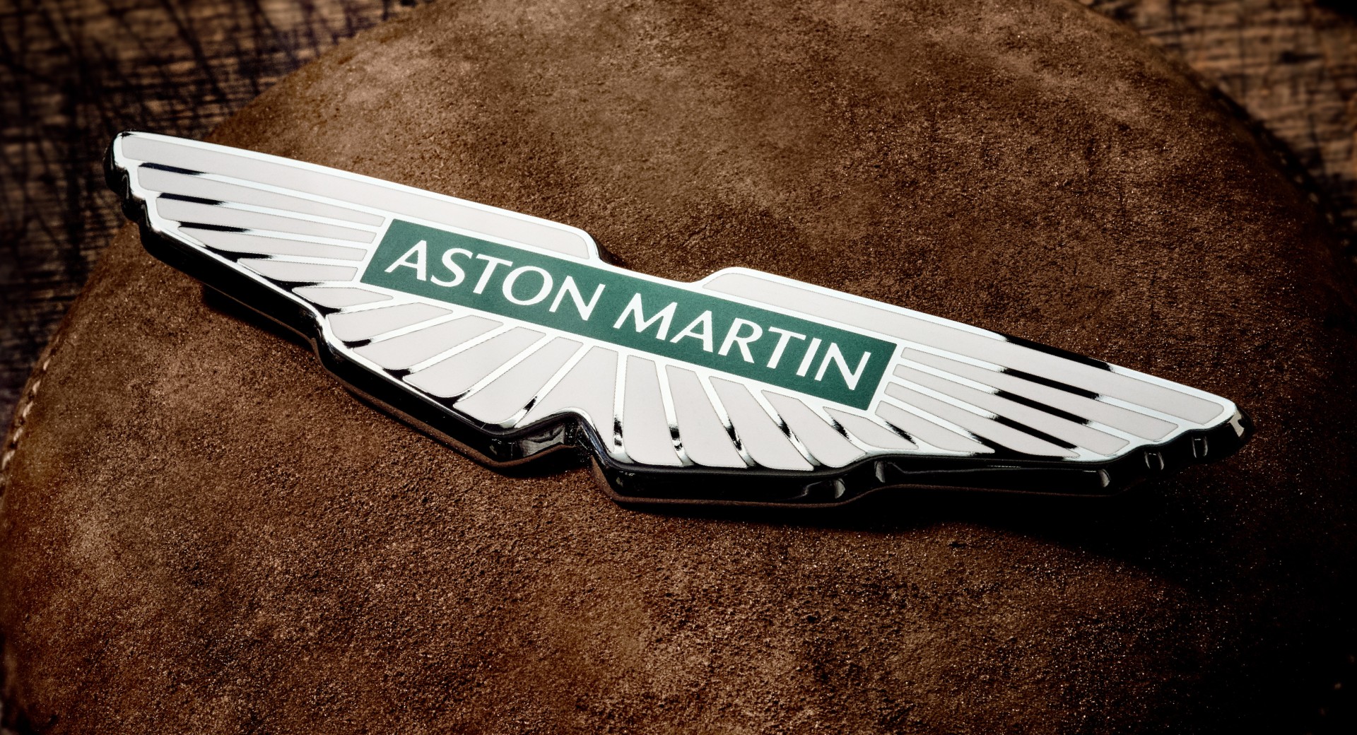
Aston Martin has updated its logo and made it look simpler and cleaner. This premium car brand has minimally changed the design by removing the curved line below the text. An all-over change in the wing design is also made. Peter Saville redesigns this logo. He is a British art director and graphic designer. Also, this new design is crafted by Birmingham jewelry quarter.
Along with the updated logo, Aston Martin is also up with a new slogan. The slogan says, “Intensity. Driven.”. With this new slogan of Aston Martin, they want to create a customer base of newer generations. They are more focused on power and performance. The new changes were revealed via a video. Thus, the whole video depicted how the logo is handcrafted. Also, in the end, the new slogan is displayed.

For the first time, this new update will be seen on the Aston Martin Aramco Cognizant F1 team in the French Grand Prix. Subsequently, it will be embedded in all the new Aston Martin cars.
Click here to watch the video of the new logo.
Previous Changes In The Aston Martin Logo: The History
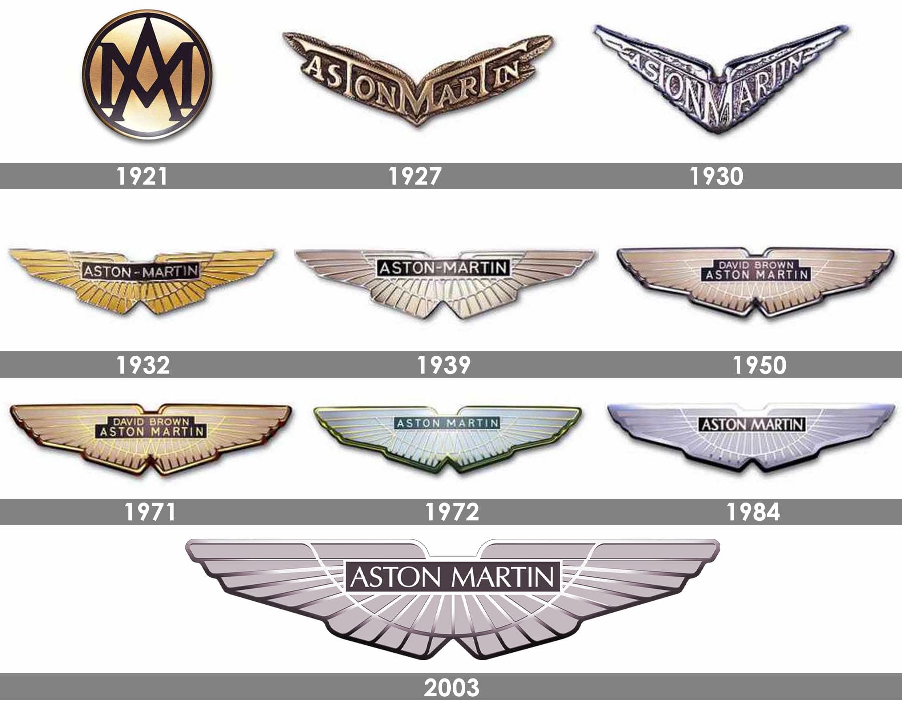
The first logo was introduced 100 years ago. Originally, the Aston Martin didn’t have the iconic wings. The first logo just had the initials of Aston Martin. Further, they added the full name to the logo in a V-shaped format. Subsequently, in 1932, Aston Martin introduced wings. The next change was to add the parent company’s name above the Aston Martin text. The next update came in 1984 when the new owner removed the parent company’s name, and the lines of the wings got thicker.

However, this English automaker has made several changes in the wings’ thickness, font, and shape over the years. The new design is simplified, with Aston Martin written in the middle of the wings.

