In today’s automotive landscape, the user interface of a vehicle—the controls, buttons, screens, and knobs that drivers interact with—is as crucial as the engine under the hood. A car’s control system is the primary bridge between the driver and the machine, directly influencing not only how enjoyable and intuitive the driving experience is but also how safe it remains.
With the rapid advancement of technology, car manufacturers have been caught in a balancing act: integrating cutting-edge digital features and infotainment systems while trying to preserve simplicity and ease of use.
Unfortunately, this balance isn’t always achieved, and some vehicles excel in offering drivers straightforward, effective controls, while others complicate the experience with overengineered or poorly thought-out interfaces.
The significance of simple and effective vehicle controls cannot be overstated. When a driver can instinctively operate the car’s systems—adjusting the climate, changing audio settings, activating safety features, or interacting with navigation—it reduces distraction and enhances overall safety.
A car that requires the driver to divert their attention to decipher complex menus or search for hidden buttons can lead to dangerous situations, particularly in high-speed or unpredictable environments. Conversely, vehicles with intuitive layouts and tactile feedback foster a sense of control and confidence, allowing drivers to focus more on the road and less on the controls.
This article explores the extremes of automotive control design by highlighting five cars renowned for their simple, effective control schemes and five others infamous for overcomplicated, frustrating interfaces. The contrast between these groups provides insight into the importance of user-centered design in modern vehicles.
On one side, cars like the Mazda MX-5 Miata and Toyota Corolla demonstrate how physical buttons, logically arranged controls, and thoughtfully designed interfaces can create a seamless driver experience
. These vehicles show that integrating technology doesn’t necessarily mean abandoning the benefits of tactile feedback and straightforward functionality. They emphasize ease of use, safety, and driver engagement, all while maintaining modern amenities.
On the other side of the spectrum, models such as early Tesla Model S versions and BMW’s initial iDrive systems showcase how reliance on touchscreens, deep menu structures, and a lack of physical controls can lead to frustration.
Overcomplicated interfaces often result in distractions, slower responses, and a steep learning curve, which may alienate less tech-savvy users or those who prefer traditional setups. These vehicles demonstrate the pitfalls of prioritizing aesthetics or technology novelty over practical usability and driver convenience.
Moreover, this comparison sheds light on the evolving expectations of drivers. While some embrace high-tech interfaces with voice commands and customizable digital displays, many still value the immediacy and reliability of physical controls.
The challenge for manufacturers is to blend these elements harmoniously, creating systems that feel both advanced and accessible. Understanding where various cars succeed or fail in this endeavor helps consumers make informed decisions and encourages automakers to prioritize human factors in design.
Ultimately, this discussion is not about labeling cars as good or bad solely based on their control systems but rather about highlighting how thoughtful design improves the driving experience and how poor design detracts from it. By examining specific examples from both ends of the spectrum, readers gain a deeper appreciation for the complexities and trade-offs involved in automotive control design.
Whether you’re a casual driver looking for a hassle-free daily commuter or an enthusiast craving an engaging cockpit, knowing which cars offer simple, effective controls and which frustrate with complexity is invaluable.
Also Read: 12 Worst GM Cars Ever Built and 10 of the Best
5 Cars With Simple, Effective Controls
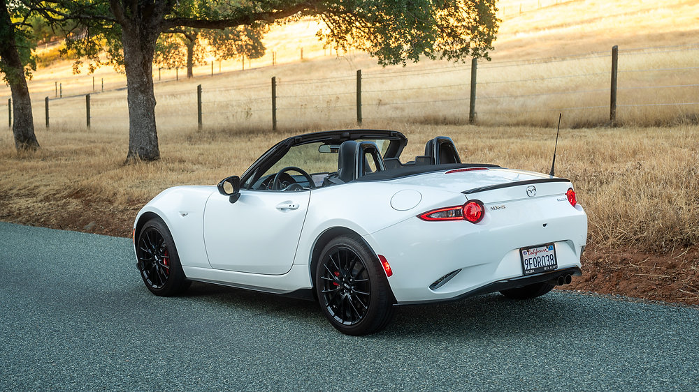
1. Mazda MX-5 Miata
The Mazda MX-5 Miata is a masterclass in simplicity, embodying the philosophy that less is more when it comes to driver controls. From the moment you step into the cabin, it’s clear that Mazda prioritized ergonomics and tactile feedback over flashy, high-tech gimmicks.
The placement of controls feels deliberate and intuitive, designed for quick access without the driver needing to look away from the road. Unlike many modern cars overloaded with touchscreens and multi-function buttons, the Miata keeps it straightforward with clearly marked physical buttons and knobs that respond with satisfying clicks and resistance.
This tactile element enhances the driving experience, especially for enthusiasts who crave that direct connection to their machine.
A key feature of the MX-5’s control design is its use of a rotary knob to operate the infotainment system instead of relying on a touchscreen. This dial, located comfortably near the driver’s hand, lets you scroll through menus, select audio sources, or adjust settings without awkwardly stretching forward or losing focus on driving.
The tactile nature of the rotary control means drivers can navigate the system by feel alone, minimizing distraction. The system itself is purposefully uncluttered, with menus that are logically organized and free of unnecessary options. This streamlined design reinforces the Miata’s driver-first ethos, where every input is efficient and intentional.
The climate control panel further exemplifies Mazda’s commitment to simplicity. Unlike vehicles that bury temperature or fan speed adjustments within touchscreen menus, the Miata features traditional rotary dials and buttons with clear, bold icons. These physical controls enable rapid changes even when conditions shift quickly, such as when driving on a cold morning or through a sudden rainstorm.
The buttons are spaced apart enough to avoid accidental presses, and their firmness provides feedback that reassures the driver that the desired command has been registered. This approach aligns with the MX-5’s overall goal: delivering a fuss-free, engaging driving experience without technological distractions.
Another aspect where the Miata shines is in the ergonomics of its primary driving controls. The gear shifter feels robust and precise, while the parking brake lever is simple and easy to engage or release without fumbling. Steering wheel-mounted buttons for audio and cruise control are minimalistic but well-positioned, designed to reduce clutter while still allowing the driver to maintain control over essential functions.
Even the stalks for indicators and wipers provide crisp feedback, all contributing to an interior that feels responsive and well-thought-out. This level of control fosters driver confidence and connection, making each drive feel deliberate and satisfying.
Finally, the simplicity of the MX-5’s controls reflects Mazda’s philosophy that technology should serve the driver, not overwhelm them. By focusing on user-friendly interfaces and tactile feedback, the Miata offers an accessible and enjoyable driving experience that caters to enthusiasts and casual drivers alike.
In a market where automotive interfaces are increasingly complex and feature-laden, the MX-5 stands out as a reminder that effective control design doesn’t have to be complicated. Instead, it shows that when done well, simplicity enhances both safety and pleasure behind the wheel.
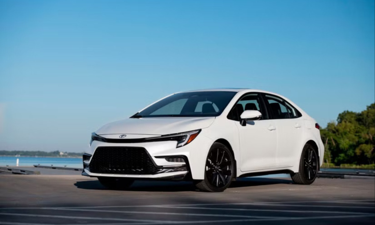
2. Toyota Corolla
The Toyota Corolla has earned its place as one of the world’s most popular compact cars by consistently delivering reliability paired with user-friendly design. A major factor in its appeal lies in its straightforward and effective control layout.
Toyota understands that the typical Corolla buyer values practicality and ease of use, and this is reflected in the placement and function of every button, knob, and switch.
The climate controls, for example, are large, clearly labeled, and distinctly separated. This means drivers can make quick adjustments to temperature or fan speed without taking their eyes off the road, an important consideration for safety-conscious buyers and everyday commuters alike.
Toyota’s steering wheel design further enhances usability with a well-considered arrangement of buttons. Cruise control, audio adjustments, and hands-free phone commands are all grouped within easy thumb reach, allowing drivers to operate these features without moving their hands away from the wheel.
The buttons themselves provide tactile feedback with a firm, clicky feel, preventing accidental presses. This physical interface helps drivers focus on driving rather than fiddling with controls, which is especially beneficial in stop-and-go traffic or long-distance driving scenarios.
The Corolla’s infotainment system embraces a hybrid approach by combining touchscreen functionality with physical buttons and knobs. This ensures that frequently used features like volume control and radio tuning remain accessible via dedicated, tactile controls rather than buried within a menu.
The touchscreen interface itself is designed with simplicity in mind — icons are large and clear, and the menu structure is shallow enough to avoid confusion. Moreover, Toyota’s consistent UI design across its lineup allows drivers familiar with one model to quickly adapt to another, reducing the learning curve and enhancing overall satisfaction.
Ergonomically, the Corolla excels with a dashboard layout that prioritizes accessibility and comfort. Controls are logically grouped and spaced to prevent accidental presses while ensuring everything needed is within easy reach.
This thoughtful design extends to the placement of charging ports and storage spaces, which are located to minimize distractions during use. The entire cockpit environment promotes a sense of order and predictability, which can be particularly reassuring for drivers who are new to a vehicle or not inclined toward complex gadgets.
In summary, the Toyota Corolla’s control system balances functionality, simplicity, and accessibility. By prioritizing physical controls where they matter most and designing a user-friendly infotainment interface, Toyota ensures drivers can operate the car confidently and safely.
This no-nonsense approach has played a significant role in making the Corolla one of the world’s most enduringly popular vehicles, proving that straightforward controls still resonate strongly with buyers.
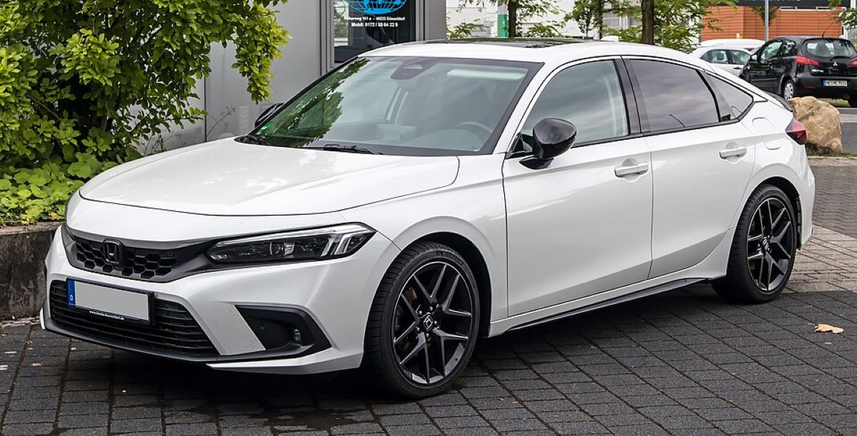
3. Honda Civic (Recent Generations)
Honda’s Civic, especially in its recent iterations, is widely regarded as a benchmark for combining modern technology with ease of use. Recognizing the frustration many drivers feel with overly touchscreen-dependent interiors, Honda has deliberately maintained a combination of physical and digital controls to ensure critical functions remain intuitive and accessible.
For example, the retention of a large physical volume knob and dedicated climate control dials demonstrates Honda’s commitment to user-friendly ergonomics. These controls are sizable, clearly marked, and provide reassuring tactile feedback, making it easy to adjust audio or temperature settings quickly, even without looking directly at them.
The infotainment system in the Civic has been streamlined to reduce distraction, with a simplified menu design and larger icons for common features. While touchscreens are used for navigation and media controls, the interface avoids deep nested menus that can frustrate or confuse drivers.
Additionally, the system supports robust voice commands, allowing hands-free control over many functions, including making calls or setting navigation destinations. Honda’s voice recognition technology is generally responsive and accurate, which helps reduce reliance on the touchscreen and contributes to safer driving habits.
Beyond the digital interface, the Civic’s physical controls extend to practical elements such as window switches, mirror adjustments, and lighting controls. These switches are arranged in a way that supports natural hand movements, reducing the need for the driver to stretch or search for controls.
The gear shifter is also ergonomically designed for smooth, precise operation, which complements the car’s reputation for being engaging yet approachable. These thoughtful design choices create a cockpit environment where drivers feel in control without the mental overload common in more complex systems.
The steering wheel also incorporates essential controls that are easy to use and positioned within easy reach. Buttons for cruise control, media, and phone calls are intuitively arranged and provide solid tactile feedback. This design not only keeps the driver’s hands on the wheel but also allows for quick adjustments without distraction.
The combination of traditional switches and modern features makes the Civic accessible to a wide range of drivers, from tech-savvy younger customers to those who prefer straightforward operation.
Overall, Honda’s approach to the Civic’s control layout is a testament to how blending the best of analog and digital controls can result in a user experience that is both modern and intuitive. By resisting the trend to eliminate all physical buttons, Honda ensures that the Civic remains a practical, comfortable, and enjoyable vehicle to drive, meeting the needs of today’s diverse drivers.

4. Subaru Outback
The Subaru Outback is designed for versatility and practicality, and its control system reflects the brand’s rugged, no-nonsense philosophy. Unlike many SUVs that prioritize flashy displays and complex interfaces, the Outback emphasizes durable, tactile controls that drivers can rely on in a variety of conditions.
Physical buttons and large knobs dominate the dashboard, especially for frequently adjusted settings like climate control. These controls are engineered for ease of use, with distinct shapes and spacing to prevent confusion or accidental presses, even when wearing gloves or driving off-road.
One of the Outback’s standout features is the combination of physical controls with a responsive infotainment touchscreen that supports modern connectivity standards like Apple CarPlay and Android Auto. However, unlike vehicles that rely solely on touchscreen interaction, Subaru keeps volume and tuning adjustments on dedicated knobs.
This hybrid approach strikes a balance between providing modern features and maintaining straightforward usability, which many drivers find appealing. It allows the driver to stay focused on driving without the need for excessive menu navigation or awkward hand movements.
Subaru also designs its control layout to support quick and intuitive operation of safety and driver-assistance features. Controls for adaptive cruise control, lane-keeping assist, and other systems are easily accessible and marked clearly, enabling drivers to activate or adjust them with confidence.
This thoughtful approach aligns with Subaru’s reputation for prioritizing safety and reliability, offering a control experience that is both reassuring and practical.
The overall cockpit design emphasizes ergonomics and comfort. Controls are placed within easy reach, and the layout minimizes visual clutter, contributing to a calm, distraction-free environment. The tactile feedback from switches and knobs further enhances the feeling of control, helping drivers maintain focus during long journeys or challenging driving conditions.
These features make the Outback an ideal choice for those who value straightforward, effective controls in a vehicle that can handle both urban and rugged environments.
Ultimately, the Subaru Outback’s control system exemplifies a well-balanced integration of traditional and modern elements. It shows that practical, user-friendly design can coexist with advanced technology, resulting in an interface that supports safe and enjoyable driving without frustration.
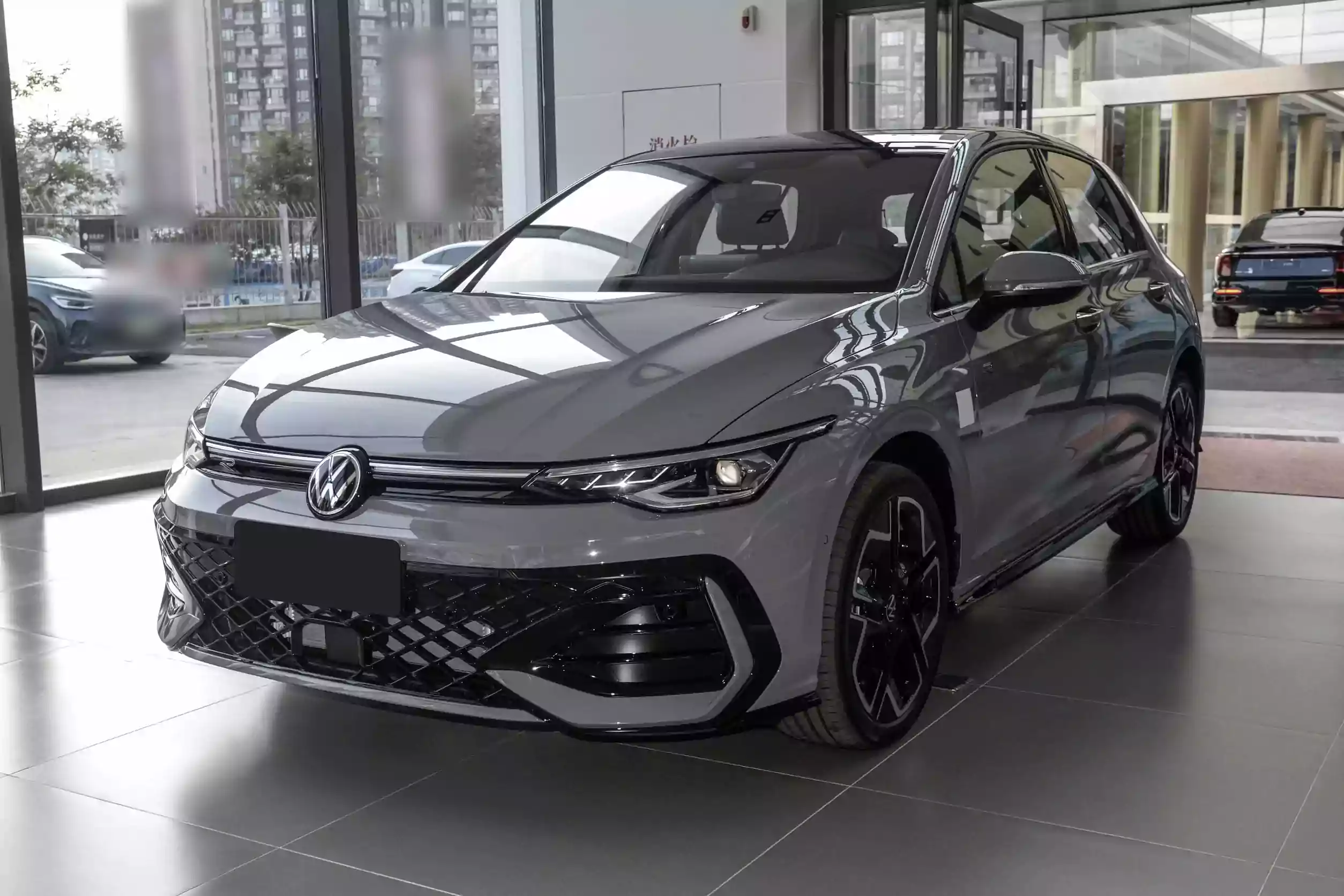
5. Volkswagen Golf
The Volkswagen Golf has long been praised for its refined blend of European design sophistication and practical functionality, and its control layout is a key factor in this balance. Volkswagen designers prioritize clear, logical placement of controls, ensuring that every button, knob, and switch serves a purpose and is easy to find.
For instance, the climate control panel features three substantial rotary dials with a smooth, premium feel. Their size and spacing allow drivers to make adjustments confidently and without distraction, even while navigating busy streets or highways.
In the infotainment system, the Golf strikes a thoughtful balance between modern touchscreen convenience and physical control usability. The system includes a touchscreen with a crisp interface and high responsiveness, but also retains a large volume knob and shortcut buttons below the screen.
These physical controls provide tactile reassurance and quick access to commonly used functions, minimizing the need to dive into menus while driving. The user interface is logically organized, with clear menus that reduce complexity and speed up navigation.
Beyond the dashboard, the Golf’s steering wheel integrates a sensible array of buttons for media, phone, and driver-assistance features. These buttons have a firm, responsive feel and are intuitively arranged for easy use. This thoughtful design allows drivers to maintain control of important features while keeping their hands firmly on the wheel, enhancing both safety and convenience.
The overall ergonomics of the cockpit reinforce this sense of driver-centered design, with controls that fall naturally to hand and clear sightlines.
Volkswagen also pays close attention to the tactile experience throughout the cabin. The buttons and switches provide consistent feedback, and their materials feel solid and durable. This attention to detail contributes to an overall impression of quality and precision, making interactions with the vehicle’s controls satisfying rather than frustrating.
For many drivers, the Golf’s interface strikes the perfect balance between modern technology and straightforward usability, making it a model example of effective automotive control design.
5 Cars With Annoying or Overcomplicated Controls
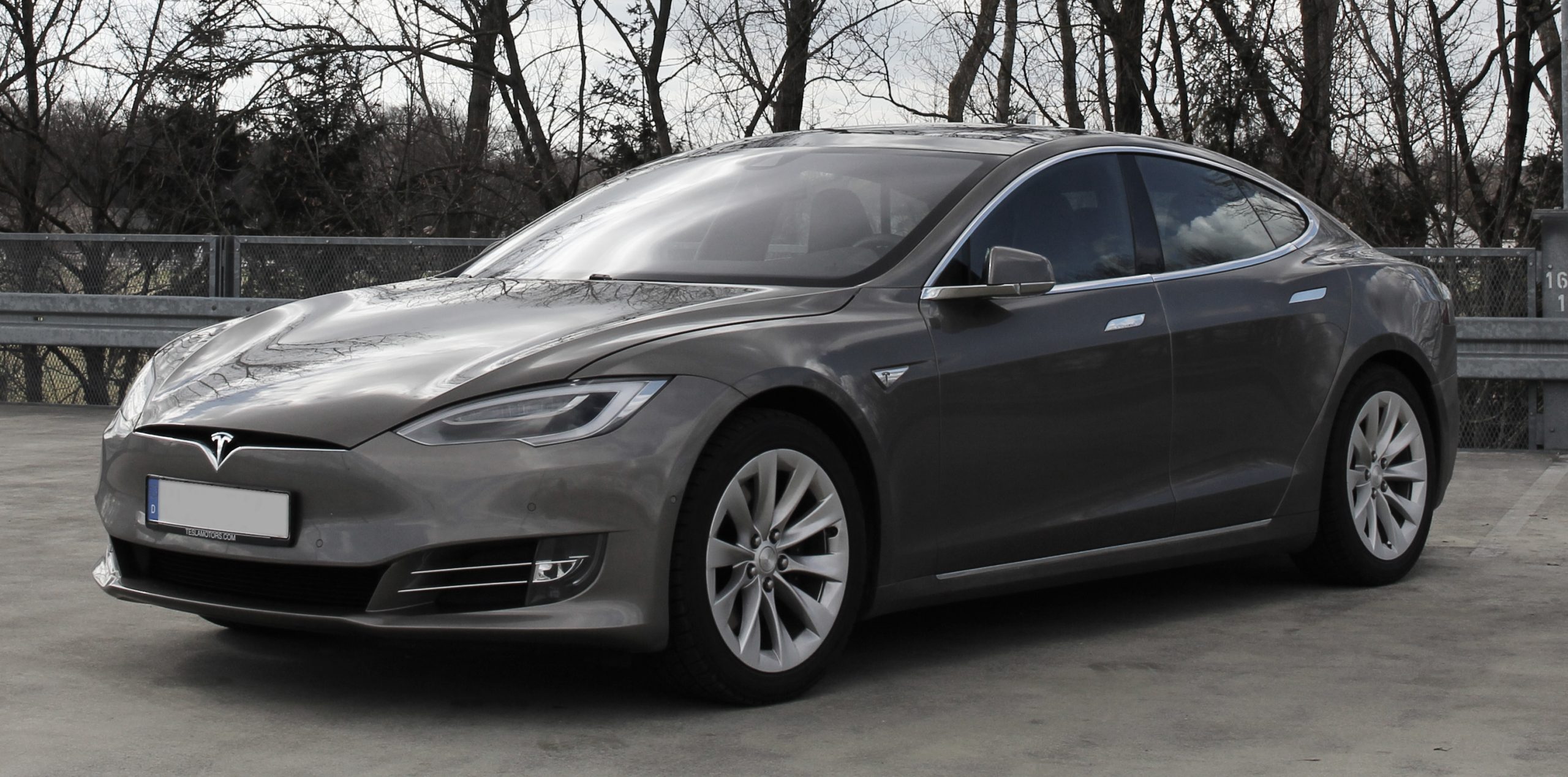
1. Tesla Model S (Earlier Generations)
Tesla’s Model S was revolutionary in many ways, but its control interface has drawn criticism for being overly reliant on a large touchscreen that attempts to manage virtually every vehicle function. Unlike traditional cars that provide physical buttons or knobs for frequently adjusted settings like climate control or audio volume, the Model S pushes nearly all controls into its massive center display.
While this minimalist design may look sleek and futuristic, it can quickly become frustrating, especially when trying to make adjustments while driving. Drivers often have to dig through several menus or swipe through different screens to change a simple setting, which increases distraction risk and detracts from the overall driving experience.
The absence of tactile feedback on the touchscreen is a significant drawback. When adjusting temperature or fan speed, drivers cannot feel the control change, making it difficult to keep their eyes on the road. This lack of physical buttons means that even basic tasks require visual confirmation, forcing drivers to look away and interact with the screen.
In conditions like bumpy roads or tight traffic, this can become particularly annoying and unsafe. Tesla has made some improvements over the years, but the fundamental design philosophy remains the same, prioritizing a futuristic look over ergonomic convenience.
Another pain point with the Model S’s controls is the complexity of its menus. Many essential functions are buried within submenus, such as adjusting suspension settings, configuring autopilot features, or changing driver profiles.
This nested structure can confuse new users or those not accustomed to digital interfaces, leading to a steeper learning curve than most vehicles in the luxury segment. Furthermore, frequent software updates sometimes shift the layout or add new features, which can disorient even experienced owners who must relearn the interface regularly.
Voice commands were intended to reduce the touchscreen burden, but early versions of Tesla’s system struggled with accuracy and responsiveness, especially in noisy environments. Although the system has improved, it still cannot replace the ease of physical controls for many users.
This situation is compounded when the car is shared among multiple drivers, as customizing preferences through the touchscreen can feel cumbersome and time-consuming. The combination of these factors means that while the Model S excels in technology and performance, its control system remains one of the more polarizing aspects of the vehicle.
Lastly, the reliance on a touchscreen for nearly every control raises concerns about reliability. In rare cases where the system freezes or crashes, the driver can lose access to critical functions, including climate control or hazard lights. Such dependency on software and digital interfaces introduces a vulnerability not present in vehicles with traditional controls.
Although Tesla’s software engineers address many issues via over-the-air updates, the Model S’s control design still feels overly complicated and, for some, unnecessarily frustrating in day-to-day use.

2. BMW iDrive (Earlier Versions)
BMW’s iDrive system was one of the earliest attempts at integrating vehicle controls into a centralized digital interface, but early implementations were notorious for their complexity and unintuitive design. Initially introduced to reduce dashboard clutter, iDrive replaced many physical buttons with a rotary knob and a small screen.
However, the early menu structures were deep and confusing, requiring multiple steps just to access basic functions like radio presets or climate adjustments. This design choice often led to driver frustration, especially for those who expected quick and straightforward access to common controls.
One major flaw in the initial iDrive systems was the lack of tactile differentiation among controls. The rotary knob’s feedback was often inconsistent, and the menus were overly text-heavy, making navigation slow and distracting.
Many users found themselves needing to glance repeatedly at the screen to ensure they were selecting the correct option, defeating the purpose of simplifying the driving experience. Even experienced BMW drivers admitted to feeling overwhelmed by the system, particularly when trying to operate it while driving in traffic or unfamiliar environments.
Another source of annoyance was the system’s responsiveness. Lag between turning the dial or pressing buttons and the screen updating made interactions feel sluggish. This delay could be aggravating during urgent situations, such as changing navigation routes or adjusting safety settings.
Additionally, the early iDrive lacked clear physical shortcuts for frequently used functions, forcing drivers to wade through menus even for minor tasks. This added cognitive load undermined driver focus and could lead to distraction or errors.
The learning curve for iDrive was steep enough that many BMW owners turned to the manual or tutorials just to understand the system’s basic operation. This was particularly problematic for older drivers or those less comfortable with technology, who found the system daunting rather than helpful.
Dealers often had to spend considerable time educating new buyers on the interface, which was unusual for a system meant to enhance convenience. Despite BMW’s efforts to update and improve iDrive in later generations, those early versions left a lasting reputation for complexity and user-unfriendliness.
Finally, the design philosophy behind early iDrive highlighted a broader challenge in automotive technology: balancing innovation with usability. While the concept of a centralized control interface was ahead of its time, the execution was flawed, causing frustration rather than enhancing the driving experience. BMW eventually refined the system, adding more physical buttons and improving software intuitiveness, but the early iDrive remains a cautionary tale of how overcomplication can alienate users.
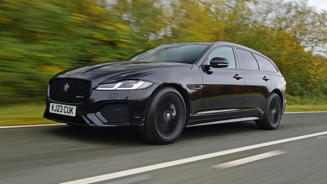
3. Jaguar XF (Early Models)
The Jaguar XF, particularly in its earlier models, received criticism for an infotainment and control system that was both overcomplicated and poorly executed. Jaguar attempted to integrate high-end features and a luxurious design with modern tech, but the result was a control layout that many found confusing and cumbersome.
The center console was dominated by a touchscreen interface with few physical controls, which initially seemed sleek but led to frustration when drivers had to navigate multiple screens to perform simple tasks.
One key issue was the screen’s sluggish response times. Drivers reported noticeable delays between touch inputs and on-screen responses, which made adjusting settings slow and irritating.
This sluggishness was especially problematic during situations where quick changes were necessary, such as lowering the temperature on a hot day or tuning the radio while merging onto a busy highway. The laggy interface, combined with nested menus, meant drivers often had to take their eyes off the road longer than is ideal, creating safety concerns.
The layout of the Jaguar XF’s controls also lacked logical grouping. Climate controls, audio settings, and navigation were scattered across different screens or accessed through different buttons, requiring multiple interactions to accomplish even basic functions.
This fragmented design made it difficult for drivers to build muscle memory or develop an intuitive use of the system. In some cases, important features like seat heating or ventilation were buried deep within menus, causing annoyance and wasted time.
Adding to the frustration was the absence of adequate physical buttons or knobs for commonly used functions. Many drivers felt that Jaguar sacrificed practical usability for sleek aesthetics, neglecting the benefits of tactile controls.
The limited haptic feedback and lack of shortcut buttons meant that even routine tasks could feel like a hassle. This imbalance between style and function contributed to a perception that the XF’s control system was designed more to impress in showrooms than to provide a satisfying everyday user experience.
Finally, software glitches and system freezes were reported by some Jaguar XF owners, adding another layer of annoyance. When the infotainment system crashed, drivers could temporarily lose access to critical functions like navigation or media control.
While Jaguar issued updates to address many of these issues, the early XF’s control design and performance left a lasting impression as one of the more frustrating luxury systems on the market.

4. Mercedes-Benz MBUX (Early Implementations)
Mercedes-Benz’s MBUX system debuted as a cutting-edge infotainment and control interface, boasting features like voice recognition, augmented reality navigation, and customizable displays. However, its early implementations were met with mixed reviews due to complexity and a steep learning curve.
While technologically advanced, the MBUX system overwhelmed many drivers with its abundance of options, layered menus, and sometimes unclear control logic. Navigating the system often required multiple steps, which made performing simple tasks more time-consuming than in more traditional layouts.
One of the most significant challenges was the inconsistent tactile feedback across the controls. MBUX employs a combination of touchscreens, touchpads, steering wheel controls, and voice commands, but not all inputs felt equally intuitive or responsive.
For example, the touchpad on the center console, intended to offer precise control, sometimes registered unintended inputs or required awkward hand positioning. This inconsistency could lead to frustration, especially for drivers trying to adjust settings quickly while driving.
Voice control, a flagship feature of MBUX, also showed mixed effectiveness in its early stages. Although capable of recognizing natural language commands, the system occasionally misinterpreted instructions or failed to respond promptly.
This could be frustrating in situations where hands-free operation was critical, leading some drivers to abandon voice commands and resort to the touchscreen instead, increasing distraction risk. Furthermore, the voice system’s learning curve meant new users had to invest time and patience to become proficient.
The sheer number of customizable options within MBUX, while impressive, contributed to overcomplexity. Drivers could change themes, layouts, ambient lighting, and assistant behaviors, but the abundance of choices sometimes felt overwhelming rather than empowering.
Adjusting or even finding certain settings could require digging through multiple menus, which was inconvenient and could divert attention from driving. This complexity was at odds with the need for quick, simple control in a car environment.
Lastly, early MBUX software was occasionally prone to glitches or lag, further detracting from the user experience. Some users reported slow boot times or freezing screens, which interfered with navigation or media playback.
Mercedes-Benz has since improved MBUX through software updates and newer hardware, but those initial experiences left a perception that the system, while ambitious, was sometimes more trouble than it was worth.

5. Land Rover Discovery (Early Generations)
The Land Rover Discovery’s early infotainment and control systems were often criticized for being cluttered and unintuitive. The SUV’s rugged exterior promised off-road capability and luxury, but the interior control experience did not always match that promise.
Many drivers found the combination of touchscreen, physical buttons, and rotary dials disjointed and confusing, with overlapping controls that lacked a clear hierarchy or logic. One of the main issues was the touchscreen interface, which was prone to slow response times and required navigating through multiple screens for everyday adjustments like climate control or audio volume.
This complexity was compounded by poorly labeled menus and inconsistent iconography, making it difficult for drivers to predict where certain settings would be found. The result was increased distraction and driver frustration, undermining the Discovery’s appeal as a comfortable and practical vehicle.
The physical controls further added to the confusion rather than alleviating it. Buttons for related functions were often spread across the dashboard and center console without a clear pattern, forcing users to hunt for the right control.
Rotary dials, while useful for some functions, were sometimes small or located in awkward positions, making operation less ergonomic. This inconsistent design diminished the sense of cohesion in the cockpit and contributed to a feeling that the controls were an afterthought.
Furthermore, the system lacked customization options that could simplify use. Unlike some competitors, early Discovery models offered limited ability to program shortcut buttons or personalize the interface.
This rigidity frustrated drivers who wanted to tailor the system to their preferences, especially in a vehicle marketed as premium and versatile. The disconnect between the vehicle’s advanced capabilities and its cumbersome control interface became a common complaint.
Lastly, software glitches and freezes plagued early Discoveries, exacerbating driver annoyance. Interruptions in infotainment or navigation functions during trips were reported, forcing drivers to restart the system or rely on backup controls.
This unreliability, combined with the confusing interface, diminished confidence in the vehicle’s technology. Though Land Rover has improved its systems over time, those early Discoveries remain examples of how complex controls can negatively impact user experience, even in high-end SUVs.
Also Read: 5 Cars That Can Idle Forever and 5 That Overheat at Stoplights
The design of a car’s control system plays a pivotal role in shaping the overall driving experience, impacting everything from safety and convenience to enjoyment and user satisfaction. As explored in this article, there exists a stark divide between vehicles that prioritize simple, effective controls and those that lean toward overcomplicated, frustrating interfaces.
This division highlights the crucial importance of user-centric design in automotive engineering—a factor that can elevate a car from merely functional to truly enjoyable and safe.
Cars like the Mazda MX-5 Miata and Toyota Corolla serve as prime examples of how simplicity and practicality can coexist with modern technology. These vehicles embrace physical buttons, intuitive layouts, and tactile feedback, ensuring that drivers can quickly and confidently operate essential functions without distraction.
By maintaining a clear, uncluttered control environment, they foster a direct connection between the driver and the vehicle, enhancing engagement and reducing cognitive load. This design philosophy demonstrates that advanced features need not come at the expense of usability; instead, when implemented thoughtfully, technology can complement and enhance simplicity.
Conversely, vehicles such as the early Tesla Model S and initial BMW iDrive systems illustrate the pitfalls of prioritizing digital novelty and minimalist aesthetics over driver convenience. While large touchscreens and centralized control systems offer impressive capabilities and futuristic appeal, they can introduce complexity that undermines ease of use.
Deep menus, lack of tactile feedback, and sluggish response times not only frustrate users but also pose potential safety risks by demanding increased driver attention. These challenges underscore the risk of designing interfaces that look sleek but do not adequately consider how drivers interact with their cars in real-world conditions.
This contrast also reflects broader trends in the automotive industry’s technological evolution. With the increasing integration of voice commands, customizable digital displays, and connected car features, manufacturers face the ongoing challenge of delivering sophistication without sacrificing intuitiveness.
The most successful control systems strike a balance, leveraging technology to provide convenience and customization while preserving the immediacy and reliability of physical controls. This balance is essential for accommodating a diverse user base, including both tech enthusiasts and those who prefer traditional, straightforward operation.
Moreover, the examples discussed reveal that control system design is not merely about convenience but about enhancing driver safety and confidence. Intuitive controls reduce the likelihood of distraction and error, allowing drivers to maintain focus on the road.
This benefit is especially critical in today’s complex driving environments, where quick reactions and clear attention are vital. As such, manufacturers who invest in ergonomic, user-friendly designs contribute meaningfully to overall road safety and driver satisfaction. For consumers, understanding the strengths and weaknesses of different control systems can significantly influence purchasing decisions.
Awareness of which vehicles offer practical, effective interfaces versus those prone to complexity and annoyance empowers buyers to select cars that match their preferences and lifestyles. It also encourages manufacturers to listen to customer feedback and prioritize human factors in future designs.
In conclusion, the landscape of automotive controls is a vivid illustration of the delicate interplay between innovation and usability. While technology continues to advance at a rapid pace, the fundamental principle remains: controls must serve the driver, not complicate their experience.
By valuing simplicity, clarity, and tactile engagement alongside technological progress, automakers can create vehicles that are not only impressive on paper but genuinely rewarding to drive. As this article has shown through concrete examples, achieving this harmony is key to enhancing both the safety and pleasure of driving in the modern era.

