In today’s rapidly evolving automotive landscape, technology has become a central pillar of the driving experience. From infotainment systems and digital instrument clusters to advanced driver assistance and connectivity features, modern vehicles are no longer just machines for transportation — they are sophisticated hubs of innovation designed to enhance comfort, safety, and convenience.
As automakers compete to integrate the latest digital advancements, the quality of in-car technology has become a key differentiator, influencing consumer choices and shaping brand reputations.
However, the presence of advanced technology alone does not guarantee a positive user experience. The interface design, responsiveness, and intuitiveness of these systems critically impact how drivers interact with their vehicles.
A well-designed interface can transform technology from a distracting complication into an invaluable aid that enriches every journey. Conversely, clunky or poorly executed tech can frustrate users, compromise safety, and detract from the overall appeal of a vehicle, no matter how impressive it may look on paper.
In this article, we explore two sides of automotive technology: vehicles that offer exemplary, user-friendly tech experiences and those that struggle with clunky, cumbersome interfaces. By examining these examples, we can better understand what makes a technology system truly user-centric and what pitfalls automakers must avoid.
User-friendly technology in cars is often characterized by clear, intuitive interfaces that allow drivers to access and control functions quickly and effortlessly. Features such as responsive touchscreens, logical menu structures, physical controls where appropriate, voice recognition, and seamless smartphone integration contribute to an experience that feels natural rather than forced.
This kind of technology supports safer driving by minimizing distraction and cognitive load, allowing drivers to keep their focus on the road while still enjoying the benefits of modern connectivity and convenience.
On the other hand, clunky tech interfaces tend to feature overly complex menu hierarchies, laggy performance, inconsistent control schemes, and voice recognition that is either inaccurate or difficult to use. These issues can lead to frustration, longer times spent adjusting settings, and greater distraction behind the wheel — all of which diminish the enjoyment and safety of driving.
The automotive industry is still in a transitional phase where manufacturers are learning how best to integrate software and hardware to create seamless user experiences. Legacy systems from earlier generations may not meet today’s expectations, while newer models often showcase the cutting edge of design thinking. By highlighting specific vehicles on both ends of the spectrum, this article offers insight into what defines good and bad tech in cars today.
The five vehicles featured for their user-friendly technology demonstrate a commitment to simplifying complex systems through well-thought-out design and constant improvement. These cars showcase how large, clear displays combined with tactile controls and advanced voice assistants can elevate the driving experience.
Meanwhile, the five vehicles noted for their clunky interfaces reveal common mistakes such as overloading screens with information, lacking physical controls, and failing to deliver smooth performance, factors that undermine otherwise promising technology.
As technology continues to evolve at a breakneck pace, consumers increasingly expect automakers to deliver not just flashy gadgets but practical, dependable, and enjoyable digital experiences. The future of automotive tech depends on designing systems that respect the driver’s needs and capabilities, bridging the gap between innovation and usability. This article aims to provide a comprehensive look at how different manufacturers approach this challenge and what lessons can be learned from their successes and missteps.
Also Read: 5 Cars That Are Cheap & Reliable and 5 That Are Neither
5 Vehicles With User-Friendly Tech
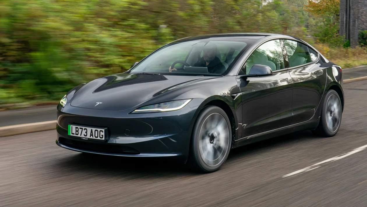
1. Tesla Model 3
Tesla’s Model 3 has redefined what many drivers expect from in-car technology by embracing minimalism without sacrificing functionality. At first glance, the Model 3’s interior might appear sparse, dominated by a single, large 15-inch central touchscreen that controls almost everything.
This radical departure from traditional dashboards eliminates the clutter of numerous physical buttons, creating a streamlined environment where the driver’s attention is focused on the road and the digital interface. The design philosophy behind this is simple: reduce complexity and allow for intuitive interaction through a consistent, high-quality screen.
The touchscreen is not just large but remarkably responsive and visually clear, featuring a user interface with clean lines, bold icons, and well-organized menus. Nearly all vehicle functions—from adjusting the climate and controlling music to opening the glovebox or even changing suspension settings—are handled here.
The simplicity of having a singular command center makes it easy for drivers to quickly learn where to find what they need, reducing the cognitive load often associated with juggling multiple buttons or interfaces.
One of Tesla’s most significant advantages is the over-the-air software updates, which improve the user experience continuously. These updates can add new features, enhance existing ones, or even unlock new vehicle capabilities without requiring a trip to the dealership.
This software-centric approach ensures that the vehicle’s technology keeps pace with evolving user expectations and industry standards, an advantage few competitors currently match.
Moreover, Tesla’s voice command system, while still evolving, enables hands-free control over many functions. Drivers can change music, set navigation, adjust temperature, or call contacts using natural speech, which reduces the temptation to look away from the road. This voice recognition, coupled with the uncluttered interface, helps create a safer, more comfortable driving environment.
Additionally, Tesla’s Autopilot and Full Self-Driving features are seamlessly integrated into the touchscreen interface. The system provides clear, real-time feedback on autonomous functions, lane changes, and adaptive cruise control status, keeping drivers informed without overwhelming them with technical jargon. This transparent communication helps build trust and usability in emerging autonomous driving technologies.
Overall, the Tesla Model 3 exemplifies how a clean design, powerful software, and ongoing updates can combine to offer one of the most user-friendly automotive tech experiences on the market today. Its blend of innovation and simplicity sets a high bar for others to follow.
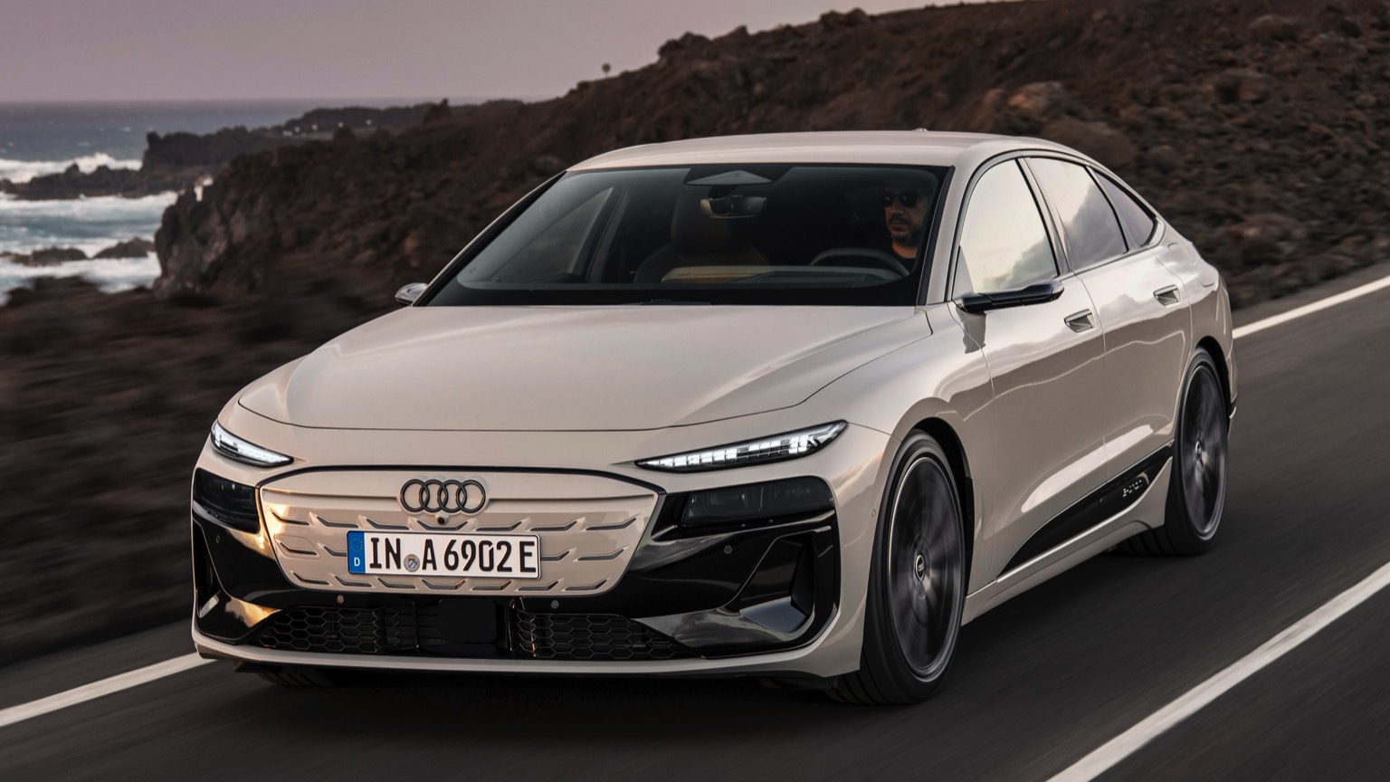
2. Audi A6
Audi has long been a benchmark for luxury and technology integration, and the A6 is no exception. Its infotainment system, known as MMI Touch Response, strikes a fine balance between futuristic digital interaction and traditional user experience design.
Unlike Tesla’s minimalist approach, Audi opts for dual touchscreens—one positioned high for navigation and media, the other lower for climate and comfort controls—providing a division that helps reduce confusion and menu overload.
The MMI system is beautifully executed, with high-resolution displays that offer crisp graphics and vibrant colors. One innovative feature is the haptic feedback on both screens.
When users press virtual buttons, they feel a subtle vibration, mimicking the sensation of a physical click. This tactile response increases confidence and reduces the chance of errors, particularly when driving, where visual attention must remain on the road.
Audi also implements handwriting recognition on the lower touchscreen. This allows users to write letters or numbers with their finger to input destinations, contacts, or search terms. This feature reduces the need to navigate through keyboard layouts and menus, saving time and minimizing distraction. It’s an elegant solution that blends natural human input with advanced technology.
The virtual cockpit is another highlight, replacing traditional analog gauges with a fully digital, customizable instrument cluster. Drivers can select from different display modes to prioritize navigation, media, or driving information directly in front of them. This centralized information display keeps vital data within the driver’s line of sight, promoting safer driving and reducing the need to glance away.
Audi’s integration of Apple CarPlay and Android Auto is also smooth and reliable. Both systems work seamlessly, allowing drivers to access their favorite apps, make calls, and control music through the familiar smartphone interface mirrored on the vehicle’s screen. The system’s responsiveness and ease of switching between apps contribute to an overall user-friendly experience.
Behind the scenes, Audi continuously updates the software to fix bugs and add new features, ensuring the system evolves alongside user needs. The attention to detail Audi puts into interface design—balancing digital innovation with tactile usability—makes the A6’s tech system one of the best examples of user-friendly automotive technology.
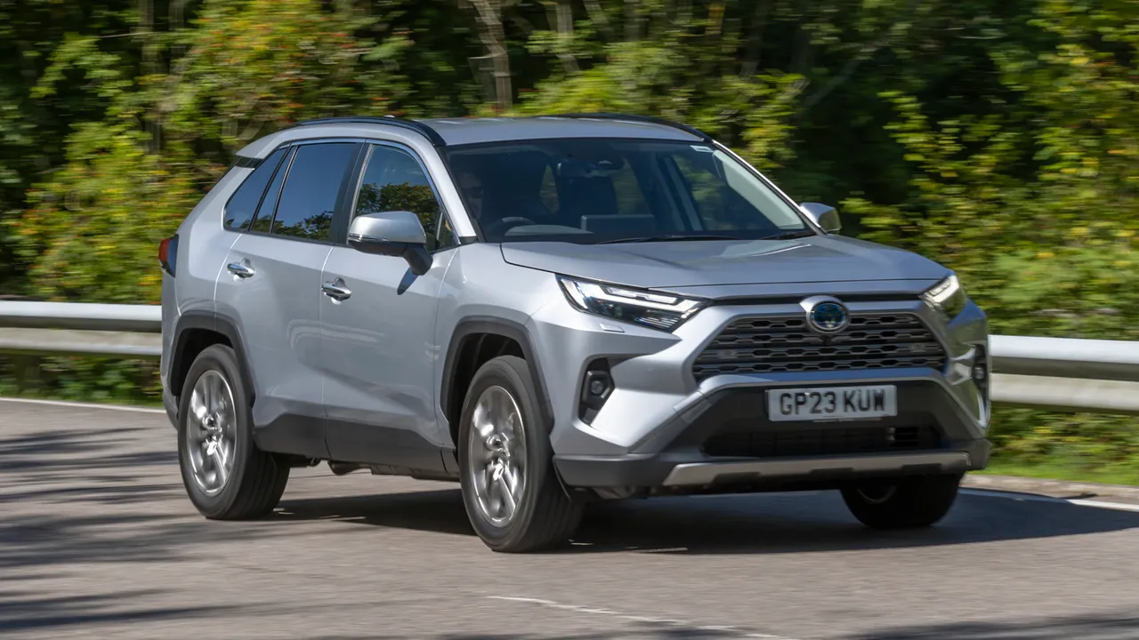
3. Toyota RAV4
While Toyota may not be the first brand that comes to mind when thinking of cutting-edge technology, the RAV4 stands out for its practical, user-focused tech setup. Toyota has taken care to develop the Entune infotainment system with simplicity and reliability as guiding principles. Unlike some competitors that emphasize flashy features, Toyota prioritizes clear, consistent usability.
The RAV4’s touchscreen comes in 7-inch or 8-inch variants, both offering large, legible icons and menus organized logically by function. This clarity ensures that users, regardless of their familiarity with tech, can easily find and operate essential features. Navigation, audio, and phone settings are all straightforward to access, and the system rarely feels overwhelming.
Physical controls remain a priority for Toyota, recognizing that many drivers appreciate tactile feedback, especially when adjusting volume or tuning radio stations. The RAV4 retains traditional knobs and buttons for these functions, which is a boon for users who find touch-only controls frustrating or distracting. This hybrid approach of touchscreen and physical buttons helps maintain ease of use during driving.
Integration with Apple CarPlay, Android Auto, and Amazon Alexa is seamless, providing drivers with access to their favorite smartphone apps and voice assistants. This broad compatibility ensures that most users can connect their devices easily and benefit from voice commands, hands-free calling, and streaming music without complicated setups.
The voice recognition system in the RAV4 is responsive and intuitive. Commands to change radio stations, set destinations, or make calls are generally understood accurately, reducing driver distraction and improving safety.
Moreover, Toyota’s commitment to safety extends to its Toyota Safety Sense suite, which integrates smoothly with the infotainment system. Warnings and alerts appear on the screen without being intrusive, keeping drivers informed without overwhelming them.
In sum, the RAV4’s technology embodies Toyota’s ethos of reliability and ease. The focus on straightforward menus, combined with essential physical controls and robust smartphone integration, creates an infotainment experience that enhances the driving experience rather than complicating it.
4. Ford Mustang Mach-E
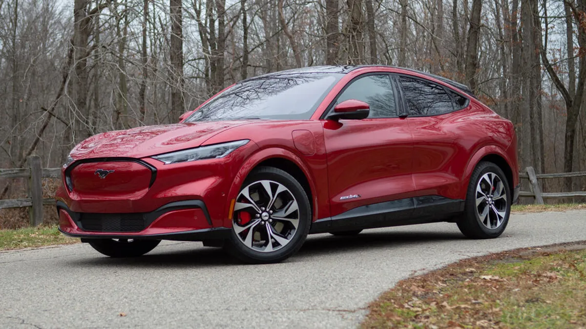
Ford’s Mustang Mach-E, a trailblazer in the electric SUV segment, impresses with its modern, user-friendly technology that blends performance-oriented data with everyday convenience.
Central to its tech appeal is the 15.5-inch vertical touchscreen, which serves as the primary interface for nearly all vehicle functions. The tall orientation allows for a generous amount of information to be displayed simultaneously, including navigation, media, climate control, and vehicle settings.
The interface design is sleek and well-organized, with large icons and customizable widgets. Users can tailor the home screen to prioritize the functions they use most often, whether it’s music, navigation, or energy consumption monitoring. This level of customization enhances usability by letting drivers create a personalized experience that suits their needs.
Physical controls have not been entirely abandoned. The Mach-E includes a rotary knob for volume control, which offers a tactile option that many drivers appreciate, especially during dynamic driving when precision and speed are necessary. This hybrid control setup reduces the frustration often associated with touchscreen-only systems.
Ford’s voice command system is designed to work naturally with everyday speech patterns, allowing for more fluid interaction without needing to memorize specific commands. The system reliably understands requests to adjust temperature, change songs, or find nearby charging stations, contributing to safer, hands-free operation.
Connectivity is another strong point. The Mach-E offers seamless Apple CarPlay and Android Auto integration, as well as Ford’s own SYNC 4 system, which supports over-the-air updates. This keeps the system current and able to receive improvements or new features without dealership visits.
Additionally, the Mach-E’s digital instrument cluster is fully customizable, allowing drivers to view performance metrics like battery charge and power delivery alongside traditional speedometer and navigation data. This integration keeps essential information front and center, blending tech and driving dynamics in a user-friendly way.
All told, the Mustang Mach-E balances modern digital innovation with practical usability, offering a technology experience that supports both casual drivers and tech enthusiasts alike.
5. Hyundai Palisade
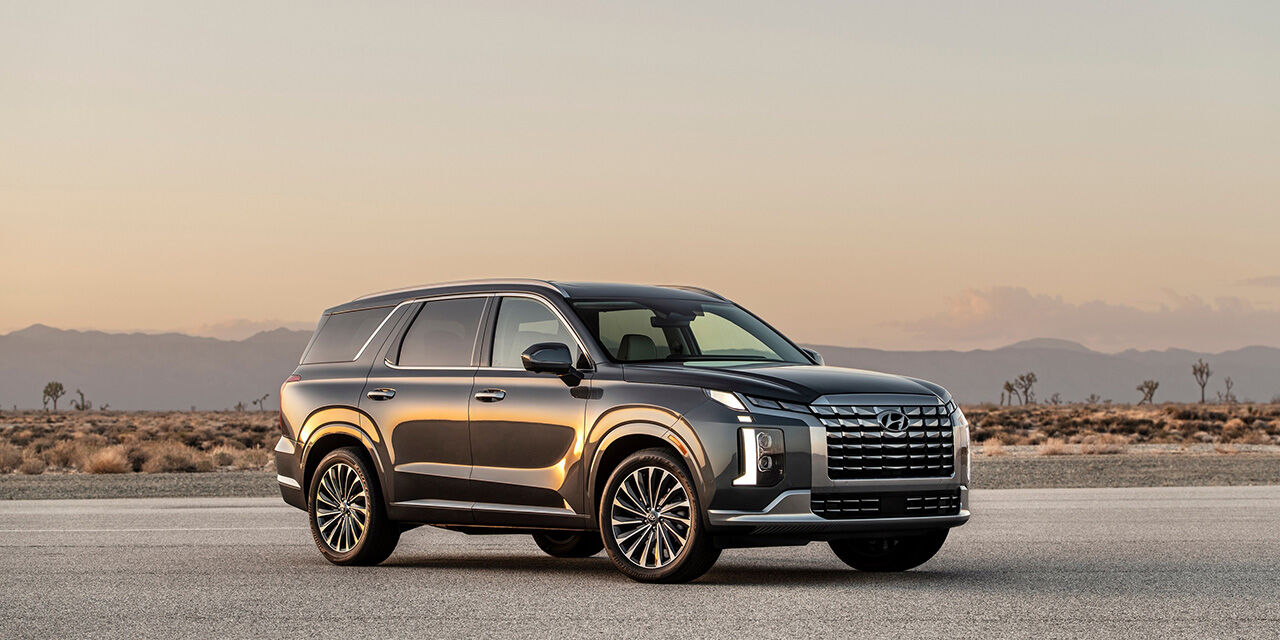
The Hyundai Palisade stands out in the midsize SUV segment not just for its spaciousness and comfort but also for its thoughtfully designed, user-friendly technology.
The Palisade’s infotainment system features a large, 10.25-inch touchscreen with vibrant colors and crisp graphics, making menus easy to read and navigate. The interface avoids clutter by focusing on essential functions and organizing them logically, which helps reduce driver confusion.
Hyundai combines touchscreen inputs with an array of physical buttons and knobs for frequently used features like volume, tuning, and climate control.
This blend ensures drivers can make quick adjustments without needing to take their eyes off the road or spend time navigating through menus. The tactile feedback of physical controls is an important usability factor that enhances safety and convenience.
Smartphone integration is comprehensive, with reliable support for Apple CarPlay and Android Auto. Users can seamlessly connect their devices and access familiar apps for navigation, music, and messaging through the vehicle’s display. The voice recognition system is efficient and easy to activate, enabling hands-free operation of many features.
The Palisade’s safety and driver-assist information is clearly presented on both the infotainment screen and a digital instrument cluster, helping drivers monitor their surroundings and system status without distraction. Alerts are timely and informative but avoid overwhelming the user.
Hyundai also offers over-the-air software updates for the Palisade, ensuring that the vehicle’s technology remains current and improves over time. This proactive approach to software maintenance underscores Hyundai’s commitment to user-friendly, evolving technology.
In conclusion, the Hyundai Palisade demonstrates how combining a responsive touchscreen, physical controls, comprehensive connectivity, and clear information display creates a tech environment that is approachable and satisfying for drivers of all backgrounds.
5 Vehicles With Clunky Interfaces

1. BMW iDrive (Earlier Generations)
BMW’s iDrive system, especially in earlier generations, is a classic example of how tech can become complicated rather than user-friendly. When first introduced, iDrive was a groundbreaking step away from the sea of buttons and knobs cluttering dashboards.
BMW aimed to simplify controls by centralizing most functions into a rotary knob and a small screen. However, the early implementation suffered from a steep learning curve and unintuitive navigation.
One of the biggest complaints was the complexity of the menu structure. Users had to scroll through multiple nested layers to perform what should be simple tasks, such as changing the radio station or adjusting climate settings.
The menu labels were sometimes ambiguous or overly technical, making it difficult for casual users to know where to find what they needed without repeated trial and error.
Another frustration was the lack of immediate tactile feedback or quick shortcuts. Unlike systems with physical buttons, the reliance on a single controller meant that users had to invest time in memorizing sequences and menu flows.
This often led to distracted driving as people tried to figure out the interface while behind the wheel. The system’s responsiveness was also an issue, with occasional lag or delays that added to user frustration.
Voice commands, when available, were limited and often inaccurate. The voice recognition system required specific phrases, and the lack of natural language processing made it cumbersome to operate hands-free. This meant many drivers abandoned the feature altogether, missing out on a safer method of controlling the car’s tech.
While newer versions of iDrive have greatly improved with touchscreens, clearer menus, and better voice integration, the legacy of the early systems continues to affect BMW’s reputation. For users who’ve experienced the older iDrive, the clunky interface is a vivid reminder that innovation without intuitive design can backfire.

2. Mercedes-Benz COMAND (Older Models)
Mercedes-Benz’s COMAND infotainment system, particularly in its older incarnations, is notorious for being difficult to use. Though rich with features and boasting high-quality hardware, the interface design often felt unintuitive and overly complex. Drivers frequently found themselves wrestling with dense menus and multiple control methods that didn’t always work in harmony.
The control knob, joystick, and touchscreen hybrid approach could confuse users who had to switch mental gears depending on the function. Some settings were only accessible via the knob, while others required touchscreen inputs or buttons on the steering wheel. This inconsistency increased the cognitive load during driving, detracting from safety and ease of use.
Menu layouts were criticized for their clutter and lack of clear organization. Many essential functions were buried within submenus, forcing users to navigate several screens just to perform a simple action like pairing a smartphone or adjusting audio balance. The terminology used in the menus was sometimes technical and not always consumer-friendly, which further alienated less tech-savvy drivers.
Another challenge was the system’s sluggish response times, especially in older hardware setups. Delays between inputs and on-screen actions could frustrate users, prompting repeated presses or long pauses that made the interface feel unpolished and outdated.
Voice control in these COMAND systems was rudimentary and required precise phrasing. The system struggled with natural speech patterns, limiting its usefulness and often forcing drivers to revert to manual controls. This made the overall experience feel fragmented rather than seamless.
While newer Mercedes-Benz infotainment systems, such as MBUX, have addressed many of these issues with more intuitive design and advanced voice AI, the older COMAND system still haunts some models, serving as an example of how complex tech without user-centric design can hamper driver interaction.
3. Jeep Grand Cherokee
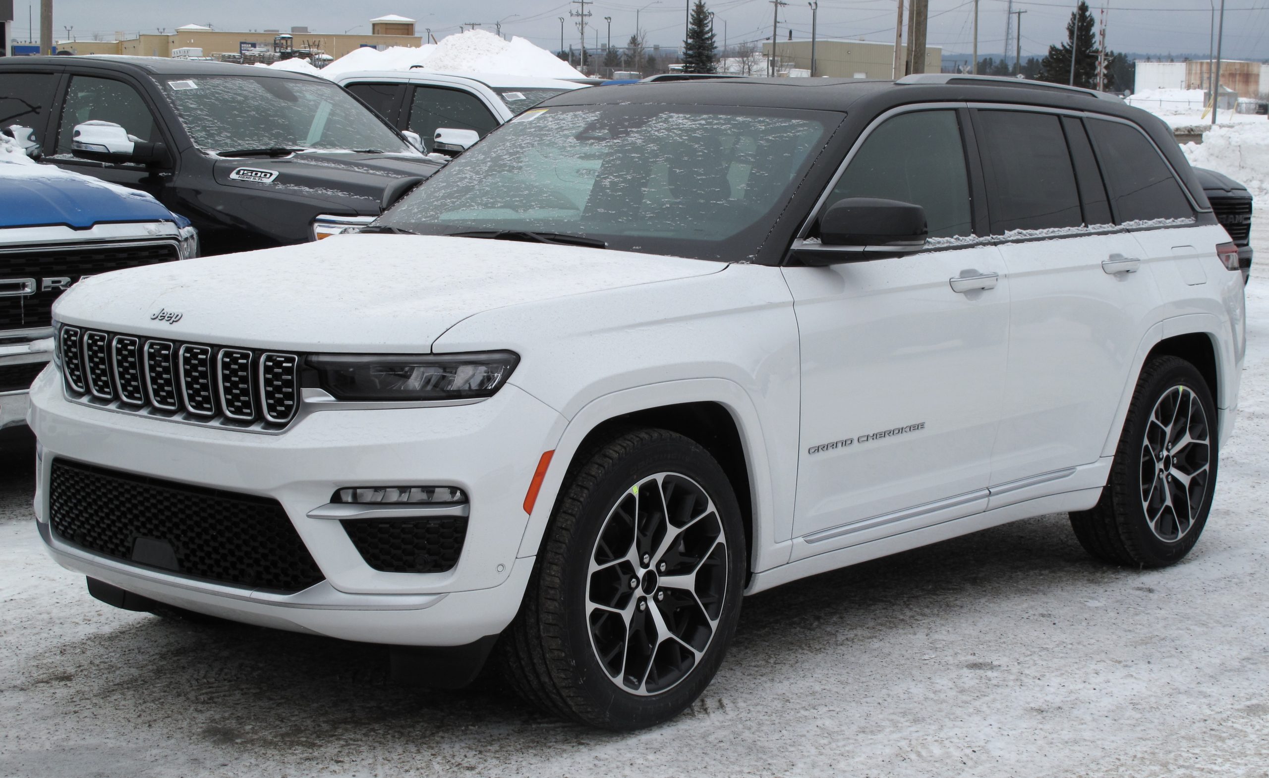
The Jeep Grand Cherokee’s infotainment system has often been cited as an example of clunky automotive tech, especially in models from the late 2010s. While Jeep offers a robust set of features, the execution in terms of user experience leaves much to be desired. The screens tend to be smaller and less responsive compared to competitors, and the interface design sometimes feels outdated and cluttered.
One major issue is the slow system startup. Upon ignition, the infotainment system can take several seconds to boot up fully, delaying access to navigation, media, or phone functions. For drivers eager to get going, this lag is a clear annoyance that detracts from the overall convenience.
Navigating the menus is not always straightforward. The graphical interface is dense, with numerous small icons and submenus packed tightly together. This crowded design can overwhelm users, especially those new to the system, who must hunt through multiple layers to reach desired functions. The lack of logical grouping sometimes forces drivers to jump between unrelated menus, increasing distraction.
Touchscreen responsiveness is another pain point. The system occasionally suffers from delayed or missed touch inputs, requiring repeated taps or longer presses that can be frustrating when on the move. Physical buttons are present but limited, meaning many actions rely on the touchscreen, exacerbating usability issues in dynamic driving conditions.
Voice control in the Grand Cherokee is also problematic. The system often fails to correctly interpret commands, requiring multiple attempts to perform even simple tasks like calling a contact or playing a particular radio station. This can lead drivers to abandon voice control in favor of manual operation, defeating its intended safety purpose.
Additionally, software updates for the system are infrequent and sometimes cumbersome, meaning that bugs and interface clunkiness persist longer than they should. Jeep’s infotainment interface exemplifies how a lack of refinement in responsiveness, menu design, and voice recognition can create a tech experience that feels outdated and awkward.
4. Cadillac Escalade (Early 2020s Models)
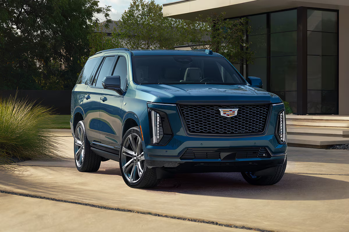
The Cadillac Escalade, a luxury SUV renowned for its bold styling and advanced features, ironically struggles with its infotainment system in early 2020s models. Cadillac opted for a massive 38-inch curved OLED display spanning the dashboard, a visual marvel that promised to redefine vehicle tech. However, the execution of the user interface on this giant screen has garnered criticism for its clunkiness and lack of intuitive operation.
The interface, while visually striking, suffers from inconsistent layout and complexity. The sheer amount of information presented at once can overwhelm users, with multiple windows and widgets competing for attention. This visual overload makes it difficult for drivers to quickly find or operate specific functions without distraction.
Menu navigation is complicated by the reliance on touch inputs with few physical controls. The lack of tactile buttons or knobs for volume and temperature adjustments forces drivers to interact with the touchscreen directly, even in situations where quick, eyes-free adjustments would be safer and more practical.
Moreover, the system’s response times are inconsistent. While some interactions are smooth and fluid, others lag or freeze briefly, creating an unpredictable user experience that frustrates drivers. This intermittency undermines confidence in the system’s reliability and usability.
Voice control, though improved compared to earlier Cadillac systems, still requires precise commands and is prone to misunderstanding natural speech. This reduces its usefulness as a hands-free tool, especially in a vehicle marketed toward luxury buyers expecting flawless tech.
Software updates have been slow to address these issues, leaving users with a high-tech display that looks impressive but doesn’t always deliver ease of use. The Escalade’s infotainment experience shows that sheer screen size and visual flair do not guarantee user-friendly technology, particularly if practical interface design is sacrificed.
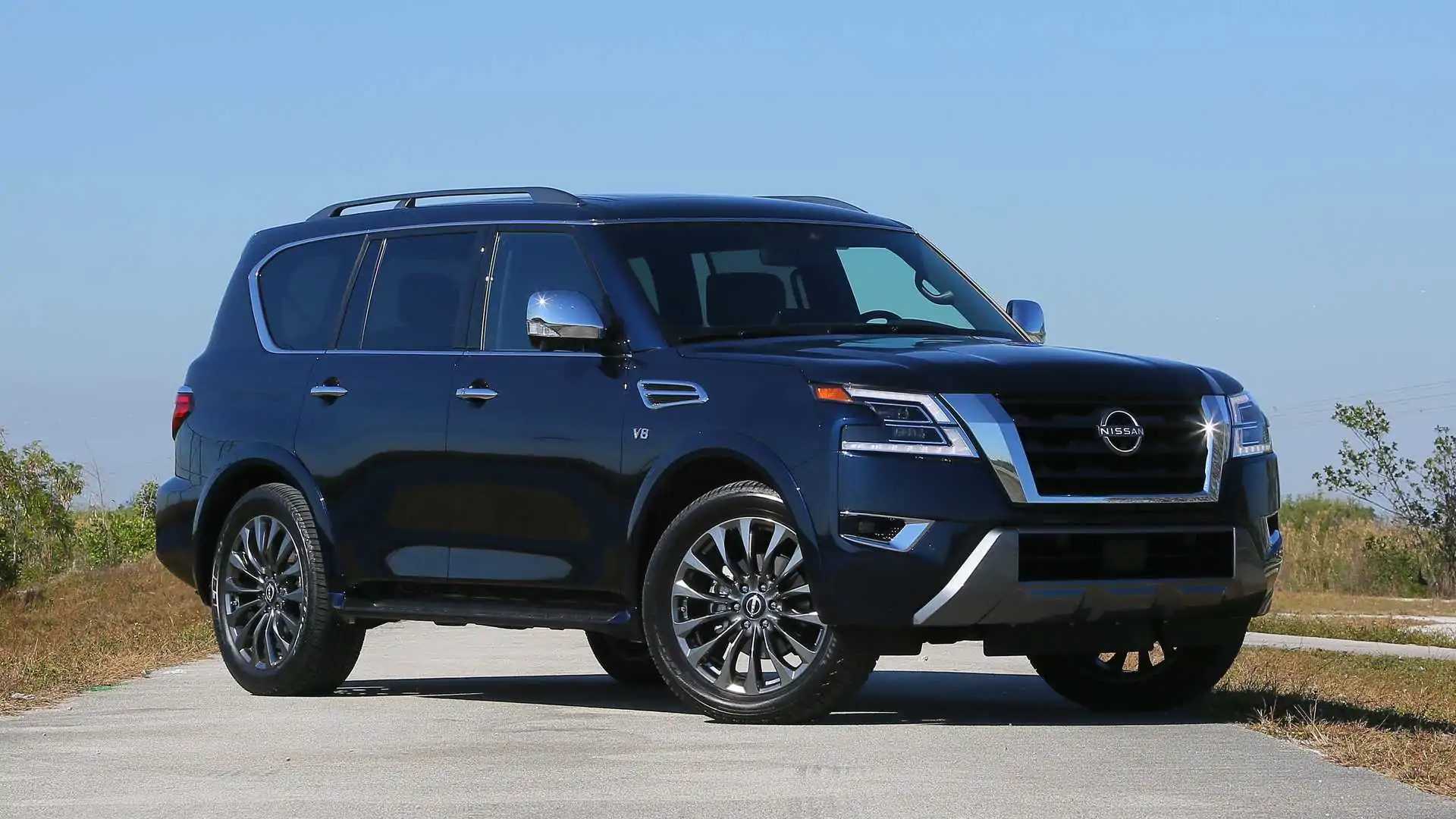
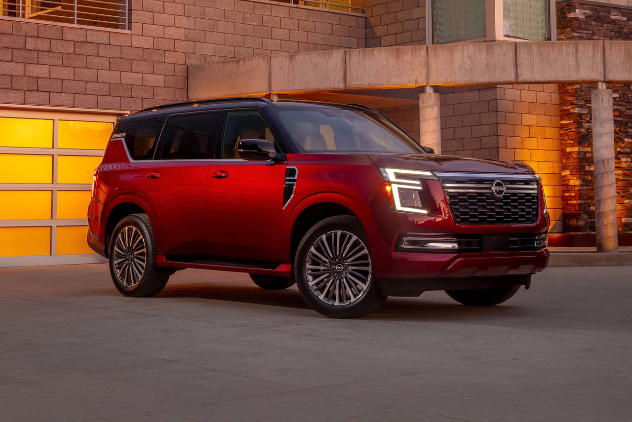
5. Nissan Armada
The Nissan Armada, a large SUV known for its rugged capability and spacious interior, unfortunately carries a reputation for having a somewhat clunky infotainment system. While Nissan packs the Armada with modern features, the interface often falls short in ease of use and responsiveness, leading to driver frustration.
The Armada’s touchscreen is moderately sized but struggles with lag and sluggish performance. Inputs sometimes register slowly or not at all, which can cause repeated presses and distraction. The graphical design of the interface leans toward being dated, with less emphasis on clean, intuitive layouts compared to competitors.
Menu navigation is complicated by the inconsistent placement of controls and unclear iconography. Users often find themselves digging through multiple layers to perform basic functions such as adjusting audio settings or pairing a smartphone. The lack of clear labels and intuitive grouping makes the system feel cumbersome.
Physical buttons and knobs exist but are limited in scope. For example, volume control is often a touchscreen function rather than a dedicated physical knob, which frustrates users who prefer tactile feedback and quick, blind adjustments. This reliance on touch for common controls is inconvenient, particularly when driving on uneven terrain, which is typical for Armada owners.
Voice commands are a mixed bag. While the system can handle some basic functions, it often fails to understand more natural or conversational commands, requiring users to repeat or simplify their requests. This can lead drivers to ignore voice control altogether, reducing safety benefits.
Infrequent software updates mean that performance issues and interface clunkiness remain longer than desirable. The Nissan Armada’s infotainment experience highlights the importance of balancing feature sets with usability and responsiveness to meet driver expectations.
Also Read: 5 Cars That Still Sell at 200K Miles and 5 That Are Worth Scrap
The landscape of automotive technology is a dynamic blend of innovation, opportunity, and challenge. The dichotomy between vehicles equipped with user-friendly tech and those saddled with clunky interfaces underscores the critical importance of human-centered design in this rapidly advancing field.
As this article has explored, the presence of cutting-edge features and powerful hardware alone is not enough; the true measure of successful automotive technology lies in its usability, responsiveness, and seamless integration into the driving experience.
Vehicles like the Tesla Model 3, Audi A6, Toyota RAV4, Ford Mustang Mach-E, and Hyundai Palisade exemplify how thoughtful design, combined with robust software and regular updates, can create a tech environment that enhances convenience, safety, and enjoyment.
These systems prioritize intuitive layouts, responsive touchscreens, physical controls for essential functions, and voice recognition that understands natural speech. They offer drivers the tools to interact with their vehicles effortlessly, reducing distraction and cognitive burden, and ultimately elevating the experience behind the wheel.
Conversely, the difficulties faced by vehicles such as early BMW iDrive systems, older Mercedes-Benz COMAND units, Jeep Grand Cherokee’s infotainment, the Cadillac Escalade’s massive yet cumbersome display, and the Nissan Armada’s lagging interface reveal how even well-intentioned technology can falter without proper attention to user needs.
Issues like complicated menus, slow responsiveness, inconsistent control methods, and unreliable voice commands turn what should be helpful features into sources of frustration. These shortcomings highlight the risks manufacturers face when technology prioritizes feature quantity over quality of interaction.
The contrast between these two groups of vehicles also illustrates a broader industry lesson: successful tech integration requires a holistic approach. Automakers must balance innovation with simplicity, combining hardware and software in ways that complement human behavior rather than complicate it. This includes understanding the varied preferences and abilities of drivers, ensuring that controls are accessible and logical, and maintaining a commitment to continuous improvement through software updates.
Looking ahead, the trend toward greater connectivity, artificial intelligence, and autonomous driving features will only increase the complexity of in-car technology. The challenge for manufacturers will be to maintain, or even improve, usability as systems grow more sophisticated.
The vehicles that succeed will likely be those that place the user experience front and center, designing technology that is not only advanced but also approachable and reliable.
For consumers, the message is clear: when choosing a vehicle, it is crucial to consider not just the presence of high-tech features but how those features actually perform in day-to-day use. A beautiful display or a long list of capabilities means little if the interface is frustrating or distracting. Practical usability should be a top priority, as it directly impacts driving safety and satisfaction.
Ultimately, the journey toward perfecting automotive technology is ongoing. By studying both exemplary and problematic examples, the industry can learn valuable lessons to shape future developments. As technology becomes more deeply embedded in vehicles, its success will be measured not by how much it can do, but by how well it serves the people who rely on it.

