
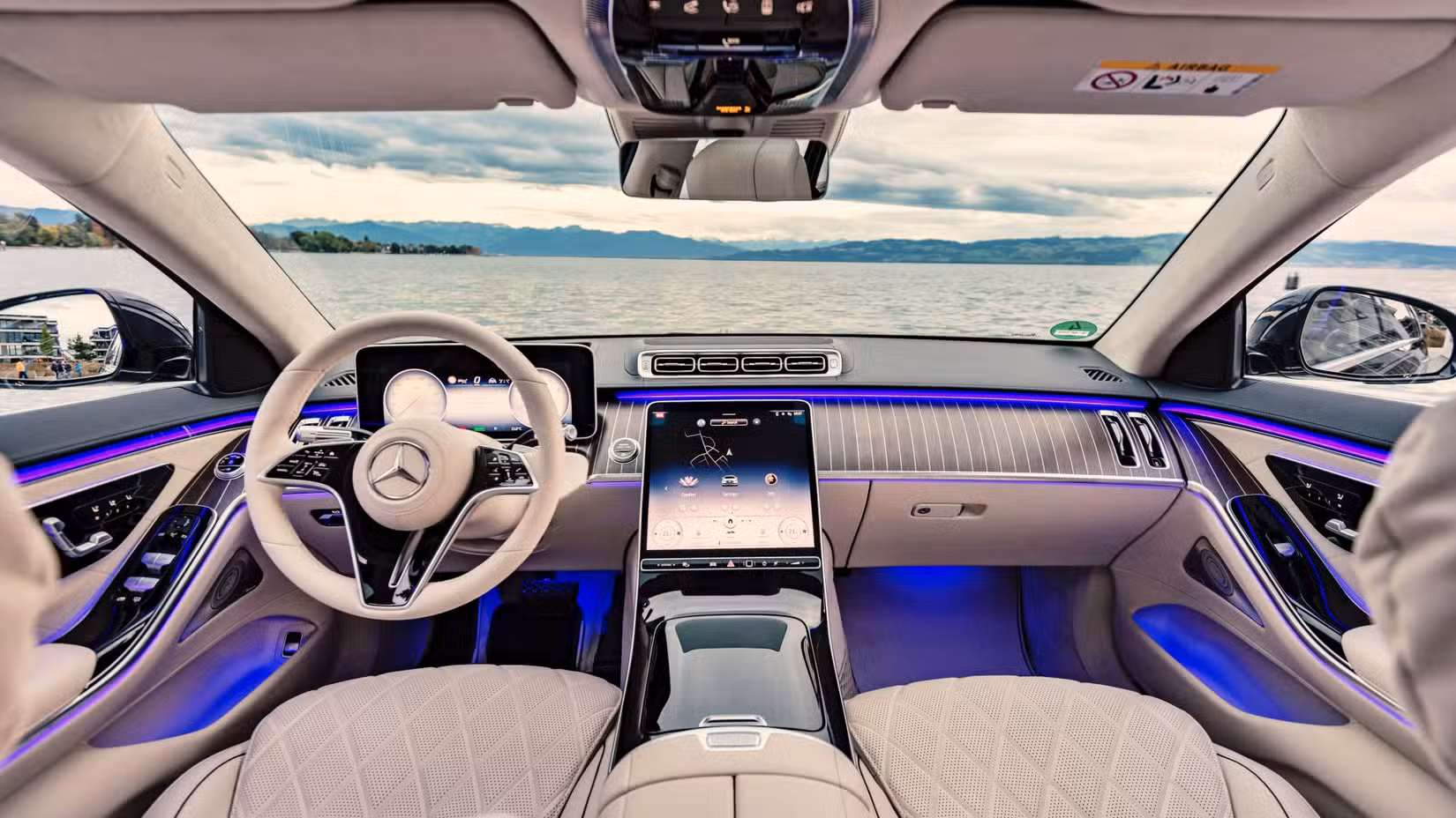
For the better part of a decade, automakers have been engaged in what can only be described as a touchscreen arms race.
Every year seems to bring another vehicle with a larger display, a wider dashboard-spanning interface, or a new claim about having the biggest screen in its segment. What began with modest infotainment displays has evolved into interiors dominated by massive digital panels stretching from pillar to pillar.
The assumption behind this trend appears straightforward: bigger screens must create a better user experience. I don’t think that’s true.
In fact, many of today’s largest automotive displays have made vehicles harder to use rather than easier. While modern touchscreens can deliver impressive graphics, advanced connectivity, and remarkable processing power, screen size alone does not improve usability. In many cases, it does the opposite.
The automotive industry has become so focused on creating visually impressive interiors that it has often overlooked the fundamental purpose of vehicle controls: allowing drivers to access important functions quickly, safely, and with minimal distraction. The result is a growing gap between technological capability and practical usability.
Also Read: 10 States With the Worst Traffic in America, Ranked
Bigger Screens Often Create More Complexity
A larger display gives designers more digital real estate. That sounds beneficial in theory. More space means more information, larger icons, and additional features. The problem is that automakers rarely use that space to simplify the experience.
Instead, they tend to fill it. Menus become more elaborate. Settings multiply. Functions that once required a single button press become buried within layers of software menus. The larger the screen becomes, the more temptation there seems to be to add additional features and customization options.
The driver is the one who bears the cost in the end. Adjusting climate settings, switching drive modes, activating seat functions, or changing vehicle configurations often requires moving through multiple screens. Although the technology is more advanced, the process can feel less intuitive and more time-consuming.
Good usability is not measured by how many functions a system can perform. It is measured by how easily drivers can access those functions.
Physical Controls Solved Problems Touchscreens Created
There is a reason physical buttons survived in automobiles for decades. They worked. Drivers could adjust temperature settings, radio volume, or defroster controls largely through muscle memory. A quick reach was often enough because the controls provided tactile feedback. Eyes remained focused on the road.
Touchscreens eliminate that advantage. Unlike a physical knob, a touchscreen offers no tactile confirmation. Drivers must often glance at the display to verify finger placement and confirm that a command has been executed.
Research from organizations including the European New Car Assessment Programme (Euro NCAP) and various transportation safety groups has repeatedly highlighted concerns about touchscreen-related distraction. The issue is not the technology itself but the way essential functions have increasingly migrated into digital interfaces.
Many automakers spent years removing physical controls only to discover that customers preferred having at least some of them available.
The recent return of buttons and knobs in several new models suggests manufacturers are beginning to recognize this reality.
Tesla Started The Trend And Others Took It Further
Much of the industry’s touchscreen obsession can be traced back to Tesla. When the company introduced large central displays and minimalist interiors, the approach felt futuristic and distinctive. The design helped separate Tesla from traditional automakers and became a defining characteristic of the brand.
Competitors quickly took notice. Soon, nearly every manufacturer was introducing larger displays. Some installed dual-screen layouts. Others created curved displays stretching across dashboards. A few went even further, turning nearly the entire front cabin into a digital interface.
The problem is that copying the appearance of innovation is not the same as improving usability.

Tesla’s approach worked partly because it was different. As other manufacturers rushed to adopt larger displays, many appeared more interested in matching visual trends than solving user-experience challenges.
The result was an industry-wide focus on screen size rather than interface quality.
More Features Do Not Automatically Improve the Experience
One of the biggest misconceptions in automotive design is the belief that more technology automatically creates a better ownership experience.
Consumers certainly appreciate useful technology. Smartphone integration, navigation systems, voice commands, over-the-air updates, and advanced connectivity features can all add value. But there is a point where additional features begin creating friction.
Many modern infotainment systems offer dozens of customization menus, multiple driver profiles, complex interface layouts, and numerous settings categories. While flexibility sounds appealing, it often increases the learning curve.
Owners may never use half the available features. Yet they must navigate around them when performing simple tasks. The best user interfaces prioritize clarity over complexity. A larger screen does not guarantee that outcome.
Screen Size Is Becoming a Marketing Tool
Part of the reason displays continue growing is simple: they are easy to market. Horsepower, fuel economy, and cargo capacity require context to appreciate. A giant screen does not.
Manufacturers can advertise a 15-inch, 17-inch, or 56-inch display and immediately create a visual impression. The feature photographs well in advertisements and stands out in showrooms.
Consumers naturally associate larger displays with technological sophistication. Automakers understand this. The challenge is that marketing appeal and usability are not always aligned.
A vehicle may feature one of the largest displays in the industry while offering a frustrating user experience. Conversely, a smaller, thoughtfully designed interface may prove far easier to live with. Unfortunately, size often receives more attention than functionality.
The Smartphone Comparison Is Misleading
Automakers frequently justify large displays by pointing to consumer familiarity with smartphones and tablets. The comparison sounds logical, but it overlooks an important difference.
People use phones while stationary or in controlled environments. Vehicles operate at highway speeds.
A driver traveling at 70 mph covers more than 100 feet every second. Even glances away from the road can have significant safety implications.
The usability standards for vehicles should therefore be different from those applied to consumer electronics.
Automotive interfaces must prioritize rapid access to critical functions while minimizing distraction. Features that work well on a tablet may not translate effectively to a moving vehicle.
This distinction is often overlooked during design discussions. A car is not a smartphone on wheels. It is a machine that requires constant attention from its operator.
Software Quality Matters More Than Display Size
Another issue rarely discussed during the screen-size debate involves software performance. A large display is only as good as the software running on it.
Many owners have experienced lagging menus, frozen screens, delayed responses, connectivity problems, and software crashes. These issues can quickly undermine even the most visually impressive interface.
Recent J.D. Power studies have repeatedly identified infotainment systems as one of the most common sources of owner complaints. Screen size does not solve those problems.
In fact, larger and more complex systems may introduce additional opportunities for software-related frustrations.
Consumers generally care less about display dimensions than they do about reliability. A smaller screen that works flawlessly is often preferable to a giant display plagued by glitches.
The Industry May Already Be Reversing Course
There are signs that automakers are beginning to reconsider the touchscreen-heavy approach.
Several manufacturers have reintroduced physical climate controls, dedicated volume knobs, and hard buttons for frequently used functions. Others have redesigned interfaces to reduce menu complexity and improve accessibility.
Euro NCAP’s recent emphasis on physical controls for key functions has further encouraged manufacturers to rethink interior layouts. The goal is not to eliminate touchscreens.
Modern displays offer undeniable advantages for navigation, media, vehicle information, and connectivity. The issue is balance.
The most effective interiors combine digital flexibility with intuitive physical controls. Many consumers appear to prefer this approach. The industry may be slowly rediscovering what drivers knew all along.
The automotive industry’s fixation on larger screens has produced some visually stunning interiors, but bigger displays do not automatically create better user experiences.
In many cases, they introduce additional complexity, increase distraction, and replace simple physical controls with software-based alternatives that require more attention. The result can be a vehicle that looks technologically advanced while feeling less intuitive to operate.
What drivers truly need is not the biggest screen available. They need interfaces that are responsive, reliable, easy to understand, and safe to use while driving.
A well-designed 12-inch display paired with thoughtful physical controls will almost always outperform a poorly designed 20-inch touchscreen loaded with complicated menus.
The future of automotive interiors should not be defined by how much glass covers the dashboard. It should be defined by how effectively the technology serves the driver. And in many cases, bigger screens simply are not the answer.
Also Read: 8 Signs A Used Car Was Used As A Rental